Many users of J-Query UI (both Mobile as well as web) are quite fond of accordion user control and ask for same or similar kind of control in Xamarin/ Xamarin Forms. As we all know, Xamarin forms controls are an abstraction to the native controls available in respective native platforms and since there is no accordion control available in any of the native mobile frameworks, it’s not available as an out of the box control in Xamarin Forms. So in this article, we will be creating a simple accordion user-control using simple Xamarin Forms controls like Button and ContentView.
Firstly, we need to understand the functionality of an accordion. As per wikipedia, the developer definition of an accordion is:
Several buttons or labels are stacked upon one another. At most, one of them can be “active”. When a button is active, the space below the button is used to display a paned window. The pane is usually constrained by the width of labels. When opened, it shifts labels under the clicked label down according to the height of that window. Only one button or pane combination can be active at any one time; when a button is selected, any other active panes cease to be active and are hidden. The active pane may have scrollbars.
And that’s exactly what I have done :).
The ‘Accordion’ class is extended from ContentView class of Xamarin.Forms in which I am creating an accordion from list ‘AccordianSource’ objects on DataBind method of the class. The code of ‘Accordion’ user control is as follows:
public class Accordion : ContentView
	{
		#region Private Variables
		List<AccordionSource> mDataSource;
		bool mFirstExpaned = false;
		StackLayout mMainLayout;
		#endregion

		public Accordion ()
		{
			var mMainLayout = new StackLayout ();
			Content = mMainLayout;
		}
		public Accordion (List<AccordionSource> aSource)
		{
			mDataSource = aSource;
			DataBind();
		}
		#region Properties
		public List<AccordionSource> DataSource
		{   get{ return mDataSource; }
			set{ mDataSource = value; }  }
		public bool FirstExpaned
		{   get{ return mFirstExpaned; }
			set{ mFirstExpaned = value; }  }
		#endregion

		public void DataBind()
		{
			var vMainLayout = new StackLayout ();
			var vFirst = true;
			if (mDataSource != null) {
				foreach (var vSingleItem in mDataSource) {

					var vHeaderButton = new AccordionButton ()
						{ Text = vSingleItem.HeaderText,
						TextColor = vSingleItem.HeaderTextColor,
						BackgroundColor = vSingleItem.HeaderBackGroundColor
					};

					var vAccordionContent = new ContentView () {
						Content = vSingleItem.ContentItems,
						IsVisible = false
					};
					if (vFirst) {
						vHeaderButton.Expand = mFirstExpaned;
						vAccordionContent.IsVisible = mFirstExpaned;
						vFirst = false;
					}
					vHeaderButton.AssosiatedContent = vAccordionContent;
					vHeaderButton.Clicked += OnAccordionButtonClicked;
					vMainLayout.Children.Add (vHeaderButton);
					vMainLayout.Children.Add (vAccordionContent);
				}
			}
			mMainLayout = vMainLayout;
			Content = mMainLayout;
		}

		void OnAccordionButtonClicked (object sender, EventArgs args)
		{
			foreach (var vChildItem in mMainLayout.Children) {
				if (vChildItem.GetType() == typeof(ContentView))
					vChildItem.IsVisible = false;
				if (vChildItem.GetType () == typeof(AccordionButton)) {
					var vButton = (AccordionButton)vChildItem;
					vButton.Expand = false;
				}
			}
			var vSenderButton = (AccordionButton)sender;

			if (vSenderButton.Expand) {
				vSenderButton.Expand = false;
			}
			else vSenderButton.Expand = true;
			vSenderButton.AssosiatedContent.IsVisible = vSenderButton.Expand;
		}
	}
This control has one public method ‘DataBind’ and two public properties ‘FirstExpaned’ and ‘DataSource’. ’DataBind’ method will be used when we use the control with XAML page as the control will not be initialized with datasource passed. ‘FirstExpaned’ is a boolean to decide whether the control should appear with all items collapsed or first one expanded and ‘DataSource’ Property of the control will require the List of ‘AccordionSource’ class defined as below:
using System;
public class AccordionSource {
  public string HeaderText { get; set; }
  public Color HeaderTextColor { get; set; }
  public Color HeaderBackGroundColor { get; set; }
  public View ContentItems { get; set; }
  }
The property names of the class are pretty self explanatory. The three properties containing ‘Header’ are for the Header button created for each accordion item and the ContentItems is of View class so that we can put any container object inside it like ListView, StackView, etc. In order to check whether the accordion header is expanded or not and to identify the Content associated with the button in order to show/hide, we require a button with some extra properties and we will get those by following ‘AccordionButton’ Class:
public class AccordionButton : Button {
		#region Private Variables
		bool mExpand= false;
		#endregion
		public AccordionButton ()
		{
			HorizontalOptions = LayoutOptions.FillAndExpand;
			BorderColor = Color.Black;
			BorderRadius = 5;
			BorderWidth = 0;
		}
		#region Properties
		public bool Expand {
			get{ return mExpand; }
			set{ mExpand = value; }
		}
		public ContentView AssosiatedContent
		{ get; set; }
		#endregion
	}
This completes the code of our user control which can be found in the ‘accordion.cs’ class in the example code. Now let's see how to use this control in a sample application. In the application, there is an accordion containing 3 items. The first one is a list, the second is static data and the third is again list.
The ‘XamlExample’ page has used this control using the following code in XAML:
="1.0"="UTF-8"
<ContentPage xmlns="http://xamarin.com/schemas/2014/forms"
xmlns:x="http://schemas.microsoft.com/winfx/2009/xaml"
xmlns:ctrl="clr-namespace:AccordionEx;assembly=AccordionEx"
x:Class="AccordionEx.XamlExample" Title="XAML Example">
<ContentPage.Content>
<ctrl:Accordion x:Name="MainOne" />
</ContentPage.Content>
</ContentPage>
and following code in the code behind constructor of the page:
public XamlExample ()
  {
     InitializeComponent ();
     MainOne.DataSource = GetSampleData ();
     MainOne.DataBind ();
  }
The ‘CodeExample’ page has used this control directly in the code file using the following code:
public CodeEaxmple ()
{
  Title = "Code Example";
  var vAccordionSource = GetSampleData ();
  var vAccordionControl = new Accordion (vAccordionSource);
  Content = vAccordionControl;
}
In both the example pages method ‘GetSampleData’ is used to get the sample data to bind with the accordion user control. The code of ‘GetSampleData’ method is as follows:
public List<AccordionSource> GetSampleData(){
			var vResult = new List<AccordionSource>();

			#region First List View
			var vListOne = new List<SimpleObject> ();
			for (var iCount = 0; iCount < 6; iCount++) {
				var vObject = new SimpleObject ()
				{ TextValue = "ObjectNo-" + iCount.ToString(),
					DataValue = iCount.ToString()};
				vListOne.Add (vObject);
			}
			var vListViewOne = new ListView () {
				ItemsSource = vListOne,
				ItemTemplate = new DataTemplate(typeof(ListDataViewCell))
			};
			vListViewOne.ItemTapped += OnListItemClicked;
			#endregion

			#region Second List
			var vListTwo = new List<SimpleObject> ();
			var vObjectRavi = new SimpleObject ()
			{ TextValue = "S Ravi Kumar",
				DataValue = "1"};
			vListTwo.Add (vObjectRavi);
			var vObjectFather = new SimpleObject ()
			{ TextValue = "Father",
				DataValue = "2"};
			vListTwo.Add (vObjectFather);
			var vObjectTrainer = new SimpleObject ()
			{ TextValue = "Trainer",
				DataValue = "2"};
			vListTwo.Add (vObjectTrainer);
			var vObjectConsultant = new SimpleObject ()
			{ TextValue = "Consultant",
				DataValue = "2"};
			vListTwo.Add (vObjectConsultant);
			var vObjectArchitect = new SimpleObject ()
			{ TextValue = "Architect",
				DataValue = "2"};
			vListTwo.Add (vObjectArchitect);

			var vListViewTwo = new ListView () {
				ItemsSource = vListTwo,
				ItemTemplate = new DataTemplate(typeof(ListDataViewCell))
			};
			vListViewTwo.ItemTapped += OnListItemClicked;
			#endregion

			#region StackLayout
			var vViewLayout = new StackLayout(){
				Children = {
					new Label { Text = "Static Content:" },
					new Label { Text = "Name : S Ravi Kumar" },
					new Label
					{ Text = "Roles : Father,Trainer,Consultant,Architect" }
				}
			};
			#endregion

			var vFirstAccord = new AccordionSource ()
			{	HeaderText="First",
				HeaderTextColor = Color.Black,
				HeaderBackGroundColor= Color.Yellow,
				ContentItems= vListViewTwo};
			vResult.Add (vFirstAccord);
			var vSecond = new AccordionSource ()
			{ HeaderText="Second ",
				HeaderTextColor = Color.White,
				HeaderBackGroundColor = Color.FromHex("#77d065"),
				ContentItems= vViewLayout };
			vResult.Add (vSecond);
			var vThird = new AccordionSource ()
			{ HeaderText="Third",
				HeaderTextColor = Color.White,
				HeaderBackGroundColor= Color.Purple,
				ContentItems= vListViewOne};
			vResult.Add (vThird);
			return vResult;
		}
In the above GetSampleData() method as the ListView objects are created on runtime, they required a custom view cell (got from ‘ListDataViewCell’) which shows the ‘TextValue’ property of the ‘SimpleObject’ class in a Label inside Stacklayout. The code of both the classes are in ‘App.cs’ file so that they can be utilized from both the example pages.
The code of ‘ListDataViewCell’ and ‘SimpleObject’ class are as follows:
public class ListDataViewCell : ViewCell
	{
		public ListDataViewCell()
		{
			var label = new Label()
			{
				Font = Font.SystemFontOfSize(NamedSize.Default),
				TextColor = Color.Blue
			};
			label.SetBinding(Label.TextProperty, new Binding("TextValue"));
			label.SetBinding(Label.ClassIdProperty, new Binding("DataValue"));
			View = new StackLayout()
			{
				Orientation = StackOrientation.Vertical,
				VerticalOptions = LayoutOptions.StartAndExpand,
				Padding = new Thickness(12, 8),
				Children = { label }
			}; }
	}

public class SimpleObject {
	public string TextValue { get; set; }
	public string DataValue { get; set; }
    }
Apart from the above code, sample application contains a ‘HomePage’ (written in XAML as I like it more  ) with two buttons to display the
 XAMLExample and CodeExample page. The code of HomePage is as follows.
XAML Code
="1.0"="UTF-8"
<ContentPage xmlns="http://xamarin.com/schemas/2014/forms"
xmlns:x="http://schemas.microsoft.com/winfx/2009/xaml"
x:Class="AccordionEx.HomePage"
Title="Accordion Example" >
<ContentPage.Resources>
<ResourceDictionary>
<Style TargetType="Button">
<Setter Property="BorderRadius" Value="10" />
<Setter Property="BorderWidth" Value="2" />
<Setter Property="WidthRequest" Value="150" />
<Setter Property="HeightRequest" Value="150" />
<Setter Property="HorizontalOptions" Value="Center" />
<Setter Property="VerticalOptions" Value="Center" />
<Setter Property="FontSize" Value="Medium" />
<Setter Property="TextColor" Value="Red" />
</Style>
</ResourceDictionary>
</ContentPage.Resources>
<ContentPage.Content>
<StackLayout VerticalOptions = "Center">
<Button Text="Xaml Page" Clicked="OnXamlClicked" />
<Button Text="Code Page" Clicked="OnCodeClicked" />
</StackLayout>
</ContentPage.Content>
</ContentPage>
Code Behind C# Code
public partial class HomePage : ContentPage
{
    public HomePage ()
    {
        InitializeComponent ();
    }

    public void OnXamlClicked (object sender, EventArgs args){

        Navigation.PushAsync(new XamlExample());
    }
    public void OnCodeClicked (object sender, EventArgs args){

        Navigation.PushAsync(new CodeEaxmple());
    }
}
The above written ‘HomePage’ is invoked in ‘App.cs’ constructor using NavigationPage, the code for the same is as follows:
public App ()
{
MainPage = new NavigationPage(new HomePage());
}
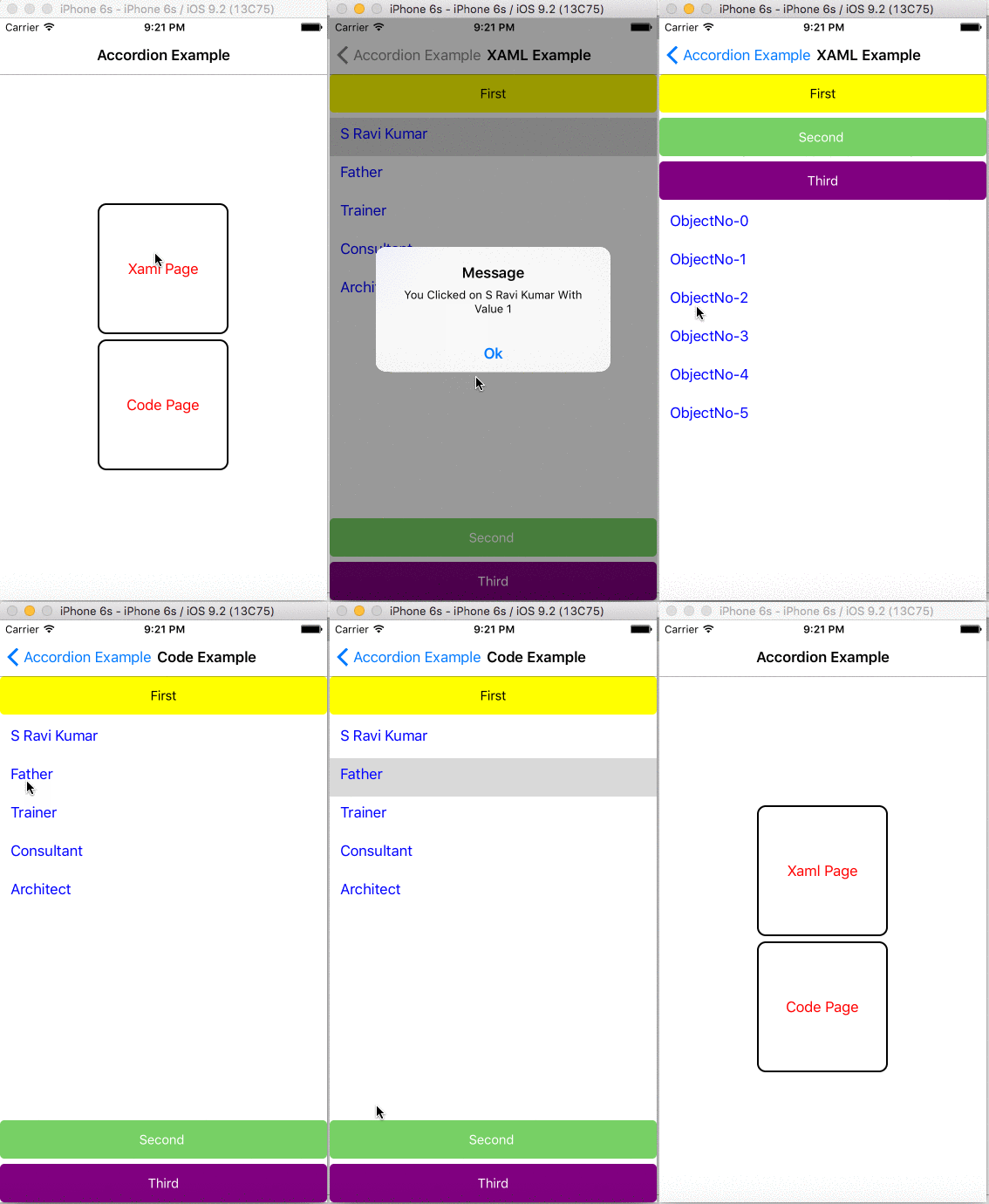
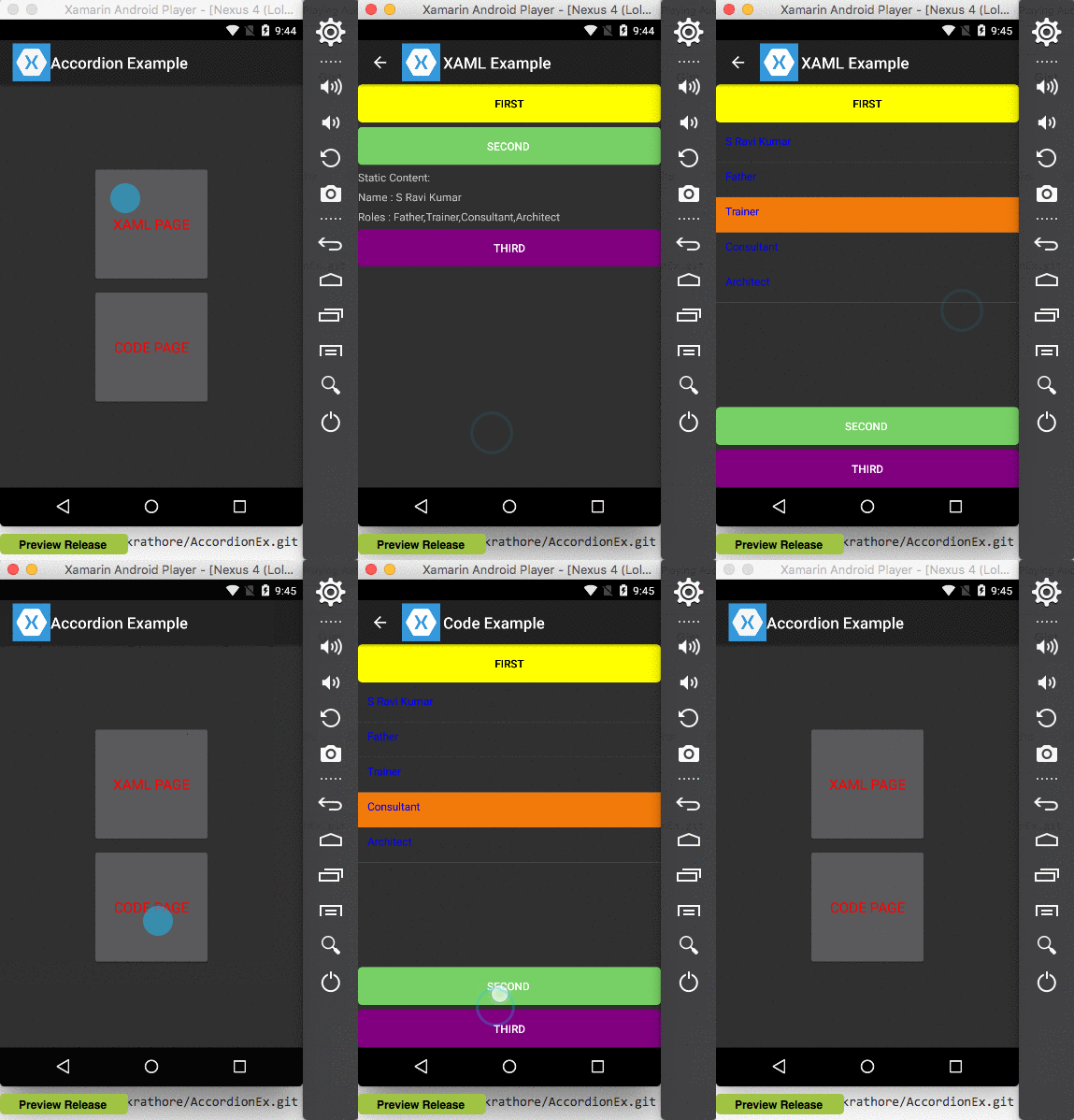
This is how the sample application looks on emulators.
iPhone:

Xamarin Android Player:

The source code of the sample application containing accordion user control and pages using the control can be downloaded from Github.
In the above post, I have created a bare bones, accordion user control which anyone can customize as per their requirements. Let me know if I have missed anything. Happy coding. 
