Introduction
Working on several different projects, I was needed to display and edit hierarchical data. Of course, the first thing you will do is to use the standard .NET TreeView control. It works pretty well if you only need basic features. But learning this control to do something more complex is not an easy job. I could not find an alternative TreeView control which is free and fully meets my needs, so finally I decided to write my own.
The architecture of this control comes mainly from the Java Swing component, with some modifications. These are the key features of the TreeViewAdv control:
- Model-View architecture - Will be covered in a separate section of this article.
- Multiselection - Maybe the first limitation which you will find in the standard
TreeView is that it’s not possible to select more then one node.
- Unlimited number of controls for each node - You can display three icons + a
CheckBox + two Labels.
- Multicolumns - You can split the
TreeView into several columns.
- Load on Demand - Lazy load of child nodes.
- Drag & Drop highlighting - Dynamically highlight the drop position.
- 100% pure .NET code - No WinAPI is used in this control.
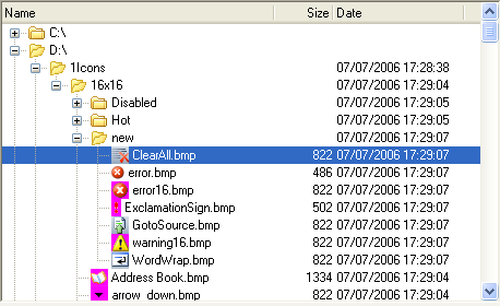
The following screenshots illustrate the TreeViewAdv features:
Model-View Architecture
I really like the Model-View pattern, and decided to use it in this control. The main idea of this pattern is to split the model (business object) from its visualization (control). If the model changes, it notifies the view by firing corresponding events. The view asks the model for details, if needed, and displays the changes. The model is described by ITreeModelInterface:
public interface ITreeModel
{
    IEnumerable GetChildren(TreePath treePath);
    bool IsLeaf(TreePath treePath);

    event EventHandler<TreeModelEventArgs> NodesChanged;
    event EventHandler<TreeModelEventArgs> NodesInserted;
    event EventHandler<TreeModelEventArgs> NodesRemoved;
    event EventHandler<TreePathEventArgs> StructureChanged;
}
It’s very simple, and you need to implement only two methods. GetChildren should return the list of child nodes of the specified parent (empty for root nodes). IsLeaf method tells TreeView whether it should try to read child nodes of the specified parent. If you wish TreeView to dynamically track model changes, you need to use one of several events of the ITreeModel interface. The most common is the StructureChanged event, which cause the TreeView to fully refresh the specified node (or empty, for the whole model). For example, see the default implementation of the ITreeModel interface – the TreeModel class.
To specify the exact node in the model, TreePath class is used. It stores the path from the root to the node, in the FullPath property.
public class TreePath
{
    public object[] FullPath{ get; }
    public object LastNode{ get; }
    public object FirstNode{ get; }
}
Using TreeView
In the source code, you can find two examples of how to use TreeViewAdv. The simplest way is to use TreeModel. All you need is to populate it with data and display it in the view:
_model = new TreeModel();
_model.Nodes.Add(new Node("Root"));
_tree.Model = _model;
The Node class, which is used in TreeModel, contains only the ‘Text’ and ‘IsChecked’ properties. If you need additional properties, you can create an ancestor of the Node class and use it in TreeModel.
But to use the full power of the TreeViewAdv, you should create your own realization of the ITreeModel interface. See the folder browser presented in the source code, for an example.
Customizing TreeView
There are a number of properties which help to customize the look and behavior of the TreeView. The main ones are:
Model - Assign your model to this property to display it.
NodeControls - The collection of controls which will be used to visualize the model. You should provide at least one NodeControl in order to see the model.
LoadOnDemand - Read all child nodes at start-up or when the parent node expands.
SelectionMode - Single (no multi-selection), Multi, MultiSameParent (children of only one node can be selected).
UseColumns - Display data in columns or not.
Columns - The collection of columns. For each column, you can specify its header, width and alignment.
NodeControls
The standard TreeView can display only one icon, CheckBox, and Label for each node. In TreeViewAdv, you can use any number of NodeControl. All controls must inherit from the ‘NodeControl’ abstract class. Inherited classes should contain the code to draw the control and the code to respond on user actions – mouse and keyboard events.

This is the class diagram of all NodeControls provided by the library:

The BindableControl class provides a ‘DataPropertyName’ which is used in the control to read and write data to the node. All that you need is to specify the name of the property of your class.
Terms and Conditions
The TreeViewAdv control is provided as free software with open source code. You can use it in your applications if the original copyright is kept.
The latest version of TreeViewAdv is always available here. Please feel free to add your comments and suggestions in the forum there.
