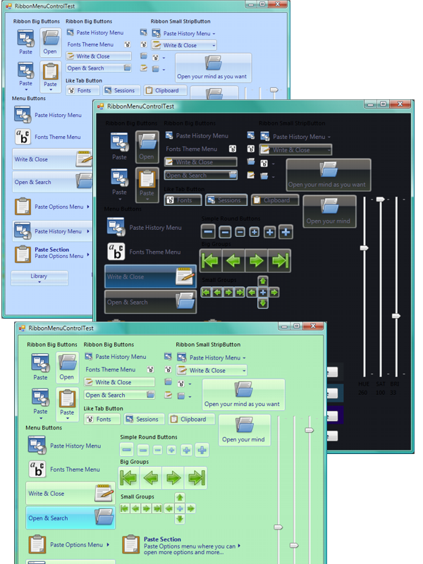
Introduction
First of all, thanks to everyone. I am grateful to know that people value this effort. I remember like yesterday when I was sixteen, more or less, and I saw many types of software, apps and games. For me, it was impossible to access and develop software then. I have learned a lot since, however, and I realize that it's now one million times easier to access this kind of software. Furthermore, if I can help anyone to create eye-candy apps, I've decided that they can use my code freely.
Background
I was thinking about how to make a fully customizable button and about how difficult it was changing RGB components. I decided to make RibbonColor, which has many options to operate with colors. If you play the demo app, you will understand quickly as you move the Hue, Sat and Brightness track bar. I have to admit that I have approximately 70% of the new RibbonControl library finished. However, as people are anxious to have improved code and have told me that I did not explain practically anything about my code, I've decided to do this like for dummies. So, here we go.
How to Use the Code
First of all, create a new Windows application. From the Solution Explorer, choose the option Add Existing Item. Then choose RibbonMenuButton.cs and Rebuild the project. Now, if you go to the form1 designer, in the toolbox you will have RibbonMenuButton. Drag it to the form. You will see a control without sense, but let's play with the properties. First, set properties for the RibbonMenuButton:

When you have set the properties, add an image, set the text you want and set the font to Segoe UI if you have it. You will have something like this:

If you have compiled the project and you get this, the next step is to change the properties of the control. Let's see what each property represents. I recommend that you look at the button's Properties settings in the demo project:
Arrow: Paints an arrow ToRight or ToDown; this only paints, as the double functionality is in another property. Colors: I think this doesn't need explanation; I recommend you to use the PlayGround app to choose your colors. FadingSpeed: This facilitates fading between colors; choose 0 to avoid fading. GroupPos: This is to make round corners on the Left, Right, Center (None), Top or Bottom. ImageLocation: To put the image on the Left, Right, Top or Bottom. ImageOffset: To offset from the borders. MaxImageSize: To make buttons larger with a scaling image limit. Radius: The corner radius. ShowBase: If you want to show the BaseColor and BaseStroke color where Transparent is a color and makes fading. If set to No, it doesn't make fading. SplitButton: Creates a double function button; the arrow section opens the associated ContextMenu and the other section, the main event. SplitDistance: How big the arrow section button is. Title: If you set this different from "", it automatically puts the title bold and under the text. Text: If you have a title and want two lines of text, add \n to the text to make two lines. KeepPress, IsPressed: If KeepPress is active on some buttons, when one of them is pressed, it keeps the press and the others in the containers lose the IsPress.
I have tried to crash the app, but it always works. So, I think the code is effectively error-free.
Points of Interest
If you want to learn more about these controls, I recommend that you take a look at:
this.Region: That's a good way to avoid matters of transparency. LinearGradient With multiple colors, that makes the gradients easy. MeasureString: That's a good method to position the text because you have to take away the base.OnPaint -> you have to do everything, including write the text. TransformColors Method including the alpha opacity. DrawArc method: As you can see, with the radius you can make smooth corners. OnMouseUp: Here you can see what happens when the SplitButton is activated and IsPressed activated. RibbonColor: I took the formulas from Wikipedia and Gimp. The System.Drawing.Color.GetHue, Sat and Brightness don't work well.
History
- 5 June, 2007. 1.6 - Solved
Repaint, ChangingSize and excessive CPU consumption. Added KeepPress and IsPress functionality. - 16 May, 2007. 1.5 - Because I had to recode everything when I learned how to use Hue, Saturation and Brightness.
