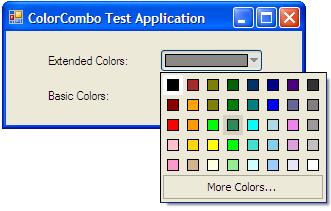
With Extended Color Set:

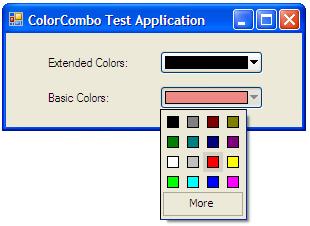
With Basic Color Set:

Introduction
This is a demonstration on the use of the ToolStripDropDown class by creating a color picker combobox. Honestly, I'm surprised that the .NET framework doesn't come with this control, as any rich text editor application would need one of these in their toolbar.
Background
As this is my first attempt at C# programming, my first thought for accomplishing the task of creating the ColorComboBox was to create a control that would inherit from a CheckBox, which when checked would create and display a form without a title bar, where the form would house the flat radio buttons representing the colors. While the popup window is being displayed, any mouse clicks outside of it has to be detected in order to close the popup. I soon learned that the only way to pickup the mouse click outside of the popup window is to use a Windows Hook (we all know that capturing the mouse would not allow the user to click on the child buttons). But, that would tie this control to windows. So, I had to find a .NET way of doing the same thing, which led me to the ToolStripDropDown class.
The other problem with this thought process was that I was exposing the checkbox's properties to the outside world. The checkbox needed to be flat, with no autosize, and the Text property had to be empty. The first two, if not set correctly, would have catastrophic results. So, I wrapped the entire thing with a UserControl derived class in order to hide the CheckBox's properties from the user.
There was another hurdle to overcome. When the dropdown was being displayed and the user clicked on the dropdown button to dismiss the dropdown, it would close, and immediately reopen. The only solution that I have found for this problem is to disable the dropdown button while the dropdown is being displayed. That is done with the help of a Timer. It is not the perfect solution, but it is the only one I could come up with.
So, the end result consists of a ColorComboBox (derived from UserControl) which contains a ColorComboButton (derived from CheckBox) which contains a PopupWindow (derived from ToolStripDropDown) which contains a ColorPopup (derived from UserControl) which contains a ColorRadioButton (derived from RadioButton).
Let's get into some detail.
Let's start with the ColorChangedHandler event. The ColorComboBox, PopupWindow, and ColorComboButton all have a ColorChangedHandler. The ones in PopupWindow and ColorComboButton are invisible to the user of the class; they are used internally to pass the color changed event down the chain of commands.
public class ColorChangeArgs : System.EventArgs
{
public ColorChangeArgs(Color color)
{
this.color = color;
}
public Color color;
}
public delegate void ColorChangedHandler(object sender, ColorChangeArgs e);
The ColorComboBox class, which inherits form UserControl, is pretty simple itself. It has a constructor, and two event handlers, one for the SizeChanged event and another to catch the ColorChanged event form the color popup, to relay to the parent control.
public partial class ColorComboBox : UserControl
{
public Color SelectedColor
{
get
{
return button.SelectedColor;
}
set
{
button.SelectedColor = value;
}
}
public Boolean Extended
{
set
{
button.Extended = value;
}
get
{
return button.Extended;
}
}
public event ColorChangedHandler ColorChanged;
public ColorComboBox()
{
InitializeComponent();
button.ColorChanged += new ColorChangedHandler(button_ColorChanged);
}
public void button_ColorChanged(object sender, ColorChangeArgs e)
{
if (ColorChanged != null)
{
ColorChanged(this, e);
}
}
private void ColorComboBox_SizeChanged(object sender, EventArgs e)
{
button.Location = new Point(0, 0);
button.Size = this.Size;
}
}
The next control in the chain is the ColorComboButton. This is the first visible thing in this control. This is the button that shows the selected color and a drop down arrow to its right. The significant items in this class are the ColorChanged event, the ColorCombo_Click event handler, and the OnCheckStatus timer event handler.
private class ColorComboButton : CheckBox
{
private void ColorCombo_Click(object sender, EventArgs e)
{
if (!this.Checked)
{
return;
}
popupWnd = new PopupWindow(colors);
Rectangle rect = Bounds;
rect = this.Parent.RectangleToScreen(rect);
Point pt = new System.Drawing.Point(rect.Left, rect.Bottom);
popupWnd.ColorChanged += new ColorChangedHandler(OnColorChanged);
popupWnd.Show(pt);
this.Enabled = false;
}
protected void OnColorChanged(object sender, ColorChangeArgs e)
{
if (ColorChanged != null && e.color != this.selectedColor)
{
this.selectedColor = e.color;
ColorChanged(this, e);
}
else
{
this.selectedColor = e.color;
}
}
private void OnCheckStatus(Object myObject, EventArgs myEventArgs)
{
if (popupWnd != null && !popupWnd.Visible)
{
this.Checked = false;
this.Enabled = true;
}
}
}
Next, we have the ColorPopup control, which is a User Control, and the ColorRadioButton. ColorPopup is simply a container that holds a number of flat radio buttons which have colors on them. The ColorRadioButton inherits from a RadioButton and does some custom drawing in order to show the colors in the ColorPopup. I'll let you discover those on your own, since they are extremely straightforward.
Next is the PopupWindow which inherits from ToolStripDropDown. This class has two methods, a constructor and a Close event handler. The constructor creates a ToolStripControlHost which will host the PopupColor User Control, and adds it as an item to the ToolStripDropDown's list. The Close event handler simply fires the ColorChanged event.
private class PopupWindow : ToolStripDropDown
{
public PopupWindow(ColorPopup content)
{
if (content == null)
{
throw new ArgumentNullException("content");
}
this.content = content;
this.AutoSize = false;
this.DoubleBuffered = true;
this.ResizeRedraw = true;
host = new ToolStripControlHost(content);
this.Padding = Margin = host.Padding = host.Margin = Padding.Empty;
this.MinimumSize = content.MinimumSize;
content.MinimumSize = content.Size;
MaximumSize = new Size(content.Size.Width + 1,
content.Size.Height + 1);
content.MaximumSize = new Size(content.Size.Width + 1,
content.Size.Height + 1);
Size = new Size(content.Size.Width + 1, content.Size.Height + 1);
content.Location = Point.Empty;
Items.Add(host);
}
protected override void OnClosed(ToolStripDropDownClosedEventArgs e)
{
if (ColorChanged != null)
{
ColorChanged(this, new ColorChangeArgs(this.SelectedColor));
}
}
}
Using the code
The use of the control is pretty straightforward. I didn't create a Class Library because it would be overkill for one control. So, simply copy and paste the three files in ColorComboBox.zip into your projects directory and add them to your project. You might have to do a build before the control will be displayed in the control toolbox. Once it is there, you can simply drag and drop it into a WinForm.
The control has two extra properties, SelectedColor and Extended. The SelectedColor property is used for getting and setting the selected color in the ColorComboBox. The Extended property changes the contents of the drop down box form a basic color set to an extended color set.
The control also exposes an event, ColorChanged, to notify that the user has changed the color selection.
private void InitializeComponent()
{
...
this.colorComboBox1.ColorChanged +=
new ColorComboTestApp.ColorChangedHandler(this.OnColorChanged);
...
}
protected void OnColorChanged(object sender, ColorChangeArgs e)
{
MessageBox.Show(this,e.color.ToString(),"Selected color",
MessageBoxButtons.OK, MessageBoxIcon.Information);
}
Have fun!
