The .NET 3.5 SP1 is full of tricks, just today I found a new property called AlternationCount which is available on all the ItemControl controls such as ItemControl, ListBox, etc.
This simple property can be used to provide some sort of alternative look based on the current value of the AlternationIndex. So you can color items or format them differently based on their index.
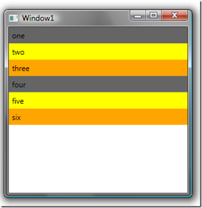
Here is a small example where I color the items, a different color based on their AlternationIndex value. The AlternationIndex works hand in hand with the AlternationCount of the ItemsControl (or derived control), so in this example the ItemsControl AlternationCount is 3, which means we can have triggers on the AlternationIndex for values 1/2 or 3.
Here is the XAML for a small example:
 1:  <Window x:Class="WpfApplication1.Window1"
 2:      xmlns="http://schemas.microsoft.com/winfx/2006/xaml/presentation"
 3:      xmlns:x="http://schemas.microsoft.com/winfx/2006/xaml"
 4:      Title="Window1" Height="300" Width="300">
 5:
 6:      <Window.Resources>
 7:
 8:          <DataTemplate x:Key="someStringItemsTemplate">
 9:
10:              <Border x:Name="bord" BorderBrush="Transparent"
11:                      CornerRadius="0"
12:                      HorizontalAlignment="Stretch"
13:                      Background="#ff656565">
14:                  <Label Content="{Binding}"
15:                         HorizontalContentAlignment="Stretch"
16:                         HorizontalAlignment="Stretch"
17:                         Margin="0"
18:                         Background="Transparent"/>
19:
20:              </Border>
21:              <DataTemplate.Triggers>
22:                  <Trigger Property="ItemsControl.AlternationIndex"
23:                           Value="1">
24:                      <Setter TargetName="bord"
25:                           Property="Background" Value="Yellow"/>
26:                  </Trigger>
27:                  <Trigger Property="ItemsControl.AlternationIndex"
28:                           Value="2">
29:                      <Setter TargetName="bord"
30:                           Property="Background" Value="Orange"/>
31:                  </Trigger>
32:              </DataTemplate.Triggers>
33:          </DataTemplate>
34:
35:      </Window.Resources>
36:
37:      <ItemsControl x:Name="someItems" AlternationCount="3"
38:                        VerticalAlignment="Top"
39:                        HorizontalAlignment="Stretch"
40:                        Margin="0,0,0,0"
41:                        ItemTemplate="{StaticResource
42:                          someStringItemsTemplate}">
43:          <ItemsControl.ItemsPanel>
44:              <ItemsPanelTemplate>
45:                  <StackPanel Orientation="Vertical"/>
46:              </ItemsPanelTemplate>
47:          </ItemsControl.ItemsPanel>
48:
49:      </ItemsControl>
50:  </Window>
And when run with a small set of items, we get:

