Ever wanted a slightly different progress bar from the standard WPF Progress bar which looks like the following (IsIndeterminate is like the WinForms Marquee enum value):
1:  <ProgressBar VerticalAlignment="Top"
2:      Height="22" IsIndeterminate="True"/>

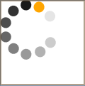
What I would like is one that is more like the ones you see all over the web, where we have a round wheel sort of progress indicator. Would you like one of those?
Well fear not, your search is over, here is a very simple idea, just arrange some Ellipses in a circle within a Canvas and do a constant Rotate StoryBoard and bam, a circular progress bar.
Here is the XAML for such a UserControl.
 1:  <UserControl x:Class="Sonic.CircularProgressBar"
 2:      xmlns="http://schemas.microsoft.com/winfx/2006/xaml/presentation"
 3:      xmlns:x="http://schemas.microsoft.com/winfx/2006/xaml"
 4:      Height="120" Width="120" Background="Transparent">
 5:      <Grid x:Name="LayoutRoot" Background="Transparent"
 6:            HorizontalAlignment="Center" VerticalAlignment="Center">
 7:          <Grid.RenderTransform>
 8:              <ScaleTransform x:Name="SpinnerScale"
 9:                              ScaleX="1.0" ScaleY="1.0" />
10:          </Grid.RenderTransform>
11:          <Canvas RenderTransformOrigin="0.5,0.5"
12:                  HorizontalAlignment="Center"
13:                  VerticalAlignment="Center"
14:                  Width="120" Height="120" >
15:              <Ellipse Width="21.835" Height="21.862"
16:                       Canvas.Left="20.1696"
17:                       Canvas.Top="9.76358"
18:                       Stretch="Fill" Fill="Orange"
19:                       Opacity="1.0"/>
20:              <Ellipse Width="21.835" Height="21.862"
21:                       Canvas.Left="2.86816"
22:                       Canvas.Top="29.9581" Stretch="Fill"
23:                       Fill="Black" Opacity="0.9"/>
24:              <Ellipse Width="21.835" Height="21.862"
25:                       Canvas.Left="5.03758e-006"
26:                       Canvas.Top="57.9341" Stretch="Fill"
27:                       Fill="Black" Opacity="0.8"/>
28:              <Ellipse Width="21.835" Height="21.862"
29:                       Canvas.Left="12.1203"
30:                       Canvas.Top="83.3163" Stretch="Fill"
31:                       Fill="Black" Opacity="0.7"/>
32:              <Ellipse Width="21.835" Height="21.862"
33:                       Canvas.Left="36.5459"
34:                       Canvas.Top="98.138" Stretch="Fill"
35:                       Fill="Black" Opacity="0.6"/>
36:              <Ellipse Width="21.835" Height="21.862"
37:                       Canvas.Left="64.6723"
38:                       Canvas.Top="96.8411" Stretch="Fill"
39:                       Fill="Black" Opacity="0.5"/>
40:              <Ellipse Width="21.835" Height="21.862"
41:                       Canvas.Left="87.6176"
42:                       Canvas.Top="81.2783" Stretch="Fill"
43:                       Fill="Black" Opacity="0.4"/>
44:              <Ellipse Width="21.835" Height="21.862"
45:                       Canvas.Left="98.165"
46:                       Canvas.Top="54.414" Stretch="Fill"
47:                       Fill="Black" Opacity="0.3"/>
48:              <Ellipse Width="21.835" Height="21.862"
49:                       Canvas.Left="92.9838"
50:                       Canvas.Top="26.9938" Stretch="Fill"
51:                       Fill="Black" Opacity="0.2"/>
52:              <Ellipse Width="21.835" Height="21.862"
53:                       Canvas.Left="47.2783"
54:                       Canvas.Top="0.5" Stretch="Fill"
55:                       Fill="Black" Opacity="0.1"/>
56:              <Canvas.RenderTransform>
57:                  <RotateTransform x:Name="SpinnerRotate"
58:                                   Angle="0" />
59:              </Canvas.RenderTransform>
60:              <Canvas.Triggers>
61:                  <EventTrigger RoutedEvent="ContentControl.Loaded">
62:                      <BeginStoryboard>
63:                          <Storyboard>
64:                              <DoubleAnimation
65:                                  Storyboard.TargetName
66:                                      ="SpinnerRotate"
67:                                   Storyboard.TargetProperty
68:                                      ="(RotateTransform.Angle)"
69:                                   From="0" To="360"
70:                                   Duration="0:0:01"
71:                                   RepeatBehavior="Forever" />
72:                          </Storyboard>
73:                      </BeginStoryboard>
74:                  </EventTrigger>
75:              </Canvas.Triggers>
76:          </Canvas>
77:      </Grid>
78:  </UserControl>
And here is all the C# codebehind:
1: using System;
2: using System.Collections.Generic;
3: using System.Linq;
4: using System.Text;
5: using System.Windows;
6: using System.Windows.Controls;
7: using System.Windows.Data;
8: using System.Windows.Documents;
9: using System.Windows.Input;
10: using System.Windows.Media;
11: using System.Windows.Media.Animation;
12: using System.Windows.Media.Imaging;
13: using System.Windows.Navigation;
14: using System.Windows.Shapes;
15:
16: namespace Sonic
17: {
18: 19: 20: 21: public partial class CircularProgressBar : UserControl
22: {
23: public CircularProgressBar()
24: {
25: InitializeComponent();
26:
27:
28:
29: Timeline.DesiredFrameRateProperty.OverrideMetadata(
30: typeof(Timeline),
31: new FrameworkPropertyMetadata { DefaultValue = 20 } );
32: }
33: }
34: }
And here is an example of one of these CircularProgressBar controls in use:
 1:  <Window
 2:      xmlns="http://schemas.microsoft.com/winfx/2006/xaml/presentation"
 3:      xmlns:x="http://schemas.microsoft.com/winfx/2006/xaml"
 4:          xmlns:local="clr-namespace:Sonic"
 5:      x:Class="Sonic.MainWindow">
 6:
 7:
 8:      <Grid>
 9:              <local:CircularProgressBar/>
10:          </Grid>
11:
12:  </Window>
And here it is in action (obviously, it looks better in run time)… Enjoy!

