For the latest and greatest:
Introduction
This is an alternative implementation of a NotifyIcon (system tray icon) for the WPF platform. It does not just rely on the corresponding WinForms component, but is a purely independent control which leverages several features of the WPF Framework in order to display rich tooltips, popups, context menus, and balloon messages.

Background
During the development of my NetDrives tool (which is open source too, btw), I discovered that there's no built-in NotifyIcon available within the WPF namespace - I had to fall back to the component of the Windows Forms namespace. So far so good, but I quickly started to miss quite a few features, including:
- Rich ToolTips rather than text
- WPF context menus and popups
- Command support and routed events
- Flexible data binding
- Rich balloon messages rather than the default messages provides by the OS
With the problem on the table, I started working on this pure-WPF solution in order to fill the gaps. And here we are. :)
Contents
Article and Samples
This article briefly discusses the implementation and structure of the control and then describes the various features. The tutorials start with the common stuff (declaration, setting the icon, ToolTips, etc.) and then dive into slightly more advanced scenarios (data binding, commands, events).
Due to the number of features of the control, this has become quite a reading. Still, you should be able to get started right away. You can explore the different features step by step, and the attached sample application closely follows the contents of this article.
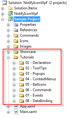
Basically, you can immediately try out everything that is outlined in the tutorial part of this article, and you'll find all the sources in the Tutorials folder of the sample application:
Project Page / Alternatives
Project Page
This article is several years old now, and while I will keep the documentation here up-to-date, the reference page for the control's development can be found at https://github.com/hardcodet/wpf-notifyicon.
Alternative Projects
I would also like to mention that there are quite a few alternative solutions around. All but one I've seen so far are basically wrappers around the WinForms NotifyIcon, and they provide the basic functionality that you may know from your WinForms project. An incomplete list of noteworthy links:
Control Implementation Overview
Basically, the implementation can be divided into two areas:
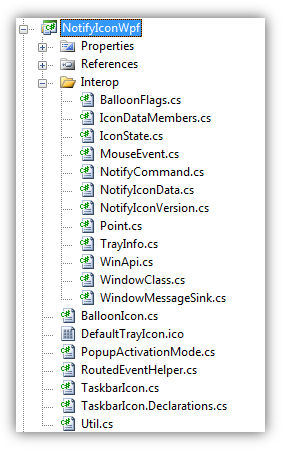
- The classes in the
Interop namespace contain code that configures the NotifyIcon via the Shell_NotifyIcon function of the Win32 API. These classes are used internally by the control. - The classes in the project folder provide the WPF API. This is the
public API that you'll be working with. The powerhorse here is the TaskbarIcon class, which represents your NotifyIcon.
Win32 API - The Interop Namespace
Just like the WinForms NotifyIcon, this control is basically a wrapper around the Shell_NotifyIcon function of the Windows API. It does, however, support the latest improvements (up to Vista), including richer ToolTips (with a fallback mechanism for Windows XP) and custom icons for balloon messages.
In case you want to start your own implementation (be it WPF or not), you can basically take the code of the Interop namespace along with the helper methods in the Util class and you should be good to go: The classes and enums there provide you with a clean and well documented façade to Shell_NotifyIcon and related classes. If you want to invoke Shell_NotifyIcon, you can do so via the WriteIconData method in the Util class:
public static bool WriteIconData(ref NotifyIconData data, NotifyCommand command)
{
return WriteIconData(ref data, command, data.ValidMembers);
}
public static bool WriteIconData(ref NotifyIconData data, NotifyCommand command,
IconDataMembers flags)
{
if (IsDesignMode) return true;
data.ValidMembers = flags;
lock (SyncRoot)
{
return WinApi.Shell_NotifyIcon(command, ref data);
}
}
WPF API - The TaskbarIcon Class
As a user of the control, you don't have to deal with Win32 interna at all. The TaskbarIcon class represents the NotifyIcon, and it exposes a clean API that should feel familiar to every WPF developer.
Here's an overview of the class' properties and events:
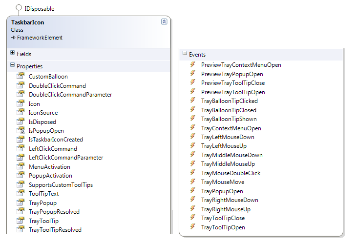
There's a huge number of properties and events available, but don't worry - if you don't want to, you don't have to deal with most of them. Basically, the control provides you with functionality in the following areas, which are all optional (even the displayed icon itself):
- Displaying an Icon in the tray area
- Showing ToolTips if the user hovers the mouse over the tray icon
- Opening a
ContextMenu if the user clicks on the NotifyIcon - Opening an interactive
Popup control is the user clicks on the NotifyIcon - Displaying balloon messages in the tray area in case of an event (either standard balloon tips or custom balloons)
Tutorial Part 1: The Basics
Hello NotifyIcon
To get started, let's have a look at creating your first NotifyIcon. You can do this both programmatically and declaratively.
Creating the NotifyIcon in Code
TaskbarIcon tbi = new TaskbarIcon();
tbi.Icon = Resources.Error;
tbi.ToolTipText = "hello world";
Creating the NotifyIcon in XAML
In order to declare the TaskbarIcon in XAML, you will have to add the following namespace declaration to the header of your XAML file first:
xmlns:tb="http://www.hardcodet.net/taskbar"
Then just declare the TaskbarIcon with the tb prefix:
<Window
xmlns="http://schemas.microsoft.com/winfx/2006/xaml/presentation"
xmlns:x="http://schemas.microsoft.com/winfx/2006/xaml"
xmlns:tb="http://www.hardcodet.net/taskbar"
>
<Grid>
<tb:TaskbarIcon
IconSource="/Icons/Error.ico"
ToolTipText="hello world" />
</Grid>
</Window>
The snippet above is all you need to display the following NotifyIcon in the tray area:

Note: If you looked closely, you saw that in code, the Icon property was set, while in XAML, the icon image was set via the IconSource dependency property. The difference between these two properties is that Icon is a standard property that takes a System.Drawing.Icon instance, while IconSource is a WPF Dependency Property of type ImageSource, which is more suitable to be used in XAML. The outcome is the same, however: Setting IconSource automatically sets the Icon property.
Creating the NotifyIcon from a Resource Dictionary
This is basically a combination of code and markup, and the pattern I'd recommend for real-life scenarios:
- The
TaskbarIcon is declared in a XAML Resource Dictionary - It is looked up in code during application initialization
This pattern allows you to separate the NotifyIcon from your application's windows and allows you to close all windows while your application still runs in the background.
<ResourceDictionary xmlns="http://schemas.microsoft.com/winfx/2006/xaml/presentation"
xmlns:x="http://schemas.microsoft.com/winfx/2006/xaml"
xmlns:tb="http://www.hardcodet.net/taskbar">
<tb:TaskbarIcon x:Key="MyNotifyIcon"
IconSource="/Icons/Error.ico"
ToolTipText="hello world" />
</ResourceDictionary>
Once declared as a global resource, you can just look up your NotifyIcon using the FindResource method:
public class App
{
private TaskbarIcon tb;
private void InitApplication()
{
tb = (TaskbarIcon) FindResource("MyNotifyIcon");
}
}
An elegant solution to provide interactivity is to assign a view model to the NotifyIcon control by setting its DataContext in XAML or programmatically. Have a look at the windowless application sample in the download.
Changing Icon Visibility
You can always show/hide the NotifyIcon in the tray area at runtime by setting the Visibility property of the TaskbarIcon (which is set to Visibility.Visible by default). Here's how to do it in XAML:
<tb:TaskbarIcon
  IconSource="/Icons/Error.ico"
  Visibility="Collapsed" />
..and this is the corresponding C# code snippet:
TaskbarIcon tbi = new TaskbarIcon();
tbi.Icon = Resources.Error;
tbi.Visibility = Visibility.Collapsed;
Properly Closing the NotifyIcon
Once created, the NotifyIcon stays alive (visible or not) until the TaskbarIcon class is being disposed. This happens automatically if you shut down your application so you probably don't have to worry about that at all (if you have a single NotifyIcon, you can just hide if you don't need it). However, if you want to completely remove it at runtime, you should invoke the Dispose method of the TaskbarIcon class.
Tutorial Part 2: ToolTips, Popups, Context Menus, Balloon Tips
The second part of the tutorials focuses on the different types of supported visuals. Starting from here, I will only show samples in XAML. I think it just makes more sense to do things declaratively than in code once the UI becomes a bit more involved.
Now let's have some shiny. :)
ToolTips

(A dynamic ToolTip in NetDrives which provides a quick status summary.)
The TaskbarIcon class provides two ToolTip-related properties:
- The
TrayToolTip property takes an arbitrary UIElement which is then displayed if the user hovers over the area. This can be a user control, a button, an image control or any other control.
This is a very convenient way to display rich ToolTips. They are, however, are only supported starting from Windows Vista/2008 due to a limitation of the Win32 Shell_NotifyIcon function in earlier versions (XP / 2003). Of course, rich ToolTips also work fine on Windows 7. - The
ToolTipText property takes a string. It is displayed in two scenarios:
- if the
TrayToolTip property is not in use - on older operating systems (xp/2003) that do not support rich ToolTips
- Accordingly, I'd recommend you always set the
ToolTipText property in order to have a fallback mechanism if your application runs on an older OS.
Note that ToolTips will only be displayed if no other control (Popup, Context Menu, or custom balloon tip) is currently displayed.
Attention: As TaskbarIcon derives from FrameworkElement, it also provides a ToolTip property, which takes an arbitrary object. This property is being ignored - you should only use the TrayToolTip and ToolTipText properties!
ToolTip Creation 1: Declaring ToolTips Inline
You can declare a custom ToolTip directly within the TaskbarIcon declaration. Here's a simple sample that shows a semi-transparent Border and a TextBlock:
<tb:TaskbarIcon
IconSource="/Icons/Error.ico"
ToolTipText="hello world">
<tb:TaskbarIcon.TrayToolTip>
<Border
Background="White"
BorderBrush="Orange"
BorderThickness="2"
CornerRadius="4"
Opacity="0.8"
Width="160"
Height="40">
<TextBlock
Text="hello world"
HorizontalAlignment="Center"
VerticalAlignment="Center"
/>
</Border>
</tb:TaskbarIcon.TrayToolTip>
</tb:TaskbarIcon>
And this is the result:

ToolTip Creation 2: Use a User Control
While declaring ToolTips inline certainly works, you might want to separate the ToolTip UI from the declaration of your NotifyIcon. As an example, let's recreate the ToolTip from above, but this time put the UI into a dedicated user control called SimpleUserControl:
<UserControl
x:Class="Samples.Tutorials.ToolTips.SimpleUserControl"
xmlns="http://schemas.microsoft.com/winfx/2006/xaml/presentation"
xmlns:x="http://schemas.microsoft.com/winfx/2006/xaml"
>
<Border
Background="White"
BorderBrush="Orange"
BorderThickness="2"
CornerRadius="4"
Opacity="0.8"
Width="160"
Height="40">
<TextBlock
Text="hello world"
HorizontalAlignment="Center"
VerticalAlignment="Center" />
</Border>
</UserControl>
...and finally assign it to the NotifyIcon:
<tb:TaskbarIcon
IconSource="/Icons/Error.ico"
ToolTipText="hello world">
<tb:TaskbarIcon.TrayToolTip>
<local:SimpleUserControl />
</tb:TaskbarIcon.TrayToolTip>
</tb:TaskbarIcon>
ToolTip Creation 3: Linking to a Resource
In case you have declared your ToolTip control as a resource, the declaration becomes even simpler:
<tb:TaskbarIcon
  IconSource="/Icons/Error.ico"
  ToolTipText="hello world"
  TrayToolTip="{StaticResource TheKeyOfMyToolTipControl}"
  />
Popups
Unlike a ToolTip, a Popup is only displayed if the user clicks on the NotifyIcon. It stays open if the user moves the mouse away from the tray area, but will close as soon as the user clicks somewhere else. Accordingly, you can provide interactive content within a Popup, usually to provide some quick access to your application.
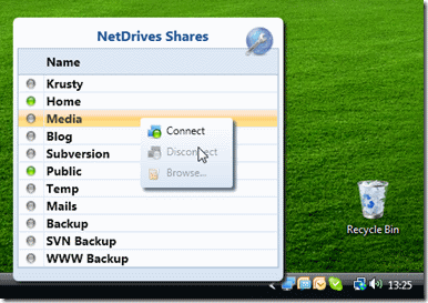
Popup in NetDrives, which provides quick access to all configured shares. The user can select a share from the grid, double click a share, or open the grid's context menu.
Declaring a Popup works pretty much the same as setting a ToolTip does: You can assign arbitrary UIElement controls as Popups by setting the TrayPopup property. Let's recycle the inline ToolTip sample from above, but this time show a Button rather than a TextBlock:
<tb:TaskbarIcon
IconSource="/Icons/Error.ico"
ToolTipText="hello world">
<tb:TaskbarIcon.TrayPopup>
<Border
Background="White"
BorderBrush="Orange"
BorderThickness="2"
CornerRadius="4"
Width="160"
Height="40">
<Button
Content="Click Me!"
HorizontalAlignment="Center"
VerticalAlignment="Center" />
</Border>
</tb:TaskbarIcon.TrayPopup>
</tb:TaskbarIcon>
The above markup produces the following (pretty ugly) result as soon as the user clicks on the NotifyIcon. But at least, it's a Popup:

Popup Activation
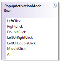
Per default, the Popup is opened if the left mouse button is being clicked, but you can use the PopupActivation property in order to control which mouse buttons activate your Popup. You can choose between left, middle, right mouse buttons, or a few common combinations.
<tb:TaskbarIcon
TrayPopup="{StaticResource MyPopup}"
PopupActivation="LeftOrDoubleClick"
/>
Context Menus
You can displays standard WPF context menus if the user clicks on the NotifyIcon:

There's nothing special here - the ContextMenu property is directly derived from the FrameworkElement base class:
<tb:TaskbarIcon
IconSource="/Icons/Error.ico"
ToolTipText="hello world">
<tb:TaskbarIcon.ContextMenu>
<ContextMenu
Background="LightCoral">
<MenuItem Header="First Menu Item" />
<MenuItem Header="Second Menu Item" />
</ContextMenu>
</tb:TaskbarIcon.ContextMenu>
</tb:TaskbarIcon>
The above snippet creates the following output:

Context Menu Activation
Per default, the context menu is opened if the right mouse button is being clicked, but you can use the MenuActivation property in order to control which mouse buttons open the popup:
<tb:TaskbarIcon
ContextMenu="{StaticResource MyMenu}"
MenuActivation="LeftOrRightClick"
/>
Note: If you define conflicting values for PopupActivation and MenuActivation, the context menu always takes precedence over the Popup:
<tb:TaskbarIcon
ContextMenu="{StaticResource MyMenu}"
TrayPopup="{StaticResource MyPopup}"
MenuActivation="LeftOrRightClick"
PopupActivation="LeftOrDoubleClick"
/>
Balloon Tips
The NotifyIcon supports two kinds of balloon tips you can use to show an information in the tray area:
- Standard balloons, which are defined by the operations system.
- Custom balloons - just like with
ToolTips and Popups, you can turn arbitrary UIElements into balloon messages. This not only means that you can style the balloon to your liking, but thanks to the rich event model of the NotifyIcon, you can also create fancy animations.
Standard Balloons
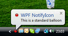
In order to display a standard balloon, the TaskbarIcon class provides two ShowBalloonTip methods. One displays a balloon with a standard icon (Info, Warning, Error, None), the other overload shows the balloon with a custom System.Drawing.Icon instead:
private void ShowStandardBalloon()
{
string title = "WPF NotifyIcon";
string text = "This is a standard balloon";
MyNotifyIcon.ShowBalloonTip(title, text, BalloonIcon.Error);
MyNotifyIcon.ShowBalloonTip(title, text, MyNotifyIcon.Icon);
MyNotifyIcon.HideBalloonTip();
}
Here's the output of the second method call that uses a custom icon:
Custom Balloons
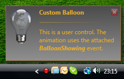
In order to display a custom balloon tip, invoke the ShowCustomBalloon method of the TaskbarIcon class. ShowCustomBalloon not only displays arbitrary UIElement instances, but also provides some basic animations out of the box and an optional time span that defines a timeout for the balloon.
private void ShowCustomBalloon()
{
FancyBalloon balloon = new FancyBalloon();
MyNotifyIcon.ShowCustomBalloon(balloon, PopupAnimation.Slide, 4000);
}
You can also close a balloon programmatically or abort the closing timer (e.g., if the user hovers over the balloon). Have a look at the showcase in the sample applications for a few scenarios.
Tutorial Part 3: Commands, Events, and Data Binding
The last part of this tutorial does not exactly require that your are a WPF-Ninja, but it's assumed that you are familiar with the concepts behind commands, routed events, or data binding. In case you get lost, just post a question on the forum and I (and hopefully others, too) will try to point you in the right direction.
Built-in Command Support
Commands provide a clean way to react to events on your NotifyIcon without having to hook up event listeners. TaskbarIcon currently exposes two properties that allow you to assign a command:
LeftClickCommandDoubleClickCommand
Let's implement a short sample that makes use of them...
Implementing a Custom Command
To get started, here's a simple command called ShowMessageCommand, which just displays a message dialog. The dialog text is taken from the command parameter:
public class ShowMessageCommand : ICommand
{
public void Execute(object parameter)
{
MessageBox.Show(parameter.ToString());
}
public bool CanExecute(object parameter)
{
return true;
}
public event EventHandler CanExecuteChanged;
}
Declaring the Command
With the ShowMessageCommand in place, all that's left to do is hooking it up with the NotifyIcon. In the snippet below, I declared the command as a local resource:
<Window
x:Class="Samples.Tutorials.Commands.CommandWindow"
xmlns="http://schemas.microsoft.com/winfx/2006/xaml/presentation"
xmlns:x="http://schemas.microsoft.com/winfx/2006/xaml"
xmlns:tb="http://www.hardcodet.net/taskbar"
xmlns:local="clr-namespace:Samples.Tutorials.Commands"
Height="300"
Width="300">
<Grid>
<Grid.Resources>
<local:ShowMessageCommand
x:Key="MessageCommand" />
</Grid.Resources>
<tb:TaskbarIcon
IconSource="/Icons/Error.ico"
LeftClickCommand="{StaticResource MessageCommand}"
LeftClickCommandParameter="Single left mouse button click."
DoubleClickCommand="{StaticResource MessageCommand}"
DoubleClickCommandParameter="Double click on NotifyIcon." />
</Grid>
</Window>
You'll find this sample (along with all other snippets in this article) in the sample application.
LeftClickCommand Delay
Note that the LeftClickCommand fires after a short delay (as opposite to the DoubleClickCommand that fires immediately). This is because there is a time span between a first click and a second click for the OS to consider the mouse action a double-click. The NotifyIcon is smart enough to wait this period in order to make sure the LeftClickCommand is only fired if the user does not click a second time within that period.
Data Binding in ToolTips, Popups, Context Menus, and Custom Balloons
Binding to the TaskbarIcon class that manages your ToolTip, Popup, context menu, or balloon tip is pretty easy. There are two variants (which are both shown in the sample application):
- You can bind implicitly through the data context of your custom control (if
DataContext is not already in use). - You can bind explicitly through the attached
ParentTaskbarIcon property. This property allows you to access the TaskbarIcon even if the DataContext is already in use.
Implicit Binding through DataContext
In order to simplify data binding scenarios for you, the TaskbarIcon class tries to set the DataContext of ToolTips, Popups, context menus and custom balloon messages according to the following rules:
- If
ToolTips, Popups, context menus, or custom balloons have a data context of their own, it is not being changed. - If the
DataContext is not in use:
- If the
TaskbarIcon has a data context (its own DataContext property is not null), it assigns its data context to the DataContext properties of ToolTips, Popups, context menus, and custom balloon tips. - If the
TaskbarIcon does not have a data context (its own DataContext property is null), it assigns itself as the DataContext of ToolTips, Popups, context menus, and balloon tips.
This mechanism provides you with a very simple solution to implicitly access either the TaskbarIcon or its DataContext in your binding expressions. As a simple example, lets revisit the inline ToolTip sample from the first tutorial, but this time, bind the output of the displayed TextBlock to the ToolTipText property of the NotifyIcon:
<tb:TaskbarIcon
IconSource="/Icons/Error.ico"
ToolTipText="hello world">
<tb:TaskbarIcon.TrayToolTip>
<Border>
<TextBlock
Text="{Binding Path=ToolTipText}"
HorizontalAlignment="Center"
VerticalAlignment="Center" />
</Border>
</tb:TaskbarIcon.TrayToolTip>
</tb:TaskbarIcon>
If you compare the above snippet with the first ToolTip tutorial, you can see that only a single line was changed:
<TextBlock Text="{Binding Path=ToolTipText}" ... />
This binding statement works because the TaskbarIcon class became the DataContext of the TextBlock control. This is what happens at runtime:
- A
Border control is assigned to the TrayToolTip property of the TaskbarIcon. - The
NotifyIcon checks whether the DataContext of this Border control is already set. This is not the case. - As a result, the
TaskbarIcon checks whether it's own DataContext is set. - Because the
TaskbarIcon itself does not have a DataContext either, it assigns itself as the DataContext of the Border control. - The
TextBlock is a child of the Border control. As such, it derives the DataContext. Accordingly, it can implicitly bind to the ToolTipText property of the TaskbarIcon.
Explicit Binding: The ParentTaskbarIcon Attached Property
Another and more explicit solution is to use the ParentTaskbarIcon attached property. If a ToolTip, Popup, context menu, or a custom balloon is managed by TaskbarIcon, TaskbarIcon assigns itself through this attached property.
You can access this property both in code or data binding expressions. As an example, here's the same ToolTip sample, this time explicitly accessing the NotifyIcon through the ParentTaskbarIcon property:
<tb:TaskbarIcon
x:Name="MyNotifyIcon2"
DataContext="WPF IS GREAT: "
IconSource="/Icons/Inactive.ico"
ToolTipText="{Binding ElementName=txtToolTip, Path=Text}">
<tb:TaskbarIcon.TrayToolTip>
<Border
Background="White"
BorderBrush="Orange"
BorderThickness="2"
CornerRadius="4"
Opacity="0.8"
Width="160"
Height="40">
<TextBlock Text="{Binding}">
<TextBlock
Text="{Binding RelativeSource={RelativeSource FindAncestor,
AncestorType={x:Type Border}},
Path=(tb:TaskbarIcon.ParentTaskbarIcon).ToolTipText}"
HorizontalAlignment="Center"
VerticalAlignment="Center" />
</TextBlock>
</Border>
</tb:TaskbarIcon.TrayToolTip>
</tb:TaskbarIcon>
Note the binding expression, which is a bit more complex here in order to get to the attached property. The TextBlock needs to resolve its parent Border (which was assigned the attached property) in order to get to the attached property:
<TextBlock
    Text="{Binding RelativeSource={RelativeSource FindAncestor,
                                  AncestorType={x:Type Border}},
    Path=(tb:TaskbarIcon.ParentTaskbarIcon).ToolTipText}"
 />
Despite the additional complexity, this syntax has its advantages, as it is guaranteed that the attached property is always at your disposal, even if the DataContext is in use (e.g., in order to access your ViewModel).
Events
Routed TaskbarIcon Events
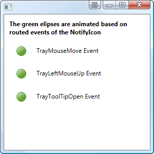
The TaskbarIcon class provides an array of routed events - there's pretty much an event for everything that happens with the NotifyIcon or related controls. For a sample on how to use these events declaratively to trigger animations, check out the tutorial in the sample application.
Attached Events for ToolTips, Popups, and Balloons
This is one of the fancy WPF features of the control. Basically, attached events are events that are fired on your custom ToolTips, Popups, and Balloon controls without requiring you to write a single line of code. This is a very clean mechanism to trigger animations in these controls on a purely declarative basis. I won't go into the details here, but rather point you to these resources:
- The sample application uses the
PopupOpened attached event in order to trigger an animation in the popup (rotating icon) every time it's being displayed.
The custom balloon sample uses several attached events to fade in and out. - I recently published a general tutorial on using attached events to trigger animations in Blend, along with another sample. You find it here.
Conclusion
I hope this article along with the attached samples will help you to a smooth start. I really enjoyed writing the control, and I hope it will make a valuable addition to your toolbox. Happy coding! :)
History
(A detailed changelog is part of the solution)
1.0.5 (2013.11.20)
Fixes issues with x64, Win 8, Focus

1.0.4 (2009.09.21)
Proper focus for popups, improved compatibility for WinForms scenarios.

1.0.3 (2009.07.02)
Proper support for routed commands including command targets.

1.0.2 (2009.05.18)
Fixed possibly wrong DataContext assignment when initializing ContextMenus.

1.0.1 (2009.05.15)
Initial CodeProject released
