Introduction
This article is a continuation of an article that I had written previously about making ASP.NET web sites friendly for mobile users.
This is the link to the article. In the last article I attempted to address the following goals for mobile user interface.
- Content will fit the small screen
- One-direction scrolling either horizontally or vertically but not both
- Clean and efficient design
- An option to visit the desktop site
The original desktop version of the sample application is illustrated here. This is a simple single-page AJAX application that allows employees of AdventureWorks to search and update their inventory of products.

The improved interface for mobile devices is illustrated here:

In this article I will address three more goals for mobile user interface:
- Reduce the amount of content for faster page loading.
- Present the navigation more efficiently for small screen devices
- Larger buttons and links for touch-screen use
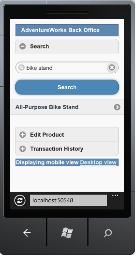
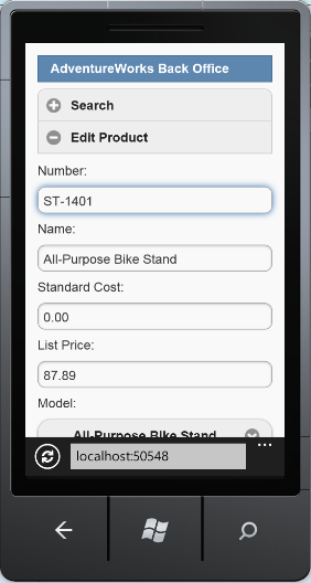
The improved mobile interface is illustrated below. Note that the search results has only one column instead of 4 and the search text box and button are larger and more user friendly for users of mobile devices. Also the "Edit Product" and "Transaction History" sections are minimized to reduce the scrolling and the color scheme is simpler. Selecting an item in the search results will collapse the Search results and expand the "Edit Product" section with the details of the product that is loaded.
The footer has a link to the desktop version of the web site.
Background
To achieve the new goals in my mobile implementation, I use the jQuery mobile library. I did not create a new web project so that the existing Controllers, Models, JavaScript, and infrastructure concerns (Entity Framework, Unity, Logging, cache) could be reused for the mobile version. Although in cases where the interface is more advanced creating a separate project will be a consideration.
The jQuery Mobile library provides a mobile user interface framework that has been tested on all of the major mobile browsers. The JavaScript and CSS files that are included with jQuery mobile style many elements to fit mobile browsers without making any markup changes.
To incorporate jQuery mobile, download the jQuery mobile library which includes a
JavaScript file, CSS, and images for the CSS. You can also use Microsoft's Ajax CDN which includes the jQuery mobile library. For this project I used the most recent production version of jQuery mobile which is version 1.2.
Using the code
1. Reference jQuery mobile
JavaScript and CSS in your project
There are many way you can incorporate jQuery mobile into your project. Because
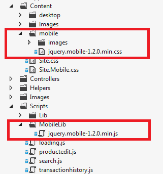
regular jQuery and mobile jQuery cannot be referenced together in the same web page, I created a separate folder under Scripts called MobileLib for the jQuery mobile JS file. I also create a
separate folder under Content for the jQuery mobile CSS and linked images.
Then I created 4 separate ASP.NET Bundles in
Global.asax.cs:
- Desktop jQuery
- Desktop jQuery CSS and supporting images
- Mobile jQuery
- Mobile jQuery CSS and supporting images
The
_Layout.cshtml file that is loaded when the web site is in desktop mode references the desktop jQuery and CSS bundles. The
_Layout.Mobile.cshtml file that is loaded when the web site is in mobile mode references the mobile jQuery and CSS bundles.
var cssDesktopBundle = new Bundle("~/Content/css", new CssMinify());
cssDesktopBundle.AddDirectory("~/Content/desktop", "*.css", true);
cssDesktopBundle.AddDirectory("~/Content", "Site.css", false);
BundleTable.Bundles.Add(cssDesktopBundle);

var cssMobileBundle = new Bundle("~/Content/Mobile/css", new CssMinify());
cssMobileBundle.AddDirectory("~/Content/mobile", "*.css", true);
cssMobileBundle.AddDirectory("~/Content", "Site.Mobile.css", false);
BundleTable.Bundles.Add(cssMobileBundle);

var jsDesktopBundle = new Bundle("~/Scripts/js");
jsDesktopBundle.AddDirectory("~/Scripts/Lib", "*.js", true);
jsDesktopBundle.AddDirectory("~/Scripts", "*.js", false);
BundleTable.Bundles.Add(jsDesktopBundle);


var jsMobileBundle = new Bundle("~/Scripts/Mobile/js");
jsMobileBundle.AddDirectory("~/Scripts/Lib", "*.js", true);
jsMobileBundle.AddDirectory("~/Scripts/MobileLib", "*.js", true);
jsMobileBundle.AddDirectory("~/Scripts", "*.js", false);
BundleTable.Bundles.Add(jsMobileBundle);
2. Create separate Mobile MVC views
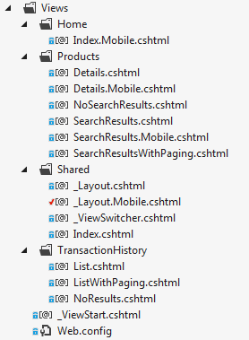
As I mentioned in the last article ASP.NET MVC 4 will uses the <View>.Mobile.cshtml naming convention to determine if there is a mobile version of an MVC view.
I created separate MVC view pages for the search results and for the product edit section in
SearchResults.Mobile.cshtml and Details.Mobile.cshtml, respectively. This gives me the freedom to enhance the mobile version of these sections without adversely affecting the desktop version including from a readability standpoint. Even though the jQuery mobile markup is not rendered on the desktop I do not want the additional markup to make the desktop view unreadable. However this will be a design consideration that depends on the application being built.
There is also a separate
Index.Mobile.cshtml for the initial screen layout.
3. Apply jQuery mobile data* attributes on your HTML elements
jQuery mobile data* attributes format your HTML elements using familiar mobile styles.
Because this is a single page AJAX application as opposed to a multipage application, I employed the single page template for jQuery mobile which defines a header, content, and footer sections in
_Layouts.Mobile.cshtml.
<div data-role="page">
    <div data-role="header" class="ui-bar ui-bar-b">
        AdventureWorks Back Office
    </div><!-- /header -->

    <div data-role="content">
        @RenderBody()
    </div>

    <div data-role="footer" class="ui-bar ui-bar-b">
        @Html.Partial("_ViewSwitcher")
    </div>
</div>
Now consider the user interface of the Search section of the mobile web site.
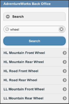
For the search text box I used an
INPUT element. When the type of the INPUT element is "search" jQuery mobile will format the input text box with a search image on the left and a delete icon on the right. For the search button, I use the
BUTTON element but the data-theme="b" attribute formats the button with the blue color and oval shape.
<div data-role="fieldcontain">
    <input type="search" id="keyword" onkeydown="Search.keyDown(event, $(this).val());" /><br />
    <button type="submit" data-theme="b" onclick="Search.search($('#keyword').val());">Search</button>
    <div id="searchContent"></div>
</div>
For the search results list I used the jquery mobile convention for creating lists which is use the "listview" data-role attribute in the unordered list. Like other data-* attributes, data-role="listview" makes the large list items easier to tap.
@foreach(AdventureWorksService.Models.ProductSearchItem item in Model.Data)
{
    <li><a href="javascript:void(0)" onclick="Search.loadProduct(@item.ProductId);">@item.Name</a></li>
}
</ul>
4. Call jQuery mobile plug-ins for AJAX content
jQuery mobile styles can only be applied to elements that are already loaded in the browsers DOM tree. Because the most of the views in this application are loaded using AJAX, it is necessary to call the jQuery mobile plug-ins on the jQuery selectors that represent the HTML elements that need styling.
Upon
successful completion of loading the HTML content into the DIV using AJAX, the
appropriate jQuery mobile plug-in is called. Because this JavaScript is also used by the desktop website, we have to check that the global object $.mobile is available. If it is then we know that we are in the mobile version of the website.
- The listview method will apply the jQuery mobile list style to a
<UL> element - The button method will apply the jQuery mobile button style to a
<A> element - The selectmenu method will apply the jQuery mobile select menu style to a
<SELECT> element
Now the HTML elements must have the necessary data* attributes to be formatted the way you what them to be after the plug-in is applied. For instance, for the paging I wanted smaller buttons so I used the data-mini="true" attribute.
$.ajax(url, {
type: "GET",
dataType: "html",
success: function (results) {
$('#searchContent').html(results);
_totalPages = parseInt($('#TotalPageCount').val());
loadingPanel.hide();
$('#searchContent').attr('data-display-mode', 'loaded');
if (typeof ($.mobile) != "undefined") {
$('#searchContent ul').listview();
$('#searchContent [data-role="button"]').button();
$('#searchPager').selectmenu();
}
},
error: function () {
loadingPanel.hide();
$('#searchContent').attr('data-display-mode', 'loaded');
}
}); Conclusion
If you have a mobile device you can view the implementation
at http://www.beachheadweb.com/adventureworks/.
I have tested the application on my iPhone and the Windows Phone Emulator. The jQuery mobile library has been tested on the vast majority
of mobile devices on the market today. This page highlights the testing results of jQuery mobile.
Thank you for reading and as always I welcome and questions and comments regarding the implementation.
