Introduction
While looking for an implementation of the algorithm that checks password strength, I came across The Password Meter page on which password strength is depicted by a changing color bar. This is achieved by displaying a selected part of a larger bitmap that gradually changes from red to green color. I thought it would be nice to create a similar control for a C++ project I am working on and which uses WTL. Except for gradually changing color, the control should follow the visual style of Vista/Win 7 progress bar control, with 3D glowing look and running marquee.
Implementation
Initially, the control has been implemented in the same way as on the
above mentioned site, using a gradient bitmap from which only a
particular section is displayed. However, during control development I
determined that the original specimen bitmap is not required at all.
Namely, to display the bar in accordance to Vista/Windows 7 visual style,
HSL (Hue, Saturation, Lightness) data must be manipulated as described later in the article. Colors on the control change from red, over yellow to green
which in HSL space corresponds to hue values shifting from 0 to 120
degrees. Therefore, we do not need the specimen bitmap but a method that generates colors with varying hue. Unfortunately, Windows API
recognizes color data in RGB format only so conversions from RGB to HSL
and vice versa must be performed. Therefore, a utility class for these
conversions has been implemented and used in the control.
CGradientBarCtrlImpl class contains the implementation of the control. Following subsections deal with implementation details.
Drawing the Bar
WM_PAINT message handler draws the bar and optional value on it. For a non-themed bar, drawing is pretty straightforward: starting hue for the value to be shown is calculated first and then for each pixel from left to the right end of the bar corresponding hues are evaluated and converted to RGB data that are passed to DC::SetPixel() method:
CRect rect;
GetClientRect(&rect);
dc.DrawEdge(&rect, EDGE_ETCHED, BF_RECT);
rect.DeflateRect(1, 1, 1, 1);
dc.FillSolidRect(&rect, ::GetSysColor(COLOR_BTNFACE));
double hueStart = HUE_RED + (HUE_GREEN - HUE_RED - HUE_RANGE) * m_value / 100.;
int columns = rect.Width();
int rows = rect.Height();
for (int column = 2; column < columns; ++column)
{
double hue = hueStart + HUE_RANGE * column / columns;
HSL hsl(hue, 1., 0.5);
COLORREF color = hsl.GetRGB();
for (int row = 2; row < rows; ++row)
dc.SetPixel(column, row, color);
}
HSL in the above code is the utility class used for RGB – HSL conversions. HUE_RED (0 degrees) and HUE_GREEN (120 degrees) are boundary hues for lowest (0 %) and largest (100 %) values, respectively. HUE_RANGE is the range of hue displayed for a given value.

Real challenge is to draw a bar that will look like the progress bar on Windows Vista and Windows 7 when visual themes are enabled, with 3D glow and shaded left and right ends. Statements
CRect rect;
GetClientRect(&rect);
OpenThemeData(L"PROGRESS");
DrawThemeBackground(dc, PP_BAR, 0, &rect, NULL);
DrawThemeBackground(dc, PP_FILL, PBFS_NORMAL, &rect, NULL);
CloseThemeData();
draw a progress control with green chunk since the third (istateId) argument passed to DrawThemeBackground() method is equal to PBFS_NORMAL (actual value is 1). Changing this argument to PBFS_ERROR (2), PBFS_PAUSED (3) or PBFS_PARTIAL (4) will draw red, yellow or cyan chunks, respectively.
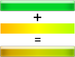
In order to mimic the look of progress bar, the chunk is drawn using the code above first, then saturation and intensity is picked for each pixel and combined with calculated hue. Resulting color is applied back on the pixel:
double hueStart = HUE_RED + (HUE_GREEN - HUE_RED - HUE_RANGE) * m_value / 100.;
int columns = rect.Width() + 1;
int rows = rect.Height() + 1;
for (int column = 0; column < columns; ++column)
{
double hue = hueStart + HUE_RANGE * column / columns;
for (int row = 0; row < rows; ++row)
{
COLORREF originalColor = dc.GetPixel(column, row);
HSL hsl(originalColor);
hsl.SetHue(hue);
COLORREF color = hsl.GetRGB();
dc.SetPixel(column, row, color);
}
}

Please note that the actual implementation differs somewhat from the above code snippets since a part of the functionality has been pulled out to a separate CEvaluateColor class. This has been done in order to allow simple replacement of the above algorithm with a custom one. CEvaluateColor class is passed as the default template parameter to CGradientBarCtrlImpl template class, but the user can provide another class if default implementation doesn’t meet their expectations.
HSL to RGB Conversions
The hue is the key value processed while drawing the gradient bar. However, Windows API cannot cope with HSL data – it can handle RGB data only. To make conversions between these formats easier, a utility class named HSL has been implemented. This class is partly adopted from the code provided by Alex Kuhl and manipulates HSL components as double type.
Since Windows API treats RGB components as one-byte integral values, initial implementation of HSL class used integer arithmetic, hoping that it will execute much faster. However, speed comparison tests showed only a slight speed difference increase (approx. 150%) when compared to the floating-point implementation. On the other hand, integer arithmetic introduces a small error into conversions and therefore, the double type version is used in final implementation.
Running Marquee
When the progress bar is idle, it displays a running marquee. I thought it would be striking to implement a similar feature in the gradient bar, especially for cases where the user modifies the value the quality of which is depicted by the control. For example (as illustrated by the “real-world” sample), if control shows the strength of the password entered by the user, while password entry control has the focus and the user is not typing anything, the gradient bar will run the marquee.
Two timers are used to handle the marquee: one (INITIAL_DELAY_TIMER_ID) suspends the marquee run and the other initiates redrawing of the highlighted section at different positions. The first timer is activated each time a new value to be depicted is set:
void SetValue(int value)
{
m_value = value;
KillTimer(INITIAL_DELAY_TIMER_ID);
SetTimer(INITIAL_DELAY_TIMER_ID, INITIAL_DELAY);
}
This prevents the marquee from running while the user is entering a new value. When the initial delay is timed-out, the OnTimer handler triggers the second timer (MARQUEE_TIMER_ID); on its timeout the position of the highlighted section is shifted right and the bar is invalidated to repaint the bar with highlighted section offset:
LRESULT OnTimer(UINT uMsg, WPARAM wParam, LPARAM lParam, BOOL& bHandled)
{
RECT rect;
GetClientRect(&rect);
switch (wParam)
{
case INITIAL_DELAY_TIMER_ID:
KillTimer(INITIAL_DELAY_TIMER_ID);
m_marqueeX = -MARQUEE_WIDTH;
m_marqueeRunning = true;
SetTimer(MARQUEE_TIMER_ID, MARQUEE_TICK);
break;
case MARQUEE_TIMER_ID:
m_marqueeX += MARQUEE_DELTAX;
Invalidate();
if (m_marqueeX >= rect.right)
{
KillTimer(MARQUEE_TIMER_ID);
m_marqueeRunning = false;
SetTimer(INITIAL_DELAY_TIMER_ID, INITIAL_DELAY);
}
break;
default:
bHandled = false;
break;
}
return 0;
}
Obviously, painting procedure must be modified to include drawing of the highlighted section:
CRect rect;
GetClientRect(&rect);
OpenThemeData(L"PROGRESS");
DrawThemeBackground(dc, PP_BAR, 0, &rect, NULL);
DrawThemeBackground(dc, PP_FILL, PBFS_NORMAL, &rect, NULL);
if (m_marqueeRunning)
{
CRect rectOverlay(rect);
rectOverlay.right = MARQUEE_WIDTH;
rectOverlay.MoveToX(m_marqueeX);
DrawThemeBackground(dc, PP_MOVEOVERLAY, PBFS_NORMAL, &rectOverlay, &rect);
}
CloseThemeData();
About the Demo Application
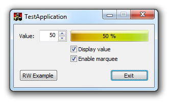
The demo application reveals the behavior of the gradient bar control. The user can turn the value displayed and the marquee on/off simply through the checkboxes provided. By clicking the “RW Example” button (stands for “real-world”) another dialog pops-up in which the gradient bar is used to represent the strength of the password the user is typing. Note that the marquee is running only when the corresponding password entry control has focus and the user is not typing. For password strength evaluation, the algorithm provided on www.passwordmeter.com has been modified and adopted.
Using the code
To use the control, simply include GradientBarCtrl.h and HSL.h files into your project. To display CGradientBarCtrl on a dialog, just place a dummy control onto the dialog resource and attach the CGradientBarCtrl instance either by invoking the SubclassWindow() method inside the WM_INITDIALOG message handler or through DDX_CONTROL macro.
Only three methods are intended to be invoked by the user code:
void SetValue(int value) – to set the new value to be depicted by the control (value must be in the range 0 – 100);void DisplayValue(bool show) – to control if the numeric value should be displayed or not (default value for the argument is true);void EnableMarquee(bool enable) – to control if the running marquee should be displayed or not (default value for the argument is true).
CGradientBarCtrlImpl is a template class that has TEvaluateColor as one of template parameters. The CEvaluateColor is used as a default implementation for this parameter, but the user can provide its own implementation.
History
- November 5, 2012 - initial version
