I have decided to split out the styling work into 2 posts as it would be a huge post to restyle even something so simple. So this post is going to change the controls to be more style-conscious and introduce basic style and the next post will introduce some more advanced concepts such as using adorners to display additional details.
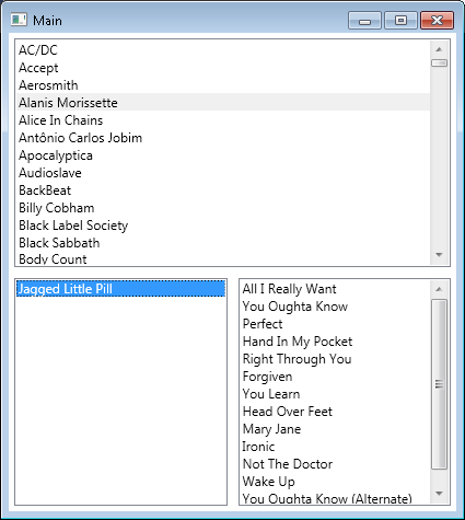
Going back to the previous post, we had a basic app as follows:

This is slightly ugly and needs a little work, so the first thing I want to add is a style that will tidy up the artist list.
I want the artist list to have a nice look and feel with rounded button type items and also contain a count of the number of albums – I want each item in the list to look something like this:

The first step to getting this design in place is adding the DataTemplate so that it is picked up by the item. A DataTemplate is a template that gets applied to an object that has no default way of showing itself and manifests itself as its type name.
NOTE – This can also be done by overriding Object.ToString(), but this is a client side post so I don’t want to have to change model code to do something.
I have added a simple DataTemplate to the Application.Resources section in App.xaml as follows:
<DataTemplate DataType="{x:Type business:Artist}">
    <TextBlock x:Name="contentHolder">
        <TextBlock.Text>
            <MultiBinding StringFormat="{}{0} - {1} albums">
                <Binding Path="Name"/>
                <Binding Path="Albums.Count" />
            </MultiBinding>
        </TextBlock.Text>
    </TextBlock>
    <DataTemplate.Triggers>
        <DataTrigger Binding="{Binding Albums.Count}" Value="1">
            <DataTrigger.Setters>
                <Setter Property="TextBlock.Text" TargetName="contentHolder">
                    <Setter.Value>
                        <MultiBinding StringFormat="{}{0} - {1} album">
                            <Binding Path="Name"/>
                            <Binding Path="Albums.Count" />
                        </MultiBinding>
                    </Setter.Value>
                </Setter>
            </DataTrigger.Setters>
        </DataTrigger>
    </DataTemplate.Triggers>
</DataTemplate>
There are several things going on here:
- The first line declares the type that this template is associated with – you have to add the namespace to this file first in order to make this work:
xmlns:business="clr-namespace:MusicApp.Model;assembly=MusicApp.Model"
- The
MultiBinding has an associated StringFormat – this is the same as a normal format string except for the “{}” after the equals sign – this simply escapes the format string. - The binding to
Albums.Count – yes you can bind to “built-in” properties as well. - The
DataTrigger is a simple way of saying that if we have only one album, then the trailing text shouldn’t have an ‘s’ on the end.
It is possible to do the whole string in a converter, but I like the declarative way as you can see everything going on in one place. For those that like using converters, you would bind the TextBlock’s Text property to the whole Artist ({Binding}) and then use a converter like the following:
public class ArtistStringConverter : IValueConverter
{
    public object Convert(object value, Type targetType, object parameter,
				System.Globalization.CultureInfo culture)
    {
        string retVal = string.Empty;
        var artist = value as Artist;
        if (artist != null)
        {
            retVal += string.Format("{0} - {1} {2}", artist.Name,
			artist.Albums.Count, artist.Albums.Count == 1 ? "artist" : "artists");
        }

        return retVal;
    }

    public object ConvertBack(object value, Type targetType, object parameter,
			System.Globalization.CultureInfo culture)
    {
        throw new NotImplementedException();
    }
}
this is then used from the XAML as follows:
<local:ArtistStringConverter x:Key="artistConverter"/>
<DataTemplate DataType="{x:Type business:Artist}">
    <TextBlock x:Name="contentHolder" Text="{Binding Converter={StaticResource artistConverter}}" />
</DataTemplate>
Once this is added (either option), you need to remove the DisplayMemberPath property from the ArtistList.xaml view so that the template is used instead.
I now have a list of Artists that show the name and the total albums they have so I can work on the actual style to make the list items look like the above image.
I want all three lists to look the same so I am adding a style with no key to the app.xaml file. If you want specific styles for your controls, then you can add ‘x:Key=”YourKeyName”’ and reference it using ‘{StaticResource YourKeyName}’ (in this instance, the reference would be in the ItemContainerStyle property of the ListBox).
<Style TargetType="ListBoxItem">
    <Style.Setters>
        <Setter Property="Margin" Value="5,2" />
        <Setter Property="Template">
            <Setter.Value>
                <ControlTemplate TargetType="ListBoxItem">
                    <Grid>
                        <Rectangle Opacity="0.5" Height="30" StrokeThickness="1" x:Name="backBox"
                                        Stroke="Silver" RadiusX="5" RadiusY="5" Fill="Azure"/>
                        <ContentPresenter HorizontalAlignment="Center" VerticalAlignment="Center"/>
                    </Grid>
                    <ControlTemplate.Triggers>
                        <Trigger Property="Selector.IsSelected" Value="True">
                            <Setter TargetName="backBox" Property="Fill" Value="Silver"/>
                        </Trigger>
                    </ControlTemplate.Triggers>
                </ControlTemplate>
            </Setter.Value>
        </Setter>
    </Style.Setters>
</Style>
Again, I have a couple of things going on inside this style:
- It targets
ListBoxItem as this is what we want to style (not the ListBox itself). - The margin separates the items nicely.
- The actual style part is contained inside a
ControlTemplate which is then assigned the Template property of the ListBoxItem. - The
ContentPresenter will present whatever content it is given, in this case it is presenting the passed in DataTemplate. - The trigger here indicates that when the
ListBoxItem is selected, we want to change the fill colour of the rectangle to indicate we have selected an item.
To finish, I have added a new DataTemplate for the albums – this looks the same with the type and property names changed to display the correct things and I have also rearranged the view as follows:
<Grid>
    <Grid.ColumnDefinitions>
        <ColumnDefinition Width="0.5*" />
        <ColumnDefinition Width="0.5*" />
    </Grid.ColumnDefinitions>
    <Grid.RowDefinitions>
        <RowDefinition Height="0.5*"/>
        <RowDefinition Height="0.5*"/>
    </Grid.RowDefinitions>

    <ListBox ItemsSource="{Binding Path=Artists}" Margin="5"
                Grid.Column="0" Grid.Row="0"
                Grid.RowSpan="2"
                SelectedItem="{Binding SelectedArtist}" />

    <ListBox ItemsSource="{Binding Path=SelectedArtist.Albums}" Margin="5"
                Grid.Column="1" Grid.Row="0"
                SelectedItem="{Binding SelectedAlbum}" />

    <ListBox ItemsSource="{Binding Path=SelectedAlbum.Tracks}" Margin="5"
                DisplayMemberPath="Name"
                Grid.Column="1" Grid.Row="1" />
</Grid>
This now gives me the following view which I am sure you will agree looks a lot better and is easily achievable by simply using XAML – we could have done this in blend as well but for the simple changes we have made, I prefer to edit the XAML directly.

In the next post, I will be adding some adorner goodness to the screen for displaying album and track details (which also covers changes to the model).


