Download
Introduction
Have you ever heard of PathListBox introduced in Silverlight 4 as Expression Blend 4 namespace? Yes, it is a new control added in the “http://schemas.microsoft.com/expression/2010/controls” namespace. You can use this to position your data, text, images or other controls in the way of a single or multiple path controls. You can use your jig-jag path to set your contents or you can use circular or rectangular path to organize your content.

In this article, I will guide you to understand the functionality of this control. Also, I will guide you step-by-step to create your first PathListBox control demo application. Here we will create the above two samples where the collection of texts will position them in proper location on the edge of the circular path.
Readout the complete post to learn about it and at the end, if you have any queries or comments, please let me know. I will try to answer your queries as soon as possible.
What is PathListBox control
The PathListBox is a new control included in the Expression Blend 4 SDK that builds on the original functionality of the ListBox, displaying multiple items and item selection, and new functionality enabling path-based layout. The PathListBox provides many areas of customization through properties and a custom child container control, the PathListBoxItem.
You can read more about this control from Microsoft site. Click the below link to read more about it:
Creating your Silverlight Project
Before starting with the discussion, we need to create the Silverlight project first. Be sure that, you are using Silverlight 4. You need to install Visual Studio 2010 and/or Expression Blend 4 for the development. Here I will use only Expression Blend and hence, if you have that one installed in your development machine then we are good to go.

Let us start with the development project. Open Expression Blend 4 and Create a new Project from the File menu:
- Select “Silverlight from the left pane
- Now select “Silverlight Application + Website” from the right pane (as shown in the above screenshot). We need to host the Silverlight application in a webpage and hence we are creating a Website project.
- Give a proper name to your project. I used “PathListBoxDemo” as the name of my solution.
- Click “Browse” to set the location of the solution
- Hit “OK” to continue. This will create your Silverlight project from the default template.
Creating the first PathListBox control
Once your project has been created with the default page named “MainPage.xaml”, open the file to design it with the PathListBox control. Follow the below steps mentioned in the screenshot:

- Click on the “Assets” tab to open up the controls gallery.
- Click “Controls” from the left panel and this will populate all the controls available for your Silverlight application.
- From the right panel, search for “PathListBox”. Click it to select.
- The selected PathListBox control will add in your recent selected pane.
- Double click on the recent selected pane (shown in the step 4) and the control will add in your LayoutRoot Grid panel.
- You can see the PathListBox added to your page, name it as “pathListBox”. Don’t worry about the dimension. You can set it to zero also as we don’t need it. For now, leave it unchanged.
Create a Circular path
Once our PathListBox control has been added to the page, it’s time to add a circular path control for our application. To create a circular path in the XAML page, use the following steps in your Expression Blend IDE:

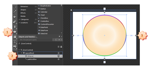
- As described in the above screenshot, select the “Ellipse” control from the Toolbox of your Expression Blend.
- Add it inside your grid control named “LayoutRoot”. Be sure that, it has been added behind the PathListBox.
- Resize your “Ellipse” control to make it a proper circle.
Now, do some styling for your circular path. I used a Gradient Fill color and a Gradient Stroke color. Steps are mentioned in the following snapshot:

Once your styling is over, we can convert the “Ellipse” control to a Path control. As the PathListBox control needs a Path to position the contents hence convert the same to a Path control. Right click over your “Ellipse” control in the Layer explorer (as mentioned in the below snapshot) and from the right click context menu select “Path” and then click on “Convert to Path”. This will change the ellipse to a path control.

Binding the Path to PathListBox
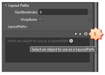
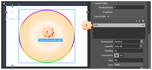
It’s time to bind the recently added Path to the PathListBox. You can bind multiple paths as the LayoutPaths to your PathListBox. From the Layer panel select your PathListBox control named “pathListBox” and open the properties panel for the selected control. Expand the property group named “Layout Paths”. There is a circular item as mentioned in the following picture. Click on it and drag to the circular path shown in the next snapshot.

- Once dragged it to our circular path it will show you a message “[Path] will be renamed ‘path’”. Yes, as our path control doesn’t have any name, hence Blend will give a default name to it.
- On drop it will add the path control named “path” (which has been renamed just now) in the LayoutPaths section. You can add as many path you want in this step or also can remove any existing paths.

If you open your XAML page, you will see the following xaml code snippet in your page:

Let me explain you the XAML code. Here you will see the PathListBox control which has a single LayoutPath inside the LayoutPaths collection. You can add as many LayoutPath here. The LayoutPath has been binded to the Element named “path” i.e. our Circular path.
You can use Padding here to set the delta value between each item. I will discuss this later when we bind our content and show you the demonstration of the code.
Here you can ask me one question: “What is ec namespace mentioned for PathListBox?” PathListBox control is not part of the default library. It is available in the Expression controls namespace. Look into the following code to see the full namespace:

Working with the Code
So, as of now our UI design is done. Now, it’s time to create some data record in Code behind and bind it accordingly to the ItemSource of the PathListBox control. Open your MainPage.xaml.cs file and inside that create a List collection of string. I am using 12 months of the year here. Now set the created list collection to the ItemSource of the pathListBox.
See the code snippet here:

Application Demo
It’s time to demo our application. Build the project and run it by hitting “F5” in your IDE (either Visual Studio 2010 or Expression Blend 4). You will see that the Silverlight application has been loaded inside your browser window. You will notice that, the collection of months are loaded inside the Silverlight app in the same direction of the circular path. It has same delta amount of gap between each item. This is nothing but your padding value. If you increase the padding value, you will see that the items will have a more gap than the earlier and in the reverse case, the items will be place near to each other.
Look into the following screenshot:

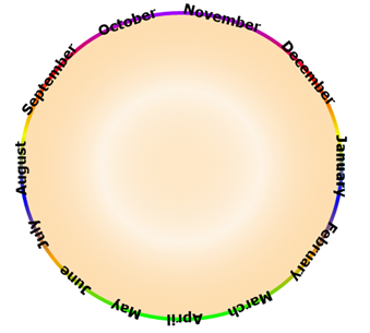
As of now, our first example is ready. Now you may come into a situation where each character of the words will place in the same direction as the circular path. So, my question to you is: Can we do that? Yes, we can. We can change the orientation of the PathListBox. The default value of the orientation is none. We have one more orientation which is called as “OrientToPath”. Once set, it will relocate the items at the edge of the path.
Hence, open your Expression Blend once again and go to the Properties pane of the PathListBox control. In the LayoutPaths tab you can see a property named “Orientation” available (see the below screenshot). Click the second orientation which is called as “OrientToPath”.

Now run your application once again and you will notice the months orientation changed to the way of your circular path. Have a look into the following screenshot:

End Note
So, what is the benefit of this PathListBox control? I think, the answer is clear to you. Let me explain the benefit from my side. You can animate any control or text in a circular way or you can animate in any random way that you want. You can rotate some ads for your business application for your client using the control. You can easily create your loader control using this. You don’t have to write more logic for your rounded loader like the one when your Silverlight application loads (during XAP download). Even you can do many more thing that you want as per your requirement.
This article is a basic one to showcase you the PathListBox control and mainly targeted for the beginners who are new to Silverlight or new to Silverlight 4. This article is also helpful to those who didn’t know about this control or didn’t explored the power of this control. Have a try in your site and if you have any queries, please let me know. I will try to answer you as soon as possible. Don’t forget to leave your comments here. By this way, I can improve my future articles and provide you more tutorials on Silverlight.
