Last Update
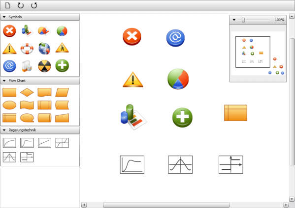
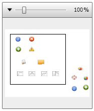
- Zoombox (new)
- Rubberband Adorner (updated)

Introduction
In the first article of this series, I have shown you how to move, resize and rotate items on a canvas. This time we are going to add further features that are essential for a typical diagram designer:
- Designer Canvas (variable size, scrollable)
- Zoombox
- Rubberband selection
- Keystroke selection (LeftMouseButton + Ctrl)
- Toolbox (drag & drop)
- Rotate items (left, right)
Designer Canvas
In the previous article, you probably have noticed that when you move an item outside the borders of the DesignerCanvas the item is no longer accessible. Normally you would expect that the designer application provides scroll bars so that you can easily scroll to any item outside the visible canvas region. For this I thought I just have to wrap the DesignerCanvas into a ScrollViewer, but that didn't work. I soon found the reason for this behaviour; let me explain it with the following code snippet:
 <Canvas Width="200"
        Height="200"
        Background="WhiteSmoke">
    <Rectangle Fill="Blue"
               Width="100"
               Height="100"
               Canvas.Left="300"
               Canvas.Top="300" />
</Canvas>
Here I have placed a Rectangle object on a Canvas, but positioned it outside the boundaries of the Canvas. Will this change the size of the Canvas? Of course not, the Canvas will keep its size, no matter where you place an item.
For the DesignerCanvas this means that it will keep its size, even if you drag an item far beyond the borders of the canvas. Now we understand why a ScrollViewer doesn't help: the DesignerCanvas will never notify the ScrollViewer of a size change, just because there is none.
The solution is that we must force the DesignerDanvas to adjust its size everytime an item is moved or resized. Fortunately the Canvas class provides an overrideable method named MeassureOverride that allows the DesignerCanvas to calculate its desired size and return it to the WPF layout system. The calculation is quite simple as you can see here:
protected override Size MeasureOverride(Size constraint)
{
Size size = new Size();
foreach (UIElement element in base.Children)
{
double left = Canvas.GetLeft(element);
double top = Canvas.GetTop(element);
left = double.IsNaN(left) ? 0 : left;
top = double.IsNaN(top) ? 0 : top;
element.Measure(constraint);
Size desiredSize = element.DesiredSize;
if (!double.IsNaN(desiredSize.Width) && !double.IsNaN(desiredSize.Height))
{
size.Width = Math.Max(size.Width, left + desiredSize.Width);
size.Height = Math.Max(size.Height, top + desiredSize.Height);
}
}
size.Width += 10;
size.Height += 10;
return size;
}
DesignerItem
The DesignerItem is inherited from ContentControl, so that we can reuse the ControlTemplate of our first article. The DesignerItem provides an IsSelected property to indicate if it is selected or not:
 public class DesignerItem : ContentControl
{
    public bool IsSelected
    {
        get { return (bool)GetValue(IsSelectedProperty); }
        set { SetValue(IsSelectedProperty, value); }
    }
    public static readonly DependencyProperty IsSelectedProperty =
       DependencyProperty.Register("IsSelected", typeof(bool),
                                    typeof(DesignerItem),
                                    new FrameworkPropertyMetadata(false));
       ...

}
Then we have to implement an event handler for the MouseDown event to support multiple selection of items:
 protected override void OnPreviewMouseDown(MouseButtonEventArgs e)
{
    base.OnPreviewMouseDown(e);
    DesignerCanvas designer = VisualTreeHelper.GetParent(this) as DesignerCanvas;

    if (designer != null)
    {
        if ((Keyboard.Modifiers &
		(ModifierKeys.Shift | ModifierKeys.Control)) != ModifierKeys.None)
        {
            this.IsSelected = !this.IsSelected;
        }
        else
        {
            if (!this.IsSelected)
            {
                designer.DeselectAll();
                this.IsSelected = true;
            }
        }
     }

     e.Handled = false;
}
Please note that we handle the PreviewMouseDown event, which is the tunnelling version of the MouseDown event and that we mark the event as not handled. The reason is that we want the item to be selected even if the MouseDown event is targeting another Control inside the DesignerItem; e.g. take a look at a class diagram in Visual Studio, if you click on the ToggleButton of the Expander, the item becomes selected and the Expander toggles its size, both at the same time.

Finally we have to update the template for the DesignerItem such that the resize decorator is only visible when the IsSelected property is true, which can be handled with a simple DataTrigger:
  <Style TargetType="{x:Type s:DesignerItem}">
    <Setter Property="MinHeight" Value="50"/>
    <Setter Property="MinWidth" Value="50"/>
    <Setter Property="SnapsToDevicePixels" Value="true"/>
    <Setter Property="Template">
      <Setter.Value>
        <ControlTemplate TargetType="{x:Type s:DesignerItem}">
          <Grid DataContext="{Binding RelativeSource={RelativeSource TemplatedParent},
			  Path=.}">
            <s:MoveThumb
                x:Name="PART_MoveThumb"
                Cursor="SizeAll"
                Template="{StaticResource MoveThumbTemplate}" />
            <ContentPresenter
                x:Name="PART_ContentPresenter"
                Content="{TemplateBinding ContentControl.Content}"
                Margin="{TemplateBinding Padding}"/>
            <s:ResizeDecorator x:Name="PART_DesignerItemDecorator"/>
          </Grid>
          <ControlTemplate.Triggers>
            <Trigger Property="IsSelected" Value="True">
              <Setter TargetName="PART_DesignerItemDecorator"
			Property="ShowDecorator" Value="True"/>
            </Trigger>
          </ControlTemplate.Triggers>
        </ControlTemplate>
      </Setter.Value>
    </Setter>
  </Style>
Toolbox
The Toolbox is an ItemsControl that uses the ToolboxItem class as default container to display its items. For this we have to override the GetContainerForItemOverride method and the IsItemItsOwnContainerOverride method:
public class Toolbox : ItemsControl
{
    private Size defaultItemSize = new Size(65, 65);
    public Size DefaultItemSize
    {
        get { return this.defaultItemSize; }
        set { this.defaultItemSize = value; }
    }

    protected override DependencyObject GetContainerForItemOverride()
    {
        return new ToolboxItem();
    }

    protected override bool IsItemItsOwnContainerOverride(object item)
    {
        return (item is ToolboxItem);
    }
}
Additionally we want the Toolbox to use a WrapPanel to layout its items:
<Setter Property="ItemsPanel">
   <Setter.Value>
     <ItemsPanelTemplate>
       <WrapPanel Margin="0,5,0,5"
                  ItemHeight="{Binding Path=DefaultItemSize.Height,
                        RelativeSource={RelativeSource AncestorType=s:Toolbox}}"
                  ItemWidth="{Binding Path=DefaultItemSize.Width,
                        RelativeSource={RelativeSource AncestorType=s:Toolbox}}"/>
     </ItemsPanelTemplate>
   </Setter.Value>
</Setter>
Note that the ItemHeight and ItemWidth properties of the WrapPanel are bound to the DefaultItemSize property of the Toolbox.
ToolboxItem
The ToolboxItem is the place where drag operations are actually started if you want to drag an item from the toolbox and drop it on the canvas. There is nothing mysterious about drag and drop itself, but still you have to take care how to copy an item from the drag source (Toolbox) to the drop target (DesignerCanvas). In our case we use the XamlWriter.Save method to serialize the content of the ToolboxItem into XAML, although that kind of serialization has some notable limitations in exactly what is serialized. In a later article, we will switch to binary serialization.
 public class ToolboxItem : ContentControl
 {
     private Point? dragStartPoint = null;

     static ToolboxItem()
     {
         FrameworkElement.DefaultStyleKeyProperty.OverrideMetadata(typeof(ToolboxItem),
                new FrameworkPropertyMetadata(typeof(ToolboxItem)));
     }

     protected override void OnPreviewMouseDown(MouseButtonEventArgs e)
     {
         base.OnPreviewMouseDown(e);
         this.dragStartPoint = new Point?(e.GetPosition(this));
     }

     protected override void OnMouseMove(MouseEventArgs e)
     {
         base.OnMouseMove(e);
         if (e.LeftButton != MouseButtonState.Pressed)
         {
             this.dragStartPoint = null;
         }
         if (this.dragStartPoint.HasValue)
         {
             Point position = e.GetPosition(this);
             if ((SystemParameters.MinimumHorizontalDragDistance <=
                  Math.Abs((double)(position.X - this.dragStartPoint.Value.X))) ||
                  (SystemParameters.MinimumVerticalDragDistance <=
                  Math.Abs((double)(position.Y - this.dragStartPoint.Value.Y))))
             {
                 string xamlString = XamlWriter.Save(this.Content);
                 DataObject dataObject = new DataObject("DESIGNER_ITEM", xamlString);

                 if (dataObject != null)
                 {
                     DragDrop.DoDragDrop(this, dataObject, DragDropEffects.Copy);
                 }
             }
             e.Handled = true;
         }
     }
 }
Rubberband Selection
When the user initiates a drag operation directly on the DesignerCanvas, a new instance of a RubberbandAdorner is created:
public class DesignerCanvas : Canvas
{
    ...

    protected override void OnMouseMove(MouseEventArgs e)
    {
        base.OnMouseMove(e);

        if (e.LeftButton != MouseButtonState.Pressed)
            this.dragStartPoint = null;

        if (this.dragStartPoint.HasValue)
        {
            AdornerLayer adornerLayer = AdornerLayer.GetAdornerLayer(this);
            if (adornerLayer != null)
            {
                RubberbandAdorner adorner = new RubberbandAdorner(this, dragStartPoint);
                if (adorner != null)
                {
                    adornerLayer.Add(adorner);
                }
            }

            e.Handled = true;
        }
    }

    ...
}
As soon as the RubberbandAdorner is created, it takes control over the drag operation and updates the drawing of the rubber band and the current selection of items. These updates happen inside the UpdateRubberband() and UpdateSelection() methods:
public class RubberbandAdorner : Adorner
{
    ....

    private Point? startPoint, endPoint;

    protected override void OnMouseMove(MouseEventArgs e)
    {
        if (e.LeftButton == MouseButtonState.Pressed)
        {
            if (!this.IsMouseCaptured)
            {
                this.CaptureMouse();
            }

            this.endPoint = e.GetPosition(this);
            this.UpdateRubberband();
            this.UpdateSelection();
            e.Handled = true;
        }
    }

    ...
}
Since the actual rubber band is an instance of a Rectangle class, the UpdateRubberband() method just needs to update the size and the position of that Rectangle:
private void UpdateRubberband()
{
    double left = Math.Min(this.startPoint.Value.X, this.endPoint.Value.X);
    double top = Math.Min(this.startPoint.Value.Y, this.endPoint.Value.Y);

    double width = Math.Abs(this.startPoint.Value.X - this.endPoint.Value.X);
    double height = Math.Abs(this.startPoint.Value.Y - this.endPoint.Value.Y);

    this.rubberband.Width = width;
    this.rubberband.Height = height;
    Canvas.SetLeft(this.rubberband, left);
    Canvas.SetTop(this.rubberband, top);
}
A little more work needs to be done in the UpdateSelection() method. Here we check for each DesignerItem if it is contained in the current rubber band. For this, the VisualTreeHelper.GetDescendantBounds(item) method provides us the bounding rectangle for each item. We transform the coordinates of this rectangle to the DesignerCanvas and call the rubberband.Contains(itemBounds) method to decide whether the item is selected or not!
private void UpdateSelection()
{
    Rect rubberBand = new Rect(this.startPoint.Value, this.endPoint.Value);
    foreach (DesignerItem item in this.designerCanvas.Children)
    {
        Rect itemRect = VisualTreeHelper.GetDescendantBounds(item);
        Rect itemBounds = item.TransformToAncestor
			(designerCanvas).TransformBounds(itemRect);

        if (rubberBand.Contains(itemBounds))
        {
            item.IsSelected = true;
        }
        else
        {
            item.IsSelected = false;
        }
    }
}
Please note that these update methods are called whenever the MouseMove event is fired during a drag operation, and that is quite frequently! Instead you may consider to update the selection only once at the end of the drag operation, when the MouseUp event is fired.
Customize the DragThumb
The default style of the DragThumb class is a transparent Rectangle, but if you want to adjust that style you can do this with the help of an attached property named DesignerItem.DragThumbTemplate. Let me explain the usage with an example. Let's say the content of a DesignerItem is a star shape like this one:
<Path Stroke="Red" StrokeThickness="5" Stretch="Fill" IsHitTestVisible="false"
      Data="M 9,2 11,7 17,7 12,10 14,15 9,12 4,15 6,10 1,7 7,7 Z"/>
To illustrate the result, I have colorized the default DragThumb template:

Now try the following:
 <Path Stroke="Red" StrokeThickness="5" Stretch="Fill" IsHitTestVisible="false"
      Data="M 9,2 11,7 17,7 12,10 14,15 9,12 4,15 6,10 1,7 7,7 Z">
    <s:DesignerItem.DragThumbTemplate>
         <ControlTemplate>
            <Path Data="M 9,2 11,7 17,7 12,10 14,15 9,12 4,15 6,10 1,7 7,7 Z"
                    Fill="Transparent" Stretch="Fill"/>
         </ControlTemplate>
    </s:DesignerItem.DragThumbTemplate>
</Path>
The result is a DragThumb that fits much better than the default one:

History
- 28th January, 2008 -- Original version submitted
- 11th February, 2008 --
Rubberband selection added
- 7th October, 2008 -- Zoombox added,
RubberbandAdorner updated
