Contents
With the advent of WPF, the fine folk at Microsoft have now given developers (and the rest of us) the ability to totally alter the way we see the visual representation of a Control. This is achieved by the use of Templates and Styles. Where Styles which will more than likely also contain Templates. But with this freedom, what is to stop a user from changing the VisualTree of a Control entirely in such a way that it is totally different from what the Control was originally authored to do? In fact, if we are authoring a CustomControl in WPF, there is no user interface at all, and the assumption is that the UI would be provided by a Template. But what sort of Template? What does it need to have in it?
That is what this article is all about; it explains several key techniques that may be used by WPF developers, to not only ensure their own controls work correctly, but that they also apply Templates and Styles in a good manner to other controls.
It should be noted that I will not be discussing theme awareness for custom authored Controls; this is a whole different issue, that would probably make yet another interesting article for someone.
As I say, what this article is about, is really making sure that the control works as it was/is intended to work.
It's going to be a fairly small article about several techniques that will help create well behaved Templatable and Stylable custom controls. This article should also help you to understand how to customize other existing controls and even third party WPF controls.
I think the best place to start with is probably an example of one of the standard Controls that ships with .NET 3.0. Let's pick a nice simple one to start with, let's say a scrollbar. I think everyone knows what one of them looks like.
A scrollbar simply looks like this. I am using Windows Vista and the Aero theme. So don't be surprised/or at all worried if your scrollbar looks a little different to this, as the current control theme is not the main focus of this article.

We can take a look at the standard Control Template that makes up the scrollbar, either using Expression Blend, or by using the attached DumpControlTemplate project, which is supplied by a download from Charles Petzold's WPF book, Applications = Code + Markup: A Guide to the Microsoft® Windows® Presentation Foundation, which is available here, or you could look up the Control Template at the MSDN website.
Whichever of these you choose, the code generated should be functionally the same. I have chosen to take the code for the Scrollbar Template from the MSDN website where a default template listing is supplied for most of the standard controls.
<!---->
<LinearGradientBrush x:Key="NormalBrush"
StartPoint="0,0" EndPoint="0,1">
<GradientBrush.GradientStops>
<GradientStopCollection>
<GradientStop Color="#FFF" Offset="0.0"/>
<GradientStop Color="#CCC" Offset="1.0"/>
</GradientStopCollection>
</GradientBrush.GradientStops>
</LinearGradientBrush>
<LinearGradientBrush x:Key="HorizontalNormalBrush"
StartPoint="0,0" EndPoint="1,0">
<GradientBrush.GradientStops>
<GradientStopCollection>
<GradientStop Color="#FFF" Offset="0.0"/>
<GradientStop Color="#CCC" Offset="1.0"/>
</GradientStopCollection>
</GradientBrush.GradientStops>
</LinearGradientBrush>
<LinearGradientBrush x:Key="LightBrush"
StartPoint="0,0" EndPoint="0,1">
<GradientBrush.GradientStops>
<GradientStopCollection>
<GradientStop Color="#FFF" Offset="0.0"/>
<GradientStop Color="#EEE" Offset="1.0"/>
</GradientStopCollection>
</GradientBrush.GradientStops>
</LinearGradientBrush>
<LinearGradientBrush x:Key="HorizontalLightBrush"
StartPoint="0,0" EndPoint="1,0">
<GradientBrush.GradientStops>
<GradientStopCollection>
<GradientStop Color="#FFF" Offset="0.0"/>
<GradientStop Color="#EEE" Offset="1.0"/>
</GradientStopCollection>
</GradientBrush.GradientStops>
</LinearGradientBrush>
<LinearGradientBrush x:Key="DarkBrush"
StartPoint="0,0" EndPoint="0,1">
<GradientBrush.GradientStops>
<GradientStopCollection>
<GradientStop Color="#FFF" Offset="0.0"/>
<GradientStop Color="#AAA" Offset="1.0"/>
</GradientStopCollection>
</GradientBrush.GradientStops>
</LinearGradientBrush>
<LinearGradientBrush x:Key="PressedBrush"
StartPoint="0,0" EndPoint="0,1">
<GradientBrush.GradientStops>
<GradientStopCollection>
<GradientStop Color="#BBB" Offset="0.0"/>
<GradientStop Color="#EEE" Offset="0.1"/>
<GradientStop Color="#EEE" Offset="0.9"/>
<GradientStop Color="#FFF" Offset="1.0"/>
</GradientStopCollection>
</GradientBrush.GradientStops>
</LinearGradientBrush>
<SolidColorBrush x:Key="DisabledForegroundBrush" Color="#888" />
<SolidColorBrush x:Key="DisabledBackgroundBrush" Color="#EEE" />
<SolidColorBrush x:Key="WindowBackgroundBrush" Color="#FFF" />
<SolidColorBrush x:Key="SelectedBackgroundBrush" Color="#DDD" />
<!---->
<LinearGradientBrush x:Key="NormalBorderBrush"
StartPoint="0,0" EndPoint="0,1">
<GradientBrush.GradientStops>
<GradientStopCollection>
<GradientStop Color="#CCC" Offset="0.0"/>
<GradientStop Color="#444" Offset="1.0"/>
</GradientStopCollection>
</GradientBrush.GradientStops>
</LinearGradientBrush>
<LinearGradientBrush x:Key="HorizontalNormalBorderBrush"
StartPoint="0,0" EndPoint="1,0">
<GradientBrush.GradientStops>
<GradientStopCollection>
<GradientStop Color="#CCC" Offset="0.0"/>
<GradientStop Color="#444" Offset="1.0"/>
</GradientStopCollection>
</GradientBrush.GradientStops>
</LinearGradientBrush>
<LinearGradientBrush x:Key="DefaultedBorderBrush"
StartPoint="0,0" EndPoint="0,1">
<GradientBrush.GradientStops>
<GradientStopCollection>
<GradientStop Color="#777" Offset="0.0"/>
<GradientStop Color="#000" Offset="1.0"/>
</GradientStopCollection>
</GradientBrush.GradientStops>
</LinearGradientBrush>
<LinearGradientBrush x:Key="PressedBorderBrush"
StartPoint="0,0" EndPoint="0,1">
<GradientBrush.GradientStops>
<GradientStopCollection>
<GradientStop Color="#444" Offset="0.0"/>
<GradientStop Color="#888" Offset="1.0"/>
</GradientStopCollection>
</GradientBrush.GradientStops>
</LinearGradientBrush>
<SolidColorBrush x:Key="DisabledBorderBrush" Color="#AAA" />
<SolidColorBrush x:Key="SolidBorderBrush" Color="#888" />
<SolidColorBrush x:Key="LightBorderBrush" Color="#AAA" />
<!---->
<SolidColorBrush x:Key="GlyphBrush" Color="#444" />
<SolidColorBrush x:Key="LightColorBrush" Color="#DDD" />
<Style x:Key="ScrollBarLineButton" TargetType="{x:Type RepeatButton}">
<Setter Property="SnapsToDevicePixels" Value="True"/>
<Setter Property="OverridesDefaultStyle" Value="true"/>
<Setter Property="Focusable" Value="false"/>
<Setter Property="Template">
<Setter.Value>
<ControlTemplate TargetType="{x:Type RepeatButton}">
<Border
Name="Border"
Margin="1"
CornerRadius="2"
Background="{StaticResource NormalBrush}"
BorderBrush="{StaticResource NormalBorderBrush}"
BorderThickness="1">
<Path
HorizontalAlignment="Center"
VerticalAlignment="Center"
Fill="{StaticResource GlyphBrush}"
Data="{Binding Path=Content,
RelativeSource={RelativeSource TemplatedParent}}" />
</Border>
<ControlTemplate.Triggers>
<Trigger Property="IsPressed" Value="true">
<Setter TargetName="Border" Property="Background"
Value="{StaticResource PressedBrush}" />
</Trigger>
<Trigger Property="IsEnabled" Value="false">
<Setter Property="Foreground"
Value="{StaticResource DisabledForegroundBrush}"/>
</Trigger>
</ControlTemplate.Triggers>
</ControlTemplate>
</Setter.Value>
</Setter>
</Style>
<Style x:Key="ScrollBarPageButton" TargetType="{x:Type RepeatButton}">
<Setter Property="SnapsToDevicePixels" Value="True"/>
<Setter Property="OverridesDefaultStyle" Value="true"/>
<Setter Property="IsTabStop" Value="false"/>
<Setter Property="Focusable" Value="false"/>
<Setter Property="Template">
<Setter.Value>
<ControlTemplate TargetType="{x:Type RepeatButton}">
<Border Background="Transparent" />
</ControlTemplate>
</Setter.Value>
</Setter>
</Style>
<Style x:Key="ScrollBarThumb" TargetType="{x:Type Thumb}">
<Setter Property="SnapsToDevicePixels" Value="True"/>
<Setter Property="OverridesDefaultStyle" Value="true"/>
<Setter Property="IsTabStop" Value="false"/>
<Setter Property="Focusable" Value="false"/>
<Setter Property="Template">
<Setter.Value>
<ControlTemplate TargetType="{x:Type Thumb}">
<Border
CornerRadius="2"
Background="{TemplateBinding Background}"
BorderBrush="{TemplateBinding BorderBrush}"
BorderThickness="1" />
</ControlTemplate>
</Setter.Value>
</Setter>
</Style>
<ControlTemplate x:Key="VerticalScrollBar"
TargetType="{x:Type ScrollBar}">
<Grid >
<Grid.RowDefinitions>
<RowDefinition MaxHeight="18"/>
<RowDefinition Height="0.00001*"/>
<RowDefinition MaxHeight="18"/>
</Grid.RowDefinitions>
<Border
Grid.RowSpan="3"
CornerRadius="2"
Background="#F0F0F0" />
<RepeatButton
Grid.Row="0"
Style="{StaticResource ScrollBarLineButton}"
Height="18"
Command="ScrollBar.LineUpCommand"
Content="M 0 4 L 8 4 L 4 0 Z" />
<Track
  Name="PART_Track"
  Grid.Row="1"
  IsDirectionReversed="true">
  <Track.DecreaseRepeatButton>
    <RepeatButton
      Style="{StaticResource ScrollBarPageButton}"
      Command="ScrollBar.PageUpCommand" />
  </Track.DecreaseRepeatButton>
  <Track.Thumb>
    <Thumb
      Style="{StaticResource ScrollBarThumb}"
      Margin="1,0,1,0"
      Background="{StaticResource HorizontalNormalBrush}"
      BorderBrush="{StaticResource HorizontalNormalBorderBrush}" />
  </Track.Thumb>
  <Track.IncreaseRepeatButton>
    <RepeatButton
      Style="{StaticResource ScrollBarPageButton}"
      Command="ScrollBar.PageDownCommand" />
  </Track.IncreaseRepeatButton>
</Track>
<RepeatButton
Grid.Row="3"
Style="{StaticResource ScrollBarLineButton}"
Height="18"
Command="ScrollBar.LineDownCommand"
Content="M 0 0 L 4 4 L 8 0 Z"/>
</Grid>
</ControlTemplate>
<ControlTemplate x:Key="HorizontalScrollBar"
TargetType="{x:Type ScrollBar}">
<Grid >
<Grid.ColumnDefinitions>
<ColumnDefinition MaxWidth="18"/>
<ColumnDefinition Width="0.00001*"/>
<ColumnDefinition MaxWidth="18"/>
</Grid.ColumnDefinitions>
<Border
Grid.ColumnSpan="3"
CornerRadius="2"
Background="#F0F0F0" />
<RepeatButton
Grid.Column="0"
Style="{StaticResource ScrollBarLineButton}"
Width="18"
Command="ScrollBar.LineLeftCommand"
Content="M 4 0 L 4 8 L 0 4 Z" />
<Track
Name="PART_Track"
Grid.Column="1"
IsDirectionReversed="False">
<Track.DecreaseRepeatButton>
<RepeatButton
Style="{StaticResource ScrollBarPageButton}"
Command="ScrollBar.PageLeftCommand" />
</Track.DecreaseRepeatButton>
<Track.Thumb>
<Thumb
Style="{StaticResource ScrollBarThumb}"
Margin="0,1,0,1"
Background="{StaticResource NormalBrush}"
BorderBrush="{StaticResource NormalBorderBrush}" />
</Track.Thumb>
<Track.IncreaseRepeatButton>
<RepeatButton
Style="{StaticResource ScrollBarPageButton}"
Command="ScrollBar.PageRightCommand" />
</Track.IncreaseRepeatButton>
</Track>
<RepeatButton
Grid.Column="3"
Style="{StaticResource ScrollBarLineButton}"
Width="18"
Command="ScrollBar.LineRightCommand"
Content="M 0 0 L 4 4 L 0 8 Z"/>
</Grid>
</ControlTemplate>
<Style x:Key="{x:Type ScrollBar}" TargetType="{x:Type ScrollBar}">
<Setter Property="SnapsToDevicePixels" Value="True"/>
<Setter Property="OverridesDefaultStyle" Value="true"/>
<Style.Triggers>
<Trigger Property="Orientation" Value="Horizontal">
<Setter Property="Width" Value="Auto"/>
<Setter Property="Height" Value="18" />
<Setter Property="Template"
Value="{StaticResource HorizontalScrollBar}" />
</Trigger>
<Trigger Property="Orientation" Value="Vertical">
<Setter Property="Width" Value="18"/>
<Setter Property="Height" Value="Auto" />
<Setter Property="Template"
Value="{StaticResource VerticalScrollBar}" />
</Trigger>
</Style.Triggers>
</Style>
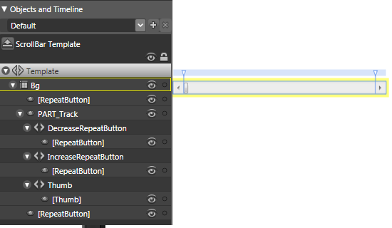
Now if we have a look at at a ScrollBar control that I have started to edit in Expression Blend, we can see the default VisualTree that makes up the default Template for the ScrollBar control. This is shown below:

There is something that looks rather odd; well, at least, to me it does. What the heck is this PART_Track thing all about? It just looks strange.
As explained in the previous section, the default appearance of a control, including any triggers that may change its appearance or behavior, is defined by a ControlTemplate, which is composed of various elements that represent different parts of a control, some of which are required in order to handle specific control behavior. The absence of these template parts will result in controls not behaving as expected.
Hmmmm..., I thought we could do what we wanted to do with custom controls. Well, as it turns out, no. We are not quite as free as we thought we were; there are some restrictions imposed on us. Of course, we don't have to abide by these restrictions, but it's probably a good idea to, as we want our control to work even if it does look different. It should still work.
Microsoft has thought about this situation, and has not fixed it (which they couldn't do anyway, as they don't know what the user is going to do to the ControlTemplate), but have provided a basic mechanism to kind of ensure that a control tries to behave correctly. This mechanism is called Template Parts.
Think of Template Parts as a loose contract between a control and its Template. The naming convention is Part_XXXX, where the PART_XXX name is applied to the item within the Template that must be provided in order for the control to work.
Well, how do we know which PARTS we are expected to provide? Well, that's done to the control author doing a good job, and supplying a documentation attribute, called TemplatePartAttribute. Don't worry, we will look at this a bit more in depth in a while. It's just important that you understand that, in some cases, there is a guideline as to what the Template should contain.
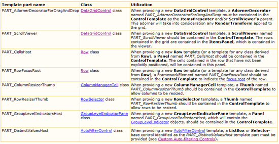
For example, my previous CodeProject article MyFriends uses a third party datagrid for WPF by a company called Xceed. And if we examine their documentation, we can see that their datagrid's ControlTemplate expects the following control parts to be provided:

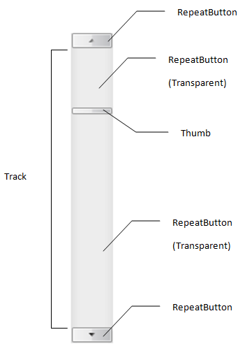
Don't worry about this XCeed example, that was really just to show you what a large control might expect from its users, but we are simply going to go back to our simple ScrollBar Template. Let's analyse that a bit further, shall we? Taking the trivial (at first glance) scroll bar, it can be seen that the scroll bar control is actually made up as follows:

And as I stated above, the default template contains a template part, where the part is expected to be called PART_Track, and is as shown below:
<Track
Name="PART_Track"
Grid.Row="1"
IsDirectionReversed="true">
<Track.DecreaseRepeatButton>
<RepeatButton
Style="{StaticResource ScrollBarPageButton}"
Command="ScrollBar.PageUpCommand" />
</Track.DecreaseRepeatButton>
<Track.Thumb>
<Thumb
Style="{StaticResource ScrollBarThumb}"
Margin="1,0,1,0"
Background="{StaticResource HorizontalNormalBrush}"
BorderBrush="{StaticResource HorizontalNormalBorderBrush}" />
</Track.Thumb>
<Track.IncreaseRepeatButton>
<RepeatButton
Style="{StaticResource ScrollBarPageButton}"
Command="ScrollBar.PageDownCommand" />
</Track.IncreaseRepeatButton>
</Track>
And as I've also demonstrated, the Track is expected to be a part of the Template or Style that is used by the ScrollBar control. In fact, if we don't have a Track whose name is PART_Track, the control will not work as expected.
To prove this, I've included as part of the attached demo application two ScrollBars that have a Style applied to them. In one case, I've supplied the PART_Track name for the Track, and in the other case, I've missed out the naming of the Track altogether. And guess what, one ScrollBar works correctly, and the other doesn't. This is the power of the mighty PART_XXX name.
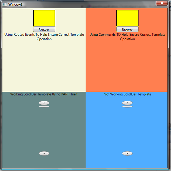
In fact, I think now may be a good time to show a small screenshot of the attached demo application. As I say, this is a small article, so it's nothing fancy.
It's basically split into four areas. Each area conducts a different function as follows:
- Top left: Hosting a custom control, and making it work using Template_Parts.
- Top right: Hosting a custom control, and making it work using Commands.
- Bottom left: Has a working
Styled ScrollBar that includes the correct PART_Track named Template visual tree object.
- Bottom right: Has a non-working
Styled ScrollBar that does not include the PART_Track named Template visual tree object, so does not work correctly; try it and you'll see.
I think I've talked about the bottom row, in what we have discussed above, where I mentioned that in some cases, there is expected to be a certain element type and name supplied as part of the applied Template. But, how should this information be dealt with by a user of a control, and what should a control author do to ensure that their own controls are well written and behave correctly when the user doesn't supply these expected control parts?

Well, according to the source that I've read, there are really only a couple of options available, to ensure controls behave well, and that users of controls know what they have to do to ensure this harmonious arrangement. The rest of this article will be dedicated to the discussion of what custom control authors can do with their controls.
Option 1
As the designer of a control, you should decide which parts are important parts of the control's inner workings, and these should probably be designated as template parts. Remember, template parts are a loose contract between a control and its template. After you decide on which elements to designate as template parts, you should pick a name for them. The convention is "PART_XXX". You should then document each part's existence by using the TemplatePartAttribute (one for each part). WPF doesn't actually do anything with the TemplatePartAttribute, but it will be used in the documentation by some XAML tools, such as Expression Blend.
The next step is to deal with the designated template parts, which should be done in an override of the OnApplyTemplate method inherited from FrameworkElement. This method is called anytime the template is applied, so it gives the chance to handle dynamic template changes gracefully. To retrieve the instances of any elements inside the control template, the GetTemplateChild method, also inherited from FrameworkElement, can be called. Let's see an example. In this example, I have created a CustomControl which I expect to have a Button and an Image. The Button allows users to browse for an Image. Yes, it's a simple image browser.
Let's see the associated code:
using System;
using System.Collections.Generic;
using System.Linq;
using System.Text;
using System.Windows;
using System.Windows.Controls;
using System.Windows.Data;
using System.Windows.Documents;
using System.Windows.Input;
using System.Windows.Media;
using System.Windows.Media.Imaging;
using System.Windows.Navigation;
using System.Windows.Shapes;

namespace CustomControlsAndTemplates
{
    [TemplatePart(Name = "Part_OpenImage", Type = typeof(Button))]
    [TemplatePart(Name = "Part_Image", Type = typeof(Image))]
    public class OpenImageCustomControlUsingRoutedEvents : Control
    {
        static OpenImageCustomControlUsingRoutedEvents()
        {
            DefaultStyleKeyProperty.OverrideMetadata(
                typeof(OpenImageCustomControlUsingRoutedEvents),
                new FrameworkPropertyMetadata(
        typeof(OpenImageCustomControlUsingRoutedEvents)));
        }

        public override void OnApplyTemplate()
        {
            base.OnApplyTemplate();

            Button openImageButton = base.GetTemplateChild("Part_OpenImage") as Button;
            Image selectedImage = base.GetTemplateChild("Part_Image") as Image;
            if (openImageButton != null && selectedImage != null)
                openImageButton.Click += new RoutedEventHandler(openImageButton_Click);
        }

        private void openImageButton_Click(object sender, RoutedEventArgs e)
        {
            Microsoft.Win32.OpenFileDialog ofd = new Microsoft.Win32.OpenFileDialog();
            ofd.AddExtension = false;
            ofd.Multiselect = false;
            ofd.DefaultExt = ".jpg";
            ofd.Filter = "Image Files(*.BMP;*.JPG;*.GIF)|*.BMP;" +
                         "*.JPG;*.GIF|All files (*.*)|*.*";
            ofd.InitialDirectory=System.Environment.GetFolderPath(
                Environment.SpecialFolder.MyPictures);

            if (ofd.ShowDialog().HasValue)
            {
                if (!string.IsNullOrEmpty(ofd.FileName))
                {
                    OpenImageCustomControlUsingRoutedEvents parent =
                        (sender as Button).TemplatedParent as
                        OpenImageCustomControlUsingRoutedEvents;
                    Image selectedImage = parent.Template.FindName("Part_Image", parent)
                        as Image;
                    if (selectedImage != null)
                        selectedImage.Source = new BitmapImage(new Uri(ofd.FileName));
                }
            }
        }
    }
}
And, here is the control being used in XAML, with the correct Part_Image and Part_OpenImage being supplied:
<local:OpenImageCustomControlUsingRoutedEvents
        x:Name="openImageControlUsingRoutedEvents" Width="80"
        Height="80" Background="Yellow" Margin="0,5,0,0">
    <local:OpenImageCustomControlUsingRoutedEvents.Template>
        <ControlTemplate>
            <StackPanel Orientation="Vertical"
                        Background="{TemplateBinding Background}">
                <Border BorderBrush="Black"
                       BorderThickness="2,2,2,2" Height="60">
                    <Image x:Name="Part_Image"
                       Margin="0" Stretch="Fill" />
                </Border>
                <Button x:Name="Part_OpenImage"
                    Width="Auto" Content="Browse"
                    Height="20"/>
            </StackPanel>
        </ControlTemplate>
    </local:OpenImageCustomControlUsingRoutedEvents.Template>
</local:OpenImageCustomControlUsingRoutedEvents>
Note that this implementation gracefully handles Templates that omit Part_OpenImage, causing the openImageButton variable to be null. This is the recommended approach. After all, it's fairly possible and probably quite reasonable that a user of this control could provide a Template that doesn't contain a Part_OpenImage Button element. This implementation deals with it. If the Part_OpenImage Button element is provided, its Click RoutedEvent is used, otherwise nothing happens.
Although this option is fine, it's not that flexible; not only do we expect there to be a Button, but we also need it to be called a certain name. Isn't there a better method? Well, yes there is. Commands. That's option 2.
Option 2
A more flexible way to attach logic to pieces of a template is to define and use commands. This not only avoids the need to special names, but the element trigger no longer even needs to be a Button.
The following is a re-write of the OpenImage CustomControl that has been changed to use commands. In this example, I am still using a Button, but this could be swapped for anything that supports commands.
using System;
using System.Collections.Generic;
using System.Linq;
using System.Text;
using System.Windows;
using System.Windows.Controls;
using System.Windows.Data;
using System.Windows.Documents;
using System.Windows.Input;
using System.Windows.Media;
using System.Windows.Media.Imaging;
using System.Windows.Navigation;
using System.Windows.Shapes;
namespace CustomControlsAndTemplates
{
[TemplatePart(Name = "Part_OpenImage", Type = typeof(Button))]
[TemplatePart(Name = "Part_Image", Type = typeof(Image))]
public class OpenImageCustomControlUsingCommands : Control
{
private static RoutedUICommand openImageCommand = new
RoutedUICommand("Opem File", "OpenImageCommand",
typeof(OpenImageCustomControlUsingCommands));
static OpenImageCustomControlUsingCommands()
{
DefaultStyleKeyProperty.OverrideMetadata(
typeof(OpenImageCustomControlUsingCommands),
new FrameworkPropertyMetadata(
typeof(OpenImageCustomControlUsingCommands)));
CommandManager.RegisterClassCommandBinding(
typeof(OpenImageCustomControlUsingCommands),
new CommandBinding(OpenImageCommand,
new ExecutedRoutedEventHandler(openImageButton_Click)));
}
public static RoutedUICommand OpenImageCommand
{
get { return openImageCommand; }
}
private static void openImageButton_Click(object sender, RoutedEventArgs e)
{
Microsoft.Win32.OpenFileDialog ofd = new Microsoft.Win32.OpenFileDialog();
ofd.AddExtension = false;
ofd.Multiselect = false;
ofd.DefaultExt = ".jpg";
ofd.Filter = "Image Files(*.BMP;*.JPG;*.GIF)|
*.BMP;*.JPG;*.GIF|All files (*.*)|*.*";
ofd.InitialDirectory=System.Environment.GetFolderPath(
Environment.SpecialFolder.MyPictures);
if (ofd.ShowDialog().HasValue)
{
if (!string.IsNullOrEmpty(ofd.FileName))
{
OpenImageCustomControlUsingCommands parent =
sender as OpenImageCustomControlUsingCommands;
Image selectedImage = parent.Template.FindName(
"selectedImage", parent) as Image;
if (selectedImage != null)
selectedImage.Source = new BitmapImage(new Uri(ofd.FileName));
}
}
}
}
}
And here is the control being used in XAML with the command being wired up:
<local:OpenImageCustomControlUsingCommands x:Name="openImageCustomControlUsingCommands"
        Width="80" Height="80" Background="Yellow" Margin="0,5,0,0">
    <local:OpenImageCustomControlUsingCommands.Template>
        <ControlTemplate>
            <StackPanel Orientation="Vertical" Background="{TemplateBinding Background}">
                <Border BorderBrush="Black" BorderThickness="2,2,2,2" Height="60">
                    <Image x:Name="selectedImage" Margin="0" Stretch="Fill" />
                </Border>
                <Button Command="{x:Static
        local:OpenImageCustomControlUsingCommands.OpenImageCommand}"
        Width="Auto" Content="Browse" Height="20"/>
            </StackPanel>
        </ControlTemplate>
    </local:OpenImageCustomControlUsingCommands.Template>
</local:OpenImageCustomControlUsingCommands>
The only problem, I guess, with this approach is that you have to know that there is a command available that will do what you want.
Well, that's it for this article. I told you it was small. But I hope this was useful in some way. I think it's fairly strange, so should still be in your mind. At least that's how my mind works. I forget the easy stuff, and remember the outright strange and scary stuff just fine.
The following is a list of the code that I have looked at and, in some case, used and altered for this article:
I would just like to ask, if you liked the article, please vote for it, and leave some comments, as it lets me know if the article was at the right level or not, and whether it contained what people need to know.
Although this article was fairly short, I hope it was of help to someone out there that may be thinking of authoring a custom WPF control, or is dealing with a third party WPF control.
