Introduction
The control I present here can come in handy when the user just needs to type in the date using the keyboard only rather than selecting the date from the drop-down/lookup calendar. Despite the task simplicity, I did not find any ready-to-use code or control with similar functionality. As opposed to the "standard" WPF DatePicker, this one adds some more validation to each date part, but at the same time does not require usage of Tab or mouse for moving to the next control.
Background
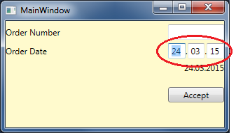
The control inherits from WPF's UserControl and contains 3 TextBoxes - for day, month and year. There is only one Date format - dd.MM.yy, since our users don't need others.
The control appearance is as follows:

Each TextBox has a text limit of 2 characters, and also subscribes to next TextBox events:
GotFocus - Here, we select all text in the current element, to allow overwriting it once user starts printing.PreviewKeyDown - Here, we filter non-numeric keys and check whether the focus should be moved to next/previous control.KeyUp - Finally validates user input and starts Beep if it is not valid.
All these methods are implemented in abstract class to let similar Time control implementation. Then SimpleDatePicker inherits the described control and then overrides some DateTime-type validation specific methods.
Using the Code
To use the code, let's add reference to XAML's namespaces list:
<Window x:Class="SimpleDatePickerTest.MainWindow"
        xmlns="http://schemas.microsoft.com/winfx/2006/xaml/presentation"
        xmlns:x="http://schemas.microsoft.com/winfx/2006/xaml"
        xmlns:pick="clr-namespace:SimplePickers"
        Background="LemonChiffon"
        Title="MainWindow" Height="200"
        Width="300" WindowStartupLocation="CenterScreen">
Then put the control itself with the proper binding (please note TwoWay since the default is OneWay):
<pick:SimpleDatePicker x:Name="sdpOrderDate" Width="80"
Date="{Binding Path=Date, Mode=TwoWay}" />
I also have added special TextBlock to verify my control's value:
<TextBlock Grid.Column="0" Grid.Row="2" HorizontalAlignment="Right"
VerticalAlignment="Center" Margin="0,5,0,0"
Text="{Binding Path=Date, ElementName=sdpOrderDate, StringFormat='dd.MM.yyyy'}"/>
The project with the control source code and usage example is attached to this post - feel free to download and use it everywhere.
