Introduction
Bootstrap is powerful responsive UI development kit that includes components, JavaScript and CSS. When I first wanted to start learning Bootstrap, it was difficult for me to find a starting point. This brief tutorial will help you to find; where to start, how to find and apply different CSS, use components and finally how to test UI on different devices like Desktop, Mobile, Tablet and kindle, etc. Let's develop a small project. Create a new folder Bootstrap_Example anywhere in your computer, e.g. Desktop.
Step 1
Open URL: http://getbootstrap.com and click on Download Bootstrap. It will take you to another page with three options, click on the first link Download Bootstrap, Compiled and minified CSS, JavaScript, and fonts. No docs or original source files are included. Unzip folder and you will find three sub folders, css, font and js. You can also use CDN link given on the same page instead of downloading Bootstrap. Copy unzipped Bootstrap files and folder into Bootstrap_Example folder.
Step 2
Open URL: http://getbootstrap.com/examples/starter-template. This is your starting page to develop Bootstrap website. Right click on the page and Click View Page Source, copy source and paste it into Notepad file, rename the Notepad file to Index.html and paste it into Bootstrap_Example folder. This page has almost all basic code you need to start Bootstrap. Go to google.com and read about "Bootstrap Viewport". Specify the correct path for bootstrap.min.css and bootstrap.min.js in Index.html. Keep fixing the Index.html until you get the same UI like
http://getbootstrap.com/examples/starter-template.
You can find the rest of JS files used in Index.html from the following URL: https://github.com/twbs/bootstrap/tree/master/docs/assets/js. Create a JavaScript folder in Bootstrap_Example folder to save the desired JS files from previously given Github URL.
Step 3
Open URLs:
CSS
12 Columns Grid System mentioned in CSS page really helps you to design Responsive UI for Mobile, Tablet and Desktop. It tells you division of page according to each device. Since we already referenced Bootstrap CSS, JS and Font, just copy and paste CSS classes in Index.html div and it will start working. Similarly go to Button section, copy the CSS from web page into Index.html page's button. You can play around CSS of different controls.
<div class="row">
<div class="col-xs-6 col-sm-3">.col-xs-6 .col-sm-3</div>
<div class="col-xs-6 col-sm-3">.col-xs-6 .col-sm-3</div>
<!--
<div class="clearfix visible-xs-block"></div>
<div class="col-xs-6 col-sm-3">.col-xs-6 .col-sm-3</div>
<div class="col-xs-6 col-sm-3">.col-xs-6 .col-sm-3</div>
</div>
Component
There are a lot of useful Components available in this section, e.g., drop down, Labels, Navigation bars, etc. Just copy HTML from page into Index.html and it's all yours. You don't need any expertise to use Bootstrap components.
<!--
<div class="btn-group">
<button type="button" class="btn btn-default dropdown-toggle"
data-toggle="dropdown" aria-expanded="false">
Action <span class="caret"></span>
</button>
<ul class="dropdown-menu" role="menu">
<li><a href="#">Action</a></li>
<li><a href="#">Another action</a></li>
<li><a href="#">Something else here</a></li>
<li class="divider"></li>
<li><a href="#">Separated link</a></li>
</ul>
</div>
JavaScript
In JavaScript section, there are a lot of example Bootstrap components using different JavaScript code snippets to perform different functionality, e.g., Tool-tip, Button, Modal Popup, etc. Following is an example using tooltip:
<div class="col-xs-6 col-md-3">
                <img class="img-rounded img_shadow img-responsive thumbnail" src="Images/office.jpg" data-toggle="tooltip" title="Generic placeholder image" style="width: 140px; height: 140px;">
            </div>

<script type="text/javascript">
    $(function () {
        $('[data-toggle="tooltip"]').tooltip();
    });
</script>
Test Your Page On Different Device
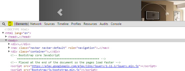
Open Index.hml in Google Chrome and press F12 to go to developer mode.
Find the small Mobile icon next to Zoom icon and click it.

It will open the following window with Device dropdown where you can select any device to analyze the view. You might need to refresh the page by F5.

History
