Introduction
A pure CSS3 styling solution (no JavaScript) described in the tip is applicable to HTML5 SELECT elements and ASP.NET DropDownList controls. Two sample implementations discussed below allow placing custom image or Unicode character on the top of pulldown button replacing the default downward arrow (single select mode), as shown in the following demo screenshot:
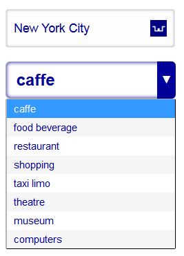
Fig.1: HTML5 SELECT elements w/advanced CSS3 style using custom image and Unicode char, sample screenshot
Click on the image to view the practical implementation of this CSS3 styling technique.
Background
Separation of Programming Concerns
Separation of programming concerns [1] is a software development paradigm of modern days, equally applicable to desktop, mobile/web applications. In adherence to this paradigm and pertinent to web design/development best practices, HTML should be used for page content, CSS for the presentation (styling) and scripting languages (javascript, jQuery, etc) mainly for the app interaction with User. In certain cases these areas may overlap: for example, javascript may be used for styling of the HTML basic elements. This styling technique via javascripting should be considered an exception rather than the rule, a sort of temporary fix. Plus, javascript (or any scripting) could be disabled on the User computer, causing such technique to fail completely. Any forward-looking web design/development should adhere to the maximum possible extent to the fundamental concept of the separation of programming concerns. In simple words, styling must be done by CSS; javascripting should be used for the interaction and behavioral logic.
HTML5 SELECT element styling
Styling of SELECT HTML element and corresponding ASP.NET DropDownList control (rendered as aforementioned HTML SELECT) is quite important and, still, a non-trivial task. The main goal of this tip is to provide a pure CSS solution with balanced complexity, flexibility and aesthetics while preserving all functionality of the underlying Select element (in other words, to create a sort of "drop-in" replacement for the existing web page design that uses SELECT elements).
Using the Code
The listing below includes both HTML5 and CSS3 encapsulated in a single .htm file. It demonstrates two sample CSS3 styling techniques: the first one using custom image identified in background URL (in this sample, it points to the favicon.ico of webinfocentral.com; in actual project, it could be any image file accessible by url property) and a second one using Unicode character (\25bc in label#lblSelect::after pseudo-element, which also displays a downward arrow with all CSS3 customization possible) on the top of pull-down button. The solution is also applicable to ASP.NET DropDownList control asp:DropDownList (use either id property or CssClass).
The following sample code snippet in Listing 1 demonstrates CSS3 styling technique allowing any Unicode character to be placed on pull-down button, plus other aesthetic enhancements.
HTML5 Select element with Unicode Character
Listing 1. Advanced CSS: HTML5 Select element with Unicode char on pull-down button
<!DOCTYPE html>
<html xmlns="http://www.w3.org/1999/xhtml">
<head>
<title>ADVANCED CSS3 | SELECT ELEMENT WITH UNICODE BUTTON SYMBOL</title>
<meta name="Description" content="Drop-down control with Unicode symbol placed on pull-button and other CSS3 styling technique" />
<style type="text/css">
select#selectPointOfInterest
{
width : 185pt;
height : 40pt;
line-height : 40pt;
padding-right : 20pt;
text-indent : 4pt;
text-align : left;
vertical-align : middle;
box-shadow : inset 0 0 3px #606060;
border : 1px solid #acacac;
-moz-border-radius : 6px;
-webkit-border-radius : 6px;
border-radius : 6px;
-webkit-appearance : none;
-moz-appearance : none;
appearance : none;
font-family : Arial, Calibri, Tahoma, Verdana;
font-size : 18pt;
font-weight : 500;
color : #000099;
cursor : pointer;
outline : none;
}
select#selectPointOfInterest::-ms-expand {display: none;}
select#selectPointOfInterest option
{
padding : 4px 10px 4px 10px;
font-size : 11pt;
font-weight : normal;
}
select#selectPointOfInterest option[selected]{ font-weight:bold}
select#selectPointOfInterest option:nth-child(even) { background-color:#f5f5f5; }
select#selectPointOfInterest:hover {font-weight: 700;}
select#selectPointOfInterest:focus {box-shadow: inset 0 0 5px #000099; font-weight: 600;}
label#lblSelect{ position: relative; display: inline-block;}
label#lblSelect::after
{
content : "\25bc";
position : absolute;
top : 0;
right : 0;
bottom : 0;
width : 20pt;
line-height : 40pt;
vertical-align : middle;
text-align : center;
background : #000099;
color : #fefefe;
-moz-border-radius : 0 6px 6px 0;
-webkit-border-radius : 0 6px 6px 0;
border-radius : 0 6px 6px 0;
pointer-events : none;
}
</style>
</head>
<body>
<br />
<label id="lblSelect">
<select id="selectPointOfInterest" title="Select points of interest nearby">
<option>caffe</option>
<option>food beverage</option>
<option>restaurant</option>
<option>shopping</option>
<option>taxi limo</option>
<option>theatre</option>
<option>museum</option>
<option>computers</option>
</select>
</label>
</body>
</html>
The following sample code snippet shown in Listing 2 demonstrates CSS3 styling technique used to place the image icon on pull-down button, plus other aesthetic enhancements.
HTML5 Select element with Image button
Listing 2. Advanced CSS: HTML5 Select element with image button
<!DOCTYPE html>
<html xmlns="http://www.w3.org/1999/xhtml">
<head>
<title>ADVANCED CSS3 | SELECT ELEMENT WITH IMAGE BUTTON</title>
<meta name="Description" content="Drop-down control with image placed on pull-button and other CSS3 styling technique" />
<style type="text/css">
select#selectTravelCity
{
width : 14em;
height : 3.2em;
padding : 0.2em 0.4em 0.2em 0.4em;
vertical-align : middle;
border : 1px solid #e9e9e9;
-moz-border-radius : 0.2em;
-webkit-border-radius : 0.2em;
border-radius : 0.2em;
box-shadow : inset 0 0 3px #a0a0a0;
-webkit-appearance : none;
-moz-appearance : none;
appearance : none;
background : url(http://webinfocentral.com/Images/favicon.ico) 95% / 10% no-repeat #fdfdfd;
font-family : Arial, Calibri, Tahoma, Verdana;
font-size : 1.1em;
color : #000099;
cursor : pointer;
}
select#select#selectTravelCity::-ms-expand {display: none;}
select#selectTravelCity option
{
font-size : 1em;
padding : 0.2em 0.4em 0.2em 0.4em;
}
select#selectTravelCity option[selected]{ font-weight:bold}
select#selectTravelCity option:nth-child(even) { background-color:#f5f5f5; }
select#selectTravelCity:hover
{
color : #101010;
border : 1px solid #cdcdcd;
}
select#selectTravelCity:focus {box-shadow: 0 0 2px 1px #404040;}
</style>
</head>
<body>
<br />
<select id="selectTravelCity" title="Select Travel Destination">
<option>New York City</option>
<option>Washington DC</option>
<option>Los Angeles</option>
<option>Chicago</option>
<option>Houston</option>
<option>Philadelphia</option>
<option>Phoenix</option>
<option>San Antonio</option>
<option>San Diego</option>
<option>Dallas</option>
<option>San Jose</option>
<option>Austin</option>
</select>
</body>
</html>
Points of Interest
CSS3 pseudo-class ::after and pseudo-element :after
In a context of this particular CSS3 solution, pseudo element label#lblSelect::after and pseudo-class label#lblSelect:after can be used interchangebly.
Browser compatibility
Unicode characters [4] are not universally recognized by different web browsers. For example, Opera/Safari/Chrome all do recognize Unicode characters ↻ and ↺ (could be used as a 'Refresh' icon), but do not recognize rather similar gapped circle arrows ⟳(U+27F3) and ⟲ (U+27F2) characters; same goes to Unicode character U+2615 ('Hot Beverage') - it's not recognized by IE/webkit-based browsers (alternatively, instead of 'Hot Beverage' glyph you can use U+1F375 ('Teacup Without Handle'), which is rendered properly in all major browsers except for Opera). As a general rule, it's highly recommended to test a Unicode solution in all web browsers of interest pertinent to the particular use-cases.
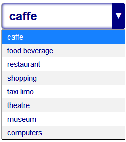
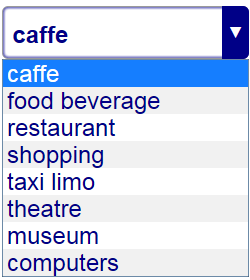
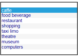
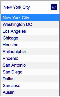
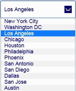
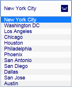
Also, notice the appearance:none; property which is essential for this solution to work properly. This property de facto is supported by all major web browsers except for IE (see the reference [2] mentioned in comments thread for more info). The latest IE11 version is mostly compatible with the solution: see the fix in'Fix and Improvements' sub-chapter (also, regarding the use of IE in any forward-looking web apps: most likely IE will be either discarded sometime soon [4], or will emerge under different branding [5], hopefully made compatible with advanced HTML5/CSS3 like other major browsers). The actual usage share of IE is relatively small and continuously shrinking: based on [3] the Google Chrome/Android browsers are taking the lion share of roughly 50%, another 12% allocated for Firefox, 14% for Safari and 4% for Opera (all mostly compatible with the solution); the IE share is estimated as 13%. Following sample screenshots reflect the test results of the actual solution running in various web browsers.
Test settings and results
Partial testing was conducted in the following web browsers:
- Firefox v.37+
- Chrome v.42+
- Opera v.28+
- Safari v.5+ (for Win)
- IE11
Sample screenshots follow (click on the image to see the fully operational HTML5/CSS3 Select control running in actual web apps in a single select mode).
| 
Firefox v.37+
| |
| 
Chrome v.42+
| |
| 
Opera v.28
| |
 |  |
| 
IE11 (before fix)
| 
IE11 (after fix applied)
|
Fig 2a. Select element with Unicode char on pull-down button
| 
Firefox v.37+
| |
Chrome v.42
| |
Opera v.28
| |
 | IE11 (before fix) |
 | IE11 (after fix applied) |
Fig 2b. Select element with Image button
Use cases
Pertinent to mobile and real-time web apps critical of Internet traffic, the Unicode CSS3 styling of SELECT element described in Listing 1 would be considered a preferred solution. It does not requre any graphic image files: the glyph on pull-down button contains just a single character Unicode character (i.e. '\25bc' in aforementioned example; also useful is white down-pointing triangle U+25BD and down arrowhead U+2304), which is easy to change as demonstrated in the following sub-chapter. In case of no any applicable Unicode character found, the second solution (Listing 2) using graphic image files can be handy, though it could increase the web traffic due to relatively larger size of graphic image files.
More Examples
More CSS3 styling examples using various Unicode charactes [6] on SELECT pull-down button are listed below. Also, the code snippet in Listing 3 utilizes 'em' relative units (instead of 'pt' as shown in previous examples).
Listing 3. Various Unicode Characters on pull-down button of SELECT element
<!DOCTYPE html>
<html xmlns="http://www.w3.org/1999/xhtml">
<head>
<title>ADVANCED CSS3 | SELECT ELEMENT WITH UNICODE CHAR ON PULL-BUTTON SYMBOL</title>
<meta name="Description" content="Drop-down control with various Unicode symbols placed on pull-button and other CSS3 styling technique using 'em' unit" />
<style type="text/css">
select
{
width : 12em;
height : 3em;
line-height : 3em;
vertical-align : middle;
padding-right : 2.5em;
text-indent : 0.2em;
text-align : left;
box-shadow : inset 0 0 3px #606060;
border : 1px solid #acacac;
-moz-border-radius : 6px;
-webkit-border-radius : 6px;
border-radius : 6px;
-webkit-appearance : none;
-moz-appearance : none;
appearance : none;
font-family : Arial, Calibri, Tahoma, Verdana;
font-size : 1.5em;
font-weight : 500;
color : #000099;
cursor : pointer;
outline : none;
}
select::-ms-expand {display: none;}
select option
{
padding : 0.3em;
font-size : 1em;
font-weight : normal;
}
select option[selected]{ font-weight:bold}
select option:nth-child(even) { background-color:#f5f5f5; }
select:hover {font-weight: 700;}
select:focus {box-shadow: inset 0 0 5px #000099; font-weight: 600;}
label { position: relative; display: inline-block;}
label::after
{
content : "\2708";
position : absolute;
top : 0;
right : 0;
bottom : 0;
width : 2.5em;
line-height : 3em;
vertical-align : middle;
text-align : center;
background : #000099;
color : #fefefe;
font-size : 1.5em;
font-weight : 500;
-moz-border-radius : 0 6px 6px 0;
-webkit-border-radius : 0 6px 6px 0;
border-radius : 0 6px 6px 0;
pointer-events : none;
}
#envelope label::after { content: "\2709"; }
#music label::after { content: "\266b"; }
</style>
</head>
<body>
<br />
<div>
<label>
<select title="TICKETS">
<option>New York City</option>
<option>Washington DC</option>
<option selected>Los Angeles</option>
<option>Chicago</option>
<option>Houston</option>
<option>Philadelphia</option>
</select>
</label> (U+2708)
</div>
<br />
<div id="envelope">
<label>
<select title="MAILING OPTIONS">
<option>USPS</option>
<option selected>UPS</option>
<option>FedEx</option>
<option>DHL</option>
</select>
</label> (U+2709)
</div>
<br />
<div id="music">
<label>
<select title="MUSIC">
<option>classical</option>
<option selected>rock/pop</option>
<option>jazz</option>
<option>country/folk</option>
</select>
</label> (U+266B)
</div>
</body>
</html>
Corresponding to the Listing above, sample screenshot follows:

Fig 3: Sample screenshot of SELECT elements with various Unicode chars
Flexibility
In order to change the glyph placed on pull-down button, just encapsulate the select element in the <div>, for example <div id="envelope"> and add the corresponding line to the CSS stylesheet:
<code>#envelope label::after { content: "\2709"; }</code>
as shown in the examples (Listing 3).
Fixes and improvements
IE compatibility fix: as suggested by our fellow CPian Joe-Gakenheimer (jgakenhe), the following line added to CSS stylesheet will partially fix IE-compatibility issue, making the pull-down button look normally (kudos to jgakenhe):
select::-ms-expand {display: none;}
Other considerations for IE Users
Regarding the versions prior to IE11, you probably have seen the meta statement like the following:
<meta http-equiv="X-UA-Compatible" content="IE=edge"/>
It may be helpful in certain cases: you can find more info on this topic in MSDN article [6,7].
Other examples of HTML5/CSS3 advanced technique
There are examples of advanced CSS3 pseudo-class use-cases: ToggleButton on the top of CheckBox element [8], and an example of using <div> elements in order to create compact and flexible pseudo-graphics [9].
History
- March 24, 2015: Original version published
- April 23, 2015: Extended version published with major code/graphic and textual updates.
- April 25, 2015: IE fix discussed/applied
- April 25, 2015: More samples added with various Unicode characters used as button glyphs
References
- Separation of concerns
- CSS Appearance property
- Usage share of web browsers
- Project Spartan (Microsoft)
- UTF-8 Miscellaneous Symbols
- How Internet Explorer Chooses Between Document Modes (MSDN)
- Document Modes (MSDN)
- Toggle Button built on ASP.NET CheckBox and HTML5/CSS
- Advanced CSS3: Pseudo-icons Made of div Elements
