Introduction
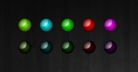
The LEDBulb is a .NET user control for Windows Forms that emulates an LED light with two states On and Off. The purpose of the control is to provide a sleek looking representation of an LED light that is sizable, has a transparent background and can be set to different colors.
LedBulb bulb = new LedBulb();
bulb.Size = new Size(25, 25);
bulb.Color = Color.LawnGreen;
bulb.On = true;
this.Controls.Add(bulb);
Sizeable
I recently needed to add a custom user control to a Window Forms project of mine that would represent an LED bulb commonly seen on household electronics. After a quick search, most of the existing controls I found were ugly and used static images, which means they wouldn’t scale well. This control uses the System.Drawing.Drawing2D namespace to draw a vector image so that it not only looks clean but will also scale to any size without affecting the image quality.
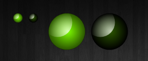
Rendering the control starts with drawing a solid circle with our background color. Then we draw a radial gradient over it with our highlight color, transitioning to transparent. To draw the reflection, we draw another radial gradient, from white to transparent, but in a smaller rectangle shifted up and left. To prevent the white gradient from showing up outside the bulb, we set the clip parameter to the bounds of our original circle.
g.FillEllipse(new SolidBrush(darkColor), drawRectangle);
GraphicsPath path = new GraphicsPath();
path.AddEllipse(drawRectangle);
PathGradientBrush pathBrush = new PathGradientBrush(path);
pathBrush.CenterColor = lightColor;
pathBrush.SurroundColors = new Color[] { Color.FromArgb(0, lightColor) };
g.FillEllipse(pathBrush, drawRectangle);
GraphicsPath gp = new GraphicsPath();
gp.AddEllipse(drawRectangle);
g.SetClip(gp);
GraphicsPath path1 = new GraphicsPath();
path1.AddEllipse(whiteRectangle);
PathGradientBrush pathBrush1 = new PathGradientBrush(path);
pathBrush1.CenterColor = Color.FromArgb(180, 255, 255, 255);
pathBrush1.SurroundColors = new Color[] { Color.FromArgb(0, 255, 255, 255) };
g.FillEllipse(pathBrush1, whiteRect);
Transparent Background
It is important that this control has a transparent background. To do this, we need to add a command to the constructor.
SetStyle(ControlStyles.DoubleBuffer
    | ControlStyles.AllPaintingInWmPaint
    | ControlStyles.ResizeRedraw
    | ControlStyles.UserPaint
    | ControlStyles.SupportsTransparentBackColor, true
);
Customizable Colors
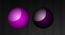
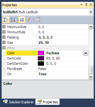
You can customize the color of the LED display by setting the Color property. Setting this property also automatically calculates two other Properties ColorDark and ColorDarkDark which are used for gradients when the control is drawn. These colors are calculated using the using the ControlPaint class, a Control helper class in the System.Windows.Forms namespace.
this.DarkColor = ControlPaint.Dark(_this.Color);
this.DarkDarkColor = ControlPaint.DarkDark(_this.Color);
Blink
The control has a blink method that will make the control start blinking. You pass the number of milliseconds between blinks. To turn the blinking off just call the blink function again passing 0 as the argument.
led.Blink(2000);
led.Blink(500);
led.Blink(0);

Points of Interest
This control uses double-buffering by drawing its image to an off-screen bitmap first, then sending the final rendering to the client. Double buffering creates a smoother drawing of the control and avoids flicker when moving or re-sizing. The code to accomplish this is below.
protected override void OnPaint(PaintEventArgs e){
Bitmap offScreenBmp = new Bitmap(this.ClientRectangle.Width,
this.ClientRectangle.Height);
System.Drawing.Graphics g = Graphics.FromImage(offScreenBmp);
g.SmoothingMode = SmoothingMode.HighQuality;
drawControl(g);
e.Graphics.DrawImageUnscaled(offScreenBmp, 0, 0);
}
Links
