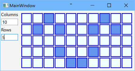
The post demonstrates WPF data grid with dynamically defined number of rows and columns, but all cells have the same size.
Introduction
The post is devoted to the WPF data grid with dynamically defined number of rows and columns, but all cells have the same width and the same height. For example, such grid could be used in chess or checkers games for 8x8 field.

The application has the following features:
- Number of rows and columns can be changed at run-time
- All cells has the same width and the same height
- Grid occupies as much space as possible
- Input click switches the state of the cell
Background
The solution uses C#6, .NET 4.6.1, WPF with MVVM pattern.
Solution
WPF Application
 WPF application is done in MVVM pattern with one main window. Dynamic grid is implemented as user control that contains
 DataGrid control bound to observable collection of collections of cell view models. In this implementation, collection of cells is recreated each time if grid width or grid height is changed, and it leads to some application pauses. In the following post, this issue is solved with asynchronous method that updates cell array. Also, other implementation for cells could be used; for example, 2-dimensional array of cells ICellViewModels[][] works well.
Behind Code

Dynamic grid view model implements IDynamicGridViewModel interface that has two size’s properties for grid width and height that are number of rows and columns, observable collection of collections of cell view models, and several color properties:
public interface IDynamicGridViewModel
{
ObservableCollection<ObservableCollection<ICellViewModel>>
Cells { get; }
int GridWidth { get; }
int GridHeight { get; }
Color StartColor { get; set; }
Color FinishColor { get; set; }
Color BorderColor { get; set; }
}
Values of color properties are assigned to corresponding properties of CellView control. View model for each cell implements ICellViewModel interface that defines property for data model that implements ICell interface and command for changing state for the cell.
public interface ICellViewModel
{
  ICell Cell { get; set; }
  ICommand ChangeCellStateCommand { get; }
}
And, finally, ICell interface contains one Boolean property State:
public interface ICell
{
bool State { get; set; }
}
XAML
The same height of cells is controlled by RowHeight property defined in style of DataGrid:
<Style TargetType="{x:Type DataGrid}">
  <Setter Property="RowHeight">
    <Setter.Value>
      <MultiBinding Converter="{StaticResource DivideDoubleConverter}"
                    ConverterParameter="2">
        <Binding RelativeSource="{RelativeSource Self}"
                 Path="ActualHeight" Mode="OneWay"
                 Converter="{StaticResource SubstractConverter}"
                 ConverterParameter="2"/>
        <Binding Path="DataContext.GridHeight"
                 RelativeSource="{RelativeSource Self}"
                 Mode="OneWay"/>
      </MultiBinding>
    </Setter.Value>
  </Setter>
</Style>
Cell height equals to actual height of data grid minus 2 divided by number of rows. The same width of cells is controlled by Width property of cell data template:
<DataTemplate x:Key="CellTemplate">
  <Border BorderBrush="Transparent"
      BorderThickness="1 0 1 0"
      DataContext="{Binding}">
    <Border.Width>
      <MultiBinding Converter="{StaticResource DivideDoubleConverter}" ConverterParameter="2">
        <Binding RelativeSource="{RelativeSource FindAncestor, AncestorType={x:Type DataGrid}}"
              Path="ActualWidth" Mode="OneWay"
              Converter="{StaticResource SubstractConverter}" ConverterParameter="2"/>
        <Binding RelativeSource="{RelativeSource FindAncestor, AncestorType={x:Type DataGrid}}"
              Path="DataContext.GridWidth" Mode="OneWay"/>
      </MultiBinding>
    </Border.Width>

    <views:CellView
      DataContext="{Binding}"
      BorderColor="{Binding DataContext.BorderColor,
              RelativeSource={RelativeSource FindAncestor, AncestorType={x:Type DataGrid}},
              Mode=OneWay, FallbackValue=#FF000000}"
      StartColor="{Binding DataContext.StartColor,
              RelativeSource={RelativeSource FindAncestor, AncestorType={x:Type DataGrid}},
              Mode=OneWay, FallbackValue=#FFF0F0F0}"
      FinishColor="{Binding DataContext.FinishColor,
              RelativeSource={RelativeSource FindAncestor, AncestorType={x:Type DataGrid}},
              Mode=OneWay, FallbackValue=#FF0F0F0F}"/>
  </Border>
</DataTemplate>
Similarly, cell width equals to actual width of data grid minus 2 divided by number of columns. And there is a definition of DataGrid control:
<DataGrid
  x:Name="DynamicGrid"
  DataContext="{Binding}"
  ItemsSource="{Binding Path=Cells}"
  IsEnabled="True"
  IsTabStop="False">

  <DataGrid.Columns>
    <DataGridTemplateColumn Width="*">
      <DataGridTemplateColumn.CellTemplate>
        <DataTemplate>
          <ItemsControl ItemsSource="{Binding}"
                ItemTemplate="{DynamicResource CellTemplate}">
            <ItemsControl.ItemsPanel>
              <ItemsPanelTemplate>
                <StackPanel Orientation="Horizontal"/>
              </ItemsPanelTemplate>
            </ItemsControl.ItemsPanel>
          </ItemsControl>
        </DataTemplate>
      </DataGridTemplateColumn.CellTemplate>
    </DataGridTemplateColumn>
  </DataGrid.Columns>
</DataGrid>
Conclusion
In the following article, the following features will be implemented:
- Asynchronous method of adding/deleting cells
- Resize timer that prevents too frequent cell updating
- Preserve active cells
- Fixed size of cells
- Dependency container
- Logging
History
- 3rd January, 2017: Initial post
