Introduction
This article describes the creation of a custom UISlider, that has some additional functionality and features to the default slider. The class we’re going to use is UISlider which is a part of UIKit. It is a visual control used to select a single value from a continuous range of values.
Pre-requisites
To start with, we’ll need to already have an understanding of object oriented concepts, and we’ll need to know Objective-C language.
Hardware : We need to have a Mac, which is the basic requirement for iOS development.
Software : To start developing iPhone and iPad apps, Xcode is the only tool we need to have. Xcode is an integrated development environment (IDE) provided by Apple, that provides everything we need to kick start your app development.
OverView of default UISlider:

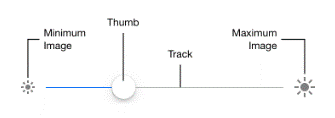
UISlider consist of various elements like a track - which gives us a range of values to select from, a thumb - which is a knob that helps us to select a desired value by sliding it over the track. As you move the thumb of a slider, it passes its updated value to any actions attached to it. The appearance of sliders is configurable; you can tint the track and the thumb, and provide images to appear at the ends of the slider (minimumValueImage and maximumValueImage). You can add sliders to your interface programmatically or by using Interface Builder.
Let’s start by creating our demo project.
1. Create a new Xcode 8 project
We’re going to create a Single View Application for our demo purpose.
2. Add UISlider to the view
In this demo we’re going to use storyboards to add the UISlider to our view. Drag the UISlider onto
your view in Main.Storyboard file and attach the elements to the IBOutlets and IBActions. From the Attributes Inspector we can give MinimumValueImage, MaximunValueImage, MinimunTrackColor, MaximumTrackColor, Slider minimum and maximum values etc according to our requirements.
The default UISlider doesn’t have few functionalities like the ticks or the tooltip that shows the value of the slider the user has just set, by moving the slider. So for that we are going to build our custom UISlider.
3. Build a custom UISlider subclass

And in your Main.storyboard file, go to your UISlider, and in the identity inspector give your custom class as CustomSlider.

4. Adding Ticks to Slider
Now to add the ticks to you slider we will insert a view below our slider. Make a property - noOfTicks - to define the no of ticks you want in your slider in CustomSlider.h class.
Add the following code in your CustomSlider.m class. This method will add a view to show the ticks on your slider.

Now you can simply call this method from ViewController.m class to add the ticks functionality to your slider.

So your slider now looks like this.

Now the purpose of ticks is that whenever you slide to a particular value, the knob snaps to the nearest tick mark. To implement the same we override the UIControl method in the UISlider subclass.

4. Adding ToolTip to UISlider
We can add another useful functionality to our UISlider and that is the ToolTip. Tooltip is used to provide a feedback to the user on which value he or she has just set by moving it.
To determine slider value whenever it is updated to a new value, we will have to override a few UIControl methods in the UISlider subclass implementation:

In beginTrackingWithTouch: we have to check if the touch is within slider’s knob boundary or not and the tooltip popup is then shown accordingly. We add a little fade-in/ fade-out effect on tooltip appearance/disappearance. Here tooltip is a custom UIView to show the slider value.

5. Adding ToolTip UIView Subclass
We have to build a small view to represent to slider value (give it a tooltip like appearance). For this we will create two paths using UIBezierPath : one will be a rectangle and the other will be a arrow attached to it. To give the desired appearance both the paths are merged together, and a float value is used to represent the slider’ knob position. We can do all of this in the drawRect: method of our subclass, through which we get updated view every time the value is changed.

So the slider with tooltip will look like this :

Conclusion
This post shows how you can customize a UISlider to add tick & snap functionality and also to show which value is set while you move the slider’s knob (tooltip). These functionalities are very useful, and with this customized class, it can be used as drop-in replacement, wherever you used UISlider view before. Thanks for reading.
