Making UI User Friendly in HTML
From the client’s perspective UI is no less important than back-end functionality. This is what creates the first impression of the product – what customer can look and feel. That’s why it’s important to keep forms and dialogs bright and clear.
In this article, a few tips described helping to make user interface simple and user friendly.
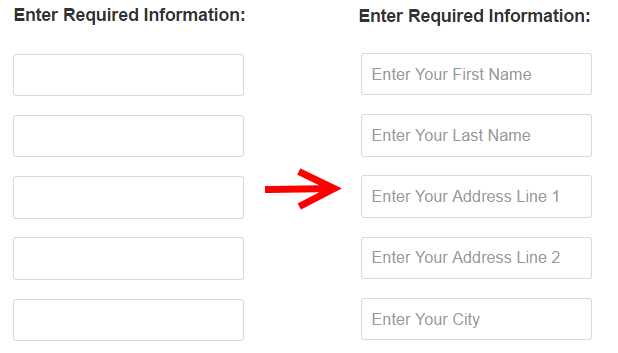
1. Using placeholders
Using placeholders helps to understand the meaning of the fields even if they don’t have labels.

HTML:
<div class="form-group row">
    <label for="FirstName" class="col-sm-4 col-form-label">First Name</label>
    <div class="col-sm-6">
        <input name="FirstName" type="text" class="form-control" placeholder="Enter Your First Name" required>
    </div>
</div>
<div class="form-group row">
    <label for="LastName" class="col-xs-4 col-form-label">Last Name</label>
    <div class="col-xs-6">
        <input name="LastName" type="text" class="form-control" placeholder="Enter Your Last Name" required>
    </div>
</div>
<div class="form-group row">
    <label for="AddressLine1" class="col-xs-4 col-form-label">Address Line 1</label>
    <div class="col-xs-6">
        <input name="AddressLine1" type="text" class="form-control" placeholder="Enter Your Address Line 1" required>
    </div>
</div>
HTML here and in the next examples is built on Bootstrap layout. Class form-group is used to group the fields and class row is used to display the fields lined. Columns are sized by classes col-sm-4 and col-sm-6 <label> and <input> are controls styled with classes col-form-label and form-control placeholder is a special attribute of control <input> which tells browser to display specific text hint on the control.
2. Using TABs for input fields.
When there are multiple fields it’s very convenient to use TAB button to switch between them. Most UI engines support assigning custom order TAB index for custom sequences which may help to make navigation smooth and clear.

HTML:
<div class="form-group row">
    <label for="FirstName" class="col-sm-4 col-form-label">First Name</label>
    <div class="col-sm-6">
        <input name="FirstName" type="text" class="form-control" placeholder="Enter Your First Name" tabindex="1" required>
    </div>
</div>
<div class="form-group row">
    <label for="LastName" class="col-xs-4 col-form-label">Last Name</label>
    <div class="col-xs-6">
        <input name="LastName" type="text" class="form-control" placeholder="Enter Your Last Name" tabindex="2" required>
    </div>
</div>
<div class="form-group row">
    <label for="AddressLine1" class="col-xs-4 col-form-label">Address Line 1</label>
    <div class="col-xs-6">
        <input name="AddressLine1" type="text" class="form-control" placeholder="Enter Your Address Line 1" tabindex="3" required>
    </div>
</div>
<input> control has attribute tabindex which defines the tab order of the element.
3. Using “Enter” button for default
Often when user pushes “Enter” button he or she expects the default behavior. For example, if user entered all necessary fields and pushed “Enter” it is usually expected that data is submitted to server.

HTML:
<form class="center-panel" id="centerform">

  .....

  <div class="form-group row">
     <div class="offset-xs-4 col-xs-10">
         <button type="submit" class="btn btn-primary">Submit</button>
     </div>
  </div>

</form>

<script type="text/javascript">
    $(document).keypress(function (e) {
        if (e.which == 13) {
            $("#centerform").submit();
        }
    });
 </script>
<form> is centralized with class center-panel and contains <button> control used to submit it. Javascript code uses jQuery event keypress to submit the form when "Enter" key is pressed. Parameter which defines which key was pressed and value 13 corresponds to "Enter"
4. Using specific controls and masks for DateTime/Currency/Colors etc.
It’s very convenient to use specialized controls/masks to fill in input fields.

HTML of using datepicker from jQuery UI (https://jqueryui.com/datepicker/):
<div class="form-group row">
    <label for="Date" class="col-xs-4 col-form-label">Date</label>
    <div class="col-xs-6">
        <input name="Date" type="text" id="datepicker" class="form-control" placeholder="Enter Date" tabindex="4" required>
    </div>
</div>

<script type="text/javascript">
   $("#datepicker").datepicker();
</script>
Control datepicker is defined on <input> with id datepicker by initializing in Javascript through jQuery plugin datepicker provided by jQuery UI
5. Using tolerant user input validation
Input validator should be flexible enough to process any user input entered with excessive spaces, brakes, dashes etc.

HTML of using validation with jQuery Validate (https://jqueryvalidation.org/):
<form class="center-panel" id="centerform">
    <div class="form-group row">
        <label for="PhoneNumber" class="col-xs-4 col-form-label">Phone Number</label>
        <div class="col-xs-6">
            <input name="PhoneNumber" type="text" class="form-control" placeholder="Enter Your Phone Number" tabindex="3" required>
        </div>
    </div>
</form>

<script type="text/javascript">
    $.validator.addMethod("phoneNumberFormat", function(value, element) {
        return value && value.replace(/\D+/g, "").length == 10;
    }, "Phone number should be a number with 10 digits");

    $("#centerform").validate({
       rules: {
                PhoneNumber: {
                    phoneNumberFormat: true,
                }
              }
    });
</script>
jQuery Validate function addMethod adds a new validation method and accepts validation name, validation function and validation message as parameters. Validation function accepts two parameters: target element and its value. In the code snippet validation function checks if phone number value is digits with length 10. Regular exception is used to replace all unneccessary symbols (whitespaces, dashes, etc.). The last block executing $("#centerform").validate() simply registeres the rule on form with id centerform and elements with name PhoneNumber.
6. Using error messages rather than a disabled button.
When button is disabled it confuses user because the reason why functionality is unavailable is not clear. It’s better to use an error message or a tip.

For jQuery Validate no code changes required, it will validate all forms on a page automatically on submittion.
7. Showing all controls at once, not popping up on input.
Layout transformations on popup may distract the user.
It’s better to show all controls at once and provide helpful tips if necessary.

HTML:
<div class="form-group row">
    <label for="Country" class="col-xs-4 col-form-label">Country</label>
    <div class="col-xs-6">
        <select class="form-control" name="Country" id="countrySelection">
            <option value="" disabled selected>Enter Your Country</option>
            <option value="USA">USA</option>
        </select>
    </div>
</div>
<div class="form-group row">
    <label for="State" class="col-xs-4 col-form-label">State</label>
    <div class="col-xs-6">
        <select class="form-control" name="State" id="stateSelection">
            <option value="">-- Select Country --</option>
        </select>
    </div>
</div>

<script type="text/javascript">
   $("#countrySelection").change(function () {
       var stateSelection = $("#stateSelection");

       var selected = this.value;
       if (selected) {
           stateSelection.empty();
           stateSelection.append($("<option></option>")
                         .attr("value", "")
                         .attr("disabled", "")
                         .attr("selected", "")
                         .text("Enter Your State"));

           stateSelection.append($("<option></option>")
                         .attr("value", "CA")
                         .text("CA"));
       }
   })
</script>
This example contains two fields Country and State behavior of which is defined in the Javascript block. jQuery event change is used to subscribe on change of Country <select> combobox When event triggers State combobox is filled with <option> elements which represent the <select> items. Attributes disabled and selected are set for the first element to make it as a tip for selection.
Points Of Interest
There are a lot of other tricks to make UI simple and user-friendly.
