Those who are working with Xamarin.Forms know that there is no out of the box support for charts/graphs in Xamarin Forms. If you want to show any data report in the form of charts/graph like Pie, Bar, etc. you will have to use third party graph controls like Syncfusion (Some Xamarin pre-built examples use these), Infragistics or Telerik controls and you have to pay license fee for same.
There is a little known open source plotting library for Xamarin Forms called OxyPlot, this library is not only free/Open source, It’s also easy to use. However, you may have to play around with code samples to understand the working of these graph controls. In this article, we will learn how to use a few of graph options OxyPlot.
- As usual, create a new Xamarin Forms XAML Project
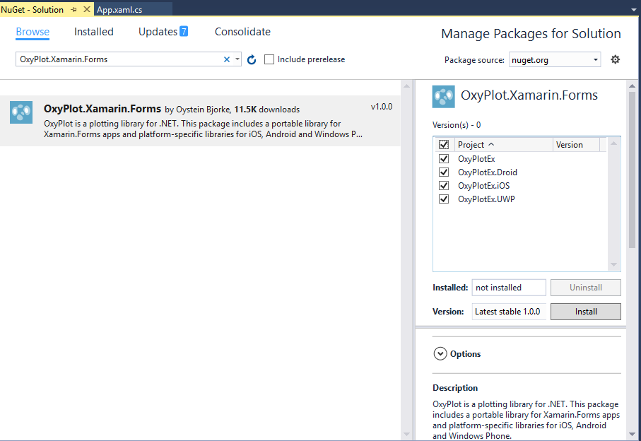
- Add the Nuget Package named ‘
OxyPlot.Xamarin.Forms’ to all your projects as shown in the below image:

- Just like Xamarin Forms, Oxyplot also needs to be initialized in the platform specific projects so that it can work.
- Add the following code in MainActivity.cs file of your Android project just after
global::Xamarin.Forms.Forms.Init(this, bundle); line in <strng>onCreate method:
OxyPlot.Xamarin.Forms.Platform.Android.PlotViewRenderer.Init();
- Similarly, add the following code in AppDelegate.cs file of your iOS project just after
global::Xamarin.Forms.Forms.Init(); line in <strng>FinishedLaunching method:
OxyPlot.Xamarin.Forms.Platform.iOS.PlotViewRenderer.Init();
- And in the same way, add the following code in App.xaml.cs file of your UWP project just after
Xamarin.Forms.Forms.Init(e); line in <strng>FinishedLaunching method:
OxyPlot.Xamarin.Forms.Platform.UWP.PlotViewRenderer.Init();
- Once the Oxyplot component is initialized in all the platform projects of the application, we can use the component in the same way as we use any user control in Xamarin Forms. For example, the following code is of the File “PieEx.xaml” where we are declaring the Oxyplot component with local namespace and then creating the control of the same.
="1.0"="utf-8"
<ContentPage xmlns="http://xamarin.com/schemas/2014/forms"
xmlns:x="http://schemas.microsoft.com/winfx/2009/xaml"
xmlns:oxy="clr-namespace:OxyPlot.Xamarin.Forms;assembly=OxyPlot.Xamarin.Forms"
x:Class="OxyPlotEx.PieEx">
<AbsoluteLayout>
<oxy:PlotView Model="{Binding PieModel}"
AbsoluteLayout.LayoutBounds="20,0,.9,.9"
AbsoluteLayout.LayoutFlags="WidthProportional,HeightProportional" />
</AbsoluteLayout>
</ContentPage>
As you can see from the code, the PlotView control requires Model to show the data, that’s why we have binded that property with PieModel which is the object of type PlotModel available in OxyPlot Library.
- The
ContentPage shown in the previous step is binded with the object of the following class, which has three properties named PieModel, AreaModel, BarModel, StackedBarModel all of type PlotModel as this same object is used to bind rest of 3 pages used in the example to show different types of graphs like Area, Stacked Bar and Normal Comparison Bar. These charts are created using hard coded values in the example, however you can use similar code to show any data you get from Web service or database.
public class OxyExData
{
public PlotModel PieModel { get; set; }
public PlotModel AreaModel { get; set; }
public PlotModel BarModel { get; set; }
public PlotModel StackedBarModel { get; set; }
public OxyExData()
{
PieModel = CreatePieChart();
AreaModel = CreateAreaChart();
StackedBarModel = CreateBarChart(true,"Stacked Bar");
BarModel = CreateBarChart(false, "Un-Stacked Bar");
}
private PlotModel CreatePieChart()
{
var model = new PlotModel { Title = "World population by continent" };
var ps = new PieSeries
{
StrokeThickness = .25,
InsideLabelPosition = .25,
AngleSpan = 360,
StartAngle = 0
};
ps.Slices.Add(new PieSlice("Africa", 1030) { IsExploded = false });
ps.Slices.Add(new PieSlice("Americas", 929) { IsExploded = false });
ps.Slices.Add(new PieSlice("Asia", 4157));
ps.Slices.Add(new PieSlice("Europe", 739) { IsExploded = false });
ps.Slices.Add(new PieSlice("Oceania", 35) { IsExploded = false });
model.Series.Add(ps);
return model;
}
public PlotModel CreateAreaChart()
{
var plotModel1 = new PlotModel { Title = "AreaSeries with crossing lines" };
var areaSeries1 = new AreaSeries();
areaSeries1.Points.Add(new DataPoint(0, 50));
areaSeries1.Points.Add(new DataPoint(10, 140));
areaSeries1.Points.Add(new DataPoint(20, 60));
areaSeries1.Points2.Add(new DataPoint(0, 60));
areaSeries1.Points2.Add(new DataPoint(5, 80));
areaSeries1.Points2.Add(new DataPoint(20, 70));
plotModel1.Series.Add(areaSeries1);
return plotModel1;
}
private PlotModel CreateBarChart(bool stacked, string title)
{
var model = new PlotModel
{
Title = title,
LegendPlacement = LegendPlacement.Outside,
LegendPosition = LegendPosition.BottomCenter,
LegendOrientation = LegendOrientation.Horizontal,
LegendBorderThickness = 0
};
var s1 = new BarSeries { Title = "Series 1",
IsStacked = stacked, StrokeColor = OxyColors.Black, StrokeThickness = 1 };
s1.Items.Add(new BarItem { Value = 25 });
s1.Items.Add(new BarItem { Value = 137 });
s1.Items.Add(new BarItem { Value = 18 });
s1.Items.Add(new BarItem { Value = 40 });
var s2 = new BarSeries { Title = "Series 2",
IsStacked = stacked, StrokeColor = OxyColors.Black, StrokeThickness = 1 };
s2.Items.Add(new BarItem { Value = 12 });
s2.Items.Add(new BarItem { Value = 14 });
s2.Items.Add(new BarItem { Value = 120 });
s2.Items.Add(new BarItem { Value = 26 });
var categoryAxis = new CategoryAxis { Position = CategoryAxisPosition() };
categoryAxis.Labels.Add("Category A");
categoryAxis.Labels.Add("Category B");
categoryAxis.Labels.Add("Category C");
categoryAxis.Labels.Add("Category D");
var valueAxis = new LinearAxis { Position = ValueAxisPosition(),
MinimumPadding = 0, MaximumPadding = 0.06, AbsoluteMinimum = 0 };
model.Series.Add(s1);
model.Series.Add(s2);
model.Axes.Add(categoryAxis);
model.Axes.Add(valueAxis);
return model;
}
private AxisPosition CategoryAxisPosition()
{
if (typeof(BarSeries) == typeof(ColumnSeries))
{
return AxisPosition.Bottom;
}
return AxisPosition.Left;
}
private AxisPosition ValueAxisPosition()
{
if (typeof(BarSeries) == typeof(ColumnSeries))
{
return AxisPosition.Left;
}
return AxisPosition.Bottom;
}
}
- As you can see from the above example, we can use the same
PlotModel type of object to show different types of data by adding different types of series object to it. - The sample code given in this article is published on Github and it has 3 more screens showing Area Graph, Stacked Bar Graph and Comparison Bar Graph.
- This is how the sample application looks like when executed in iOS simulator:

This article has just touched the surface of using Oxyplot controls to create different types of charts and graphs, you can experiment more with it by trying out their examples. Let me know if you need any particular graph example.
