CGroupLine
This article presents CGroupLine, a class derived from CStatic that adds a horizontal line to your static text, and includes support for XP Themes. The control looks similar to the controls used in Office 2003 (see Tools->Options in Word or Excel).

The control is called GroupLine because it is very similar to the standard GroupBox. The GroupLine control looks very much like the top edge of a GroupBox, and the purpose of both controls is to present dialog controls in logical groups. The difference is that the GroupLine is only the top Line of the GroupBox. GroupLine provides a nice way to bundle controls into logical groups (the whole point of a group control), but without the downside of the GroupBox (i.e. wasting valuable dialog real estate, on the left, right and bottom).
Features
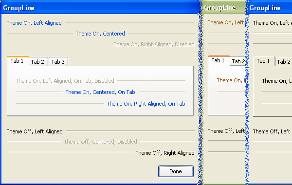
The image helps to demonstrate the main features of CGroupLine:
- Text can be left, center or right aligned
- The horizontal line takes up the remainder of the room in the control (a small gap is left between the text and line).
- Theme support is set to "Automatic" by default. The control checks to see if your application is theme-enabled (courtesy of some code from Nishant Sivakumar's article), and draws the controls appropriately. This automatic detection can be overridden, and theme support can be set on or off programmatically for each control (the three controls in the bottom-left have been turned off, while the six controls above them were left in the "Automatic" setting).
- By default, standard
GroupBoxes with themes are drawn the same way when enabled as when they are disabled. This seemed like an odd behaviour, so CGroupLine draws the disabled state with grayed-out text. - If the control is not theme-enabled (no manifest file present / Windows prior to XP / explicitly turned off) the control will still look fairly nice (see controls in the dialog on the right hand side of the image).
- The theme drawing code can be delay-loaded, so your application can be used in versions of Windows prior to XP (the theme drawing will only work on Windows XP, or later).
Using the control
Using the control is fairly simple. Essentially, you just associate a static text control with a member variable, and change the type of the member variable from CStatic to CGroupLine. The public portion of the class is listed here:
class CGroupLine : public CStatic
{
public:
enum eThemeControl {
eThemeAutomatic,
eThemeOff,
eThemeOn,
};
enum eDisabledThemeStyle {
eGrayIfDisabled,
eSameAsEnabled,
};
CGroupLine(eThemeControl useTheme = eThemeAutomatic,
eDisabledThemeStyle disabledThemeStyle = eGrayIfDisabled);
virtual ~CGroupLine();
void SetUseTheme(eThemeControl useTheme);
void SetDisabledThemeStyle(
eDisabledThemeStyle disabledThemeStyle);
A few notes about the code:
- Adding the control - The
CGroupLine class is derived from CStatic. To use the control, you just add a regular Static Text control to your dialog, and assign it an ID. Associate this control with a member variable (e.g. using the Add Member Variable Wizard), and change the type of the member variable from CStatic to CGroupLine. - Sizing - Stretch the control as wide as you want it in the dialog editor. The text is drawn, and whatever room is leftover is filled with the horizontal line.
- Horizontal alignment - If you want to change text alignment (i.e. Left / Right / Center), use the dialog editor to change the Align Text option in the Properties for the static control.
- Vertical alignment - Use the dialog editor to change the Center Image option in the Properties for the static control. If Center Image is true the text and the line will be centered vertically. If it is false, the text and the line will be placed at the top edge of the control space.
- Disabled state - By default, standard
GroupBoxes with themes are drawn the same way when enabled as when they are disabled. This seemed like an odd behaviour, so CGroupLine draws the disabled state with grayed-out text. To change this behaviour back to the default (i.e. drawing the enable and disabled state the same way) use the SetDisabledThemeStyle function or the optional parameter to the constructor. - Themes - To control the use of themes (to force them On or Off), use the
SetUseTheme function or the optional parameter to the constructor. - UNICODE - The control supports UNICODE or ANSI builds.
- Warnings - The code provided builds without any warnings at Level 4 in Visual Studio 2003.
Manifest files
The executable provided in the demo needs a manifest file to be present in order to draw the controls with the XP theme style. This following article explains how to embed the XP manifest in your executable, rather than providing a separate manifest file: Add Windows XP Theme Style to your current projects by Jiang Hong.
The method explained in that article works with this project, but I used a separate manifest file so it would be easy to see the effect of adding or removing the file (i.e. to see the control draw with the themes on or off without having to rebuild the project).
Delay loading UxTheme.Dll
The theme drawing is provided by UxTheme.Dll, which is provided only on Windows XP or later. You may have to delay-load UxTheme.Dll, if you want your application to run on versions of Windows prior to XP (e.g. Windows 2000).
To delay-load a DLL in Visual Studio 2003 (for other compiler versions, refer to the help):
- Configuration Properties->Linker->Input->Delay Loaded Dlls->Add-->"UxTheme.DLL" (without the quotes).
- You may also have to add support for delay loading DLLs: Configuration Properties->Linker->Input->Additional Dependencies->Add->"delayimp.lib" (without the quotes).
Credits
The code in this article includes a function BOOL CGroupLine::IsThemed() that is taken from Nishant Sivakumar's article: How to accurately detect if an application is theme-enabled.
History
- 2005-11-16: Version 1.0 - Initial release.
- 2008-11-18: Added VS 2005 demo
