[Note: It has been brought to my attention that this solution does not work properly with Opera, Safari, and a handful of other low-profile browsers. Most likely, the only portion of it that does not work correctly is the modified box-model (the IE vs Everyone Else section). You can work around this by rendering the site in standards mode, and telling IE that it should do the same.
Personally, I haven't ever had to take anything other than IE and Firefox into account on my projects. All of my clients have been of the opinion that the 2-4% of web users who were not using Firefox or IE weren't in their target demographic, and that even if they were, they probably had access to Firefox or IE, and could suffer the hassle of viewing the site through those browsers. (I can hear the lynch mob coming with their pitchforks and torches.)
If you modify this code to work in any of those browsers, let me know, and I'll post your modifications and give you the credit you deserve for trudging through that tedious work.]
Introduction
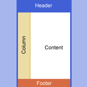
I often find myself performing the same layout code for various projects. Nearly always, I am trying to use DIVs rendered using CSS to achieve a site layout that looks something like this:

Making this layout work in both IE and Firefox is nontrivial, and nearly always headache inducing. In this article, I provide a basic layout that can be tweaked to work for just about any project.
The layout involves several common elements: a header, two full-length columns, and a footer. Getting this layout to work correctly involves working around several frustrating problems.
The Basic Divs
The first thing to do is actually create the HTML that we will be manipulating via CSS. The basic HTML looks like this:
<div id="Wrapper">
    <div id="Header"></div>
    <div id="Column"></div>
    <div id="Content"></div>
</div>
<div id="Footer"></div>
IE vs Everyone Else
Next, we have the problem of IE rendering everything differently than everyone else. To solve this, we include the following definition in our CSS sheet:
Div
{
-moz-box-sizing:border-box;
box-sizing:border-box;
margin:0;
padding:0;
}
This essentially tells Firefox to render <div>s in the same way that IE does, which is non-standard, but more intuitive to me.
Min-Height of 100%
OK. Now the site's rendering the way I expect it to. Next, we want the main content of the site to render at 100% height or greater. To do this, we add the following element to our CSS:
#Wrapper
{
display: table;
border: solid 3px #4160D5;
margin: auto;
width: 800px;
height: 100%;
padding-bottom: 47px;
}
The items to note here are the display:table and the height:100%. The display:table item tells Firefox to render the #Wrapper element as if it is rendering a table, which means that it will expand to fit its children. The height:100% specifies that the #Wrapper element will be at least the full height of the browser window.
Same-Height Columns
Moving right along. It turns out that getting columns to render at the same height is a real pain using only DIVs and CSS. There is a solution known as pseudo columns, which involves simulating a column using a tiling background image. I don't like that solution. So, after Googling for a while, I came across a much more agreeable solution.
What we do, is make our columns huge, and tell their containing element to hide excessive, unused column space. This requires several modifications to our CSS. First, we add the following to our CSS column items:
padding-bottom: 32767px;
margin-bottom: -32767px;
What this does is push the bottom of the column way down using padding, then bring it right back up again using a negative margin. Basically, this creates a large column that has lots of unused space - space that the browser knows is unused. So now, we add the following to our CSS:
html>body #Wrapper {overflow:hidden;}This basically tells Firefox that the container (#Wrapper) is to hide any unused space in its children. For some reason, IE7 doesn't work correctly if you specify overflow:hidden on the container, so we add this line specifically for Firefox.
That Dern Footer
Finally, we want our footer to hang out at the bottom of the page. We do that with the following CSS definition:
#Footer
{
margin: auto;
background: #D66C43;
margin-top: -50px;
height: 50px;
width: 800px;
border: solid 3px #4160D5;
border-top: 0;
color: #FFF;
}
You'll note that its margin-top is set to the negative value of its height. Without this, the footer would sink beneath the bottom of the screen. This pulls it back up to its appropriate position. We also want the footer to be the same width as our primary wrapper element, and to have auto margins so that Firefox centers it.
It should also be noted that the footer will now be crammed up into the main content of our page. We don't want this, so we add padding to the bottom of our wrapper (if you scroll back up to the wrapper CSS code, you'll notice it is already there).
Whew!
Well, that's that. You can download the source to get the complete picture and start manipulating it to look the way you want. I tested this in the latest version of Firefox and IE7. It's currently being used in my blog. Special thanks goes out to alistapart, a continually useful site. I'm sure they would hate my solution, but that's beside the point. Also, I'd like to thank the guy who wrote this article.
