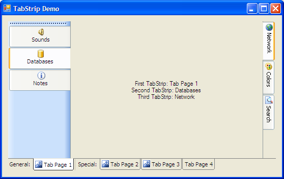
Introduction
With the introduction of .NET Framework 2.0, we have got a set of Strip controls, like MenuStrip and ToolStrip. They have rich design-time and run-time features and flexible interfaces. So the idea was to create a ToolStrip-like tab control supporting formatting in tab headers, animated icons, tab headers at any side, run-time tab reordering, tab grouping, and other stuff we miss in the Windows Forms TabControl.
Background
To implement the TabStrip and TabStripButton classes, we should use ToolStrip and ToolStripButton. Drawing should be performed via a ToolStripRenderer derived class - it's more flexible than painting in OnPaint. To use the current Windows XP theme, we ought to use methods from the System.Windows.Forms.VisualStyles namespace. The framework already wraps the uxTheme.dll, so we can go without a lot of P/Invoke calls.
We have to provide at least two ways for painting the interface: using visual styles, and without using them (we cannot use uxTheme on systems that don't support themes). So, let's add a theming check:
private bool useVS = Application.RenderWithVisualStyles;
public bool UseVS
{
get { return useVS; }
set
{
if (value && !Application.RenderWithVisualStyles)
return;
useVS = value;
}
}
ToolStrip generally has a few RenderModes: System, Professional, etc. So, if we want to paint an interface using any of them, we can either make derived classes from each Renderer class, or make one ToolStripRenderer derived class and use instances of the needed type within it. It will look like this:
private ToolStripRenderer currentRenderer = null;
private ToolStripRenderMode renderMode = ToolStripRenderMode.Custom;
public ToolStripRenderMode RenderMode
{
get { return renderMode; }
set
{
renderMode = value;
switch (renderMode)
{
case ToolStripRenderMode.Professional:
currentRenderer = new ToolStripProfessionalRenderer();
break;
case ToolStripRenderMode.System:
currentRenderer = new ToolStripSystemRenderer();
break;
default:
currentRenderer = null;
break;
}
}
}
Now, our toolbar's behavior should depend on its orientation. For this, we can use the ToolStrip.Orientation property. But it solves only one half of the problem. We still don't know at which side our TabStrip is docked. Theoretically, we can refer to the Dock and Parent properties to determine this, but in most cases, we know where our bar is located. So, we'll only make a property which determines if tab headers should be flipped.
private bool mirrored = false;
public bool Mirrored
{
get { return mirrored; }
set { mirrored = value; }
}
The rest of the TabStripRenderer class is code for drawing, and nothing more interesting.
So we can go straight to the TabStripButton class. It extends the ToolStripButton with some new properties:
HotTextColor - Text color when mouse hovers TabStripButton.
SelectedTextColor - Text color when TabStripButton is SelectedTab.
SelectedFont - Font when TabStripButton is SelectedTab.
IsSelected - Gets or sets if tab is selected.
Also, we have to shadow the Checked, Padding, and Margin properties to avoid the user from breaking the pretty interface. These properties are also removed from the designer properties window.
Now, about the TabStrip class. It provides some new properties, most of them are wrappers for properties of the internal TabStripRenderer class.
UseVisualStyles - specifies if the system visual styles should be applied. If system does not support themes, this property is ignored, and the painting goes the custom way.
FlipButtons - specifies if the buttons should be drawn flipped. Set this to true if TabStrip should display tabs on the right or bottom side.
RenderStyle - property to use instead of RenderMode. Renderer and RenderMode are shadowed (for normal behavior), and removed from the designer property window.
Design-time support
First of all, we need to register TabStripButton as an available control for ToolStrip:
[ToolStripItemDesignerAvailability(ToolStripItemDesignerAvailability.ToolStrip)]
public class TabStripButton : ToolStripButton
Note that the class should be declared as public.

Now, let's add the "Insert tab page" option in TabStrip's designer menu:
DesignerVerb insPage = null;
protected void InitControl()
{
insPage = new DesignerVerb("Insert tab page",
new EventHandler(OnInsertPageClicked));
}
public override ISite Site
{
get
{
ISite site = base.Site;
if (site != null && site.DesignMode)
{
IContainer comp = site.Container;
if (comp != null)
{
IDesignerHost host = comp as IDesignerHost;
if (host != null)
{
IDesigner designer =
host.GetDesigner(site.Component);
if (designer != null &&
!designer.Verbs.Contains(insPage))
designer.Verbs.Add(insPage);
}
}
}
return site;
}
set
{
base.Site = value;
}
}
protected void OnInsertPageClicked(object sender, EventArgs e)
{
ISite site = base.Site;
if (site != null && site.DesignMode)
{
IContainer container = site.Container;
if (container != null)
{
TabStripButton btn = new TabStripButton();
container.Add(btn);
btn.Text = btn.Name;
}
}
}
The result looks like this:

Summary
So, we have a new flexible control now. Unlike TabControl, it's not a container control, but it can be combined with other controls to simulate a container. And when tabs are needed for navigation, it leaves TabContol in the dust. And visual styles and rich picture support will make your application more cute and friendly.
History
- 30.05.2006 - The very first version.
