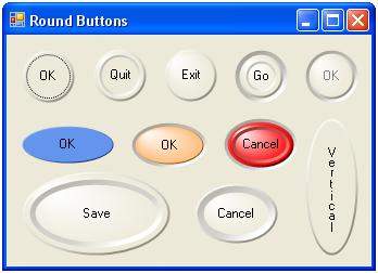
Introduction
Some time ago, I tried to find a nice round-button control. I couldn't find one, so in the time-honoured tradition, I decided to write my own. I "almost" finished it, but for various reasons, it was consigned to the "come back to it later" category. In its inimitable style, "later" finally arrived, and armed with my shiny new Microsoft Visual C# 2005 Express Edition, I decided to have a crack at finishing it.
Though I say it myself, I think the buttons look nice - you'll have to judge for yourself! They look even better "in the flesh", rather than as the JPEGs in this article.
Background
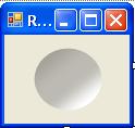
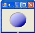
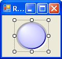
In my quest for a round button control, I came across a couple of articles (including one by the great man Chris Maunder himself!) which seemed to me and my Very Small Brain to have far too much complicated mathematics involved. Also, I'd been learning about graphics in C#, and doing a lot of experimenting with groovy things like the PathGradientBrush, taking much inspiration from the very excellent Bob Powell site. Probably, by chance, I forget exactly how, I stumbled upon the idea of layering ever decreasing circles filled with LinearGradientBrushes and PathGradientBrushes one above the other to build up a passable 3-D button. The following images illustrate this:
Hover your cursor for a description.
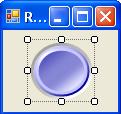
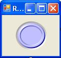
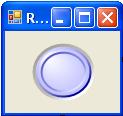
How It Works
Well, putting lots of circles one on top of another is how it works, in essence. The control is derived from the Button class, and overrides the OnPaint method, where all the drawing is done. I've added some new properties:
RecessDepth - how far the button is set back into the containing surfaceBevelHeight - the size of the "outer" bevel of the button topBevelDepth - the size of the "inner" bevelDome - whether or not the button has a "rounded" top
These have all been added to the Button Appearance category of the Properties panel by decorating them with the appropriate attributes. In addition, I wrote a custom drop-down UITypeEditor for the RecessDepth property. I would never have managed this without Chris Sells' excellent book Windows Forms Programming in C#, and I recommend it highly - I won't attempt to explain how the UITypeEditor works, as it's covered in a sample online chapter which discusses all aspects of Design Time IDE Integration (although I do own the actual book too!).
NB: To get the ToolboxBitmap attribute to work properly, I had to add this dummy class, as suggested by that man Bob Powell, again in this article: ToolboxBitmap.
internal class resfinder
{
}
.
.
.
.
[Description("Round (Elliptical) Button Control"),
ToolboxBitmap(typeof(resfinder), "RoundButton.Images.RoundButton.bmp")]
public class RoundButton : System.Windows.Forms.Button
Noteworthy Sections of Code
This is the overridden OnPaint method. Nothing too exciting, but I've included it for reference.
protected override void OnPaint(PaintEventArgs e)
{
    buttonColor = this.BackColor;
    edgeColor1 = ControlPaint.Light(buttonColor);
    edgeColor2 = ControlPaint.Dark(buttonColor);

    Graphics g = e.Graphics;
    g.SmoothingMode = SmoothingMode.AntiAlias;

    Rectangle buttonRect = this.ClientRectangle;
    edgeWidth = GetEdgeWidth(buttonRect);

    FillBackground(g, buttonRect);

    if (RecessDepth > 0)
    {
        DrawRecess(ref g, ref buttonRect);
    }

    DrawEdges(g, ref buttonRect);

    ShrinkShape(ref g, ref buttonRect, edgeWidth);

    DrawButton(g, buttonRect);

    DrawText(g, buttonRect);

    SetClickableRegion();

}
Next is the DrawRecess method, which creates the illusion of the button being set into the form surface. The Blend object allows you to specify at which points across the rectangle, and by how much, the two colours in the LinearGradientBrush are blended. I arrived at these parameters by trial and error until it looked right to me, so they are purely subjective. ControlPaint.Dark and ControlPaint.Light are extremely useful here, because they create lighter and darker shades of the parent background colour. This, of course, assumes that the illusion we want to create is that of a form made of a solid piece of coloured material, rather than one which is still grey but has been painted a different colour. If that's what you'd prefer, then simply change Parent.BackColor to Color.FromKnownColor(KnownColor.Control).
The interesting thing I found here was the "Using this second smaller rectangle..." part. I use the same technique again in the BuildGraphicsPath method, and although it creates much smoother curves, I have no idea how or why it actually works. But then, how many of us really know how TV works...?
protected virtual void DrawRecess(ref Graphics g, ref Rectangle recessRect)
{
LinearGradientBrush recessBrush = new LinearGradientBrush(recessRect,
ControlPaint.Dark(Parent.BackColor),
ControlPaint.LightLight(Parent.BackColor),
GetLightAngle(Angle.Up));
Blend recessBlend = new Blend();
recessBlend.Positions = new float[] {0.0f,.2f,.4f,.6f,.8f,1.0f};
recessBlend.Factors = new float[] {.2f,.2f,.4f,.4f,1f,1f};
recessBrush.Blend = recessBlend;
Rectangle rect2 = recessRect;
ShrinkShape(ref g, ref rect2, 1);
FillShape(g, recessBrush, rect2);
ShrinkShape(ref g, ref recessRect, recessDepth);
}
You'll notice a copious amount of ShrinkShape(ref g, ref edgeRect, 1); statements in the source. This is the method by which the "ever decreasing circles" are created. I use a ref parameter so that the rectangle in question just keeps getting smaller.
To draw the domed top, I simply use this bit of code in the DrawButton method. The default value for cColor is White, so if we want a domed top, we set the CenterColor to white, and calculate a CenterPoint based on the size of the button.
pgb.CenterColor = buttonColor;

if (dome)
{
    pgb.CenterColor = cColor;
    pgb.CenterPoint =
        new PointF(buttonRect.X + buttonRect.Width / 8 + buttonPressOffset,
                   buttonRect.Y + buttonRect.Height / 8 + buttonPressOffset);
}

FillShape(g, pgb, buttonRect);
Drawing the text on the button is accomplished with the DrawText method, shown below. It uses the Font and ForeColor properties inherited from the base Button class. I used my VerticalString class to write upright text if the button's height is more than twice its width. VerticalString was the subject of a previous CodeProject article here, and I've included the source in the project download for completeness. I also had to ensure that where possible, the button text stays within the bounds of the button. As part of this process, I had to convert the alignment of the text from ContentAlignment to StringAlignment. Finally, I check to see if the button is disabled, and if so, I "grey out" the text.
protected void DrawText(Graphics g, Rectangle textRect)
{
labelStrFmt = new StringFormat();
labelBrush = new SolidBrush(this.ForeColor);
labelFont = this.Font;
vs = new VerticalString();
vs.TextSpread = .75;
bool verticalText = false;
if (textRect.Height > textRect.Width * 2)
{
verticalText = true;
}
labelStrFmt.Alignment = ConvertToHorAlign(this.TextAlign);
labelStrFmt.LineAlignment = ConvertToVertAlign(this.TextAlign);
if ((!verticalText & (labelStrFmt.LineAlignment != StringAlignment.Center)) |
(verticalText & (labelStrFmt.Alignment != StringAlignment.Center)))
{
textRect.Inflate(-(int)(textRect.Width/7.5),
-(int)(textRect.Height/7.5));
}
textRect.Offset(buttonPressOffset, buttonPressOffset);
if (!this.Enabled)
{
textRect.Offset(1, 1);
labelBrush.Color = ControlPaint.LightLight(buttonColor);
WriteString(verticalText, g, textRect);
textRect.Offset(-1, -1);
labelBrush.Color = Color.Gray;
}
WriteString(verticalText, g, textRect);
}
The illusion of the button being pressed is achieved in the two small methods below. When the user presses the button, the buttonPressOffset variable is set to 1, and the virtual light angle is altered so that the top left of the button becomes dark, and the bottom right becomes light, creating the impression that the button has receded into the form surface. When the button is released, the values revert to normal.
protected void buttonDown()
{
    lightAngle = Angle.Down;
    buttonPressOffset = 1;
    this.Invalidate();
}

protected void buttonUp()
{
    lightAngle = Angle.Up;
    buttonPressOffset = 0;
    this.Invalidate();
}
Finally, a Couple of Points...
The RoundButton control only supports FlatStyle.Standard. I wrote some code for FlatStyle.Flat and FlatStyle.Popup, which worked OK, but I wasn't completely happy with either the code or the results, so I took it out.
If you look at the source, you might notice a Region called Overrideable shape-specific methods, containing uninspiring methods like these:
protected virtual void AddShape(GraphicsPath gpath, Rectangle rect)
{
    gpath.AddEllipse(rect);
}


protected virtual void DrawShape(Graphics g, Pen pen, Rectangle rect)
{
    g.DrawEllipse(pen, rect);
}
Why not just call AddEllipse, rather than AddShape? Well, I've also written some other classes such as TriangleButton and DiamondButton which obviously don't use AddEllipse, or anything else to do with ellipses, so I wanted to be able to override the methods in the code for the other shapes. I didn't include the other shapes here, partly because I decided that some of the code had got a bit messy, and needed more reworking than I had time to do now, and because frankly they didn't look as good as the round ones!
To use the buttons in another project, just add a reference to RoundButton.dll, and the RoundButton icon should appear in the Toolbox. (You might have to do Tools -> Choose Toolbox Items to add it manually.)
That's the end of the article. I hope you found it interesting, and like the buttons!
