Introduction
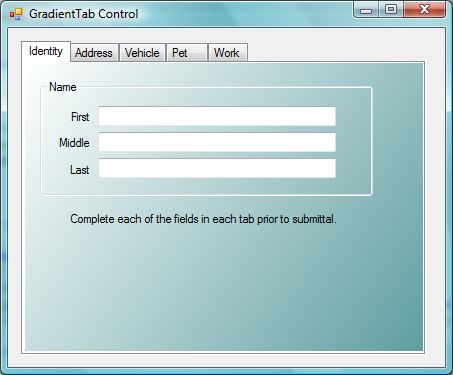
This article describes a quick and simple approach to creating a tabbed custom control with a gradient background. In this example, the standard Windows Forms Tab control is extended to provide a persistent gradient background; this differs from using an approach where a gradient background is created directly against the graphics context of each of the control’s tab pages. Even though the background is persistent, it is dynamically updated whenever it is resized or painted. Figure 1 illustrates the control in use:

Figure 1. Gradient Tab Control in Use
In contrast, adding the gradient to the graphics context for each tab page dynamically, may lead to less than desirable results. In figure 2, the gradient is added dynamically against the graphics context of each tab page in the tab control. The controls shown on the tab page actually have their background colors set to transparent, but as you can see in the figure, the area behind the group panel and label control appears to be white. Naturally, you may draw a gradient on the background of each of the controls, but it would be difficult to match the gradient on the control with the gradient on the background, and it still likely would not look that great due to any mismatches in the patterns. At any rate, there is a much simpler solution.

Figure 2. Standard Tab Control with Gradient Added
Getting Started
In order to get started, start up the Visual Studio 2005 IDE and open the included project. The solution consists of a WinForms project with a single form and a single custom control included. The form is used as a test bed for the custom control, and the custom control is an extension of the standard Windows Forms Tab control. Figure 3 shows the Solution Explorer for this project:

Figure 3. Solution Explorer
The Code: Main Form
The main form of the application does not contain any meaningful code; the form itself contains a single instance of the GradientTab control, and the GradientTab control is configured through the property editor for the purpose of the control test.
As the main form is trivial, I will not describe it any further in this document.
The Code: The GradientTab Control
The GradientTab control is a custom control built to extend the standard Windows Forms Tab control; the only additions made to the standard control are those required to render the gradient background behind each of the tab pages at run time.
If you open the code up and examine the imports, you will note the following imports prior to the namespace and class declaration.
using System;m;
using System.Collections.Generic;
using System.ComponentModel;
using System.Data;
using System.Drawing;
using System.Drawing.Drawing2D;
using System.Text;
using System.Windows.Forms;

namespace GradientTabControl
{
    public partial class GradientTab :
           System.Windows.Forms.TabControl
    {
As you can see in the code provided, there is little added to the default imports used in the class. The System.Drawing.Drawing2D reference is added, and is required to support some of the activity in this class.
After the class declaration, the code creates two member variables used to hold the beginning and ending colors of the gradient. After the declaration of these two variables, the initialization and paint event handlers for the custom control are managed:
System.Drawing.Color StartColor;
System.Drawing.Color EndColor;
public GradientTab()
{
InitializeComponent();
RepaintControls();
}
protected override void OnPaint(PaintEventArgs pe)
{
RepaintControls();
}
The RepaintControls method called in the class constructor and on the Paint event is described next:
private void RepaintControls())
{
    foreach (TabPage ctl in this.TabPages)
    {
        System.Drawing.Drawing2D.LinearGradientBrush gradBrush;
        gradBrush = new System.Drawing.Drawing2D.LinearGradientBrush(new
        Point(0, 0),
        new Point(ctl.Width, ctl.Height), PageStartColor, PageEndColor);

        Bitmap bmp = new Bitmap(ctl.Width, ctl.Height);

        Graphics g = Graphics.FromImage(bmp);
        g.FillRectangle(gradBrush, new Rectangle(0, 0, ctl.Width,
        ctl.Height));
        ctl.BackgroundImage = bmp;
        ctl.BackgroundImageLayout = ImageLayout.Stretch;
    }
}
In this method, each page in the tab control is examined, and a linear gradient brush is created and configured to match the area of the tab page; the start and end color (which exist as properties) are passed to the new instance of the brush to define the gradient.
A bitmap is then created and sized to the height and width of the tab page. The graphics for the bitmap is captured and then the FillRectangle method is called to draw the gradient on the drawing surface of that bitmap. Once the bitmap has been created, the tab page’s background image is set to point to the bitmap and the background image layout is set to the Stretch mode.
As we are setting the tab page’s background image to the dynamically generated image, the gradient background and the controls placed on it are not subject to the same problems that might be observed if the gradient were drawn directly on the tab page.
The next bit of code in the control is used to invoke the RepaintControls method in response to resizing:
private void GradientTab_Resize(object sender, EventArgs e)
{
    RepaintControls();
}
After that, the properties used to set the starting and ending colors for the gradients are set up:
public System.Drawing.Color PageStartColor
{
    get
    {
        return StartColor;
    }
    set
    {
        StartColor = value;
        RepaintControls();
    }
}


public System.Drawing.Color PageEndColor
{
    get
    {
        return EndColor;
    }
    set
    {
        EndColor = value;
        RepaintControls();
    }
}
At design time, the control user may set these properties in the property grid, or the values may be set in the code.

Figure 4. Properties for Start and End Colors
Summary
This article described an approach to making a persistent gradient background on a tab control based custom control. The control provided in the example could be dropped into other projects and used as is. The purpose of the control was to provide a tool for making gradient tab pages in a tab control without reliance upon drawing the gradient directly on the graphics context of the tab page.
