Introduction
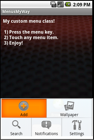
For the last year now, I have found myself concentrating on primarily Android development. Like any platform, Android has its plusses and minuses. In my opinion, falling into that latter category is the system generated menu bar. The Android SDK gives an application developer very little room to customize this widget. While I appreciate the idea of UI consistency throughout the platform, the white menus with orange highlights Google chose for this widget are likely to clash with just about any color scheme an app developer might come up with. Besides being tough on the eyes, I take some other issues with the built-in menu widget. First, I don’t get to explicitly control how many menu items are displayed on a single line. The control limits me to two total lines of menu options, after which I have to switch to the dreaded “more” menu. And finally, I’m not a big fan of how menu items align themselves with one another when the second row on the menu has fewer options than the first. The image below shows my app running on Android 1.6 using the default menu implementation. As you can see, it’s not very pretty.

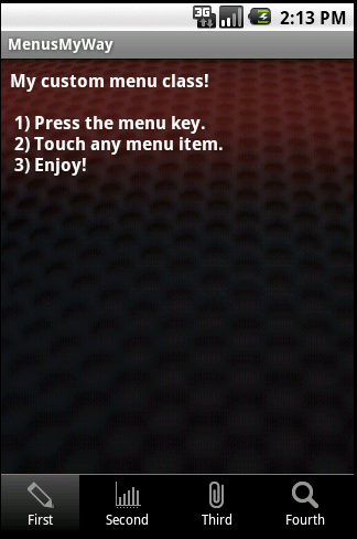
I suspected being an open platform, it wouldn’t take me long to implement my own menu system that overrides the default Google provided one. I was wrong. I saw plenty of people asking the same questions I had in numerous forums throughout the internet, but there were very few if any responses besides: “learn to love orange”. Eventually, I did manage to cobble something together using the popup window class. Thanks to CodeProject, I am sharing that implementation with you. I realize there is plenty of room for improvement for my menu helper classes, but I believe the code is at least a good starting point, and will save a resourceful developer a good deal of time. The image below shows my menu against the same application window. While you may not care for the color scheme in general, at least there is a unified feel. More importantly, using my helper classes, you can tweak the menu look until your heart is content.

Using the Code
The key to creating my menu class turned out to lay largely in me stumbling across the PopupWindow class in the SDK, then subsequently wading through the sometimes confusing documentation and examples. All of the code handling the PopupWindow is found in my CustomMenu class. If you choose to layout your menu using a table, as I have done, you shouldn’t really need to modify this class. What you will need to do is, tweak a couple resource files unless you just happen to be looking for a grey menu bar. Let’s first look closer at the layouts.
custom_menu.xml
="1.0"="utf-8"
<LinearLayout xmlns:android="http://schemas.android.com/apk/res/android"
android:orientation="vertical"
android:layout_width="fill_parent"
android:layout_height="fill_parent"
android:background="#000000"
android:padding="0dip"
android:focusable="true"
android:focusableInTouchMode="true"
android:clickable="true">
<ImageView
android:layout_width="fill_parent"
android:layout_height="wrap_content"
android:scaleType="fitXY"
android:gravity="center"
android:src="@drawable/custom_menu_header"/>
<TableLayout
android:layout_width="fill_parent"
android:id="@+id/custom_menu_table"
android:layout_height="wrap_content"
android:stretchColumns="*"
android:focusable="true"
android:focusableInTouchMode="true">
</TableLayout>
</LinearLayout>
This file is the linear layout responsible for placement of the gray bar that separates the menu from the rest of your app, the menu background color (or image if you like), and finally the table which will hold the view for individual menu items.
custom_menu_item.xml
="1.0"="utf-8"
<LinearLayout xmlns:android="http://schemas.android.com/apk/res/android"
android:orientation="vertical"
android:layout_width="fill_parent"
android:layout_height="wrap_content"
android:gravity="center"
android:layout_gravity="center"
android:padding="4dip"
android:clickable="true"
android:background="@drawable/custom_menu_selector">
<ImageView
android:id="@+id/custom_menu_item_icon"
android:layout_width="fill_parent"
android:layout_height="wrap_content"
android:gravity="center"
android:paddingBottom="2dip"
android:paddingTop="2dip"/>
<TextView
android:id="@+id/custom_menu_item_caption"
android:layout_width="wrap_content"
android:layout_height="wrap_content"
android:textColor="#ffffff"
android:textSize="12sp"
android:gravity="center"/>
</LinearLayout>
The custom menu item layout is responsible for defining the view that will get dropped inside of each cell in the table that contains the menu. Currently, I am displaying an image centered over a line of text. One thing to note here is the background attribute. This I am assigning to a custom selector so that I can define how the item looks when the user taps it. The other layout in the layout folder is the main.xml file. This has little to do with the actual custom menu classes but rather is the layout for the demo itself. The remainder of the interesting resources for customizing the menus can be found in the drawable folder.
custom_menu_selector.xml
<selector xmlns:android="http://schemas.android.com/apk/res/android">
	<item	android:state_pressed="true"
			android:drawable="@drawable/menu_item_pressed" />
	<item 	android:drawable="@drawable/menu_item_bg" />
</selector>
Here is where I am defining the behavior for the background of individual menu items. At rest, I simply use an image with a black back drop. However, when the item is tapped, I replace the image with a nice gray gradient.
Now that we have our resources in place, let’s take a look at how to actually use the helper classes in your application.
The Demo.java file serves as an example on how to use the helper classes in your own code. The steps are pretty straight forward. First, you need to create a collection of individual menu items. The process as it exists now is a bit tedious but did the trick.
ArrayList<CustomMenuItem> menuItems = new ArrayList<CustomMenuItem>();
CustomMenuItem cmi = new CustomMenuItem();
cmi.setCaption("First");
cmi.setImageResourceId(R.drawable.icon1);
cmi.setId(1);
menuItems.add(cmi);
cmi = new CustomMenuItem();
cmi.setCaption("Second");
cmi.setImageResourceId(R.drawable.icon2);
cmi.setId(2);
menuItems.add(cmi);
etc…
Once you have an array list of your individual menu items, you need to instantiate a new custom menu. The constructor requires a context, a listener, and a layout inflater. If you’ve done much Android development, you know that generally you can pass context simply by sending the keyword “this” as a parameter. The listener is a standard part of Java, and in this case is defined as an interface for the CustomMenu class. So you need to add an “implements” clause to your activity’s constructor:
public class Demo extends Activity implements OnMenuItemSelectedListener {
And you will also have to add a callback for the listener:
@Override
public void MenuItemSelectedEvent(CustomMenuItem selection) {
}
We can come back later and fill in the body for the message handler. Once our activity implements the OnMenuItemSelectedEvent, we are now missing just one piece before we can instantiate our CustomMenu class. This is a layout inflater.
Requiring the CustomMenu class to receive a layout inflater from the parent is a bit odd, I confess. The problem was I couldn’t figure out how to get a layout inflater from within the context of the CustomMenu class and PopupWindow. Luckily, getting the layout inflater from inside the main activity takes zero effort. A call to getLayoutInflater() and we are ready to begin.
CustomMenu mMenu = new CustomMenu(this, this, getLayoutInflater());
Once the menu has been created, we have to assign our menu items to it. If you aren’t sure, check the isShowing property prior to assigning or reassigning the menu item list as it will throw an exception if you try to change the content of a visible menu.
if (!mMenu.isShowing()){
       try {
       mMenu.setMenuItems(menuItems);
} catch (Exception e) {
       AlertDialog.Builder alert = new AlertDialog.Builder(this);
	alert.setTitle("Egads!");
	alert.setMessage(e.getMessage());
	alert.show();
}
}
At this point, we could display our menu by calling the show method, but there are a couple other items we can use in the helper class to further customize the menu.
mMenu.setHideOnSelect(true);
This method controls whether or not the menu is automatically closed when the user makes a selection.
mMenu.setItemsPerLineInPortraitOrientation(4);
This is the preferred number of menu items to display on a single line when the phone is in portrait orientation.
mMenu.setItemsPerLineInLandscapeOrientation(8);
Finally, here is the preferred number of menu items to display on a single line with the phone is in landscape orientation.
To invoke our custom menu when someone hits the menu key, we just override the onKeyDown handler in our main activity.
public boolean onKeyDown(int keyCode, KeyEvent event) {
if (keyCode == KeyEvent.KEYCODE_MENU) {
if (mMenu.isShowing()) {
mMenu.hide();
} else {
mMenu.show(findViewById(R.id.any_old_widget));
}
return true;
}
return super.onKeyDown(keyCode, event);
}
The override is pretty straight forward. We use the menu key as a toggle. So if you press the key and the menu is currently showing, it will be hidden, and vice-versa. Currently the menu does not go away when pressing the back key. This can be handled though simply as another override. A little more trick would be to hide the menu when the user touches the screen outside the menu itself. This is accomplishable through the PopupWindow class onTouchInterceptor and the setOutSideTouchable property.
Notice that when calling the show function of the menu, we must send it a view. This is so the popup window can borrow a window token from the parent. It really doesn’t matter what view on the parent you pass in as long as you give it one.
Once the menu displays, the only thing that remains is to handle the menu item selection events in our main activity. For the demo, it is sufficient to just toast the user selection to the display.
@Override
public void MenuItemSelectedEvent(CustomMenuItem selection) {
	Toast t = Toast.makeText(this,
"You selected item #"+Integer.toString(selection.getId()), Toast.LENGTH_SHORT);
	t.setGravity(Gravity.CENTER, 0, 0);
	t.show();
}
And there you have it, a replacement for those standard Android menus.
Points of Interest
The helper classes provided here are more than usable. However, they are not as simple as a drop in replacement for the built-in menu widgets. I suspect they could be, given time and refinement, but for now they are meeting my needs. One thing experienced Android users might notice these custom menus lack is the ability to give focus to, and thus select or highlight a menu item without actually clicking the item and generating the select event. I started to implement this and found it was tricky because of how focus is handled and subsequent key presses once focus leaves the main activity. It’s not really critical to my application, but if anyone reading this post comes up with a solution and doesn’t mind sharing, I’d be happy to update my class and repost.
History
- (v)01.00 Initial release 03/24/2011
