I have been working on Silverlight since 3 years and during the initial period, I had a fear about creating a Custom control. I was more confident creating UserControls. But when I started working on custom control, I came to know the power of custom control. Currently, I am seeing the same fear in others and hence decided to write a series which will be beneficial for beginners.
In this tutorial part, we will discuss about "How to create a Custom Control in Silverlight". This is very basic and will be helpful for beginners. Don't hesitate to leave your feedback at the end. If you have any queries/suggestions/feedback, drop a line here. I will try to answer you as soon as possible.
Creating a Silverlight Application Project
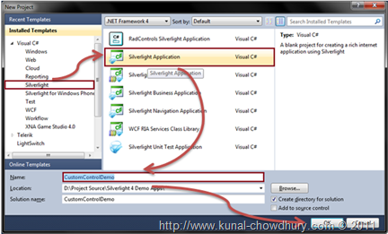
First of all, we need to create a Silverlight project. Assume, you already know about it. Just for your reference, create a new project. From the left panel, select Silverlight and chose "Silverlight Application" from the right panel. Give a proper name for your application and solution. Click ok to continue.

In the next screen, just press "OK". You can choose the version of Silverlight from that screen.
Creating a Custom Control
Now once your project is ready, it's time for us to create a Custom Control. In this chapter, we will just create a default control without any additional customization. We will customize our control in a later part of the series.

To do this, right click on your Silverlight project, from the context menu, select "Add" and from the second level context menu, click "New Item". This will open the "Add New Item" dialog box.
As shown in the below screen shot, select "Silverlight Templated Control" and give you proper name to the control. Remember that the "Silverlight Templated Control" is the template for Custom Silverlight control.

Click "Add" button to add the custom control into your project. Once the control creation is done, you will notice two things in the solution explorer. Expand the "Solution Explorer" and there you will find the following things:
- A "Themes" folder containing a file called "Generic.xaml". This is the default resource file for all of your styles for your controls.
- A "MyControl.cs" file, which is nothing but the class of your custom control. The class name is the control name.
Note that if you create multiple controls, the IDE will create multiple class files for you with the name of the control. But the resource file will be the same. All styles and templates of your control will go into the same file.

The above screenshot will give you better visibility of the files that have been created in our demo application.
Know About the Class
Here, we will discuss about the class of the Custom control. You will get detailed knowledge on the class in later part of the series. For now, just know that every control by default derives from base class called "Control". You may change the base class to another control depending upon your requirement.
Have a look into the basic code that has been generated for you by the IDE:
using System.Windows.Controls;

namespace CustomControlDemo
{
    public class MyControl : Control
    {
        public MyControl()
        {
            this.DefaultStyleKey = typeof(MyControl);
        }
    }
}
You will see the above code in the constructor. It takes the control style from the resource file and set it as the default style of the control. We will discuss more about on the class later.
Basic to the Template
You will find the basic template of the custom control in the Generic.xaml file. Open the file and you will find the below style inside the ResourceDictionary:
<Style TargetType="local:MyControl">
    <Setter Property="Template">
        <Setter.Value>
            <ControlTemplate TargetType="local:MyControl">
                <Border Background="{TemplateBinding Background}"
                        BorderBrush="{TemplateBinding BorderBrush}"
                        BorderThickness="{TemplateBinding BorderThickness}">
                </Border>
            </ControlTemplate>
        </Setter.Value>
    </Setter>
</Style>
The first line describes the TargetType of the style. The second line declares the Template of the control. The third line sets the value of the template. The child of the value is your ControlTemplate. You can design your control template here.
One thing I want to tell you here is that this is the default template of any control. You can add more style values before starting the template declaration. We will discuss this later.
Adding the Custom Control in Main Page
Let us add the custom control that we created to our main page. To do this, you need to add the XMLNS namespace in the XAML. In our case, it is the project name. Once you declare the namespace, you will be able to access the control easily.
<UserControl x:Class="CustomControlDemo.MainPage"
    xmlns="http://schemas.microsoft.com/winfx/2006/xaml/presentation"
    xmlns:x="http://schemas.microsoft.com/winfx/2006/xaml"
    xmlns:d="http://schemas.microsoft.com/expression/blend/2008"
    xmlns:mc="http://schemas.openxmlformats.org/markup-compatibility/2006"
    xmlns:CustomControlDemo="clr-namespace:CustomControlDemo" mc:Ignorable="d"
    d:DesignHeight="300" d:DesignWidth="400">

    <Grid x:Name="LayoutRoot" Background="White">
        <CustomControlDemo:MyControl
            Width="200"
            Height="200"
            Background="Yellow"
            BorderBrush="Red"
            BorderThickness="1"/>
    </Grid>
</UserControl>
The above code will explain everything to you. There, we added our custom control named "MyControl" with proper declaration of height and width. If you don't specify the height and width, it will take the whole screen of the application (only for our example).
If you run the application, you will not see anything rather than the blank screen. This is because the control has default transparent background. Hence, we added a background color, border brush and border thickness to the control in the above code.

Once you run the application now, you will see the above UI in your browser. The rectangle is the custom control that we created in this sample. If you modify the control template, it will change the UI here automatically.
What Next?
This was the basic discussion about custom control in Silverlight. In our next tutorial, we will see some more on Custom Control. Leave your feedback here if you find this article helpful. Also, leave your queries and I will try to answer you as soon as possible.
Follow my blog for the next part of the series. Also find me on Twitter @kunal2383. You will get updates there as well. Thank you so much for reading my articles/tutorials. Happy coding!
