This is a continuation to my previous post "How to create a Custom Control in Silverlight". In this tutorial, we will discuss the template and modify our basic template to give a better look as per our needs. In this chapter, we will learn about Template Part and how to modify the existing template.
Read more to learn in depth about Custom Controls in Silverlight. This will benefit you not only for Silverlight but for WPF and Windows Phone 7 development too. In the end, don't forget to provide your feedback.
As mentioned, this is a continuation to my previous post "How to create a Custom Control in Silverlight" that I posted yesterday. Here we will learn about Template Parts. Hope this will clear the basic idea behind custom controls. It's not at all hard if you understand it properly.
So, let's begin with the post. Hope you have the previous example intact with you.
Modifying the Template
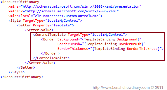
Open the Generic.xaml page. As shown earlier, you have the following style present in your file. As marked below, you have the ControlTemplate and inside that you have a Border control. We will now modify this template to give a better look to our control with a header title and a content area.

Let us design our control template. You can design as you wish, but for now, just go with my code. Inside the Border control, we will add a Grid panel and divide it to two rows. The first row will have a fixed height and the second row will have a variable height.
Now add a Border control in the first row and name it. Don't forget to use proper names. Generally, a control template should define its child element prefixed with "PART_". In this scenario, we are adding a header panel and hence we will name it "PART_HeaderPanel". Give a background color (hard code it for now, once we implement the custom properties in a later article, we will change it there), and add a TextBlock with white foreground color as a child element to the header panel. Also, provide a text to it.
In the second row, we will add a ContentPresenter which will hold any child element. For the time being, we will not assign any properties to it. Hence, we will see a blank part in the UI. We will add it from the control level, once we implement the proper properties in the next chapter.
Here is our Control Template which you can use as a reference:
<Style TargetType="local:MyControl">
    <Setter Property="Template">
        <Setter.Value>
            <ControlTemplate TargetType="local:MyControl">
                <Border Background="{TemplateBinding Background}"
                        BorderBrush="{TemplateBinding BorderBrush}"
                        BorderThickness="{TemplateBinding BorderThickness}">
                    <Grid>
                        <Grid.RowDefinitions>
                            <RowDefinition Height="25"/>
                            <RowDefinition MinHeight="100"
                            Height="*"/>
                        </Grid.RowDefinitions>
                        <Border x:Name="PART_HeaderPanel"
                                Background="Blue"
                                Grid.Row="0">
                            <TextBlock x:Name="PART_HeaderText"
                                        Text="Caption"
                                        Foreground="White"
                                        VerticalAlignment="Center"/>
                        </Border>
                        <ContentPresenter x:Name="PART_Content"
                        Grid.Row="1"/>
                    </Grid>
                </Border>
            </ControlTemplate>
        </Setter.Value>
    </Setter>
</Style>
Again, we are using hard coded text and color here and will implement them from the Template binding later. Make sure that you properly name your important controls there. We are using Part_HeaderPanel, PART_HeaderText, and PART_Content. We may need them later from the code-behind file, i.e., the control's class file.

Make sure that you have the proper TargetType mentioned for the Style and ControlTemplate. Don't play with this for now.

Let's run our application now and we will see the below UI in the browser window. The Border control became a ChildWindow like control. This is our custom control (as of now).

The blue area is our header panel which has a header title, and the yellow portion is our content area, where we may add child controls later.
What Next?
Hope this series of articles is helping you to understand Custom Control creation in Silverlight. Oh yeah, don't forget that the same thing is applicable for both WPF and Windows Phone 7 too. Here, we discussed a basic level of implementing a control template. More yet to come. In later chapters, we will discuss this in depth.
Follow my blog for the next part of the series. Also find me on Twitter @kunal2383. You will get updates there as well. Thank you so much for reading my articles/tutorials. Happy coding.
Also, don't forget to leave your comment here. Suggestions are welcome.
