
Introduction
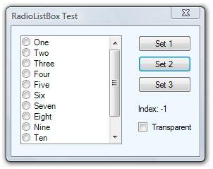
This is the .NET version of my previous MFC article, CRadioListBox: A ListBox with Radio Buttons. A couple of years ago, I discussed in a Visual C++ forum about a member's request to implement a custom ListBox control similar to MFC's CCheckListBox, but with radio buttons. Initially it appeared to be trivial, since the ListBox control's unique selection version complies with the requirements, but I have concluded that this control has some advantages:
- It is clearer that options are mutually exclusive with radio buttons.
- It is a good alternative to a group of radio buttons because you have to maintain just one control, less memory use.
- It inherits some useful features like scrolling, sorting, data binding and multi-column.
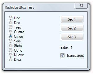
- It will be easier to change options dynamically, as shown in the demo application.
- It will be easier to manage selection events, also shown in the demo application.
Using the Code
To implement RadioListBox into your project, you just need to do a few steps:
- Include RadioListBox.cs into your project.
- Drop a
RadioListBox object into your form. - Change the standard properties of the control, just like a
ListBox. - Countersense to standard
ListBox, transparent BackColor property is allowed.
That's all! Now you can use the radio button collection as a regular ListBox. You can add items with the Items.Add() method and query for user selection with the SelectedIndex property.
Fake Transparency
Some .NET controls accept a transparent color as a BackColor property, but ListBox is not one of them. So, transparency requires lots of non-managed tricks. However, transparency is a key feature needed for this control to be useful. It allows the control to acquire a real radio button look and feel, as you can see in the screenshot above. I decided to stay in the managed world by providing fake transparency to the control by overriding the BackColor property to accept it, and saving its own background color brush. When setting the background color to transparent, the control will mimic the parent form or control, even if the form has a non-standard background color.
RadioListBox Internals
The RadioListBox class is derived from Windows Forms' ListBox class with the owner-draw feature. The resumed class definition is the following:
using System.ComponentModel;
using System.Drawing;
using System.Windows.Forms.VisualStyles;
namespace System.Windows.Forms
{
public class RadioListBox : ListBox
{
private StringFormat Align;
private bool IsTransparent = false;
private Brush BackBrush;
public override Color BackColor ...
[Browsable(false)]
public override DrawMode DrawMode ...
[Browsable(false)]
public override SelectionMode SelectionMode ...
public RadioListBox() ...
protected override void OnDrawItem(DrawItemEventArgs e) ...
protected override void DefWndProc(ref Message m) ...
protected override void OnHandleCreated(EventArgs e) ...
protected override void OnFontChanged(EventArgs e) ...
protected override void OnParentChanged(EventArgs e) ...
protected override void OnParentBackColorChanged(EventArgs e) ...
}
}
The core enhancement is at the OnDrawItem() method. The method does not highlight the selected item as in a standard ListBox control, but draws a radio button instead. It also manages the focus state to draw the focus rectangle properly and the background color according to the transparency attribute. Here is the C# source code:
protected override void OnDrawItem(DrawItemEventArgs e)
{
int maxItem = this.Items.Count - 1;
if (e.Index < 0 || e.Index > maxItem)
{
e.Graphics.FillRectangle(BackBrush, this.ClientRectangle);
return;
}
int size = e.Font.Height;
Rectangle backRect = e.Bounds;
if (e.Index == maxItem)
backRect.Height = this.ClientRectangle.Top +
this.ClientRectangle.Height - e.Bounds.Top;
e.Graphics.FillRectangle(BackBrush, backRect);
Brush textBrush;
bool isChecked = (e.State & DrawItemState.Selected) == DrawItemState.Selected;
RadioButtonState state = isChecked ?
RadioButtonState.CheckedNormal : RadioButtonState.UncheckedNormal;
if ((e.State & DrawItemState.Disabled) == DrawItemState.Disabled)
{
textBrush = SystemBrushes.GrayText;
state = isChecked ? RadioButtonState.CheckedDisabled :
RadioButtonState.UncheckedDisabled;
}
else if ((e.State & DrawItemState.Grayed) == DrawItemState.Grayed)
{
textBrush = SystemBrushes.GrayText;
state = isChecked ? RadioButtonState.CheckedDisabled :
RadioButtonState.UncheckedDisabled;
}
else
{
textBrush = SystemBrushes.FromSystemColor(this.ForeColor);
}
Size glyphSize = RadioButtonRenderer.GetGlyphSize(e.Graphics, state);
Point glyphLocation = e.Bounds.Location;
glyphLocation.Y += (e.Bounds.Height - glyphSize.Height) / 2;
Rectangle bounds = new Rectangle(e.Bounds.X + glyphSize.Width, e.Bounds.Y,
e.Bounds.Width - glyphSize.Width, e.Bounds.Height);
RadioButtonRenderer.DrawRadioButton(e.Graphics, glyphLocation, state);
if (!string.IsNullOrEmpty(DisplayMember))
e.Graphics.DrawString(((System.Data.DataRowView)this.Items[e.Index])
[this.DisplayMember].ToString(),
e.Font, textBrush, bounds, this.Align);
else
e.Graphics.DrawString(this.Items[e.Index].ToString(),
e.Font, textBrush, bounds, this.Align);
e.DrawFocusRectangle();
}
History
- 23rd April, 2007: First version
- 14th September, 2007: Refinements in control rendering (thanks to stephpms); support for bounded data (thanks to PeterDP)
- 1st September, 2008: Improved background painting; support for large fonts (thanks to rkousha)
