Introduction
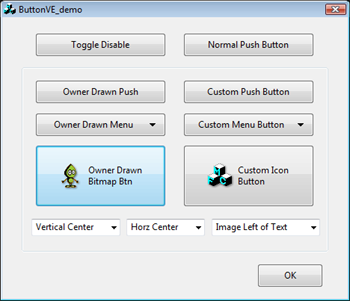
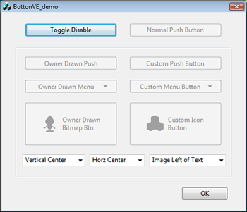
This article describes a set of themed owner-drawn &
second set of themed full-custom push buttons. On Vista,
they provide
visual
effects similar to standard push buttons - fading transitions
and the subtle glowing default-state effects.
I've refined these for my own apps for awhile now, recently
upgraded them for Vista, and figured others might benefit. The
button classes
are compatible with Windows 98, 2000, XP, and Vista. They
are implemented as C++/MFC controls. Standard push buttons,
menu
dropdown buttons, and image (bitmap or icon) buttons are provided.
Background
Windows support for themed controls is quite good.
Creating custom controls matching system
flavors is easy. Vista goes one step further by
animating certain controls - notably push buttons. Vista
push buttons smoothly transition between states and have subtle glowing
default-state buttons to catch the eye. Cool stuff!
 Not Glowing
  Glowing
Unfortunately the theme API's don't obviously allow custom
controls to match this new behavior. The
NM_CUSTOMDRAW technique for custom drawing (see Stephen Steel's CImageButtonWithStyle
article) doesn't support the glowing-effect, although other transitions
work. However, on Vista the NM_CUSTOMDRAW technique isn't
needed for simple themed bitmap/icon
buttons. They are supported natively.
Custom Draw
If you really need owner or
custom draw
however, read on. The included button classes offer a
consistent drawing framework across platforms, and replicate
Vista's glowing-effects. Examples are a plain push, menu,
and image+text buttons.
Just to be clear, these visual effects appear only on Vista. On 98/2k/XP
these buttons are like any other. There is
no owner-drawn support for checkboxes
or radio buttons (they're not animated, so no point).
Since I needed these backwards compatible with Win98, I used VC6
here (horrors!). Fortunately,
running Win98 under VirtualPC
or VMWare makes such support trivial. It also compiles with
VS7/2003 or VS8/2005
fine - just open the DSW project file. VS8 users must remove
entries from the RT_MANIFEST resource category beforehand.
David
Zhao's
visual
styles class is used to avoid DLL problems on
Win98/2k. You'll also need a platform SDK with the XP
themes
header files.
Alpha Blending
The AlphaBlend API is used to
merge bitmaps of rendered button states. What is alpha
blending? References to "alpha" means
the degree to which two images are merged. The following
equation might help illustrate:
output = (old_pixel *
(255-alpha) + new_pixel * alpha)/255
An alpha of zero means the output equals the old pixel. An
alpha
of 255 means the output equals the new pixel. Other values
produce a blended
combination of the two. Expand the concept to RGB
colors, add image scaling, and you
have the AlphaBlend API.
Vista Button Transitions
The theme-API supports five states for push buttons: disabled,
normal, hot, defaulted, and pushed. Vista performs transitions
between these states at varying speeds. Some are fast -
like when pushing a button. Others slower -
like fading from the hot or disabled states.
There are also differences depending on how long the mouse has
hovered over the button. Such is life. I don't claim to
perfectly reproduce Vista, warts
and all, but these classes are pretty close. Now to code...
First, we determine the new button state with a
prioritized check:
int old_stateid = m_stateid;
if (!button_enabled) m_stateid = PBS_DISABLED;
else if (button_pressed) m_stateid = PBS_PRESSED;
else if (button_hot) m_stateid = PBS_HOT;
else if (button_default) m_stateid = PBS_DEFAULTED;
else m_stateid = PBS_NORMAL;
If the state
changes, then we setup the transition:
if (UseVistaEffects() && (m_stateid != old_stateid))
{
switch (m_stateid)
{
case PBS_HOT :
m_transition_tickcount = (old_stateid==PBS_PRESSED) ? 4 : 2;
break;
case PBS_NORMAL :
m_transition_tickcount = (old_stateid==PBS_HOT) ? 20 : 4;
break;
case PBS_PRESSED :
m_transition_tickcount = 2;
break;
case PBS_DEFAULTED :
m_transition_tickcount = (old_stateid==PBS_HOT) ? 20 : 2;
break;
default : m_transition_tickcount = 4; break;
}
m_transition_tickscale = 250/m_transition_tickcount;
CDCBitmap tempDC(dc,m_oldstate_bitmap);
g_xpStyle.DrawThemeParentBackground(m_hWnd, tempDC.GetSafeHdc(), &rc);
g_xpStyle.DrawThemeBackground (
hTheme, tempDC.GetSafeHdc(), BP_PUSHBUTTON,
old_stateid, &rc, NULL);
}
The tickcount variable holds the number of 50ms timer
ticks
required. The tickscale variable when
multiplied by tickcount, provides the 0 to 250 range
"alpha" for
merging bitmaps. We also record a snapshot of the old
button
state here. CDCBitmap is a helper class for
drawing into bitmaps.
Next, the new button state background is rendered:
if (g_xpStyle.IsThemeBackgroundPartiallyTransparent(hTheme, BP_PUSHBUTTON,
m_stateid))
{
g_xpStyle.DrawThemeParentBackground(m_hWnd, mDC.GetSafeHdc(), &rc);
}
g_xpStyle.DrawThemeBackground (
hTheme, mDC.GetSafeHdc(), BP_PUSHBUTTON,
m_stateid, &rc, NULL);
CRect border(rc);
g_xpStyle.GetThemeBackgroundContentRect (
hTheme, mDC.GetSafeHdc(), BP_PUSHBUTTON, m_stateid,
&border, &border);
Standard stuff. Nothing new there.
Lastly, AlphaBlend the old with the new:
if (UseVistaEffects() && (m_transition_tickcount>0))
{
CDCBitmap tempDC(dc,m_oldstate_bitmap);
BLENDFUNCTION bf;
bf.BlendOp = AC_SRC_OVER;
bf.BlendFlags = 0;
bf.SourceConstantAlpha = m_transition_tickcount*m_transition_tickscale;
bf.AlphaFormat = 0; AlphaBlend(mDC.GetSafeHdc(), rc.left, rc.top, rc.Width(), rc.Height(),
tempDC.GetSafeHdc(), rc.left, rc.top, rc.Width(), rc.Height(), bf);
}
Tada! Mostly its just setting up the
BLENDFUNCTION struct for AlphaBlend. Initially the alpha is near
100%, so the old-state
dominates visually. As the timer decrements tickcount
& forces window refreshes, the alpha
reduces to 0% so the
new-state prevails. Simple eh?
You might wonder why I'm not using NM_CUSTOMDRAW. It's
incompatible with timer based updates, since Windows already provides
state transitions. The methods fight - a joy to
behold.
Note: The above code only deals button
backgrounds.
Center content is drawn afterwards (text, menu arrows, bitmaps, etc.)
Vista Default/Focused Buttons
The glowing/pulsing default button is the neatest
effect.
Unfortunately the theme-API doesn't know about it.
Doh.
However, its apparently just a combination of the default &
hot states.
We'll reproduce the effect as follows:
- Copy the default-state image to a temporary
bitmap.
- Thicken the button border with a 50% AlphaBlend from the temp
bitmap.
- Render the hot button state to the temp bitmap.
- AlphaBlend the content area from the temp bitmap.
The AlphaBlend steps are alpha-scaled over a two-second interval
providing the pulsing effect.
if (UseVistaEffects() && (m_transition_tickcount==0) &&
(m_stateid == PBS_DEFAULTED))
{
CDCBitmap tempDC(dc,rc);
AlphaBlt (tempDC, rc, mDC, rc, 255); int alpha = (int)(m_defaultbutton_tickcount*12.5);
if (m_defaultbutton_tickcount>=20) alpha = 500-alpha;
CRect rect(border);
rect.InflateRect(1,1);
AlphaBlt (mDC, border, tempDC, rect, alpha/2);
g_xpStyle.DrawThemeParentBackground(m_hWnd, tempDC.GetSafeHdc(), &rc);
g_xpStyle.DrawThemeBackground (
hTheme, tempDC.GetSafeHdc(), BP_PUSHBUTTON, PBS_HOT, &rc, NULL);
border.DeflateRect(1,1);
AlphaBlt (mDC, border, tempDC, border, alpha);
border.InflateRect(1,1);
}
Here the AlphaBlend function was moved off into a standalone function AlphaBlt
cleaning things up. The timer cycles tickcount
from 0 to 40 endlessly, from which we compute the alpha.
Ticks 0 to 19 become alpha 0 to 237, and
ticks 20 to 40 become alpha 250 to 0.
Using the code
To evaluate the Vista Effects, replace or subclass any push-button
instance of CButton with the owner-drawn CButtonVE. Add the
source files to your project and you're in
business.
The following classes are provided:
CButtonVE / CButtonVE2 - Owner drawn
& full-custom push button.
CButtonVE_Menu / CButtonVE2_Menu -
Owner drawn
& full-custom menu
button.CButtonVE_Image / CButtonVE2_Image -
Owner
drawn & full-custom image button (bitmap or icons).
All provide the following content control functions:
SetOwner - Specify window to receive button clicks
(& menu button commands). Defaults to parent.
SetContentHorz - Specify horizontal alignment for
button image/text content (ModifyStyle can be used also).
SetContentVert - Specify vertical
alignment for button image/text content (ModifyStyle can be used also).SetContentMargin - Specify spacing
between button border & content.SetBackgroundColor - Force button background color (defaults
to polling parent with WM_CTLCOLOR).
The menu button classes add the following setup/notify functions:
SetMenu - Preload a menu from resource ID or CMenu
(can be changed with following functions before display).
AddMenuItem - Add a menu item manually (can append
to loaded menu resource).RemoveMenuItem - Remove a menu item (can remove
items from a loaded menu resource).RemoveAllMenuItems - Removes all menu items.NotifyMenuPopup - Called before menu appears for
dynamic updating (default polls owner for UI updates).
The image button classes provide these:
SetImagePosition - Specify position of image
relative to text (left, right, above, or below the text).SetImageSpacing - Specify spacing between image and text.SetImageShadow - Control if Gaussian blurred drop shadow shown under images.SetTransparentColor - Specify bitmap background
color. Default is the upper-left corner pixel.SetHotImage - Specify a bitmap or icon to display
when the button is hot (mouse hovering over it).SetDisabledImage - Specify a bitmap or icon to
display when the button is disabled. By default the image button
creates a shaded version of the source image.
Adding Owner Drawn Buttons
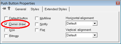
Add a standard button in the dialog editor, setting the "owner draw"
style.
Add a control type member variable (subclassing it), and replace
the "CButton" header instance with your choice of button class.
Adding Full Custom Buttons
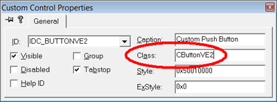
Add a custom control in the dialog editor, and specify the desired
"Class"
name in the properties. ie:
In your WM_INITDIALOG handler, you'll need to configure font &
window text for the full-custom controls (see demo code).
Customizing Button Content
To customize button drawing, derive a new class & replace "DrawContent". The CButtonVE framework handles the background & transition
effects.
Several parameters provide useful info for drawing, including
three different rectangle coordinates: the button outline, the
safe
content border, and the recommended text rectangle. If hTheme
is valid, using the theme-API's whenever possible is
recommended. The uistate mask controls hiding
of focus & accelerator marks.
virtual void DrawContent (
CDC &dc, HTHEME hTheme, int uistate, CRect rclient, CRect border, CRect textrc, int text_format, BOOL enabled)
The image buttons (for example) just override this one function drawing
within the "textrc" coordinates.
Points of Interest
Two versions of each button are provided. Owner-drawn
(VE)
and a fully custom (VE2) implemented
button.
Why both you ask? Owner drawn buttons are great! They
simplify life in a
number of ways (despite the headache mentioned later). However,
there is a singular show stopper. In order to draw itself, a
child window depends on the parent cooperating &
reflecting back messages. Thus the "owner" part of
"owner-drawn". This also applies to NM_CUSTOMDRAW.
Some parent windows don't reflect notify messages, such as
CFileDialog (GetOpenFileName/GetSaveFileName). For these
uncooperative
parents, you can't use the owner draw or NM_CUSTOMDRAW
approaches. Deriving from
CButton and replacing the WM_PAINT handler doesn't work, because
Windows repaints button controls outside of WM_PAINT on button
clicks. Therefore the full-custom push
buttons derived from
CWnd option.
The Owner Draw Headache
One irritating problem with owner draw buttons is worth
mentioning. In dialogs, Windows tracks the "default"
button - the one "clicked" when pressing Enter. The
default button is
drawn with a heavy border.
Windows tracks the "default" state by querying a window with
WM_GETDLGCODE. Push buttons should return
DLGC_DEFPUSHBUTTON (if the default) or
DLGC_UNDEFPUSHBUTTON (if not). Failing to do so means you
can't become the "default" as far as Windows
is concerned. OK, simple enough.
Now the irritating problem. Returning the values in
WM_GETDLGCODE has a side effect - they make Windows remove the
BS_OWNERDRAW button style! Huh? Windows
sends a BS_SETSTYLE message setting the BS_DEFPUSHBUTTON style on
default buttons, and BS_DEFPUSHBUTTON is mutually exclusive to the
owner draw style. Doh. Fortunately, its
possible to override BS_SETSTYLE and restore owner draw.
Doing so though means losing the default state. Nice.
My workaround involves tracking the default state locally.
A BS_SETSTYLE handler records when Windows specifies BS_DEFPUSHBUTTON,
then forces
owner draw instead. The recorded state is used for drawing
and returning the correct value in WM_GETDLGCODE. Works
great for both keyboard navigation & mouse clicks!
Subsequent research found Paolo Messina's COddButton
article which solves the problem similarly.
Customized File Dialog Demo
The CFileDialogVE demo class (opened with the "Normal
Push" button) shows use of the custom image button:
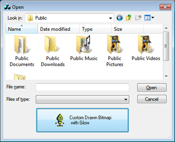
An OnInitDialog handler creates
an instance of CButtonVE2_Image, and adjusts the dialog
size so
its visible:
CButtonVE2_Image *btn = new CButtonVE2_Image(); btn->Create(_T("Custom Drawn Bitmap\n with Glow"),
WS_VISIBLE|WS_CHILD|WS_TABSTOP|BS_MULTILINE,
rve, CWnd::FromHandle(ofn_hWnd), CUSTOM_IMAGEBTN_ID);
HBITMAP hBitmap = (HBITMAP)(LoadImage(theApp.m_hInstance,
MAKEINTRESOURCE(IDB_BITMAP1), IMAGE_BITMAP, 0, 0, LR_DEFAULTCOLOR));
btn->SetBitmap(hBitmap);
CRect rw;
::GetWindowRect(ofn_hWnd,&rw);
int adjust = rve.bottom-rcombo.bottom;
if (m_ofn.lStructSize == OPENFILENAME400SIZE) adjust -= rcombo.Height();
::SetWindowPos(ofn_hWnd, NULL, 0, 0, rw.Width(), rw.Height()+adjust,
SWP_NOMOVE|SWP_NOZORDER);
CRect rve holds the button
coords, rcombo the coords of the type combobox, and ofn_hWnd
the file dialog handle. The dialog size adjust depends on if the
places bar is visible (detected by size of the structure).
Vista of course,
already provides limited customization support in its new file dialogs
(see Michael Dunn's Vista File
Dialogs article).
Other Goodies
The code includes various useful routines. Supporting the
Vista 9pt Segoe UI
font, and 8pt MS Sans Serif
for
98/2k/XP is handled by CFontOccManager
(see ButtonVE_demo.cpp). Someone posted it on MSDN
forums, but its too good to languish there.
If running Vista, it queries SystemParametersInfo and initializes a
LOGFONT, then computes the correct scaling for an MFC CDialogTemplate.
The image buttons runtime compute disabled & normal images
supporting a transparent background color. For those who
enjoy BitBlt, see DrawDisabledImage,
DrawTransparentImage, and DrawBluredShadowImage
(in ButtonVE_Helper.h). Monochrome bitmaps are created to mask
off the background, then images are drawn to an output context.
Enjoy!
Copyright and License
This article is Copyright © 2007 by
Ian E Davis. The demo code and source code accompanying
this article are hereby
released to the
public domain.
History
- April 24th, 2007 - First release. My first Code Project article!
- April 27th, 2007 - Patched problems found by Hans Dietrich (themed WinXP
default state on full-custom buttons), and Jerry Evans (uistate not handled properly).
Also added better Enter handling in full-custom buttons.
- May 4th, 2007 - Added support for BS_PUSHLIKE style for toggle pushbuttons
(query with normal GetCheck), Gaussian blurred image drop shadows, and hot image hover
support. Also added WM_CTLCOLOR polling for background color. Fixed rare and
difficult to reproduce visual flicker with animated default button.
