WPF includes the Canvas control that allows you to place elements using exact coordinates.
To position an element on the Canvas, you set the attached Canvas.Left and Canvas.Top properties. Canvas.Left sets the number of units between the left edge of your element and the left edge of the Canvas. Canvas.Top sets the number of units between the top of your element and the top of the Canvas.
Although the Canvas control has a definite visible area determined by the Height and Width properties of the control, it allows child controls to be virtually placed at any coordinate. We can use this particular feature of the Canvas control to achieve a ticking/sliding effect by continuously changing the coordinates of the content.

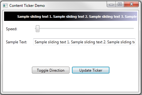
Demo application screenshot
The ContentTicker control derives from the WPF ContentControl. The ControlTemplate is defined to place the content in a Canvas control. Also, a double animation is defined that is started on loading of the control. The animation target property is set to the attached property (Canvas.Left) of the content.
public class ContentTicker : ContentControl
{
    Storyboard _ContentTickerStoryboard = null;
    Canvas _ContentControl = null;
    ContentPresenter _Content = null;

    static ContentTicker()
    {
        DefaultStyleKeyProperty.OverrideMetadata(typeof(ContentTicker),
           new FrameworkPropertyMetadata(typeof(ContentTicker)));
    }

    public ContentTicker()
    {
        this.Loaded += new RoutedEventHandler(ContentTicker_Loaded);
    }

    ..
}
<controltemplate targettype="{x:Type local:ContentTicker}">
  <canvas x:name="PART_ContentControl" width="300"
        verticalalignment="Stretch"
        horizontalalignment="Stretch" height="150"
        removed="{TemplateBinding Background}">
    <canvas.triggers>
      <eventtrigger routedevent="Canvas.Loaded">
        <beginstoryboard>
          <storyboard x:name="ContentTickerStoryboard" storyboard.targetproperty="(Canvas.Left)">
            <doubleanimation storyboard.targetname="PART_Content" repeatbehavior="Forever">
            </doubleanimation>
          </storyboard>
        </beginstoryboard>
      </eventtrigger>
    </canvas.triggers>
    <contentpresenter x:name="PART_Content"
      verticalalignment="{TemplateBinding ContentControl.VerticalAlignment}"
      horizontalalignment="{TemplateBinding ContentControl.HorizontalAlignment}"
      contenttemplate="{TemplateBinding ContentControl.ContentTemplate}"
      content="{TemplateBinding ContentControl.Content}">
    </contentpresenter>
  </canvas>
</controltemplate>
The ContentTicker control defines two additional dependency properties for defining the rate (speed) of ticking and direction (east or west). The rate is used to calculate the duration of the animation, the time required to complete one cycle of the animation.
public double Rate
{
    get { return (double)GetValue(RateProperty); }
    set { SetValue(RateProperty, value); }
}

public static readonly DependencyProperty RateProperty =
    DependencyProperty.Register("Rate", typeof(double),
    typeof(ContentTicker), new UIPropertyMetadata(60.0));

public TickerDirection Direction
{
    get { return (TickerDirection)GetValue(DirectionProperty); }
    set { SetValue(DirectionProperty, value); }
}

public static readonly DependencyProperty DirectionProperty =
    DependencyProperty.Register("Direction",
    typeof(TickerDirection), typeof(ContentTicker),
    new UIPropertyMetadata(TickerDirection.West));
The canvas size is adjusted while loading the control and Content is vertically aligned in the canvas according to the user specified settings. Further, the animation parameters are adjusted according to the width of the Canvas and Content controls.
The animation is dependent on the width of the Canvas and Content so the animation details are updated every time the size of these are changed.
void UpdateAnimationDetails(double holderLength, double contentLength)
{
    DoubleAnimation animation =
        _ContentTickerStoryboard.Children.First() as DoubleAnimation;
    if (animation != null)
    {
        bool start = false;
        if (IsStarted)
        {
            Stop();
            start = true;
        }

        double from = 0, to = 0, time = 0;
        switch (Direction)
        {
            case TickerDirection.West:
                from = holderLength;
                to = -1 * contentLength;
                time = from / Rate;
                break;
            case TickerDirection.East:
                from = -1 * contentLength;
                to = holderLength;
                time = to / Rate;
                break;
        }

        animation.From = from;
        animation.To = to;
        TimeSpan newDuration = TimeSpan.FromSeconds(time);
        animation.Duration = new Duration(newDuration);

        if (start)
        {
            TimeSpan? oldDuration = null;
            if (animation.Duration.HasTimeSpan)
                oldDuration = animation.Duration.TimeSpan;
            TimeSpan? currentTime =
               _ContentTickerStoryboard.GetCurrentTime(_ContentControl);
            int? iteration =
               _ContentTickerStoryboard.GetCurrentIteration(_ContentControl);
            TimeSpan? offset =
                TimeSpan.FromSeconds(
                currentTime.HasValue ?
                currentTime.Value.TotalSeconds %
                  (oldDuration.HasValue ? oldDuration.Value.TotalSeconds : 1.0) :
                0.0);

            Start();

            if (offset.HasValue &&
                offset.Value != TimeSpan.Zero &&
                offset.Value < newDuration)
                _ContentTickerStoryboard.SeekAlignedToLastTick(
                  _ContentControl, offset.Value, TimeSeekOrigin.BeginTime);
        }
    }
}
The ContentTicker control is a generic control to slide the content. It can be used as a news ticker, thumbnails slider, RSS feed slider, etc., depending on the requirement. The Start/Stop and Pause/Resume methods can be used to dynamically change the behavior of the sliding content.
The demo application uses the control as a text ticker and provides the interfaces to change the speed, content, and direction at run time.
