Introduction
Presentation layer is always the important aspect of a software , NextUI provides a list of unique controls
in hope that it is useful to anyone .
Background
This control provides a digital panel that is easy to use and configured .
Using the code
This Control has few property to be configured
| | Name | Description |
 | Alignment |
Set the alignment , it can be left , right
or center or Fill
|
| BackGrdColor |
Set the background color of the control,
the color is used to paint the back ground as a linear gradient brush
. To fill a solid color , consider using a image
|
| BackGroundImage |
Use this to set the background , for
example , you can set the background to solid color by setting this
image to solid color image
|
| EnableGlare |
Enable a kind of glowing effect for the
digital display
|
| FontColor |
Set the color of the display character
|
| Number |
The Value to be displayed . It can be
floating point or negative number as well . if the number exceeded the
value that can be supported by the control, a ------ will be displayed
|
| PanelColor |
The color of each digital panel, where each
panel hold 1 numerical value
|
| PanelNumber |
The number of panel that can be displayed .
the more the panel ,the larger value will be supported
|
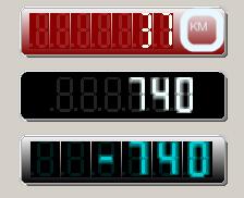
Example 1:
The Code snippet below is extracted from the sample code , and will generated a control that looks like the one below .
The Alignment has set to left , so the panel has been leaned towards left.
this.digitalDisplay1.Alignment = NextUI.Display.DigitalDisplay.location.LEFT;

this.digitalDisplay1.BackGrdColor = System.Drawing.Color.Maroon;

this.digitalDisplay1.BackGroundImage = global::DigitalDisplayDemo.Properties.Resources.digital2;

this.digitalDisplay1.EnableGlare = false;

this.digitalDisplay1.FontColor = System.Drawing.Color.Ivory;

this.digitalDisplay1.Number = 0F;

this.digitalDisplay1.PanelColor = System.Drawing.Color.DarkRed;

this.digitalDisplay1.PanelNumber = 7;
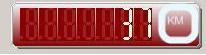
Example 2:
The Code snippet below is extracted from the sample code , the alignment has set to center .
It also set EnableGlare to true . As you can see , there is a glare effect on the panel.
this.digitalDisplay2.Alignment = NextUI.Display.DigitalDisplay.location.CENTER;

this.digitalDisplay2.BackGrdColor = System.Drawing.Color.DarkRed;

this.digitalDisplay2.BackGroundImage = global::DigitalDisplayDemo.Properties.Resources.digital1;

this.digitalDisplay2.EnableGlare = true;

this.digitalDisplay2.FontColor = System.Drawing.Color.Azure;

this.digitalDisplay2.Number = 0F;

this.digitalDisplay2.PanelColor = System.Drawing.Color.Black;

this.digitalDisplay2.PanelNumber = 6;
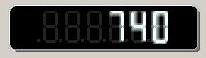
Example 3:
The Code snippet below is extracted from the sample code , the alignment has set to Fill .
The Panelnumber has set to 6 , so you can only see 6 panels on the control
this.digitalDisplay3.Alignment = NextUI.Display.DigitalDisplay.location.FILL;

this.digitalDisplay3.BackGrdColor = System.Drawing.Color.Black;

this.digitalDisplay3.BackGroundImage = null;

this.digitalDisplay3.EnableGlare = true;

this.digitalDisplay3.FontColor = System.Drawing.Color.DarkTurquoise;

this.digitalDisplay3.Number = 0F;

this.digitalDisplay3.PanelColor = System.Drawing.Color.Black;

this.digitalDisplay3.PanelNumber = 6;
Points of Interest
This control is still in development , if you have any cool enhancement that you like to suggest ,
send me an email at sllow@nextwavesoft.com
History
Initial beta release 0.9


 Submit an article or tip