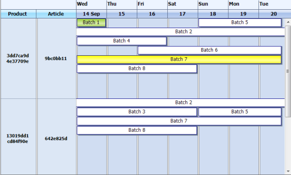
This is a .NET WinForms control which allows to fetch data from database and manipulate it like in Outlook Calendar Planner, but with some differences.


Introduction
During my job, I was in need of a .NET WinForms control which would allow to fetch data from the database and manipulate it like in Outlook Calendar Planner (add, delete, drag items), but with a few differences. Instead of showing the time information in the left side of the control, it was necessary to retrieve and show columnar data from the database. I found some similar controls: A Professional Calendar/Agenda View That You Will Use, Calendar DayView Control, and Day, Week, and Month Calendar Controls, but none of them met my requirements. For commercial components, I didn't want to pay. So I created my own Calendar Planner.
Control Features
The control consists of rows with items and columns on the left side, as you can see from the screenshot below:

Each item in a row can be updated individually. You can change the background color, specify text, drag it, change date, etc. In the left side of the calendar, you can add columns with some text, it may be used in order to retrieve data from different data sources (for example, from DB or XML file). The component can show date intervals in two modes: daily and weekly. In daily mode, each date shows day name, as in the screenshot above. In weekly mode, the date shows the week number, as in the screenshot below. Control supports rows nesting. For this, you can set a row as collapsible.

Background
In order to manage the behaviour of the control, you can use different properties. Some of them are:
CurrentDate: gets/sets calendar dateDatesIntervalMode: possible modes to show date intervals in the headerDayCount: day count to show by the calendarGridCellHeight: height of each rowHeaderStylemode: possible modes to fill background headerIsAllowedDraggingBetweenRows: allows/disallows item drag/drop between rowsItemHeight: height of each itemLeftMargin: margin of left columnSelectedRowindex: gets the index of the selected rowSelectedItem: gets the selected itemRows: list of rows of the calendarItems: list of items of the rowColumns: columns in the left side of the controlIsAllowedTreeViewDrawing: enables\disables lines drawing like in treeview
Events:
ItemClick: occurs when an item is clickedItemDoubleClick: occurs when an item is double-clickedRowClick: occurs when a row is clickedRowDoubleClick: occurs when a row is double-clickedItemDatesChanged: occurs when an item date range has changedItemTextEdited: occurs when an item text is edited
Using the Code
The control doesn't support data binding, so you must write your own logic for rows with items saving and fetching.
Each row of the control, this is the class WeekPlannerRow with different properties (such as BackColor, Name, and others). The calendar consists of a list of rows in the class WeekPlannerRowCollection: List<WeekPlannerRow>.
In turn, each row contains a list of items WeekPlannerItemCollection:List<WeekPlannerItem>. An item is the class WeekPlannerItem with some properties: StartDate, EndDate, Subject, BackColor, and others.
Also, each row has columns, and all related methods can be found in the DataColumns class. This class contains an array of classes DataValue with properties like: Name (name of column), Width (width of column), and Text (text for column header). Also, the DataValue class has a list ValueColorCollection : List<weekplanneritem>. The purpose of the ValueColor<weekplanneritem> class is to show text information in a column in different colors.
In order to add columns, you can use this code:
weekPlanner1.Columns.Add("ColumnName1", string.Empty, 150);
weekPlanner1.Columns.Add("ColumnName2", string.Empty, 150);
Rows adding happens this way:
var itemCollection = new WeekPlannerItemCollection();
var item = new WeekPlannerItem();
item.StartDate = DateTime.Now.AddDays(0);
item.EndDate = DateTime.Now.AddDays(0);
item.Subject = "1 date";
item.BackColor = Color.YellowGreen;
itemCollection.Add(item);
var ColumnRows = new DataColumns(weekPlanner1.Calendar);
ColumnRows["ColumnName1"].Data.Add(Guid.NewGuid().ToString().Substring(0, 8));
ColumnRows["ColumnName1"].Data.Add(Guid.NewGuid().ToString().Substring(0, 8));
ColumnRows["ColumnName2"].Data.Add(Guid.NewGuid().ToString().Substring(0, 8));
weekPlanner1.Rows.Add(ColumnRows, itemCollection);
Here is the code for items adding:
var rows = weekPlanner1.Rows;
var row = rows.ElementAt(weekPlanner1.SelectedRowIndex);
var item = new WeekPlannerItem();
item.StartDate = DateTime.Now.AddDays(0);
item.EndDate = DateTime.Now.AddDays(0);
item.Subject = "Example";
item.BackColor = Color.YellowGreen;
row.Items.Add(item);
History
- 9th August, 2011
- 20th August, 2011
- Added new events
OnItemDatesChanged, OnItemTextEdited
- 4th September, 2011
- Added new events
OnItemMouseHover, OnItemMouseLeave
- 11th October, 2011
- Now each row increases its height individually
- 24th April, 2013
- Added new property
IsAllowedTreeViewDrawing, event OnRowLeftColumnClick - Added new row properties
IsVisible, IsExpanded, AncestorName, IsCollapsible
