Introduction
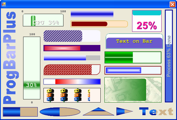
Why another Progress Bar? The Standard ProgressBar was too limited and I couldn't find a custom control written that did all that I wanted. This is a UserControl with lots of properties and versatility. It shows minimum to maximum value progress or infinite back and forth progress. It is simple to use, just drop it on the form, adjust the design time properties and use it like the normal ProgressBar.
Background
This was my first UserControl that implemented some design time properties including an expandable property with the ExpandableObjectConverter TypeConverter and ControlDesigner. I have expanded the Design-Time editing in Version 2.0 using the techniques explained here: UITypeEditorsDemo[^] (Because of the new Editors, a revamp of the Properties occurred so there are some differences from the previous version). The demo also illustrates how to use a component or runtime BackgroundWorker to run different threads.
Control Properties
Here is a list of the primary properties:
BarStyleFill
The fill style for the bar. Solid, Patterns, multiple color blends, and Image
BarColorBlend
The Colors and Positions used for Gradient fills
BarColorSolid, BarColorSolidB
The Colors used for Solid and Hatch fills
FocalPoints
The movable Centerpoint and Focus Scales for the color blends
Shape
The shape of the bar. Rectangle, Ellipse, Triangle, and Text
BorderColor, BorderWidth
Change the border properties
Orientation
Horizontal or Vertical progress
FillDirection
Horizontal Right to Left or Left to Right and Vertical Bottom to Top or Top to Bottom
Corners, CornersApply
Adjust the corner radius and apply to the border, bar, or both
ForeColor, TextAlignment, TextAlignmentVert, TextWrap, TextPlacement, Shadow
Adjust the color, alignments, wrapping, and if the text appears over the control or moves with the bar
TextShow, TextFormat
Templates for what text to display:
NoneValue = Just the Value ValueOfMax = Formats the Value with the Max i.e. '22 of 100'Percent = Just the ValuePercent with a percent signFormatString = Enter any text here:
- Enter
{0} where you want the Value to show. - Enter
{1} where you want the ValuePercent to show. - Enter
{2} where you want the Max to show.
i.e. '{0} rows of data out of {2} processed'
BarType
Display Min to Max progress or Back and Forth infinite progress
BarLength, BarLengthValue
Bar continues to expand with the Value or a fixed length of the bar moves with the value
Min, Max
The minimum and maximum value of the ProgressBar
Value
The current value of the ProgressBar
ShowDesignBorder
Show a dotted line in design mode only if there is no border
Control Methods
ValuePercent()
Get the Percent the value represents
ResetBar(opt value)
Sets the Value to MinValue or MaxValue
Increment(opt value)
Increase the value by one or the value given
Decrement(opt value)
Decrease the value by one or the value given
Using the Code
Once you get the Progress Bar looking the way you want, add some code. You can directly change the Value property or use the Increment/Decrement methods:
With MyProgBarText
   .Max = 200
   .ResetBar()
   For i As Int32 = 0 To 200
       .Increment()
       // Add Your Code Here
   Next
End With
For the Infinite Progress Bar, change the BarType and change the CylonRun Boolean value:
MyProgBarCylon.BarType = MyProgBar.eBarType.CylonBar
MyProgBar.CylonRun = True
Points of Interest
The SmartTag makes it easy to customize the Progress Bar. All the important properties are organized to simplify the process.

History
- Version 1.0 February 2008
- Version 2.0 November 2008
- Version 3.0 June 2011
- Many design and layout fixes
