Introduction
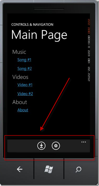
We are all familiar with the Application Bars in Windows Phone 7…

It can be achieved with a few lines of code as shown below:
<phone:PhoneApplicationPage.ApplicationBar>
    <shell:ApplicationBar>
        <shell:ApplicationBarIconButton IconUri="/icons/download.png" IsEnabled="True" />
        <shell:ApplicationBarIconButton IconUri="/icons/settings.png" IsEnabled="True" />
        <shell:ApplicationBar.MenuItems>
            <shell:ApplicationBarMenuItem x:Name="mnuReturnToHome"
                 Text="return to home" Click="mnuReturnToHome_Click" />
        </shell:ApplicationBar.MenuItems>
    </shell:ApplicationBar>
</phone:PhoneApplicationPage.ApplicationBar>
We want to do the same thing with our new XAML Metro applications. The good news is that it is just as easy as in the Windows Phone 7, with a few other cool features.
Let’s get started…
Fire open Visual Studio 11 and select File->New Project. Then select Visual C# –> Windows Metro Style –> Application, and give it a name and hit OK.

Once MainPage.xaml loads, replace the Grid with the following code snippet:
<Grid x:Name="LayoutRoot" Background="#FF0C0C0C">
    <ApplicationBar VerticalAlignment="Bottom">
        <StackPanel Orientation="Horizontal">
            <Button Content="Exit" x:Name="btnExit" />
        </StackPanel>
    </ApplicationBar>
</Grid>
Now you should be able to run the project with a simple Ctrl+F5 or from the Debug menu.

But you will quickly notice that all you have is a black screen.

Note: Black screenshot added for laughs.

App bars are transient by default, which means they start out hidden and only appear in response to a gesture, or in this case, a right mouse click. If you
right click on the application (if using an emulator or a non-tablet device), you will see the application bar appear.

You can also press CTRL+ALT+A if you are a keyboard kind of guy/gal.
I want my app bar always visible!
You can make the app bars display at all times by setting the IsPersistent property to True.
<Grid x:Name="LayoutRoot" Background="#FF0C0C0C">
   <ApplicationBar VerticalAlignment="Bottom" IsPersistant="True">
       <StackPanel Orientation="Horizontal">
           <Button Content="Exit" x:Name="btnExit" />
       </StackPanel>
   </ApplicationBar>
</Grid>
How do you change the way app bars are dismissed?
You can change the way that app bars are dismissed by setting the DismissMode property.

From the documentation:
The default value is EdgeSwipe, which requires an edge swipe gesture, right-click, or CTRL+ALT+A. LightDismiss causes the app bar to disappear
when the user interacts with the main part of the app, and TimeDelay causes the app bar to disappear after a specified delay.
In the sample code below, you will see that we set two properties: DismissMode and Delay. (We set this example to hide the application bar after 5 seconds.)
<ApplicationBar Background="White" VerticalAlignment="Bottom"
                DismissMode="TimeDelay" Delay="5000">
   <StackPanel>
         <Button Content="Bottom" Background="Black" />
   </StackPanel>
</ApplicationBar>
Is my app bar limited to the bottom?
No, you may change the VerticalAlignment to any of the following values. The only one that I found beneficial was Top or Bottom.

As you can see, several options exist.
Can I have both a Top Application Bar and a Bottom Application Bar?
Sure, just add in code similar to the following:
<Grid x:Name="LayoutRoot" Background="#FF0C0C0C">
<ApplicationBar Background="White" VerticalAlignment="Top"
DismissMode="TimeDelay" Delay="5000">
<StackPanel>
<Button Content="Top" Background="Black" />
</StackPanel>
</ApplicationBar>
<ApplicationBar Background="White" VerticalAlignment="Bottom"
DismissMode="TimeDelay" Delay="5000">
<StackPanel>
<Button Content="Bottom" Background="Black" />
</StackPanel>
</ApplicationBar>
</Grid>
What about adding an image to my button?
I did it the following way:
<Grid x:Name="LayoutRoot" Background="#FF0C0C0C">
    <ApplicationBar VerticalAlignment="Bottom" DismissMode="TimeDelay" >
        <StackPanel Orientation="Horizontal">
            <Button Content="Exit" x:Name="btnExit" />
            <Button >
                <Button.Content>
                    <Image Height="20" Width="20"
                       Source="c:\users\mbcrump\documents\visual studio 11\
                         Projects\ApplicationBarSample\
                         ApplicationBarSample\Images\SmallLogo.png"/>
                </Button.Content>
            </Button>
        </StackPanel>
    </ApplicationBar>
</Grid>
I am pretty sure there are probably other more elegant ways, but I did it simply using my existing XAML knowledge and the image supplied by the project
template. I wanted to see how much of the “use your existing skills” was true.

Conclusion
It was pretty easy to get up to speed with the new Application Bar in XAML Metro applications. I am investing a lot of free time learning how to develop Metro
applications using XAML/C#. If you are interested in more articles like these, then please look through the last few posts on my blog. Also, don’t forget to
come back for more articles on a wide range of XAML technologies.
