Introduction
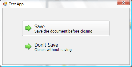
There are a lot of great Vista-style controls written in .NET. So this is yet one more, a command-link button. I am a fan of creating custom controls from scratch rather than depending on the OS drawing libraries. Thus, our CommandLink is drawn entirely with C# code, making it compatible with older versions of Windows.
Goal of the CommandLink
When I set out to write the control, I decided I wanted a CommandLink that had that Vista-style feel to it, but that did replicate default Command-Links exactly. So, I wrote a simple goal list of which elements to include:
- Two different font-sizes within the same button, i.e., for the header text and the description text.
- An image/icon off to the left that, unlike Vista’s
CommandLink, can be aligned vertically to the top, middle, or bottom. - A blended flat-look for default and a gradient look for the mouse-hover.
- Behave like a button.
Rounded Rectangles
Before drawing the actual control, first, we need a function to draw rounded rectangles. Since the button will need to outline and fill the round rectangle, it is easiest to write a function that returns a GraphicsPath:
private static GraphicsPath RoundedRect(int width, int height, int radius)
{
RectangleF baseRect = new RectangleF(0, 0, width, height);
float diameter = radius * 2.0f;
SizeF sizeF = new SizeF(diameter, diameter);
RectangleF arc = new RectangleF(baseRect.Location, sizeF);
GraphicsPath path = new GraphicsPath();
path.AddArc(arc, 180, 90);
arc.X = baseRect.Right - diameter;
path.AddArc(arc, 270, 90);
arc.Y = baseRect.Bottom - diameter;
path.AddArc(arc, 0, 90);
arc.X = baseRect.Left;
path.AddArc(arc, 90, 90);
path.CloseFigure();
return path;
}
Drawing Elements
So, let’s break down the visual elements of the CommandLink. The only two complicated states are the Hover and the Down state.
Hover

The part that makes the button pop-up is a simple white gradient that goes three-fourths of the way down the button’s height. Due to the way the LinearGradientBrush works, sometimes if the gradient drawing area is 1 pixel too tall, the gradient will start over, making an ugly white line appear in the middle of the control. To fix that, we add the following line after the LinearGradientBrush is declared:
WrapMode.TileFlipX

Next comes the outline. It is a 3 radius rounded rectangle generated with the above function. The color can either be SystemColors.ColorDark, or if you prefer a fixed color, (189, 189, 189) is nice.

Then, we need an inside outline. This will be 2 radius instead, and is positioned at coordinates (1, 1). The color is a slightly transparent white with an alpha value of 245.
We put it together by drawing them in order, and we get something like this:

Down

The background this time is solid, and once again, can either be a system color (ControlLight), or (234, 234, 234), if you like fixed colors better.

The outline will be the same as before, except the color will be darker, (167, 167, 167).

Lastly, the inner outline too will only change colors to a dark color (to give a shadow effect).
The final down state:

Highlight
The user should be able to tell when the CommandLink is selected, even if it was done with Tab. To highlight a selected CommandLink, we draw only an inner outline with the color (192, 233, 243), which is a light blue.
Foreground – Image and Text
The foreground elements will be the same for any state of the button. There is actually nothing special to drawing the text and the image. The description text will always be three sizes smaller than the header text. The font can be changed, but the default one is Tahoma. To center the combined sizes of the header and the description text, go with:
SizeF headerLayout = g.MeasureString(headerText, this.Font);
SizeF descriptLayout = g.MeasureString(descriptionText, descriptFont);
Rectangle totalRect = new Rectangle(0, 0,
(int)Math.Max(headerLayout.Width,
descriptLayout.Width),
(int)(headerLayout.Height +
descriptLayout.Height) - 4);
Also, this is the part of the control that will change if the control is disabled. The text need only change color. The image, however, needs to be converted to grayscale if it hasn’t been done already.
Events to Override
There are a few events that need to be overridden to get the CommandLink to behave like we want:
OnPaint – Handles all the drawing methods; depending on the CommandLink’s state, it executes the proper drawing routine. OnClick – Since the user control is not inheriting the Button class, if we want to be able to specify a DialogResult, the behavior needs to manually be handled here. OnKeyPress – If the CommandLink is selected with Tab and the user hits Enter, then do a PerformClick. OnGotFocus/OnLostFocus – Refreshes the control to draw/remove the light-blue highlight. OnMouse[…] – All the OnMouse events simply change a variable to reflect the current state of the CommandLink and makes the control redraw itself. OnEnabledChanged – Sets the correct state and redraws the CommandLink. (Note, unfortunately, this event is not called during design-time, but it works fine at run-time.)
Conclusion and Improvements
At the end, we are left with a control that has the basic functionality of a button but the appearance of a Vista-style CommandLink. The implementation is meant to be compatible for older versions of Windows, so there are optional improvements that can be done. For example, there is no support for gradual fading like Vista controls do, and for now, the image has to be on the left side.
