Introduction
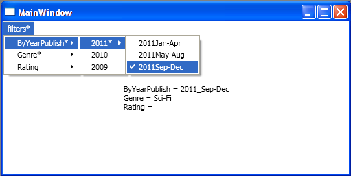
Dealing with large data-sets often requires some kind of filtering mechanism. For more than once, I've found that the following filtering approach comes in handy (for both UI and code-design). What I was aiming for was a menu-based UI filtering solution in which the first level will show the filtering criteria and the next levels will give the optional values in more and more granular resolution options. Each criteria can have only single or none filter value, where none means no filtering. I also wanted to have a visual indicator of whether any filtering is being applied*.
Here are some screenshots that might make it more clear:


* A faster way to understand what I am aiming for might be to download and run the sample project...
Background
UI Aspect
Using menu as the filtering-parameters-selection-platform has the advantage of minimum client area while giving the user information about the filtering criteria (in more details as the menu expands).
Implementation
The suggested implementation is heavily based on AttachedProperties. This allows to implement all the functionality inside the View and pass the ViewModel only the relevant information through binding. In the ViewModel, Using a filter/search command and LINQ/lambda, for instance, a result bound list could be populated for display (not implemented in this sample).
AttachedProperties (AP)
The next paragraph is for readers not familiar with AttachedProperties. If you are familiar with the concept, you can skip to the 'Using the code' section.
Here's a quote:
'The concept of Attached Properties (AP) is one of the most innovative features of WPF and also one of the least utilized.'
--WPF Control Development Unleashed/SAMS
Rather than explaining what APs are in WPF (which you can find in any WPF book), I'll try to convey its idea using a 'real-life' sample:
Imagine a custom desk internet-ordering-form, it has a few lines that enables the user to specify its properties:
At the bottom, there's a submit button which when pressed sends this form and, as a consequence, a new desk will be built (instantiated).
All is well, except...you would like to have some drawers...
In an 'AP-enabled-reality', all you'll need to do is to take out your 'magic pen' and hand-write another line. Now the form would look like this:
Color-greenWidth-100Height-50Depth-50NumberOfDrawers
NumberOfDrawers has a default value of zero, so you can omit its value if you wish a desk with no drawers.
What we actually did here is an alteration/customization/extension of an existing 'initialization-form'.
To make things even more interesting - let's say that we want the Height value to increase in 20 cm for every additional drawer we'll set (in the NumberOfDrawers property). Luckily, just like the default value set for the NumberOfDrawers property, we can also set a callback that will get triggered on every change of its value. There, we could update the Height property like so:
Height=_BaseHeight+(NumberOfDrawers*20)
I hope that this small analogy helped in giving an initial clue about the role AP has in WPF.
I've found AttachedProperties especially useful in two circumstances:
- Functionality Extension.
Binding/Animation enabling for properties that aren't DependencyPropertys; there, AP (which are Bindable/Animatable as they are DependencyProperty) acts as a proxy.
Using the code
In order to achieve the desired functionality, I've used AP to extend the MenuItem Elements.
In XAML:
Every criteria top level MenuItem has the IsGroupValueHolder AP set to True, for code-implementation purposes, and Value set to a bound ViewModel's Matching property.
<MenuItem Header="Rating" local:CheckGroupHelper.IsGroupValueHolder="True"
    Style="{StaticResource CheckGroupChildStyle}"
    local:CheckGroupHelper.Value=
       "{Binding Rating,Mode=OneWayToSource}">
Every criteria bottom level checkable value MenuItem has Value set to some predefined parameter.
<MenuItem Header="5" Style="{StaticResource CheckGroupChildStyleLeaf}" local:CheckGroupHelper.Value="5">
Inside styles:
'CheckGroupChildStyleLeaf' - IsCheckable sets to True (to allow user check), and IsChecked sets to our own IsCheckGroupChecked AP (which we monitor for value changes) via Binding.
'CheckGroupChildStyle' - IsCheckable sets to False, and asterisk visibility is controlled by Binding to the Value AP, using the AnyString2Asterisk Converter.
In code (CheckGroupHelper):
Inside IsCheckGroupCheckedChanged (relevant only for 'leaf' MenuItem):
If checked:
- Uncheck the currently checked value in this criteria-group (which consequently will bubble an empty value up to the group's value-holder).
MenuItem micc = GetGroupCurrentlyCheckedLeaf(mi);
if (micc != null)
{
    micc.IsChecked = false;
}
- Bubble this 'leaf' value.
mi.Parent.SetValue(CheckGroupHelper.ValueProperty,
          obj.GetValue(CheckGroupHelper.ValueProperty));
If unchecked: bubble empty value.
mi.Parent.SetValue(CheckGroupHelper.ValueProperty, "");
Inside ValueChanged:
- Bubble value up the
MenuItems tree. - Don't bubble empty value beyond the criteria's top level
MenuItem (IsGroupValueHolder =True) if any other criteria top level MenuItem has a value (so, the 'Filters' MenuItem will still show that it has a value!).
Points of Interest
- I hope that with this simple demonstration, I have successfully shown how, by using
AttachedPropertys, we can achieve special UI functionality, with minimum code, while preserving a clean MVVM infrastructure. - In previous versions of this application, I used a 'Named-Groups' approach (just like a radio-button's
GroupName property). This approach, although it gives a lot of design flexibility, is redundant for this kind of scenario. Groups here are clustered and defined by the MenuItems hierarchy.
