 One of our applications required a
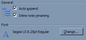
 GroupBox which was more like the one featured in the Options dialog of Microsoft Outlook 2003. This article describes how to create a custom GroupBox component which allows this type of user interface, and also a neat trick on adjusting the client area so that when you drag controls inside the GroupBox, the handy little margin guides allow you to position without overlapping the icon.
Add a new Component class to your project, and inherit this from the standard GroupBox.
[ToolboxItem(true)]
[DefaultEvent("Click"), DefaultProperty("Text")]
public partial class GroupBox : System.Windows.Forms.GroupBox
I personally don't like assigning variables at the same time as defining them, so I've added a default constructor to assign the defaults and also to set-up the component as we need to set a few ControlStyles.
public GroupBox()
{
   _iconMargin = new Size(0, 6);
   _lineColorBottom = SystemColors.ButtonHighlight;
   _lineColorTop = SystemColors.ButtonShadow;

   this.SetStyle(ControlStyles.DoubleBuffer |
       ControlStyles.AllPaintingInWmPaint | ControlStyles.ResizeRedraw |
       ControlStyles.UserPaint | ControlStyles.SupportsTransparentBackColor, true);

   this.CreateResources();
}
Although this is a simple component, we need at the minimum an Image property to specify the image. We're also adding color properties in case we decide to use the component in a non-standard interface later on.
private Size _iconMargin;
private Image _image;
private Color _lineColorBottom;
private Color _lineColorTop;

[Category("Appearance"), DefaultValue(typeof(Size), "0, 6")]
public Size IconMargin
{
  get { return _iconMargin; }
  set
  {
    _iconMargin = value;
    this.Invalidate();
  }
}

[Category("Appearance"), DefaultValue(typeof(Image), "")]
public Image Image
{
  get { return _image; }
  set
  {
    _image = value;
    this.Invalidate();
  }
}

[Category("Appearance"), DefaultValue(typeof(Color), "ButtonHighlight")]
public Color LineColorBottom
{
  get { return _lineColorBottom; }
  set
  {
    _lineColorBottom = value;
    this.CreateResources();
    this.Invalidate();
  }
}

[Category("Appearance"), DefaultValue(typeof(Color), "ButtonShadow")]
public Color LineColorTop
{
  get { return _lineColorTop; }
  set
  {
    _lineColorTop = value;
    this.CreateResources();
    this.Invalidate();
  }
}

[DefaultValue("")]
public override string Text
{
  get { return base.Text; }
  set
  {
    base.Text = value;
    this.Invalidate();
  }
}
If you wanted, you could create and destroy required GDI objects every time the control is painted, but in this example I've opted to create them once for the lifetime of the control. Therefore, I've added CreateResources and CleanUpResources to create and destroy these. Although not demonstrated in this in-line listing, CleanUpResources is also called from the components Dispose method. You'll also notice CreateResources is called whenever a property value changes, and that it first releases resources in use.
private void CleanUpResources()
{
  if (_topPen != null)
    _topPen.Dispose();

  if (_bottomPen != null)
    _bottomPen.Dispose();

  if (_textBrush != null)
    _textBrush.Dispose();
}

private void CreateResources()
{
  this.CleanUpResources();

  _topPen = new Pen(_lineColorTop);
  _bottomPen = new Pen(_lineColorBottom);
  _textBrush = new SolidBrush(this.ForeColor);
}
Now that all the initialization is performed, we're going to add our drawing routine which is to simply override the OnPaint method.
Remember that as we are overriding an existing component, we should override the base components methods whenever possible - this means overriding OnPaint and not hooking into the Paint event.
protected override void OnPaint(PaintEventArgs e)
{
SizeF size;
int y;
size = e.Graphics.MeasureString(this.Text, this.Font);
y = (int)(size.Height + 3) / 2;
e.Graphics.DrawString(this.Text, this.Font, _textBrush, 1, 1);
e.Graphics.DrawLine(_topPen, size.Width + 3, y, this.Width - 5, y);
e.Graphics.DrawLine(_bottomPen, size.Width + 3, y + 1, this.Width - 5, y + 1);
if ((_image != null))
e.Graphics.DrawImage(_image, this.Padding.Left +
_iconMargin.Width, this.Padding.Top + (int)size.Height +
_iconMargin.Height, _image.Width, _image.Height);
if (this.DesignMode)
{
Pen pen;
pen = new Pen(SystemColors.ButtonShadow);
pen.DashStyle = DashStyle.Dot;
e.Graphics.DrawRectangle(pen, 0, 0, Width - 1, Height - 1);
pen.Dispose();
}
}
In the code above, you'll also notice a block specifically for design time. As this control only has borders at the top of the control, at design time it may not be obvious where the boundaries of the control are when laying out your interface. This code adds a dotted outline to the control at design time, and is ignored at runtime.
Another method we are overriding is OnSystemColorsChanged. As our default colors are based on system colors, should these change, we need to recreate our objects and repaint the control.
protected override void OnSystemColorsChanged(EventArgs e)
{
   base.OnSystemColorsChanged(e);

   this.CreateResources();
   this.Invalidate();
}
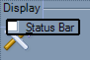
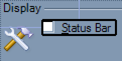
 The client area of a standard group box accounts for the text header and the borders. Our component however, needs an additional offset on the left to account for the icon. If you try and place controls into the group box, you will see the snapping guides appear in the "wrong" place.
Fortunately however, it is very easy for us to suggest our own client area via the DisplayRectangle property. We just override this and provide a new rectangle which includes provisions for the width of the image.
public override Rectangle DisplayRectangle
{
  get
  {
    Size clientSize;
    int fontHeight;
    int imageSize;

    clientSize = base.ClientSize;
    fontHeight = this.Font.Height;

    if (_image != null)
      imageSize = _iconMargin.Width + _image.Width + 3;
    else
      imageSize = 0;

    return new Rectangle(3 + imageSize, fontHeight + 3,
    Math.Max(clientSize.Width - (imageSize + 6), 0),
    Math.Max((clientSize.Height - fontHeight) - 6, 0));
  }
}
 Now as you can see, the snapping guides suggest a suitable left margin based on the current image width.
You can download the complete source for the GroupBox component above.
Update History
- 10/08/09 - First posted at cyotek.com
- 29/01/12 - Posted on codeproject.com
