
Introduction
I've been reading articles on CodeProject for a long time and I thought it was about time I gave writing a shot. I am about as far from a talented writer as one could get, so hopefully the first try is tolerable to read.
I wanted an alternative to Internet Explorer for reading / playing RSS video feeds, so I decided to write an application that would let me easily peruse and watch the videos from my favorite feeds. After writing the RSS portion, I decided to add support for opening media from the file system as well.
Using the Code
To use this application, you will need .NET 3.5 installed. The application uses the WPF MediaElement for video and audio playback. The MediaElement relies on Windows Media Player 10+ to function.
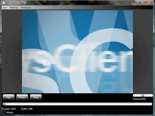
When you start the application, the Media browser will be expanded and contains both the Library view and the RSS view. You can close either of the views and re-open them from the menu bar, under Windows.
To hide the media browser, click the very bottom of the screen where it says “Media”. The rest of the application is pretty straightforward; just select the media you want to view, and you can control the playback like most other media applications.
Points of Interest
The Media Element
Application Cleanliness
The MediaElement is not exactly friends with the MVVM pattern, and honestly complicates trying to write an application like this. Why? It lacks dependency properties. I don't know why, I just trust that the WPF gods have a plan.
Regardless of the reason, I had to find a way to work around this. Since I can't bind its properties like, Position, Source, and Volume in XAML, I will need a code-behind, but at the same time, I don't want to clutter the UI and main window code-behind. The solution for me was to use a user control which contains the media element and all of the controls that will operate it.
Power of Dependency
That solves the problem of keeping things clean. Now, how can I update the media to be played?
In an MVVM application, the ViewModel has no idea what controls are in its associated view. I decided to create a dependency property on the user control so that in the main window, I could data bind the control in XAML to a property on the ViewModel.
It's a little confusing and is probably better explained in code.
In the MyMediaControl code-behind, I declare a dependency property like this. It is important to note that you should not put anything in the wrapper property other than the get and set. Like shown here. Doing so will cause the property to not function correctly.
public static readonly DependencyProperty MediaSourceProperty =
          DependencyProperty.Register("MyMediaSource", typeof(string),
            typeof(MyMediaControl), new PropertyMetadata(LastNameChangedCallback));

public string MyMediaSource
{
    get
    {
        return (string)GetValue(MediaSourceProperty);
    }
    set
    {
        SetValue(MediaSourceProperty, value);
    }
}
All that is left to do is catch the property changed event. Like so:
private static void MediaSourceChangedCallBack(
               DependencyObject obj, DependencyPropertyChangedEventArgs e)
{
    if (e.NewValue != null)
        if (e.NewValue.ToString().Length > 0)
            _MediaURI = new Uri((string)e.NewValue);
}
Now that there is a functioning dependency property, all that is left to do is bind the property in XAML.
In MainWindow.xaml:
<UC:MyMediaControl MyMediaSource="{Binding ElementName=mainwnd,Path=DataContext.Source}"/>
The property needs to be explicitly bound to the data context of the main window. For some reason, it won't look at the main window's data context by default, and instead, will look at the user control for the property.
With this setup, I am able to change the Source property on the MainWindowViewModel and have that also update the user control while maintaining a loose coupling between all the elements.
Look-less Controls
WPF controls are designed to be look less. That means you can change any of the visuals without affecting the business logic. To do this with existing controls, you use control templates.
Here is the template for the slider control used in this application:
<ControlTemplate x:Key="HorizontalSlider" TargetType="{x:Type Slider}">
    <Grid>
        <Grid.RowDefinitions>
            <RowDefinition Height="Auto"/>
            <RowDefinition Height="Auto"
               MinHeight="{TemplateBinding Slider.MinHeight}"/>
            <RowDefinition Height="Auto"/>
        </Grid.RowDefinitions>
        <TickBar
  Name="TopTick"
  SnapsToDevicePixels="True"
  Placement="Top"
  Fill="{StaticResource GlyphBrush}"
  Height="15"
  Visibility="Collapsed" />
        <Border
  Name="TrackBackground"
  Margin="0"
  CornerRadius="4"
  Height="15"
  Grid.Row="1"
  Background="{StaticResource LightBrush}"
  BorderBrush="{StaticResource NormalBorderBrush}"
  BorderThickness="1" />
    <Track Grid.Row="1" Name="PART_Track">
        <Track.DecreaseRepeatButton>
            <RepeatButton
  Style="{StaticResource SliderButtonStyle}"
  Command="Slider.DecreaseLarge" />
        </Track.DecreaseRepeatButton>
        <Track.Thumb>
            <Thumb Style="{StaticResource SliderThumbStyle}" />
        </Track.Thumb>
        <Track.IncreaseRepeatButton>
            <RepeatButton
  Style="{StaticResource SliderButtonStyle}"
  Command="Slider.IncreaseLarge" />
        </Track.IncreaseRepeatButton>
    </Track>
    <TickBar
  Name="BottomTick"
  SnapsToDevicePixels="True"
  Grid.Row="2"
  Fill="{TemplateBinding Foreground}"
  Placement="Bottom"
  Height="4"
  Visibility="Collapsed" />
    </Grid>
    <ControlTemplate.Triggers>
        <Trigger Property="TickPlacement" Value="TopLeft">
            <Setter TargetName="TopTick"
               Property="Visibility" Value="Visible"/>
        </Trigger>
        <Trigger Property="TickPlacement" Value="BottomRight">
            <Setter TargetName="BottomTick"
               Property="Visibility" Value="Visible"/>
        </Trigger>
        <Trigger Property="TickPlacement" Value="Both">
            <Setter TargetName="TopTick"
               Property="Visibility" Value="Visible"/>
            <Setter TargetName="BottomTick"
               Property="Visibility" Value="Visible"/>
        </Trigger>
    </ControlTemplate.Triggers>
</ControlTemplate>
Look less controls let you give your application a very unique appearance without creating custom controls from the ground up.
You will find that it is easiest to start with the default template of the control. There are ways to get this in code, but if you are using a standard WPF control, MSDN has the default templates for all WPF controls: http://msdn.microsoft.com/en-us/library/aa970773.aspx.
Data Converters
The final quick topic I would like to cover is data converters. When using MVVM, you should seldom if ever need to use these, but I feel they are an extremely powerful tool, and deserve a little coverage.
Data converters allow you to bind to all kinds of data in XAML and convert it using a custom class that can manipulate the data in code. A simple Converter class looks like this:
public class DoubleToPercent : IValueConverter
{
public object Convert(object value, Type targetType, object parameter,
System.Globalization.CultureInfo culture)
{
double thisdbl = (double)value;
int percent = (int)(thisdbl * 100);
return percent;
}
public object ConvertBack(object value, Type targetType, object parameter,
System.Globalization.CultureInfo culture)
{
throw new NotImplementedException();
}
}
You need to implement IvalueConverter which provides your class with two functions to convert the data.
In XAML, your binding would like this:
<TextBlock Text="{Binding ElementName=mMediaElement, Path=Volume,
                  Converter={StaticResource DoubleToPercent}}"/>
