Update: Other article links are moved towards the bottom.
Table of Contents
Perhaps this article is very basic. But I have seen many Silverlight developers struggling with layout controls and objects in Silverlight. In this section, we will quickly walk through 3 different methods of layout for Silverlight. In this article, we will go through each of these layout implementations and make a simple sample for the same.
There are three ways provided by Silverlight for layout management - Canvas, Grid and Stack panel. Each of these methodologies fit into different situations as per layout needs. All these layout controls inherit from Panel class. In the next sections, we will go through each of them to understand how they work.
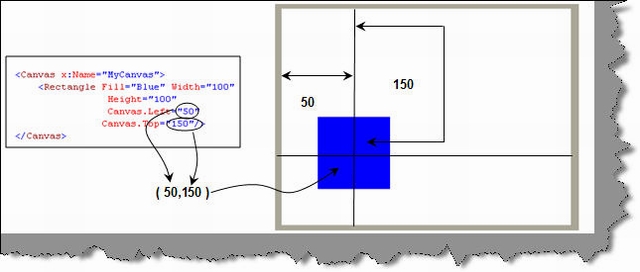
Canvas is the simplest methodology for layout management. It supports absolute positioning using ‘X’ and ‘Y’ coordinates. ‘Canvas.Left’ helps to specify the X co-ordinate while ‘Canvas.Top’ helps to provide the ‘Y’ coordinates.
Below is a simple code snippet which shows how a rectangle object is positioned using ‘Canvas’ on co-ordinates (50,150).
<Canvas x:Name="MyCanvas">
<Rectangle Fill="Blue" Width="100"
Height="100"
Canvas.Left="50"
Canvas.Top="150"/>
</Canvas>
Below is how the display looks like. When you the run the code, the XAML viewer will position the rectangle object on absolute ‘X” and ‘Y’ coordinates.

Grid layout helps you position your controls using rows and columns. It’s very similar to table defined in HTML.

Below is a simple table with two columns and two rows defined using Grid. We have shown how the table display looks like. Using the Grid.ColumnDefinition, we have defined two columns and using Grid.RowDefinition, we have defined two rows. We have then created 4 text blocks which are then specified in each section using Grid.Column and Grid.Row. For instance, to place in the first column, we need specify the Grid.Column as 0 and Grid.Row as 0. We have followed the same pattern for everyone and you can see that all the textblocks are placed in the appropriate sections.
As the name, so the behavior. Stack allows you to arrange your UI elements vertically or horizontally.

For instance, below are 4 elements which are arranged in a stack panel element. You can see how the stack aligns / stacks the elements one above other. You can also stack the UI elements horizontally or vertically depending on the nature of your layout.
We have provided one single source code which has three XAML files explaining a sample of each layout. You can download the source code from here.
Silverlight FAQ Part 1: This tutorial has 21 basic FAQs which will help you understand WPF, XAML, help you build your first Silverlight application and also explains the overall Silverlight architecture.
SilverLight FAQ Part 2 (Animations and Transformations): This tutorial has 10 FAQ questions which starts with Silverlight animation fundamentals and then shows a simple animated rectangle. The article then moves ahead and talks about 4 different ways of transforming the objects.
For Further reading do watch the below interview preparation videos and step by step video series.
