Introduction
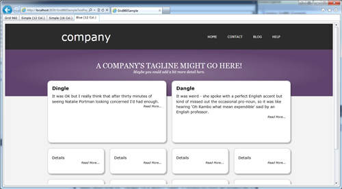
If you've never heard of the 960 Grid System, have a glance over the page here: http://960.gs/. The idea is that you have a page where the content is no wider than 960 pixels - you then lay out the content consistently in twelve columns in those 960 pixels. For example, in the page below, we have:
- First row, three columns occupied by 'company', three columns space, six columns occupied by a menu.
- Second row, all twelve columns occupied by a tagline.
- Third row, two six column boxes.
- Fourth and fifth row, four three column boxes.

960gs is a CSS based layout system for web pages that are designed to follow a horizontally fixed and vertically fixed or flowing layout. Why 960? Well, we divide 960 horizontal pixels (a comfortable width for most screens) by 12 columns - then lay out our page with elements that span one or more of these columns. The Grid960 component can be used in 12, 16, 24 or a custom number of column layouts. 960 is a good number for web page layouts - because it is highly divisible - 960 is divisible by 2, 3, 4, 5, 6, 8, 10, 12, 15, 16, 20, 24, 30, 32, 40, 48, 60, 64, 80, 96, 120, 160, 192, 240, 320, and 480.
Using Grid960
Using Grid960 couldn't be easier. First, you must add a reference to Grid960:
xmlns:g960="clr-namespace:Grid960;assembly=Grid960"
Now, we can add a grid to the page:
<g960:Grid960>
</g960:Grid960>
We add Grid960Row rows to the Grid960 next:
<g960:Grid960>
<g960:Grid960Row>
</g960:Grid960Row>
<g960:Grid960Row>
</g960:Grid960Row>
</g960:Grid960>
The final stage is to add Grid960Element elements to the rows. Below, we have a row of three columns and a row of two columns:
<g960:Grid960>
<g960:Grid960Row>
<g960:Grid960Element ColumnSpan="4">
</g960:Grid960Element>
<g960:Grid960Element ColumnSpan="4">
</g960:Grid960Element>
<g960:Grid960Element ColumnSpan="4">
</g960:Grid960Element>
</g960:Grid960Row>
<g960:Grid960Row>
<g960:Grid960Element ColumnSpan="6">
</g960:Grid960Element>
<g960:Grid960Element ColumnSpan="6">
</g960:Grid960Element>
</g960:Grid960Row>
</g960:Grid960>
Essentially, this is all there is to the Grid960 layout system!
When you visit the main 960gs home page, you can see many examples of how common sites (like Drupal!) have actually used 960gs for their layout.

The Example Application
The example application shows two example layouts based on the system. It also has a quick reference diagram of the two most popular layouts - 12 column and 16 column.

Customizing Grid960
Here are the key properties for each of the main parts of the Grid960 system.
Grid960
Core layout options:
int Columns - The number of columns - the default is 12.double ColumnMargin - The margin that each column has on the left and the right. The default is 10 pixels - with 12 columns, this gives a width of sixty pixels per column.double ColumnWidth - The width of each column. It is the combination of these three properties that makes the full width of the grid up to 960 pixels.
Presets:
- Preset Preset - The preset can be
Grid960_12_Columns, Grid960_16_Columns, or Grid960_24_Columns. Setting any one of these presets will change all three properties above.
Grid960Row
FrameworkElement FullWidthContent - This can be set to any framework element and will occupy the height of the row and the full width of the screen (useful for laying out backgrounds).FrameworkElement RowWidthContent - This can be set to any framework element and will occupy the row width of the screen (almost always 960 pixels).bool FillAvailableSpace - If set to true, then if the full Grid960 doesn't fill the vertical space on the screen, then this row will be stretched to fill the available space.
Grid960Element
int ColumnSpan - The most important property for a Grid Element - how many columns it spans.int ColumnOffset - Allows you to offset a grid element by a specific number of columns. This defaults to zero.
Thanks
I'd like to offer my thanks to Nathan Smith who has kindly given me permission to port 960gs to Silverlight.
Show Off!
If any of you create a great layout with this, let me know - I'd love to put some examples on this page!
As usual, any comments or suggestions are most welcome!
History
- 11th June, 2013: Initial version
