Introduction
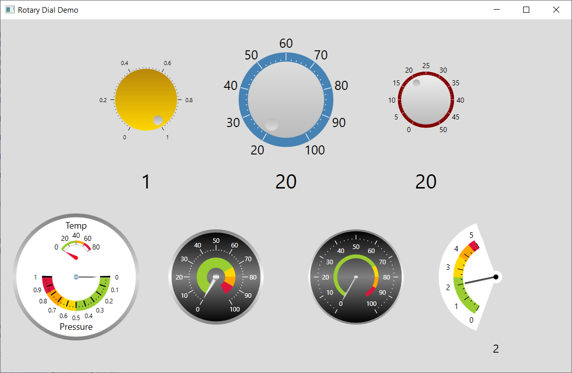
This article presents a custom rotary dial control with configurable properties including labels, major ticks and major tick increments. It includes a simple demonstration application with examples of the rotary dial control in use:

The top three dials use a circular position indicator.
The top left hand dial has a continuous range of values from 0 to 1, with a major tick every 0.2 units and black labels. The dial is 150 units wide.
The top central dial has integral values from 0 to 100 with a major tick every 20 units and black labels. The dial is 200 units wide.
The top right hand dial has integral values from 0 to 50 with a major tick every 5 units and black labels. The dial is 100 units wide.
The bottom four dials use needle pointers, and have coloured arcs.
The bottom left hand dial is constructed from two dial controls. The top dial has a continuous range of values from 0 to 80, with a major tick every 20 units and black labels. The bottom dial has a continuous range of values from 0 to 1.0, with a major tick every 0.1 units and black labels.
The bottom central left and right dials have a continuous range of values from 0 to 100, with a major tick every 10 units and white labels. Each dial is 200 units wide. The left central dial has labels outside the tick marks, whereas the right central dial has labels inside the tick marks.
The bottom right hand dial spans an arc rather than a full circle.
Background
You will need to understand C# and the basics of WPF.
Designing a Rotary Dial
My design goal was to make the rotary dial as customisable as possible without making it unduly complex. To achieve this aim, a rotary control is constructed from a series of concentric circles or dials, some of which are imaginary and serve to layout components such as labels and tick marks.
The labels are placed around the edge of an imaginary label dial whose radius is set by the LabelDialRadius dependency property. The font size is set by the FontSize dependency property and the font colour is set by the Foreground dependency property.
The major ticks are placed around the edge of an imaginary major label dial whose radius is set by the MajorTickDialRadius dependency property. The length of each major tick is set by the MajorTickLength dependency property.
The minor ticks are placed around the edge of an imaginary minor label dial whose radius is set by the MinorTickDialRadius dependency property. The length of each minor tick is set by the MinorTickLength dependency property.
The angular position of the first value on the dial is set by the StartAngleInDegrees dependency property.
The angular position of the last value on the dial is set by the EndAngleInDegrees dependency property.
Both angles are relative to the 12 o'clock position and in a clock wise direction.
There are two ways to add coloured segments, or complete circles, to a rotary control.
The first way to add coloured segments is to use the Segments dependency property. This holds an array of RotaryControlSegment objects. Each defines a segment with an associated colour and angle. The segments are contiguous, and start at the first value. All segments have the same outer radius, set by SegmentRadius, and the same thickness, set by SegmentRadius.
The second more flexible way to add coloured segments is to use the Arcs dependency property. Each arc has its own radius, start angle, arc angle and thickness.
There is an inner dial which can be used to represent a knob. Its radius is set by the InnerDialRadius dependency property and its colour is set by the InnerDialFill dependency property.
The pointer style is set by the PointerType dependency property. Supported values include a circular pointer, representing a position indicator on a knob, and an arrow pointer representing a needle pointer. For all pointers, apart from the circle, the length, width and fill can be set.
Many of the properties have sensible default values and do not need to be explicitly defined.
Using the Code
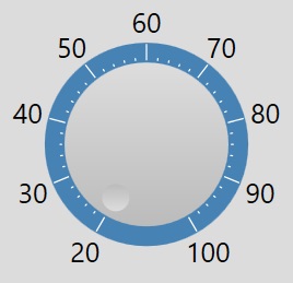
It is easy to create a simple dial with a central knob and position indicator as follows:

The above is created using the following XAML code:
<view:RotaryControl Grid.Row="0" Grid.Column="3"
x:Name="_dialTemperature" Value="{Binding Temperature,
Mode=TwoWay}" FontBrush="Black" FontSize="20"
Foreground="Black" Background="Transparent">
    <view:RotaryControl.MinimumValue>20</view:RotaryControl.MinimumValue>
    <view:RotaryControl.NumberOfMajorTicks>9</view:RotaryControl.NumberOfMajorTicks>
    <view:RotaryControl.MajorTickIncrement>10</view:RotaryControl.MajorTickIncrement>
    <view:RotaryControl.MajorTickBrush>White</view:RotaryControl.MajorTickBrush>
    <view:RotaryControl.NumberOfMinorTicks>4</view:RotaryControl.NumberOfMinorTicks>
    <view:RotaryControl.MinorTickBrush>White</view:RotaryControl.MinorTickBrush>
    <view:RotaryControl.OuterDialFill>SteelBlue</view:RotaryControl.OuterDialFill>
    <view:RotaryControl.OuterDialBorder>Transparent</view:RotaryControl.OuterDialBorder>
    <view:RotaryControl.OuterDialBorderThickness>1</view:RotaryControl.OuterDialBorderThickness>
    <view:RotaryControl.InnerDialRadius>60</view:RotaryControl.InnerDialRadius>
    <view:RotaryControl.PointerFill>
        <LinearGradientBrush EndPoint="0.5,0" StartPoint="0.5,1">
            <GradientStop Color="#DDDDDD" Offset="0"/>
            <GradientStop Color="#BBBBBB" Offset="1.0"/>
        </LinearGradientBrush>
    </view:RotaryControl.PointerFill>
</view:RotaryControl>
The above defines a rotary dial with grey central control, 9 major ticks on a slate blue background, a major tick increment of 10, a black 20 point font for the labels, and a transparent background. The Value is bound to the Temperature property in the view model.
By default, the control is 200 units wide.
To resize the control, use a LayoutTransform:
<view:RotaryControl.LayoutTransform>
    <ScaleTransform  ScaleX="2" ScaleY="2"/>
</view:RotaryControl.LayoutTransform>
When you resize the control, you will of course have to adjust the font size accordingly. The advantage of using a layout transform, rather than implementing scaling in code, is that the scaling is uniform, and requires far less background code.
To create a dial with integral values, bind the Value dependency property to an integer/long property in the view model. For continuous values, bind Value to a double property in the view model.
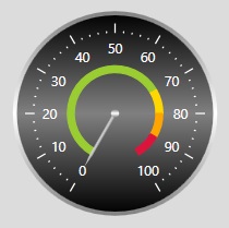
You can if you prefer to create a control with a needle pointer as follows:

The above is created using the following XAML code:
<view:RotaryControl Grid.Row="1" Grid.Column="5"
FontBrush="White" FontSize="10"
Foreground="Black" Background="Transparent" >
    <view:RotaryControl.PointerFill>
        <LinearGradientBrush EndPoint="0.5,0" StartPoint="0.5,1">
            <GradientStop Color="#DDDDDD" Offset="0"/>
            <GradientStop Color="#AAAAAA" Offset="1.0"/>
        </LinearGradientBrush>
    </view:RotaryControl.PointerFill>

    <view:RotaryControl.OuterDialFill>
        <LinearGradientBrush EndPoint="0.5,0" StartPoint="0.5,1">
            <GradientStop Color="Black" Offset="0"/>
            <GradientStop Color="Gray" Offset="0.5"/>
            <GradientStop Color="Black" Offset="1.0"/>
        </LinearGradientBrush>
    </view:RotaryControl.OuterDialFill>
    <view:RotaryControl.OuterDialBorder>
        <LinearGradientBrush EndPoint="0.5,0" StartPoint="0.5,1">
            <GradientStop Color="Gray" Offset="0"/>
            <GradientStop Color="White" Offset="0.5"/>
            <GradientStop Color="Gray" Offset="1.0"/>
        </LinearGradientBrush>
    </view:RotaryControl.OuterDialBorder>
    <view:RotaryControl.OuterDialBorderThickness>3</view:RotaryControl.OuterDialBorderThickness>

    <view:RotaryControl.InnerDialRadius>0</view:RotaryControl.InnerDialRadius>
    <view:RotaryControl.InnerDialFill>
        <LinearGradientBrush EndPoint="0.5,0" StartPoint="0.5,1">
            <GradientStop Color="White" Offset="0"/>
            <GradientStop Color="White" Offset="0.5"/>
            <GradientStop Color="White" Offset="1.0"/>
        </LinearGradientBrush>
    </view:RotaryControl.InnerDialFill>

    <view:RotaryControl.LabelDialRadius>48</view:RotaryControl.LabelDialRadius>

    <view:RotaryControl.MajorTickDialRadius>65.5</view:RotaryControl.MajorTickDialRadius>
    <view:RotaryControl.MajorTickLength>6</view:RotaryControl.MajorTickLength>
    <view:RotaryControl.NumberOfMajorTicks>11</view:RotaryControl.NumberOfMajorTicks>
    <view:RotaryControl.MajorTickIncrement>10</view:RotaryControl.MajorTickIncrement>
    <view:RotaryControl.MajorTickBrush>White</view:RotaryControl.MajorTickBrush>
    <view:RotaryControl.NumberOfMinorTicks>4</view:RotaryControl.NumberOfMinorTicks>
    <view:RotaryControl.MinorTickBrush>White</view:RotaryControl.MinorTickBrush>

    <view:RotaryControl.StartAngleInDegrees>210</view:RotaryControl.StartAngleInDegrees>
    <view:RotaryControl.EndAngleInDegrees>150</view:RotaryControl.EndAngleInDegrees>

    <view:RotaryControl.PointerAxleFill>
        <LinearGradientBrush EndPoint="0.5,0" StartPoint="0.5,1">
            <GradientStop Color="Gray" Offset="0"/>
            <GradientStop Color="White" Offset="0.5"/>
            <GradientStop Color="Gray" Offset="1.0"/>
        </LinearGradientBrush>
    </view:RotaryControl.PointerAxleFill>
    <view:RotaryControl.PointerLength>45</view:RotaryControl.PointerLength>
    <view:RotaryControl.PointerWidth>2</view:RotaryControl.PointerWidth>
    <view:RotaryControl.PointerType>standard</view:RotaryControl.PointerType>

    <view:RotaryControl.SegmentThickness>5</view:RotaryControl.SegmentThickness>
    <view:RotaryControl.SegmentRadius>35</view:RotaryControl.SegmentRadius>
    <view:RotaryControl.Segments>
        <x:Array Type="{x:Type view:RotaryControlSegment}" >
            <view:RotaryControlSegment Fill="YellowGreen" AngleInDegrees="210"/>
            <view:RotaryControlSegment Fill="Gold" AngleInDegrees="30"/>
            <view:RotaryControlSegment Fill="Orange" AngleInDegrees="30"/>
            <view:RotaryControlSegment Fill="Crimson" AngleInDegrees="30"/>
        </x:Array>
    </view:RotaryControl.Segments>
</view:RotaryControl>
Although the above is quite verbose, it should be relatively easy to understand. The length is due to the large number of properties allowing a high degree of customization. The coloured segments are defined by a segments dependency property. This is an array with four RotaryControlSegment objects each defining a coloured segment. The segments share the same radius and thickness.
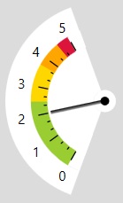
You also create a dial that subtends an arc as follows:

The above is created using the following XAML code:
<view:RotaryControl Grid.Row="1" Grid.Column="7" FontBrush="Black"
      FontSize="12" Foreground="Black" Background="Transparent"
      Value="{Binding Pressure, Mode=TwoWay}" >
    <view:RotaryControl.PointerType>rectangle</view:RotaryControl.PointerType>
    <view:RotaryControl.PointerFill>
        <LinearGradientBrush EndPoint="0.5,0" StartPoint="0.5,1">
            <GradientStop Color="Black" Offset="0"/>
            <GradientStop Color="#AAAAAA" Offset="1.0"/>
        </LinearGradientBrush>
    </view:RotaryControl.PointerFill>
    <view:RotaryControl.PointerLength>50</view:RotaryControl.PointerLength>
    <view:RotaryControl.PointerWidth>3</view:RotaryControl.PointerWidth>
    <view:RotaryControl.PointerAxleFill>Black</view:RotaryControl.PointerAxleFill>
    <view:RotaryControl.PointerAxleRadius>4</view:RotaryControl.PointerAxleRadius>

    <view:RotaryControl.OuterDialFill>Transparent</view:RotaryControl.OuterDialFill>
    <view:RotaryControl.OuterDialBorderThickness>0
    </view:RotaryControl.OuterDialBorderThickness>

    <view:RotaryControl.InnerDialRadius>10</view:RotaryControl.InnerDialRadius>
    <view:RotaryControl.InnerDialFill>White</view:RotaryControl.InnerDialFill>

    <view:RotaryControl.LabelDialRadius>77</view:RotaryControl.LabelDialRadius>
    <view:RotaryControl.MinimumValue>0</view:RotaryControl.MinimumValue>

    <view:RotaryControl.StartAngleInDegrees>210
    </view:RotaryControl.StartAngleInDegrees>
    <view:RotaryControl.EndAngleInDegrees>330</view:RotaryControl.EndAngleInDegrees>

    <view:RotaryControl.MajorTickDialRadius>61
    </view:RotaryControl.MajorTickDialRadius>
    <view:RotaryControl.MajorTickLength>8</view:RotaryControl.MajorTickLength>
    <view:RotaryControl.MajorTickWidth>1</view:RotaryControl.MajorTickWidth>
    <view:RotaryControl.NumberOfMajorTicks>6</view:RotaryControl.NumberOfMajorTicks>
    <view:RotaryControl.MajorTickIncrement>1</view:RotaryControl.MajorTickIncrement>
    <view:RotaryControl.MajorTickBrush>Black</view:RotaryControl.MajorTickBrush>

    <view:RotaryControl.MinorTickDialRadius>55
    </view:RotaryControl.MinorTickDialRadius>
    <view:RotaryControl.MinorTickLength>2</view:RotaryControl.MinorTickLength>
    <view:RotaryControl.NumberOfMinorTicks>2</view:RotaryControl.NumberOfMinorTicks>
    <view:RotaryControl.MinorTickBrush>Black</view:RotaryControl.MinorTickBrush>

    <view:RotaryControl.SegmentThickness>15</view:RotaryControl.SegmentThickness>
    <view:RotaryControl.SegmentRadius>67</view:RotaryControl.SegmentRadius>
    <view:RotaryControl.Segments>
        <x:Array Type="{x:Type view:RotaryControlSegment}" >
            <view:RotaryControlSegment Fill="YellowGreen" AngleInDegrees="60"/>
            <view:RotaryControlSegment Fill="Gold" AngleInDegrees="30"/>
            <view:RotaryControlSegment Fill="Orange" AngleInDegrees="20"/>
            <view:RotaryControlSegment Fill="Crimson" AngleInDegrees="10"/>
            <view:RotaryControlSegment Fill="White" AngleInDegrees="10"/>
        </x:Array>
    </view:RotaryControl.Segments>

    <view:RotaryControl.Arcs>
        <x:Array Type="{x:Type view:RotaryControlArc}" >
            <view:RotaryControlArc Fill="Black" StartAngleInDegrees="180"
            AngleInDegrees="180" Radius="6" Thickness="1"
            Stroke="Black" StrokeThickness="0"/>
            <view:RotaryControlArc Fill="Black" StartAngleInDegrees="0"
            AngleInDegrees="180" Radius="6" Thickness="1"
            Stroke="Black" StrokeThickness="0"/>

            <view:RotaryControlArc Fill="White" StartAngleInDegrees="200"
            AngleInDegrees="10" Radius="67"
            Thickness="35" StrokeThickness="0"/>

            <view:RotaryControlArc Fill="White" StartAngleInDegrees="200"
            AngleInDegrees="140" Radius="90" Thickness="23"
            Stroke="Black" StrokeThickness="0"/>
            <view:RotaryControlArc Fill="White" StartAngleInDegrees="200"
            AngleInDegrees="140" Radius="52" Thickness="42"
            Stroke="Black" StrokeThickness="0"/>
        </x:Array>

    </view:RotaryControl.Arcs>
</view:RotaryControl>
The Code
The dial is implemented as a WPF UserControl:
<UserControl x:Class="WpfRotaryControlDemo.View.RotaryControl"

             xmlns="http://schemas.microsoft.com/winfx/2006/xaml/presentation"

             xmlns:x="http://schemas.microsoft.com/winfx/2006/xaml"

             xmlns:mc="http://schemas.openxmlformats.org/markup-compatibility/2006"

             xmlns:d="http://schemas.microsoft.com/expression/blend/2008"

             mc:Ignorable="d"

             d:DesignHeight="450" d:DesignWidth="800">
    <UserControl.Resources>
        <ResourceDictionary>
            <LinearGradientBrush x:Key="InnerDialFillResource">
                <LinearGradientBrush.StartPoint>0.5,1.0</LinearGradientBrush.StartPoint>
                <LinearGradientBrush.EndPoint>0.5,0.0</LinearGradientBrush.EndPoint>
                <GradientStop Color="#BBBBBB" Offset="0"/>
                <GradientStop Color="#DDDDDD" Offset="1.0"/>
            </LinearGradientBrush>
        </ResourceDictionary>
    </UserControl.Resources>
    <Grid Name="_grid" Width="200"

    Height="200" Background="Transparent">

        <Ellipse x:Name="_ellipseOuterDial" Width="150"

        Height="150" Stroke="Gainsboro"

        StrokeThickness="4" Fill="SteelBlue" />

        <Ellipse x:Name="_ellipseInnerDial"

        Width="100" Height="100" Panel.ZIndex="98"/>

        <Ellipse Name="_pointerCircle" Width="20"

        Height="20" Stroke="Gainsboro" StrokeThickness="0" Panel.ZIndex="99">
            <Ellipse.RenderTransform>
                <TransformGroup>
                    <TranslateTransform x:Name="_markerTranslation" X="35" Y="0"/>
                </TransformGroup>
            </Ellipse.RenderTransform>
            <Ellipse.Fill>
                <LinearGradientBrush EndPoint="0.5,0" StartPoint="0.5,1">
                    <GradientStop Color="Red" Offset="0"/>
                    <GradientStop Color="DarkRed" Offset="1.0"/>
                </LinearGradientBrush>
            </Ellipse.Fill>
        </Ellipse>

        <Path Name="_pointerStandard" Stroke="Red"

        StrokeThickness="0" Fill="Red" Panel.ZIndex="100">
            <Path.Data>
                <PathGeometry>
                    <PathFigure StartPoint="100,100">
                        <LineSegment Point="100,98" x:Name="_pointerTopLeft"/>
                        <LineSegment Point="140,98" x:Name="_pointerTopRight"/>
                        <LineSegment Point="150,100" x:Name="_pointerTip"/>
                        <LineSegment Point="140,102" x:Name="_pointerBottomRight"/>
                        <LineSegment Point="100,102" x:Name="_pointerBottomLeft"/>
                        <LineSegment Point="100,100"/>
                    </PathFigure>
                </PathGeometry>
            </Path.Data>
        </Path>

        <Path Name="_pointerArrow" Stroke="Red"

        StrokeThickness="0" Fill="Red" Panel.ZIndex="100">
            <Path.Data>
                <PathGeometry>
                    <PathFigure StartPoint="100,100">
                        <LineSegment Point="100,98" x:Name="_pointerArrowTopLeft"/>
                        <LineSegment Point="150,100" x:Name="_pointerArrowTip"/>
                        <LineSegment Point="100,102" x:Name="_pointerArrowBottomLeft"/>
                        <LineSegment Point="100,100"/>
                    </PathFigure>
                </PathGeometry>
            </Path.Data>
        </Path>

        <Path Name="_pointerRectangle" Stroke="Red"

        StrokeThickness="0" Fill="Red" Panel.ZIndex="100">
            <Path.Data>
                <PathGeometry>
                    <PathFigure StartPoint="100,100">
                        <LineSegment Point="100,98" x:Name="_pointerRectangleTopLeft"/>
                        <LineSegment Point="150,98" x:Name="_pointerRectangleTopRight"/>
                        <LineSegment Point="150,102" x:Name="_pointerRectangleBottomRight"/>
                        <LineSegment Point="100,102" x:Name="_pointerRectangleBottomLeft"/>
                        <LineSegment Point="100,100"/>
                    </PathFigure>
                </PathGeometry>
            </Path.Data>
        </Path>

        <Path Name="_pointerAxle" Stroke="Black"

        StrokeThickness="0" Fill="Black" Panel.ZIndex="101">
            <Path.Data>
                <PathGeometry>
                    <PathFigure StartPoint="100,97" x:Name="_pointerPathFigure">
                        <ArcSegment Point="100,103" Size="3,3"

                        SweepDirection="Clockwise" IsLargeArc="True"

                        x:Name="_pointerAxleArc1"/>
                        <ArcSegment Point="100,97" Size="3,3"

                        SweepDirection="Clockwise" IsLargeArc="True"

                        x:Name="_pointerAxleArc2"/>
                    </PathFigure>
                </PathGeometry>
            </Path.Data>
        </Path>

    </Grid>
</UserControl>
The XAML above creates the basic rotary control from an outer circle for the control outline, an inner circle for the rotary knob, and various shapes for the pointers.
The tick marks and the labels are created in the CreateControl method which is called from the constructor. As far as I am aware, this cannot be done in the XAML. Each tick mark is created with a Polyline, and each annotation is created with a Label.
The control has a large number of dependency properties:
Value | The current reading. If you want to bind to this value:
Value="{Binding CoupledValue, Mode=TwoWay}"
Note that the Mode is set to TwoWay as by default it is OneWayToSource.
|
MinimumValue | The minimum allowed value |
FontBrush | The brush used to draw the numerals around the label dial |
StartAngleInDegrees | The angle of the first major tick relative to the 12 o'clock position |
EndAngleInDegrees | The angle of the last major tick relative to the 12 o'clock position |
MajorTickDialRadius | The radius of the major tick dial |
MajorTickLength | The length of each major tick |
MajorTickWidth | The width of each major tick |
NumberOfMajorTicks | The number of major ticks (excluding the one at zero) |
MajorTickIncrement | The numerical increment between adjacent major ticks |
MajorTickBrush | The brush used to draw the major ticks |
MinorTickDialRadius | The radius of the minor tick dial |
MinorTickLength | The length of each minor tick |
NumberOfMinorTicks | The number of minor ticks per major tick increment |
MinorTickBrush | The brush used to draw the minor ticks |
InnerDialRadius | The radius of the inner dial. The inner dial may be used to draw a rotating knob with a circular position indicator. |
InnerDialFill | The brush used to fill the inner dial |
OuterDialFill | The brush used to fill the outer dial. The outer dial contains the other dials, the labels, the ticks and the pointer. |
OuterDialBorder | The brush used to fill the outer dial border. |
OuterDialBorderThickness | The thickness of the outer dial border. |
SegmentThickness | The width of the coloured segments. |
SegmentRadius | The radius of the segments. |
Segments | An optional array of contiguous coloured segments sharing the same radius and thickness. |
Arcs | An optional array of coloured segments each with its own starting angle, arc angle, radius and thickness. |
PointerType | The type of pointer. Allowed values are as follows:
- "
circle" : A circular position indicator - "
arrow" : A triangular pointer - "
rectangle" : A rectangular pointer - "
standard" : A sword shaped pointer
|
| | |
By default, the control is 200 units wide. This is set in the XAML and the associated code.
Comments
It is not hard to create a compound dial control, with two or more gauges inside a circular border. The demonstration application contains an example with two semi circular gauges.
Be aware that the control is rectangular, and the invisible region will absorb mouse and keyboard events. This may create problems for semi circular dials. The solution is to ensure a good separation between them.
To change the look and feel of the dial to suit your own needs is quite straightforward assuming a basic knowledge of C# and WPF.
History
- 3rd May, 2019: First version
- 21st August, 2019: Second edition, the code has been largely rewritten to make it much more flexible.
- 23st August, 2019: Minor update to the Value dependency property description.
