Introduction
Trying to make a custom control is not that easy the first time. Finally, I think I got something useful after several (hundreds of) hours at the desk. I hope you enjoy it as much as I do. I will be referring to three different states in the code and in the rest of this article:
- Normal state: occurs when mouse is not over any toolbar item in the control.
- Over state: occurs when mouse is over a toolbar item but left mouse button is not down.
- Down state: occurs when left mouse button is down and mouse is over a toolbar item.
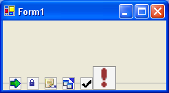
Design
Planning on how to draw this toolbar was actually the hardest part. I never paid attention to advanced pixelmath in highschool, so I really had to stay tuned all the time. Here is what I came up with:

Implementation
Everything in the code should be very self describing. Still, I want to describe some steps I used extra time on. With the design in mind, I wanted to make as few function calls as possible, and - if possible - the same amount of function calls every time the control had to be repainted. I quickly found out that the lines between the toolbar item could be done with one call in normal state, max two calls in the mouse over/down state. This is due to the nature of the line... it is simply dashed. As for the images and its bounding boxes, I could not find any fast algorithm but the standard "for each".
When the mouse enters a toolbar item, the item goes big. It is done by scaling the small picture. Scaling a picture is very easy in C#, using the built-in function like this:
g.DrawImage(_iList.Images[i], destRect, sourceRect,
System.Drawing.GraphicsUnit.Pixel);
How to Use
To use the control, you simply add it to the control pane, and d&d it to the form. It automatically docks to the bottom, but you are free to change that. If you do not like the control pane, just make the initialization yourself!
You also need some items in the toolbar. You'll get that by adding an imageList to your project, add some pictures to it, and change the ImageList property of the Toolbar control to point to your newly created imageList. Remember, if the background color has to appear on the buttons, you need images with transparency.
Feel free to change some of the properties at all times.
Control Properties
BackgroundColorNormal: The background color of a button when it is in "normal state"BackgroundColorOver: The background color of a button when it is in "over state"BackgroundColorDown: The background color of a button when it is in "down state"LineColorNormal: The color of the line the horizontal line, and the boxes around the images when in "normal state".LineColorOver: The background color of a button when it is in "down state"LineColorDown: The background color of a button when it is in "down state"ImageList: A list containing each toolbar item(image) in the toolbar
Events
The control can raise some events:
ItemChanged: Raised when mouse enters/leaves a itemClicked: Raised when mouse button is released over a item
Bugs and Future Expansion
- When altering the
imageList in design mode, those changes do not take place in the control. I have not found any smart solution to this. The only - not so smart - solution I can think of is to make my own imageList class with capabilities of generating a "please update designer" event. - To show the big image (when mouse enters the item), the small one is scaled. This causes a blurry effect. I could have two
imageLists, one with small images, the other with big ones. That way I erase the blurring effect that comes after scaling an image. Maybe C# are even able to do a better scale (than the one I am doing now), which I am not aware of. - The color properties of the control, can actually be divided into two categories - line colors and background colors. It would be nice if this could be reflected in the property grid, so that one property is called
LineColors, another BackGroundColors. When expanding one of these (by use of the + tree expansion), the underlying colors named Normal, Over, Down are presented. - The toolbar can only be shown horizontally. It could be nice to show it vertically, without having to change too much code. I tried to
rotateTransform before making any graphic calls, but somehow the images are not aligned correctly.
History
- 7th August, 2003 : Version 0.1
License
This article has no explicit license attached to it but may contain usage terms in the article text or the download files themselves. If in doubt please contact the author via the discussion board below.
A list of licenses authors might use can be found here.
I am living in mexico right now, making small apps for 3d show off. I am planning soon to get out of here, and move on to somewhere ....
Well, studied electrical engeneering, and now I program. I love to discover the possebilities of the programming world, since it never seems to end of what you can do.


 General
  News
News  Suggestion
  Question
  Bug
Bug  Answer
  Joke
Joke  Praise
  Rant
Rant  Admin
Admin 


 Submit an article or tip


 very nice control
 control as a new style of toolbar
![Rose | [Rose]](https://codeproject.global.ssl.fastly.net/script/Forums/Images/rose.gif)