Introduction
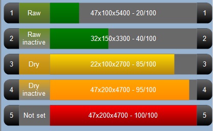
In this article, I paint a simple customized progress bar with four sections and different colors depending on the status and % filled. The class is written to fit into my company's software, but it's not that hard to modify it for your own needs. A progress bar is a good way to show data of any type, since you can see the most "important" info from far away without reading the text. Adding different colors further enhances that.
I use the superb extensions that Arun Reginald posted a while ago: http://www.codeproject.com/KB/GDI-plus/ExtendedGraphicsII.aspx, to get the rounded corners.
Background
Back in VB 6 days, there were controls for everything. No matter what you wanted to do, there were always some controls that would do it. My company used a simple progress bar with some text on it to display production data from saw mills. In our new version of the software, we made a more good looking version of that form. We liked it until the day we had to remote control over 56K ;). The customers however did not. Too much non-important graphics they said. So we listened, and went back to the idea of progress bars. The one that comes with .NET is good in many ways, but sometimes, you just want more. My friend Google just didn't solve the problem this time, so I had to write my own.
Using the Code
Once imported and compiled, you can use this control like any other in Visual Studio, or you can add it like this:
HarrProgressBar pgb = new HarrProgressBar();
pgb.Padding = new Padding(5);
pgb.LeftText = "1";
pgb.MainText = "47x100x5400 - 20/100";
pgb.FillDegree = 20;
pgb.RightText = "1";
pgb.StatusText = "Raw";
pgb.StatusBarColor = 0;
pgb.Size = s;
pgb.Anchor = AnchorStyles.Left | AnchorStyles.Right;
this.flowLayoutPanel1.Controls.Add(pgb);
This control is based on System.Windows.Forms.Panel, and thus supports all the normal behaviors like Anchor and Docking. I added an internal padding to create a distance between the actual panel area and the drawn area, to be able to switch the background color to get a "selected" look and feel.
The different color codes are hardcoded to keep it simple. To hide sections, just set the sectionsize to 0.
Points of Interest
I haven't really used GDI+ that much, so this was quite fun to do for a change. I soon realized that rounded rectangles are much more better looking. This wasn't that easy though, and I am really happy I found Arun's extensions, which made my life much easier. The tricky part was to calculate the areas to draw:
private Rectangle GetLeftArea()
{
    return new Rectangle(
        Padding.Left,
        Padding.Top,
        LeftBarSize,
        this.ClientRectangle.Height - Padding.Bottom - Padding.Top);
}

private Rectangle GetStatusArea()
{
    return new Rectangle(
        Padding.Left + LeftBarSize,
        Padding.Top,
        StatusBarSize,
        this.ClientRectangle.Height - Padding.Bottom - Padding.Top);
}

private Rectangle GetMainArea()
{
    return new Rectangle(
        Padding.Left + LeftBarSize + StatusBarSize,
        Padding.Top,
        Convert.ToInt32(((this.ClientRectangle.Width -
          (Padding.Left + LeftBarSize + StatusBarSize +
           RightBarSize + Padding.Right)) * FillDegree) / 100),
        this.ClientRectangle.Height - Padding.Bottom - Padding.Top);
}

private Rectangle GetMainAreaBackground()
{
    return new Rectangle(
           Padding.Left + LeftBarSize + StatusBarSize,
           Padding.Top,
           this.ClientRectangle.Width - (Padding.Left +
             LeftBarSize + StatusBarSize + RightBarSize + Padding.Right),
           this.ClientRectangle.Height - Padding.Bottom - Padding.Top);
}

private Rectangle GetRightArea()
{
    return new Rectangle(
        this.ClientRectangle.Width - (RightBarSize + Padding.Right),
        Padding.Top,
        RightBarSize,
        this.ClientRectangle.Height - Padding.Bottom - Padding.Top);
}
I had to have two different "Main" sections to be able to draw the text and the grey background. Once I have those rectangles, painting the sections is easy:
public void paintThis(Graphics _graphics)
{
StringFormat f = new StringFormat();
f.Alignment = StringAlignment.Center;
f.LineAlignment = StringAlignment.Center;
_graphics = this.CreateGraphics();
System.Drawing.Drawing2D.LinearGradientBrush _LeftAndRightBrush =
new LinearGradientBrush(GetMainArea(), Color.DimGray,
Color.Black, LinearGradientMode.Vertical);
System.Drawing.Drawing2D.LinearGradientBrush _StatusBrush =
new LinearGradientBrush(GetMainArea(), StatusColor1,
StatusColor2, LinearGradientMode.Vertical);
System.Drawing.Drawing2D.LinearGradientBrush _MainBrush =
new LinearGradientBrush(GetMainArea(), FirstColor,
SecondColor, LinearGradientMode.Vertical);
if (LeftBarSize > 0)
{
_graphics.FillRoundedRectangle(_LeftAndRightBrush,
this.GetLeftArea(), this.RoundedCornerAngle,
RectangleEdgeFilter.TopLeft | RectangleEdgeFilter.BottomLeft);
_graphics.DrawString(this.LeftText, this.Font,
Brushes.White, this.GetLeftArea(), f);
}
if (StatusBarSize > 0)
{
_graphics.FillRoundedRectangle(_StatusBrush, this.GetStatusArea(),
this.RoundedCornerAngle, RectangleEdgeFilter.None);
_graphics.DrawString(this.StatusText, this.Font,
Brushes.White, this.GetStatusArea(), f);
}
_graphics.FillRoundedRectangle(Brushes.DimGray,
GetMainAreaBackground(), this.RoundedCornerAngle,
RectangleEdgeFilter.None);
_graphics.FillRoundedRectangle(_MainBrush, this.GetMainArea(),
this.RoundedCornerAngle, RectangleEdgeFilter.None);
_graphics.DrawString(this.MainText, this.Font,
Brushes.White, this.GetMainAreaBackground(), f);
if (RightBarSize > 0)
{
_graphics.FillRoundedRectangle(_LeftAndRightBrush,
this.GetRightArea(), this.RoundedCornerAngle,
RectangleEdgeFilter.TopRight | RectangleEdgeFilter.BottomRight);
_graphics.DrawString(this.RightText, this.Font,
Brushes.White, this.GetRightArea(), f);
}
_LeftAndRightBrush.Dispose();
_MainBrush.Dispose();
_StatusBrush.Dispose();
}
Drag and Drop
To make this control a little more useful, I added drag and drop to it, controlled by AllowDrag. To enable the control to be "selected", I had to prevent the DoDragDrop() from triggering on MouseDown. This was solved by adding a small check so that you have to drag the control outside a small radius before it triggers. I also have _isDragging to be able to trigger DoDragDrop(); in the OnMouseMove override.
protected override void OnMouseDown(MouseEventArgs e)
{
this.Focus();
base.OnMouseDown(e);
_mX = e.X;
_mY = e.Y;
this._isDragging = false;
}
protected override void OnMouseMove(MouseEventArgs e)
{
if (!_isDragging)
{
if (e.Button == MouseButtons.Left &&
_DDradius > 0 && this.AllowDrag)
{
int num1 = _mX - e.X;
int num2 = _mY - e.Y;
if (((num1 * num1) + (num2 * num2)) > _DDradius)
{
DoDragDrop(this, DragDropEffects.All);
_isDragging = true;
return;
}
}
base.OnMouseMove(e);
}
}
protected override void OnMouseUp(MouseEventArgs e)
{
_isDragging = false;
base.OnMouseUp(e);
}
Selection
My purpose was to use this control in a FlowLayoutPanel and to make it look like a ListView, so I wanted to be able to "select" the items. This is made by changing the background color while focused. It's not totally perfect, but it was good enough for me.
protected override void OnGotFocus(EventArgs e)
{
    this.BackColor = Color.SandyBrown;
    base.OnGotFocus(e);
}

protected override void OnLostFocus(EventArgs e)
{
    this.BackColor = Color.Transparent;
    base.OnLostFocus(e);
}

protected override void OnClick(EventArgs e)
{
    this.Focus();
    base.OnClick(e);
}
Final Thoughts
This little Christmas workshop actually turned out pretty good. I could probably add more functions and better looking graphics and animation, but since my customers don't want it or need it, I think I will leave it like this for the moment.
Check out my other article about the FlowLayoutPanel to see how I plan to use it.
History
- 2009-12-21 - v1.0 - Article added.
