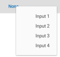
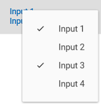
The FlagsEnumButton is an extension of the Button control that presents the values of a Flags Enum as a list of checkable options in a dropdown menu. The Enum values can overlap, where selecting one value simultaneously selects other values. The items in the dropdown are autogenerated and the text on the button can be customized to show the selected flags in multiple ways.


Introduction
In an app I recently created, I found myself in need of a compact control that provided for selection of multiple values in an enum with the Flags attribute; I wanted to set myFlags = Flag2 | Flag5 | Flag7 through the GUI. This can be done in a variety of ways that all involve displaying all the selectable values on the form, but I didn’t have that kind of space available. The ComboBox has a multiselect mode that comes close, but it requires a list of selectable values as its InputSource. I wanted something that created its own list from the enum type and would bind to the enum value. Decribed here is my solution.
The code is developed with .NET Core 3.1 but can be retargeted to .NET Framework 4.5.2 or later without difficulty. Although I developed it and the demo project in Visual Studio 2019, I don't think I use anything that isn't available in VS 2015.
Using the Control
Add a namespace reference in your Window node and insert the FlagsEnumButton in your XAML just as you would insert a Button. (See the demo application.) The full set of available custom properties is shown in the example below.
<uc:FlagsEnumButton EnumValue="{Binding InputSelection, Mode=TwoWay,
                                Converter={StaticResource FlagsIntConverter}}"
                    Check="LogUserActivity"
                    ButtonLabelStyle="FixedText"
                    EmptySelectionLabel="Inactive">
    <uc:FlagsEnumButton.ButtonLabel>Activated</uc:FlagsEnumButton.ButtonLabel>
    <uc:FlagsEnumButton.ChoicesSource>
        <x:Type Type="models:Inputs"/>
    </uc:FlagsEnumButton.ChoicesSource>
</uc:FlagsEnumButton>
The custom Properties are described below:
ChoicesSource – Sets the Type of the Enum. This must be an enum with the Flags attribute. It is used to create the entries in the dropdown. The bound field is assumed to be of this Type. This is the only required property.ButtonLabelStyle (Dependency Property) – Selects the form for what is shown as the button text. Available values are:
Indexes. The 1-based index of each selected flag is shown in a comma-separated list, like “1, 3, 4.” This is the default. The indexes match the order displayed in the dropdown.Values. The value of each selected flags is shown in a comma-separated list, like “1, 4, 8.” In retrospect, this doesn’t seem very useful, but I left it in. You never know when it might be the right thing.Names. The textual representation of the flag values is shown, one per line. I think this looks best and it was perfect for my needs, but it can get messy when lots of flags are set.FixedText. The button label (Button.Content) is the same when any flag is set. Note that this is independent of the setting for EmptySelectionLabel. The fixed text defaults to “Button”.
ButtonLabel - Sets the fixed text string shown as the button label when ButtonLabelStyle is FixedText. Otherwise ignored.Check (Dependency Property) – Sets a Routed Event Handler that is called when a flag selection is changed. The clicked MenuItem is passed to the handler.EmptySelectionLabel (Dependency Property) – Sets the text string to display as the button label when no values are selected. Applies to all values of ButtonLabelStyle. Default is "None."EnumValue (Dependency Property) – Gets/Sets the value of the bound Enum field. The property is defined as an int, so a converter is needed in your application to convert this to and from the enum value. (WPF doesn’t find them as equivalent as .NET does.) I couldn’t find a way to eliminate the need for the converter.
The minimum XAML need only set the ChoicesSource property to the Type of enum to be represented. Although it isn’t required, the control is rather useless without also binding to the EnumValue Dependency Property. After all, that's why you chose to use this control.
Binding to the EnumValue needs a simple converter. Add the value converter to your ResourceDictionary with a suitable key, like “FlagsIntConverter” as used in the example above.
<ResourceDictionary>
    <local:FlagsIntConverter x:Key="FlagsIntConverter"/>
</ResourceDictionary>
Write your own converter or copy the one in the demo project, listed below.
public class FlagsIntConverter : System.Windows.Data.IValueConverter
{
    public object Convert(object value, Type targetType, object parameter,
                          System.Globalization.CultureInfo culture)
    {
        int val = -1;
        if (value is Enum)
            val = (int)value;
        return val;
    }

    public object ConvertBack(object value, Type targetType, object parameter,
                              System.Globalization.CultureInfo culture)
    {
        if (!targetType.IsEnum)
            throw new InvalidCastException(targetType.Name + " is not an Enum type.");
        return Enum.ToObject(targetType, (int)value);
    }
}
Inside the Control
The XAML is quite simple. I extended the Button with a ContextMenu and a named TextBlock containing the button label.
<Button x:Class="UserControls.FlagsEnumButton"
        xmlns="http://schemas.microsoft.com/winfx/2006/xaml/presentation"
        xmlns:x="http://schemas.microsoft.com/winfx/2006/xaml"
        xmlns:mc="http://schemas.openxmlformats.org/markup-compatibility/2006"
        xmlns:d="http://schemas.microsoft.com/expression/blend/2008"
        xmlns:local="clr-namespace:UserControls"
        mc:Ignorable="d"
        Height="Auto"
        Padding="10,1,10,3"
        Click="Button_Click">
    <Button.ContextMenu>
        <ContextMenu x:Name="menu" Closed="Menu_Closed" />
    </Button.ContextMenu>
    <Button.Content>
        <TextBlock x:Name="buttonLabel" Text="FlagsEnumButton"/>
    </Button.Content>
</Button>
Points of Interest
Things of interest in the code-behind are:
- When initializing the
ChoicesSource, each defined enum value is used to create a MenuItem in an ObservableCollection which is assigned to the ContextMenu.ItemsSource in the constructor. Checkmarks become automatic by setting MenuItem.IsCheckable true. I use MenuItem.Tag to store the original enum value. It is stored as the enum's type but MenuItem.Tag is an object so it still must be explicitly cast in all places. The Click event of each MenuItem invokes a recalculation of the EnumValue and of the button label.
I was somewhat surprised to discover that when the control is in an expandable grid row (DataGrid.RowDetailsTemplate), the EnumValue gets set before the ChoicesSource gets set. That causes the value and displayed label to lose sync. To resolve this, if the EnumValue is not zero when the MenuItems are created, it is redundantly assigned to itself which causes the display and value to re-sync. - The button label must be updated each time the
enum value changes. I put all the logic for producing the string in the ButtonLabel property getter, using some simple LINQ expressions inside a switch statement. Testing for the "no selection" condition before checking for ButtonLabelStyles.FixedText gives the EmptySelectionLabel precedence and makes a two-valued label possible. - The button
Click event is used to open the context menu. The “gotcha” here was that the menu’s IsOpen property is always false at this point, regardless of the menu state. The IsVisible property is used instead to check the menu state. - When the context menu closes, the source bound to
EnumValue is explicitly updated. This isn’t necessary for all actions, but I encountered at least one where the source didn’t get updated, so I put this in. - The
int gives you room for 31 distinct flags and you could make it 32 by changing to uint, but I found that more than eight flags selected at a time does not look good with the Names style. Plan wisely.
Embellishment
The Description Attribute
During initialization, the names of the flags are retrieved and used to create the dropdown list for the context menu. I wanted freer text than enum names allow so I gave them a Description attribute and use its value (when it exists) for the dropdown list. A GetDescription() extension method (included in the control library) checks for the attribute and returns the appropriate string. See the demo application for an example using this attribute.
public static string GetDescription(this System.Enum value)
{
var fieldInfo = value.GetType().GetField(value.ToString());
if (fieldInfo == null)
return value.ToString();
var attribArray = fieldInfo.GetCustomAttributes(
typeof(System.ComponentModel.DescriptionAttribute), false);
if (attribArray.Length == 0)
return value.ToString();
else
return ((System.ComponentModel.DescriptionAttribute)attribArray[0]).Description;
}
Material Design
Material Design is being encouraged in the company, so I added the MaterialDesignInXAML Nuget package to my application to see what effect it had. The results were quite nice. However, if you use it, you will want to disable RippleAssist for this control. Leaving it enabled makes the behavior look a bit odd. Add the following to the Button node of FlagsEnumButton.xaml.
xmlns:materialDesign="http://materialdesigninxaml.net/winfx/xaml/themes"
materialDesign:RippleAssist.IsDisabled="True"
Concluding Thoughts
Along the way, I experimented with a variety of feature ideas. Some stayed, some didn’t. The concept of disabling individual flag values in the dropdown remains in the code as comments if you want to resurrect it for your application. I ran into difficulty determining how the application could use it and ended up just eliminating the need.
This control may not be as generically usable as I originally thought it could be, but it was a fun learning experience, particularly when I added the MaterialDesignInXAML package. I’d love to hear of improvements you make to it.
History
- 15th January, 2020: Initial version
