In order to design a nice GUI, one needs to understand how colors are created, color models, the limitations of the color pickers and the WPF Colors class. There are many articles covering one or the other aspect, but none covers all of them detailed and easy understandably. The article provides also some in WPF missing methods for changing colors, like making them brighter (change saturation) or darker (change brilliance) or mixing colors together.
Introduction
I don't know about you, but I struggled now for many years with the limited number of colors available in the Colors class, trying to get matching colors with ColorPickers and understanding the various color models. To simplify my life, I wrote few small methods which allow me to change any color towards white and black and another one to mix colors. With this, I get nicely matching colors, a bit like gradients as in GradientBrush.
Then I had the bad idea to write a CodeProject article. To explain how my methods work, I had no choice but to investigate in detail what is going on. So the biggest part of this article is about colors, color models, hue, brightness and stuff, but in easy terms a software developer can understand without a math of physics degree.
If you already have a solid understanding of colors, you can just jump to the chapter, Generating your own color with precision, where the actual code is.
Table of Contents
As we probably all know, color on a computer screen gets created by pixels and each pixel consists of 3 dots which can emit the light Red, Green and Blue, which explains the names R, G and B of these dots. However, here is already the first misunderstanding, because in actual fact, G is not Colors.Green but Colors.Lime. The human eye has three different kind of receptors for colors and the colors (hue) of R, G and B are chosen to match well with these receptors, which happens to be the lime green and not the "normal" green. With RGB pixels, a monitor can produce most colors a human eye can differentiate. Well, almost. Of course, the "strength" (brightness) of these colors are rather limited when compared to other light sources as for example, the sun.

Each color is defined by how much light each of the 3 dots emits. One dot can have a value between 0 (emitting nothing) and 255 (or 0xFF in hexadecimal) emitting at full strength. To see one of the primary colors, for example red, R gets set to 255 and the G and B to zero, which gives the brightest red possible. If we want a darker red, we just lower the value of R. Once R is 0, the resulting color is black, since no dot is emitting anything. This is an example of changing the brightness of a color, one of the three properties every color has. Interestingly, brightness is not defined from 0 to 255, but from 0 to 1 or 0 to 100%.
Another property of a color is called hue. Hue assigns values for yellow, orange, red, etc. We can produce hues at their purest when one of the 3 dots is 255, one is 0 and the "middle" (third) one can have any value. For example, R 225, G 255, B 0 combines red and green and the result is ? Strangely enough, the result is yellow ! The reason is that when 2 lights shine on the same spot, the spot gets brighter not darker. If we mix R, G and B shining at their maximum, we get a white light. This is the opposite of painting colors. If we mix many painting colors together, we get something dark grayish and ugly.

R:FF G:FF B:00 = Yellow
R:00 G:FF B:FF = Cyan
R:FF G:00 B:FF = Magenta
These, by the way, are the brightest colors a monitor can produce, since they use 2 dots fully turned on as opposed to red, green and blue, where only 1 dot is used. For all other hues, the second strongest dot emits at less than 255. It is this "middle" dot, which is not 255 and not 0 which defines the hue. By incrementing this middle dot slowly from 0 to 255, we get all possible hues, for example, between red (FF0000) and yellow (FFFF00). In total, there are 6 such transitions:
255 Red and some Green: Red to Yellow

255 Red and some Blue: Red to Violet

255 Green and some Red: Green to Yellow

255 Green and some Blue: Green to BlueGreen

255 Blue and some Green: Blue to BlueGreen

255 Blue and some Red: Blue to Violet
When we vary R, G or B by small increments, we get something like a rainbow:

On the left and right end, there is each time a red. For this reason, the rainbow is often drawn as a circle. Hue is defined in degrees with red being a 0 and 360 degrees.
The third color property is called saturation. So far, we have dealt only with fully saturated colors, i.e., the darkest dot was 0. If we want to make a fully saturated color brighter and bring it finally close to white, we need to lower the saturation by increasing the intensity of all three dots proportionally closer to 255. To decrease the saturation from 100% to 50%, we have to half the difference between the present value to 255. Example:
Present value: R 255, G 128, B 0

Decrease saturation from 1 to .5

New R value = 255 + 0.5 * (255-255) = 255

New G value = 128 + 0.5 * (255-128) = 192 (or 191 depending on rounding)

New B value = 0 + 0.5 * (255-0) = 128 (or 127 depending on rounding)

Decrease saturation from 1 to 0 (=white)

New R value = 255 + 1 * (255-255) = 255

New G value = 128 + 1 * (255-128) = 255

New B value = 0 + 1 * (255-0) = 255
The color red drawn from 100% saturation to 0%:

Now we can draw the rainbow again and include some saturation and brightness variation. The x-axis increases the hue from 0 to 360. In the middle is each hue shown with 100% saturation and 100% brightness. In the upper half, the brightness stays 100% and the saturation is decreased to 0%, which results in white. In the lower half, the saturation stays 100% and the brightness is decreased to 0%, which results in black.

Notice how yellow, cyan and magenta can keep their color longer before they turn white or black than the other hues. They are the strongest colors, because 2 dots shine at full intensity.
A hue with close to 0% saturation and 100% brightness looks white. White has the value FFFFFF and the hue and saturation are undefined.
A hue with 100% saturation and close to 0% brightness looks black. Black has the value 000000 and the hue and saturation are undefined.
A color where all 3 dots shine with the same strength looks gray. A possible value could be 808080.

Note: For gray, i.e., R, G and B have the same value, neither hue nor saturation is defined, only brightness has a meaningful value. We could also say, black, gray and white are not colors. Black 000000 has a brightness of 0, White FFFFFF has a brightness of 1. That brightness alone controls how white, gray and black look has a strange consequence as we can see in the next picture.
Have we covered now all colors a monitor can display? Actually, we have shown less than 1% of all possible R, G and B combinations, i.e., only those where one dot is 255 (100% brightness) or one dot is 0 (100% saturation). Let's say we change first the saturation of a color FF8000 (kind of orange red) to 50%, we get FFC080. When we then change the brightness to 50%, we get 806040. The hue is still orange red, but the color is now much closer to a dark gray.
Here is a picture of the color Red with all possible saturation and brightness combinations:
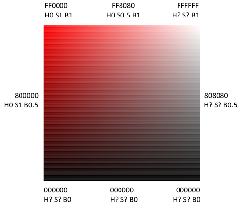
I guess this is the most confusing picture in this article. Basically, I wanted to change the color on the y axis (top to bottom) from red to black, meaning the brightness from 1 to 0, and on the x axis (left to right) from red to white, meaning saturation from 1 to 0. I would have expected that white and black would mix too and that the bottom right corner would be gray. But no such luck. As soon R, G, B have the same value, hue and saturation lose their meaning. Only brightness has an influence on the colors white, gray and black (right border). Even worse, the whole lower border is just black, because once brightness is 0, hue and saturation become meaningless again.
If you feel confused too, welcome to the club. But that's how the HSB color scheme works. When manipulating just RGB values, it is kind of difficult to tell how the result will look like (remember that mixing R and G results in yellow ?). When manipulating colors in the HSB color space, yellow stays yellow, as long you only change saturation and brightness, until the brightness becomes 1 (white) or 0 (black), at which time the hue and saturation is lost.
There is another color space called HSL Hue, Saturation and Luminosity. Hue is the same as in HSB, Saturation doesn't go towards white but gray and Luminosity goes from 0=black, 0.5=gray to 1= white. HSL was useful in the transition from black and white to color TVs. A black and white tv just displayed the L value, while a color tv used HSL.
In the past, I always struggled to understand how the color pickers are supposed to work and why they failed sometimes. Understanding now hue, saturation and brightness and how they are related to RGB colors makes the color picker easier to understand.
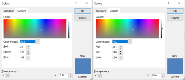
PowerPoint uses the HSL color space. In the color selection area, they display all hues horizontally, vertically they display the saturation. In the HSL color space, a saturation of 0 is gray, therefore the complete lower border is grey. On the right is a scrollbar which changes the luminosity, 0 meaning black, 128 meaning gray and 255 meaning white (it does not use 0-100% but 0-255). At 0 and 255, hue and saturation lose their meaning. The purest color is at luminosity 128.
Choosing for example a blue in HSL, then reducing the luminosity to 0 and switching to RGB display displays properly 0,0,0. Increasing R a bit then setting it again to 0 and switching back to HSV shows now 0 for Hue and Sat, which should be undefined, of course. A hue of 0 means red, but black has no hue. The pointer in the color area still shows the originally chosen blue, instead of read which is hue 0. This was not just confusing for me, but I finally crashed PowerPoint when I kept playing with black, gray and white and switching between RGB and HSL view.
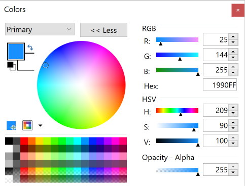
Working with the color picker from paint.net proved to be easier. They use the HSV color model, which is the same as the HSB color model, they just changed the word brightness to volume. I appreciate that they display the RGB values and the HSV values in the same window, this makes it much easier to understand how changing one HSV value influences the RGB values. It displays all available hues on the border of the color circle and in the middle is white, meaning 0% saturation. To make colors darker, one has to change the slider of the Volume (brightness) parameter. Of course, it also displays a hue of zero for black, gray and white, but at least it didn't crash when I played with these values.
The sad fact is that WPF has no color picker. It's like Microsoft gave up on WPF for many years, trying to force us to write UWP applications instead. Many developers thought "no thank you" and stayed with WPF. So now Microsoft is introducing XAML Islands allowing WPF projects using "newer" controls like a color picker, which should have been included in WPF right from the beginning. I haven't used the WinUI ColorPicker in a project, but I run it in the XAML Controls Gallery:
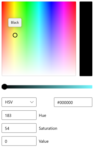
It works a bit like the PowerPoint color picker but using HSV (HSB) instead, meaning the lower part of the color area is white, not gray. The lower scrollbar allows to change the V value (brightness). When set to black, Hue and Saturation stick to their latest values, even when a different color gets chosen in the color area later on. When Value (brightness) gets increased, the circle in the color area jumps back to the old hue. Strange, but at least no crashing.
The Colors class gives some standard colors. They were chosen by committees mixing some different color schemes with sometimes strange results. For example, Colors.Gray is DARKER than Colors.DarkGray. Strange, right?

Or 2 different names represent actually the same color, like Aqua (00FFFF) and Cyan (00FFFF) or Fuchsia (FF00FF) and Magenta (FF00FF). Unfortunately, the Colors help page displays the colors alphabetically, which makes them easy to find if you know the name, but one has great difficulties to tell which colors are close to each other or matching:

So I spent some time and sorted them vertically by their hue, then horizontally by their brightness and their saturation. Here is the result listing exactly the same colors like in the Colors help page:

When I design a new application and decide about the color scheme to use, I usually cannot use the color palette provided by the Colors class. Often, I need the same hue with shades (different saturation and brightness). To do that takes surprisingly few lines of code. Here is the method to decrease the saturation (make it brighter) or decrease the brightness (make it darker) of any color:
public static Color GetBrighterOrDarker(this Color color, double factor) {
if (factor<-1) throw new Exception($"Factor {factor} must be greater equal -1.");
if (factor>1) throw new Exception($"Factor {factor} must be smaller equal 1.");
if (factor==0) return color;
if (factor<0) {
factor += 1;
return Color.FromArgb(
color.A,
(byte)(color.R*factor),
(byte)(color.G*factor),
(byte)(color.B*factor));
} else {
return Color.FromArgb(
color.A,
(byte)(color.R + (255-color.R)*factor),
(byte)(color.G + (255-color.G)*factor),
(byte)(color.B + (255-color.B)*factor));
}
}
Amazing with how few lines saturation and brightness can be changed. A bit of a challenge is to get the saturation calculation right, for which this method comes in handy.
Red, Green, Blue with factor -1 to 1:

To get stronger shining colors, do not use green, which is not 100% saturated, but use yellow, magenta and cyan instead:
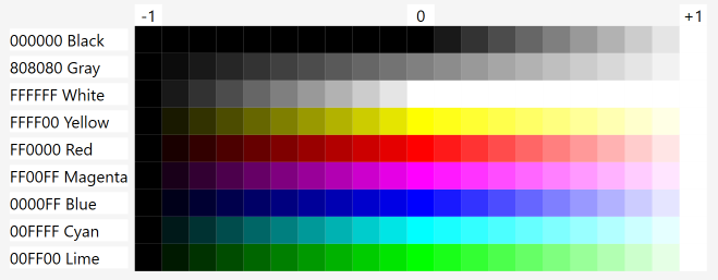
Note that applying first a factor of 0.5 and then one of -0.5 does not result in the original color. The first call changes the saturation, the second the brightness.
What I like about using this method is:
- I can increase, decrease the changes in small, controlled steps and see the results in the GUI.
- I can easily create shadows and highlights, which should have the same hue, but different saturation and brightness.
Usually, a user interface should not use too many hues, but a few might be fine and some hues mixed from them. These two methods serve this purpose, the first mixing two colors half, half, the second allowing to use more of one color than the other:
public static Color Mix(this Color color1, Color color2) {
return Mix(color1, 0.5, color2);
}
public static Color Mix(this Color color1, double factor, Color color2) {
if (factor<0) throw new Exception($"Factor {factor} must be greater equal 0.");
if (factor>1) throw new Exception($"Factor {factor} must be smaller equal 1.");
if (factor==0) return color2;
if (factor==1) return color1;
var factor1 = 1 - factor;
return Color.FromArgb(
(byte)((color1.A * factor + color2.A * factor1)),
(byte)((color1.R * factor + color2.R * factor1)),
(byte)((color1.G * factor + color2.G * factor1)),
(byte)((color1.B * factor + color2.B * factor1)));
}
That's all what's needed to generate nicely matching colors. The first picture shows how each each "main" color gets mixed with each other "main" color to various degrees, again for red, green and blue:

However, it might be better if you use yellow, magenta and cyan instead:

Here I really feel the colors are nicer than mixing red, green and blue. Of course, they might be too pure. A GUI often uses kind of grayish hues, which can easily be made after mixing by using GetBrighterOrDarker().
I made few more methods I needed for writing this article, which might be useful too. The first calculates hue, saturation and brightness of a RGB color:
public static (int Hue, double Saturation, double Brightness)GetHSB(this Color color) {
int max = Math.Max(color.R, Math.Max(color.G, color.B));
int min = Math.Min(color.R, Math.Min(color.G, color.B));
int hue = 0;
if (max-min!=0) {
int maxMinDif = max-min;
if (max==color.R) {
#pragma warning disable IDE0045 // Convert to conditional expression
if (color.G>=color.B) {
#pragma warning restore IDE0045
hue = 60 * (color.G-color.B)/maxMinDif;
} else {
hue = 60 * (color.G-color.B)/maxMinDif + 360;
}
} else if (max==color.G) {
hue = 60 * (color.B-color.R)/maxMinDif + 120;
} else if(max == color.B) {
hue = 60 * (color.R-color.G)/maxMinDif + 240;
}
}
double saturation = (max == 0) ? 0.0 : (1.0-((double)min/(double)max));
return (hue, saturation, (double)max/0xFF);
}
I copied this code from CodeProject: Manipulating colors in .NET Part 1, which actually won "Best C# article of May 2007" and "improved" it slightly. For example, I feel integer 0 to 360 are enough to enumerate all hues. The original code uses floating point numbers and there you can have an unlimited number of hues. This might make the calculation less susceptible to rounding errors, but I guess one can't see the difference.
In my approach of choosing matching colors, it helps to start with "pure" colors which have a saturation and brightness of 100%, which then later are used for mixing and making them darker or brighter. The following method takes any RGB color and returns a RGB color with the same hue, but 100% saturation and brightness:
public static Color ToFullColor(this Color color) {
var max = Math.Max(color.R, Math.Max(color.G, color.B));
var min = Math.Min(color.R, Math.Min(color.G, color.B));
if (max==min) {
return Color.FromArgb(color.A, 0xFF, 0xFF, 0xFF);
}
double rBright = (double)color.R * 255 / max;
double gBright = (double)color.G * 255 / max;
double bBright = (double)color.B * 255 / max;
if (color.R==max) {
if (color.G==min) {
double p = gBright / 255;
return Color.FromArgb(color.A, 0xFF, 0, (byte)((bBright-gBright)/(1-p)));
} else {
double p = bBright / 255;
return Color.FromArgb(color.A, 0xFF, (byte)((gBright-bBright)/(1-p)), 0);
}
} else if (color.G==max) {
if (color.R==min) {
double p = rBright / 255;
return Color.FromArgb(color.A, 0, 0xFF, (byte)((bBright-rBright)/(1-p)));
} else {
double p = bBright / 255;
return Color.FromArgb(color.A, (byte)((rBright-bBright)/(1-p)), 0xFF, 0);
}
} else {
if (color.R==min) {
double p = rBright / 255;
return Color.FromArgb(color.A, 0, (byte)((gBright-rBright)/(1-p)), 0xFF);
} else {
double p = bBright / 255;
return Color.FromArgb(color.A, (byte)((rBright-bBright)/(1-p)), 0, 0xFF);
}
}
}
I wrote this method myself. The math here is a little bit more demanding and I hope I got it right. You can easily verify it by using any color picker. Please let me know if you find any discrepancies.
The article already contains the methods which help you to create your own colors. Download the sample code to see how they can be used and to see the graphics in this article shining brightly in their original size. They do look nice and you can adjust them to your own needs.
If you kept reading until here, you might be interested in other WPF related articles I wrote here on CodeProject. The last two are not WPF related, but the email POP3/MIME article is my most popular and the Debugging in real time (!) I find is my most amazing article:
- 15th March, 2021: Initial version
