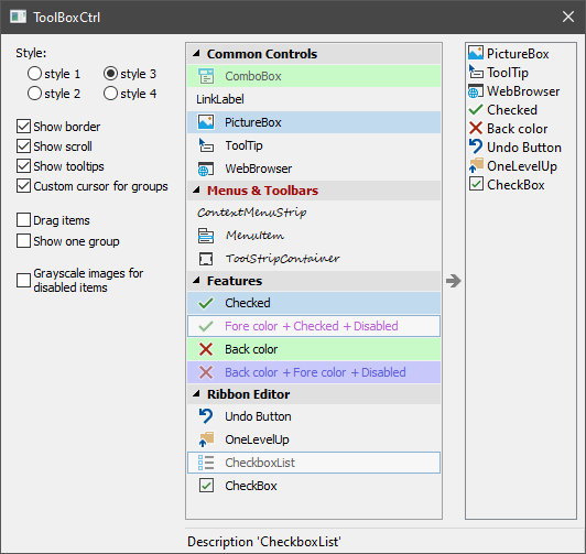
In this article, you will learn about a control representing a regular ToolBar in the form of a tree. Command buttons are located in tree branches and can be checked and disabled.

Introduction
The control is similar to a regular ToolBar. It represents a tree. The command buttons are located in the branches of the tree and you have the ability to check and disable them.
Various uses of the control are possible. For example, as a sidebar for selecting the contents of the main program window or the current page in the settings window. Also, the control is convenient when used in different editors to select a working tool or component that can be dragged with the mouse into the editor field.
The control is derived from CWnd and is a common control based on MFC. It is possible to put it on any window: main frame, dialog, etc.
Using the Code
To create the control and add elements to it, do the following:
#include "ToolBoxCtrl.h"
ToolBoxCtrlEx<ToolBoxCtrlStyle_base_system> m_ToolBox;
...
if( !m_ToolBox.Create(this, WS_VISIBLE, CRect(10,10,100,200), ID_ToolBoxCtrl) )
return -1;
m_ToolBox.CreateImages(ToolBoxCtrl::ImageGroup,NULL,ID_PNG_GROUP_IMAGES,true,11);
m_ToolBox.CreateImages(ToolBoxCtrl::ImageItem,NULL,ID_PNG_ITEM_IMAGES,true,16);
m_ToolBox.AddGroup(_T("Group 1"));
m_ToolBox.AddItem(0, 1, _T("Item 1.1"),_T("Description for 'Item 1.1'"),0);
m_ToolBox.AddItem(0, 2, _T("Item 1.2"),_T("Description for 'Item 1.2'"),1);
m_ToolBox.AddGroup(_T("Group 2");
m_ToolBox.AddItem(1, 3, _T("Item 2.1"),_T("Description for 'Item 2.1'"),-1);
m_ToolBox.AddItem(1, 4, _T("Item 2.2"),_T("Description for 'Item 2.2'"),2);
m_ToolBox.AddItem(1, 5, _T("Item 2.3"),_T("Description for 'Item 2.3'"),3);
if( !m_ToolBox.LoadState(AfxGetApp(),_T("ToolBoxCtrl"),_T("State")) )
m_ToolBox.CollapseGroup(1);
m_ToolBox.Update(true);
Class ToolBoxCtrl does not perform any rendering. For its drawing, it calls the functions of ToolBoxCtrl::Draw interface. To draw ToolBoxCtrl, you need to create an object inherited from the ToolBoxCtrl::Draw class, implement its functions, and pass the ToolBoxCtrl::Draw pointer to ToolBoxCtrl using the ToolBoxCtrl::SetDrawManager function call. Similarly, a ToolBoxCtrl::IRecalc interface is used to specify the spacing between ToolBoxCtrl areas. A ToolBoxCtrl::ToolTip interface will help you create tooltips for items. There is also a ToolBoxCtrl::Notify class for notifying about events in ToolBoxCtrl. An implementation of any of these four interfaces must exist for the entire time the control is running.
The ToolBoxCtrl::Draw and ToolBoxCtrl::IRecalc interfaces together define how a control will look, and their implementation can be called a style. The ToolBoxCtrl.cpp/ToolBoxCtrl.h files include four predefined style classes: ToolBoxCtrlStyle_base_system, ToolBoxCtrlStyle_classic_system, ToolBoxCtrlStyle_base_orange, and ToolBoxCtrlStyle_classic_orange. The first two classes use the system colors to draw the ToolBoxCtrl. If you are working with only one style, then use the template class ToolBoxCtrlEx. The name of the style class is specified as a template parameter, for example:
ToolBoxCtrlEx<ToolBoxCtrlStyle_base_system> m_ToolBox;
The user can work with ToolBoxCtrl in one of two ways:
- When you pass the
ActivateModeClick value to the ToolBoxCtrl::SetActivateMode function, tree items behave like regular buttons. When you click on them, the Notify::OnClickItem function is called. - When using the
ActivateModeDrag value, the tree items must be dragged with the mouse, for example, into the editor area located next to it. At the start of the drag, the Notify::OnDragItemStart function is called. See the OnDragItemStart, OnMouseMove, OnLButtonUp, OnCaptureChanged functions located in the Dialog.cpp file to learn more about the possible implementation of this mechanism in your program.
Tree elements can be checked and/or disabled. You can do this at any time by calling ToolBoxCtrl::CheckItem and ToolBoxCtrl::EnableItem. Also, the control itself is able to send a request to update the state of the items in it. To do this, it calls the Notify::OnUpdateItemState function at short intervals. This mode is enabled by calling ToolBoxCtrl::EnableDynamicItemsUpdate(true). The Notify::OnUpdateItemState function can be called separately for each visible item in the tree, or once for all items. This is determined by the value passed to the ToolBoxCtrl::SetUpdateMode function.
The control requires a call to ToolBoxCtrl::Update() after changing its state, properties, or the number of groups and elements in it.
Good luck!
History
- 14th April, 2021: Initial version
