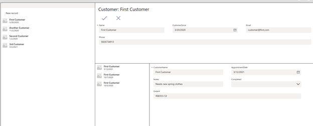
Here we create a new interface that displays full customer information including their historical purchases.
Welcome to the second article of the Teams Power App series. We are creating an internal app for Acme Shop, a high-end fashion store that offers personal shopping services. The app’s goal is to enable sales associates to make appropriate recommendations for a customer at their appointment, based on past purchase information, delighting the customer by providing a customized and personal service.
In the previous article, we created a basic application to record and access customer information. We created data tables to store this information then connected them to the application using out-of-the-box defaults.
Now, we’ll revamp our app to connect the CustomerInfo table with the Appointment table.
Designing a UI
When designing an employee user interface (UI) for our app, there are two ways to present the data: starting from the customer information or going directly into the appointment information. To book an appointment, let’s take the first approach.
In this approach, an employee first looks up the customer, then they pull up relevant information about that customer, then they can book the appointment.
Creating the New Customer Screen
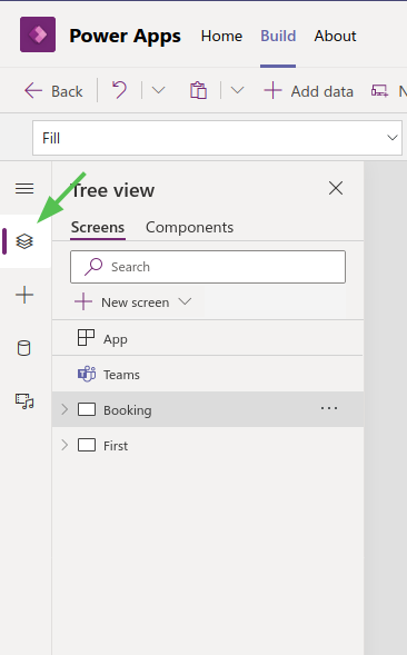
To create this employee user interface, first click the Tree View icon to reveal the New Screen button:
From the available options, choose Sidebar. Feel free to explore other options.
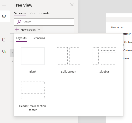
Choosing Sidebar creates a blank page with three sections, but we also break it down into additional sections to make space for the following:
- Customer lookup, where a user can view and select customers in the system
- Customer header, to indicate the current customer we are viewing
- Customer information form, where we load and edit customer details
- Appointment lookup, which displays a selectable list of historical appointments
- Appointment information, which displays detailed information about the selected appointment

Laying Out the Customer Lookup Interface
There are three components in the customer information section:
- Textbox to search customers by customer name
- Button to create new customers
- Vertical gallery to display some identifying attributes of the customer
Before adding the components, select the empty container titled SidebarContainer1 to reveal another pane on the right. Click on the pencil button to rename it something like "CustomerLookupContainer".
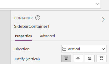
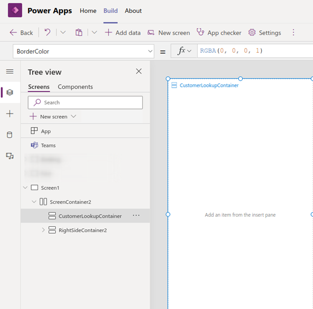
With the CustomerLookupContainer still selected, open the insert pane to insert your components. We can use the insert pane for all three components:

Everything we need is under the Popular group. So, let’s add a text box, button, and vertical gallery.
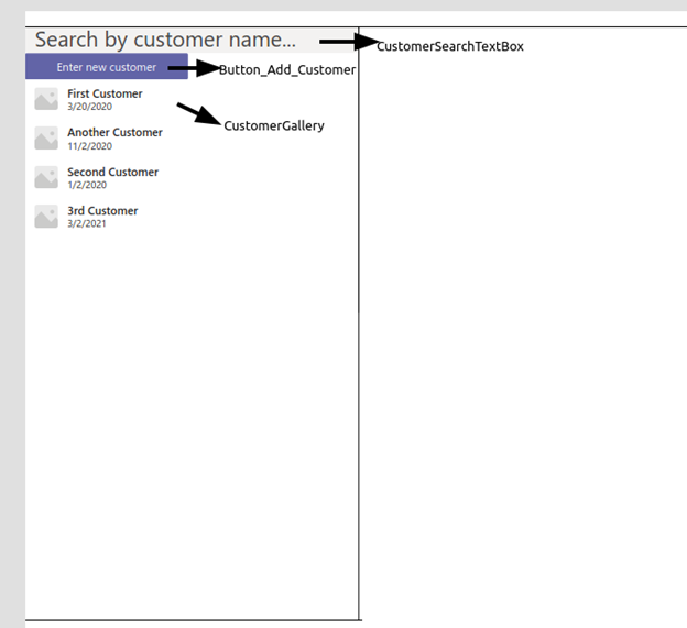
Assuming you have the container pre-selected, Power App adds each component to the container one after another, using the container’s entire height.
This happens through the magic of flexible height. Click on the CustomerGallery, and you see that flexible height is enabled. It means Power Apps uses its judgment to decide how tall the component needs to be. Turning it off enables you to specify a custom height. Let’s leave it on for the customer gallery.
While the height is flexible, the gallery width extends past the sidebar. Closer inspection reveals that the gallery width is set to 500 (by default). We can, of course, change it to a smaller value (300, for example), or we can be smart and set it to be the same width as CustomerLookupContainer.
With the Gallery selected, click on the Advanced tab to find the property width:
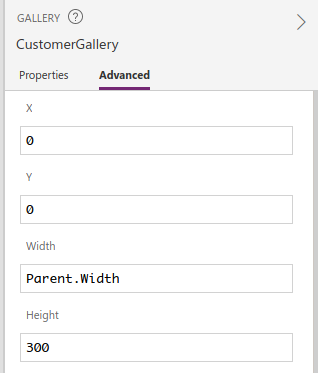
We can set it to match the width of the CustomerLookupContainer by entering CustomerLookupContainer.Width.
We can also accomplish this by entering Parent.Width because CustomerLookupContainer is the parent of this control.
Feel free to experiment with these settings on the three components we have added and experiment with other design elements.
Filtering Customers
For the next section, we refer to the TextBox as the "CustomerSearchTextBox."
We now want to filter the gallery based on the text entered in the CustomerSearchTextBox.
In the same pane is a property called "Data source." Click on it to reveal the data source dialog box and choose CustomerInfos because this is our list of customers. This tells the Gallery to display everything from the CustomerInfos table.
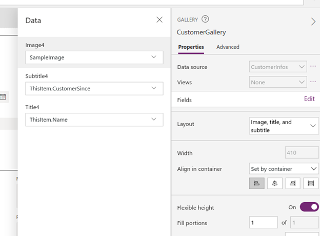
Although you can use Fields and Layout properties to customize the data you want to display, the default settings are sufficient for our purposes.
How can we then filter information using the CustomerSearchTextBox? The answer, once again, lies in the Advanced tab of the customer gallery.
Find the Items property and enter the following:
Filter(CustomerInfos, StartsWith(Name, CustomerSearchTextBox.Value))
The gallery listing will only contain customers whose name starts with the value we enter in the CustomerSearchTextBox. It automatically refreshes with no additional code or formula. We can test this using the Preview feature.
Now, we can move on to the right side of the screen!
Customer Information Screen
The right side of our app’s interface is composed of a Header container and a MainSectionContainer.
We use the Header container for what it is: the header of this screen. Go ahead and insert a label with the container selected.
Now we want the text of the label to be the currently-selected customer. How do we know who the current customer is? We can determine this by introducing a variable: CurrentCustomer.
Set the property of the text to the following:
"Customer:" + CurrentCustomer.Name
Power Apps Studio highlights CurrentCustomer and indicates that it doesn’t know what CurrentCustomer is.
Not to worry. We introduce this variable using the Set command.
Select the Customer Gallery on the left, find its OnSelect property, and insert Set(CurrentCustomer, ThisItem).
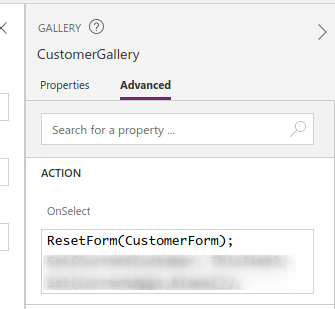
This means whenever a user selects a customer from the list, Power App sets the clicked item, referenced by Thisitem, to a variable called CurrentCustomer.
Because our label reflects the value of CurrentCustomer.Name, whenever we choose a customer from the left side, their name displays on the header. This helps the retail employee verify whose customer record they are viewing.
Appointment Information Screen
We can now break up the MainSectionContainer into two sections: customer information on the top and appointments on the bottom. As we see from the TreeView, it is a vertical gallery, with everything we insert inside the container lining up vertically, so we can insert an EditForm for editing customer information inside the horizontal layout for appointments.
Inside the horizontal layout, we insert another vertical gallery and an edit form.
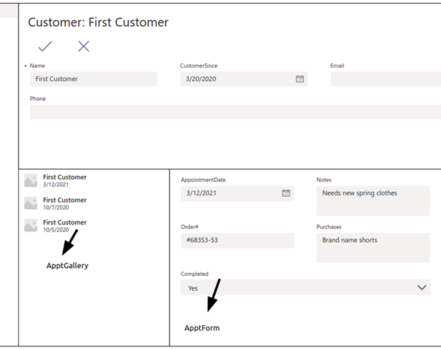
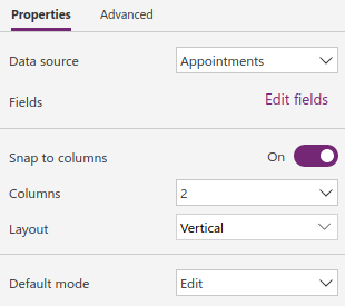
Connect both the gallery and the edit form to the AppointmentInfo table. Make the edit form a two-column form.
After changing some styling on the text controls, we get something like this:
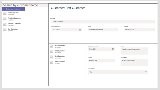
To replicate this layout, we need to adjust the width and height properties. The horizontal layout enforces flexible width, but the vertical gallery has a default height of 500. There is a simple solution for that: change the value of the height property to Parent.Height in the Advanced tab.
Similarly, we can adjust the Gallery and the EditForm by forcing the Gallery width to be 300, while keeping the display form flexible using the width of their parent container.
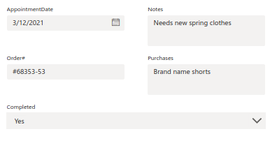
We can adjust padding and borders to separate the different sections of this screen.
Press Preview to test your app interface. You’ll notice that the only thing you can do right now is view the customers in your system. This is because we still have to make the right side of the screen respond to the left side.
Linking Appointments with Customers
We rely on variables and OnSelect actions to connect the screen components, linking appointments with customers.
Click the Advanced tab on the vertical galleries (customer and appointments). You’ll notice a section called Action. OnSelect Events are triggers to the actions. For example, actions defined in OnSelect trigger when an employee selects an item in the gallery.
We use this action to tell the right side that this is the item we want information for. It involves two steps.
First, select the Customer Gallery and set the OnSelect action to the following:
ResetForm(CustomerForm);
Set(CurrentCustomer, ThisItem);
Set(CurrentAppt, Blank());
ThisItem is a reserved identifier, the currently-selected item. When an employee selects an item from the list, we reset the EditForm, then set the selected item into a variable called CurrentCustomer.
We haven’t introduced the CurrentAppt variable yet. We use this variable to display the currently-selected appointment. Here, we blank it out because the appointment information we have previously selected was for a previously selected customer.
Next, select the customer edit form (CustomerForm) and change the Item property value to CurrentCustomer. When this happens, CustomerForm automatically refreshes its data to reflect the value of CurrentCustomer.
Similarly, we connect the appointment lookup using the variable CurrentAppt. To do this, first, select the Appointment gallery and set the OnSelect action:
Set(CurrentAppt, ThisItem)
Then, select the Appointment form and change the item property value to CurrentAppt.
With this set, we now have a functional app with a user interface that enables us to look up customer information.
Next Steps
In this second article of our Teams Power App series, we created a user interface to present customer information including their historical appointments. We also created the UI using a series of containers and vertical galleries. We connected the customer lookup with the customer view, then connected the customer lookup with the historical appointments view, using a series of variables.
You can arrange the forms in many different ways to include the fields you need and create the layout you desire. Include what you feel is best to help your employees customize the customer experience.
The app is still missing one last thing: the ability to create new customer information and book new appointments. We’ll cover that in the next and final article of the series.
Check out our 7-Step Guide to Low-Code App Development to get starting using Power Apps today.
