Here we create a customer UI for our app, and enable customer employees to enter orders and customer managers to approve and send orders to the manufacturer's Teams channel.
This is the second article in a three-part series on Power Apps development in Teams.
Introduction
This article builds the customer user interface (UI) to our HVAC manufacturer's order app. We'll create a shopping cart-style interface where customers can choose products and send their orders to a manager for approval.
Before we get started, let's take a quick tour of the tools we need and familiarize ourselves with the development environment.
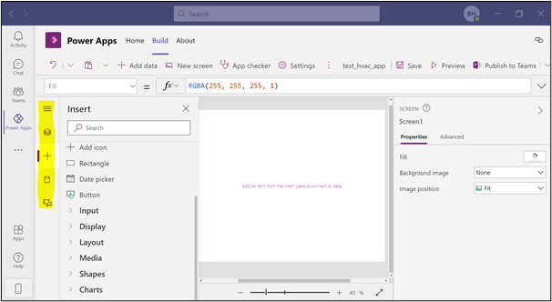
Make your way through most of the Power Apps on the left bar. You'll be able to see the screens you created in the Tree view. You can add items to your screen capture on the Insert tab. Interact with the data for your app on the Data tab.
Just as in normal development, Power Apps has coding standards. To learn more about these, check out the white paper PowerApps Canvas App Coding Standards and Guideline. This paper contains a wealth of information, from naming conventions to performance enhancement advice.
Create the Home Screen
Let's start by adding a blank screen to create a Home screen. It's handy to name screens as you go.
Working with Users
Customizing the app's home screen and security access, depending on the person logged in, is straightforward.
In this example, we'll set a global variable, varUser, to prevent multiple system calls to Active Directory. Bear in mind that the end users may use our app on mobile devices. It's undoubtedly worth maximizing performance where possible. The variable User returns the user details of the user currently logged in, providing an authentication layer to our app.
To set this global variable, in the Tree view, select App, and set the OnStart event to Set(varUser,User()). Then, select the ellipses to the right of App and click Run OnStart.
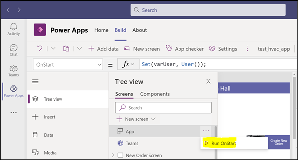
Our global variable is now ready for use.
We added a rectangle at the top of the home screen, with the label's Text property set to: "Welcome " & varUser. FullName. We added a close icon at the top with the OnSelect property set to Exit(true). This closes the app and logs the user out.

Next, we add a button and an image and group the button and image. Change the button's Text property to Create New Order and its OnSelect property to Navigate('New Order Screen'). Add a new screen and name it "New Order Screen." We encourage investigating all the properties available to you here.
We need two new screens to go with the two new buttons, View Orders and Approve Orders. Use the copy and paste function to copy your first button, then adapt the properties as follows:
| Text | "View Orders" |
| OnSelect | Navigate('View Orders' ) |
| Visible | User().Email in HVAC_Manufacturers.Email |
| Text | "Approve Orders" |
| OnSelect | Navigate('Approve Orders Screen') |
| Visible | User().Email in HVAC_Managers.Email |
The code we've added to the Visible property ensures that employees cannot approve their own orders, and "Ready for Processing'' orders are only visible to the manufacturer. There are many ways to achieve this. Depending on the company's setup, you can also make the button's visibility rely on the user's group membership, using the Office365Groups connector. We're keeping this simple for now but have fun and experiment.
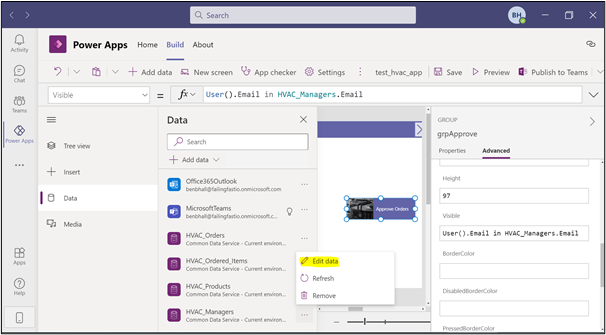
At this point, you'll find it helpful to add your email address to the data sources HVAC_Managers and HVAC_Manufacturers. The buttons will then become visible for development purposes.
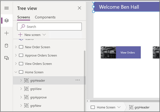
This is how our Home screen looks at this point:
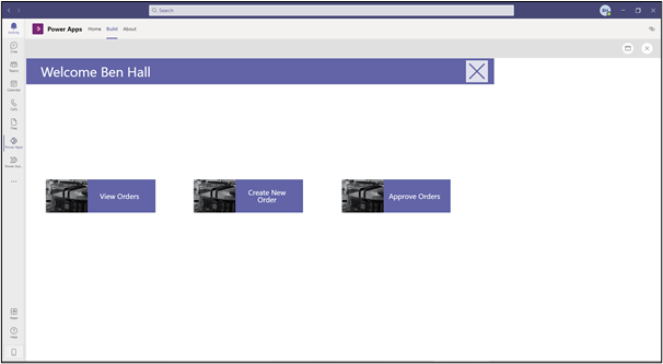
With a Tree view like this:
How To Preview Your App
You can preview your app at any time by selecting the Preview button on the top right or, to check something quick, hold down the Alt key and interact with the screen. This is a convenient feature for quickly confirming something works.
Create the Customer Order UI
Let's now move on to creating a screen for our customers to place an order for approval.
We reuse the rectangular bar from the Home screen on the New Order Screen. Change the label's text to "Create New Order for " & varUser.FullName and the icon to a home shape with OnSelect set to Navigate('Home Screen').
Now we must add a gallery and connect it to the Products table.
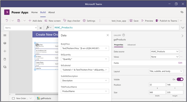
Set Layout as Title, subtitle, and body, and then edit Fields to display Product Name, Description, and Price. Remember, we added some products to the database in the first article because it's helpful to have data.
Let's format as we create the Customer Order UI. It would be nice to display our price in the correct format. We can do this by changing the Price label Text property to Text(ThisItem.Price, "[$-en-US]$#,##0.00"). Now our prices look like prices!
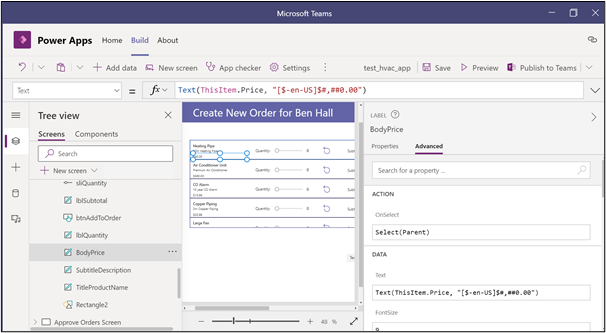
We can drag the following items to the gallery. Make sure you drop them onto the top row so they repeat for all rows.
| Label | Text | "Quantity" |
| Slider | Value | 0 |
| | Min | 0 |
| | Max | 10 |
| Reset Icon | OnSelect | Reset(sliQuantity) |
| Label | Text | "Subtotal =" & Text(ThisItem.Price * sliQuantity.Value, "[$-en-US]$#,##0.00") |
Use a Collection for Order Items
We'll also add a new button, which appears when we change the slider quantity to greater than 0, giving users the ability to add the product to their cart. Here we make use of a collection, a kind of temporary table.
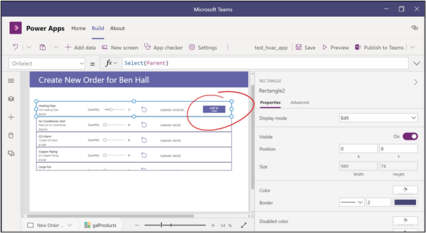
The button needs the following properties:
OnSelect:
```
Collect(colOrderDetails, {CustomerName: varUser.FullName , ProductName:     ThisItem.ProductName,Quantity:sliQuantity.Value, Subtotal: (ThisItem.Price *   sliQuantity.Value)});
Reset(sliQuantity)
```
Text: "Add to Cart"
Visible: `sliQuantity.Value >0`
These properties create a collection, colOrderDetails, which holds data until updating the actual data source (HVAC_Ordered_Items). The CustomerName field is filled by varUser. This could be a text input box if you prefer.
Now is an excellent time to ensure we start our screen with a fresh collection. Select New Order Screen and add Clear(colOrderDetails) to the OnVisible property.
Next, let's make the Cart details section of our screen.
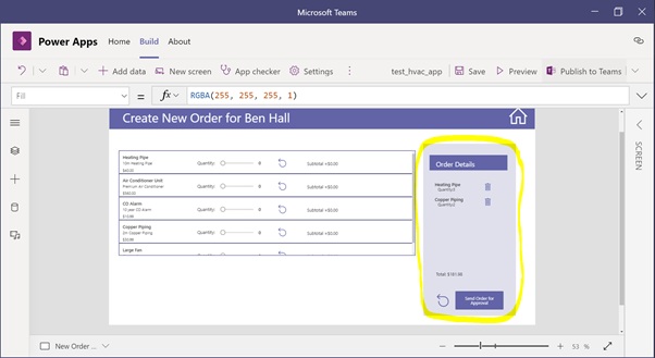
This includes:
- A rectangle to hold the purple background
- A label with the text "Order Details"
- A rectangle to hold a background for the Order Details Heading
- A gallery
| Name | galOrderDetails |
| Data source | colOrderDetails |
| Layout | Title and subtitle |
| Fields | ProductName and Quantity |
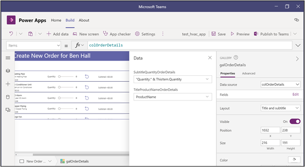
- A trash icon with its OnSelect property set to
Remove(colOrderDetails, ThisItem) - A label with text set to
("Total: " & Text(Sum(colOrderDetails, Subtotal), "[$-en-US]$#,##0.00")) - A reset icon with the tooltip "Reset Order" and its OnSelect property set to
Clear(colOrderDetails) - A button
| Text | "Send Order for Approval" |
| OnSelect |
UpdateContext(
	{
    	ReturnedRecord: Patch(
        	HVAC_Orders,
        	Defaults(HVAC_Orders),
        	{
            	CustomerName: varUser.FullName,
            	Total: Sum(
                	colOrderDetails,
                	Subtotal
            	),
            	OrderStatus: 'OrderStatus (HVAC_Orders)'.'Awaiting Approval'
        	}
    	)
	}
);
Refresh(HVAC_Orders);
ForAll(
	colOrderDetails,
	Patch(
    	HVAC_Ordered_Items,
    	Defaults(HVAC_Ordered_Items),
    	{
    	    CustomerName: colOrderDetails[@CustomerName],
        	ProductName: colOrderDetails[@ProductName],
        	OrderID: RetunedRecord.OrderID,
        	Subtotal: colOrderDetails[@Subtotal],
        	Quantity: colOrderDetails[@Quantity]
    	}
	)
);
Clear(colOrderDetails);
Notify("Order sent for approval. For reference, your order number is " & ReturnedRecord.OrderID,NotificationType.Information, 6000);
Navigate('Home Screen')
|
This button is our most complex code so far. When a user presses the button, the app creates a new order (with order status set to Awaiting Approval) in the HVAC_Orders table, and we return the record just created.
Then, for every record in our shopping cart collection colOrderDetails, we make a new record in our HVAC_Ordered_Items table, with the OrderID set to the OrderID of the returned record. A six-second notification appears to users with their order number and a message that they will return to the home screen.
For additional validation, we group everything in the large order details rectangle and set the group's visible section to !IsEmpty(colOrderDetails).
We have a pretty advanced app with an Order screen that's only taken a fraction of the time of normal development, and we haven't even left Teams!
Try out your creation, adding orders, and then verifying that all are saved correctly in the data tables.
If you want to inspect the temporary collection table contents as you add items to your cart, select the ellipses beside the settings and select Collections.
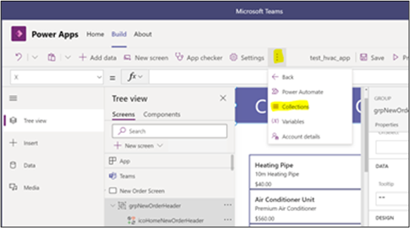
Let's press on with the next stage of our approval system.
Create the Manager Approval UI
We must create our Approve Orders screen for management to either approve or reject employee's orders. Spend a little time applying a similar theme to the rest of the app, with the rectangular bar at the top with the Home button and title.
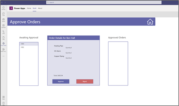
Awaiting Approval Panel
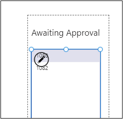
To create the Awaiting Approval panel, on the left side of our screen, we must add:
- A rectangle to act as a background to our gallery, with a border
- A label with the Text property set to "Awaiting Approval"
- A gallery
| Name | galApproveOrder |
| Data source | HVAC_Orders |
| Layout | Title |
| Fields | ThisItem.OrderID |
| Items | Filter(HVAC_Orders, OrderStatus = 'OrderStatus (HVAC_Orders)'.'Awaiting Approval' |
The Awaiting Approval panel should display only orders that are not yet approved.
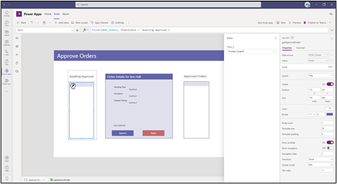
Set TemplateFill to If(ThisItem.IsSelected, RGBA(224,224,237,1)). This makes it easier for the manager to see which item in the gallery is selected.
All other items on the screen should have their Visible property set to If(!IsBlank(galApproveOrder), true) to prevent items from being visible if nothing needs approval.
Order Details Panel
Next, we create the Order Details panel. Managers will select an Order ID to approve. Then the order details appear in the middle of the screen with a button to approve or reject. The app then adds approved orders to a collection, colBatchOrders, and submits the collection for processing.
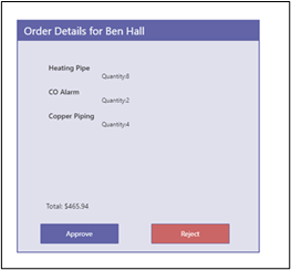
For the middle section, we need:
- A rectangle to act as a background for the order details
- A rectangle with a label inside it with the Text property set to
"Order Details for " & galApproveOrder.Selected.CustomerName - A gallery
| Name | galOrderDetailsApproval |
| Data source | HVAC_Ordered_Items |
| Layout | Title and subtitle |
| Fields | ProductName and Quantity |
| Items | Filter(HVAC_Ordered_Items, OrderID=galApproveOrder.Selected.OrderID |
- A label with the Text properties set to
"Total: " & Text(galApproveOrder.Selected.Total, "[$-en- US]$#,##0.00") - An Approve button
| Text | "Approve" |
| OnSelect |
Collect(colBatchOrders, {OrderID: galApproveOrder.Selected.OrderID});
Patch(HVAC_Orders, galApproveOrder.Selected, {OrderStatus:'OrderStatus (HVAC_Orders)'.Approved});
|
| Text | "Reject" |
| OnSelect | Patch(HVAC_Orders, galApproveOrder.Selected, {OrderStatus:'OrderStatus (HVAC_Orders)'.Rejected}); |
Approved Orders Panel
Now we must make the final section of our screen, which displays the approved orders, ready to submit to the manufacturer as Ready for Processing.
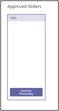
Create:
- A rectangle to act as a background for the approved orders
- A rectangle with a label inside it with the Text property set to
Approved - A gallery
| Name | galApprovedOrders |
| Data source | colBatchOrders |
| Layout | Title |
| Fields | OrderID |
| Items |
Filter(HVAC_Ordered_Items, OrderID=galApproveOrder.Selected.OrderID
|
- A button to send orders for processing
| Text | "Send for Processing" |
| Visible | !IsEmpty(colBatchOrders) |
| OnSelect |
ForAll(
	colBatchOrders,
	Patch(
    	HVAC_Orders,
    	LookUp(
        	HVAC_Orders,
        	OrderID = colBatchOrders[@OrderID]
    	),
    	{OrderStatus: 'OrderStatus (HVAC_Orders)'.'Ready for Processing'}
	)
);
Clear(colBatchOrders);
MicrosoftTeams.PostMessageToChannelV3(
	"a15e2e15-8592-4d89-ac3f-419baefe3943",
	"19:e45661661372454886f656b60500a97f@thread.tacv2",
	{
    	content: "<p>New order ready for processing</p>",
    	contentType: "html"
	},
	{subject: "ALERT: NEW ORDER"}
);
Navigate(‘Home Screen’);
|
Again, there is quite a bit going on here. When the manager selects the Send for Processing button, the status of all the collected orders updates to Ready for Processing. The app sends a message to the manufacturer's Teams channel, alerting them a new order is ready. The app then redirects the manager to the Home screen.
Post to a Teams Channel
Before our app can post a message to a Teams channel, it needs some information, namely, the group ID and Channel ID. This information is difficult to find, but the results are certainly worth the effort, and the skill is worth sharing here.
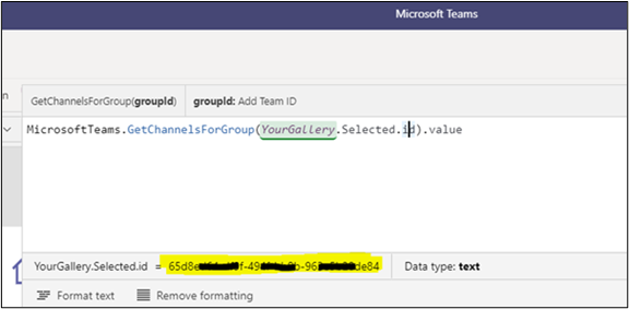
We need some temporary galleries to find these IDs.
Add two to a screen, somewhere in your app. Set the Items property of the first gallery to MicrosoftTeams.GetAllTeams().value
Set the second to MicrosoftTeams.GetChannelsForGroup(YourGallery.Selected.id).value
You can then inspect these galleries and retrieve the required ChannelID and GroupID to enable you to post messages to the Teams channel of your choosing. Don't forget to delete the temporary galleries.
Summary
We have achieved so much in this tutorial. We created a customer UI for our app, enabling customer employees to enter orders and customer managers to approve and send orders to the manufacturer's Teams channel.
In the final article of this series, we'll create a viewing screen for manufacturer employees to view orders and send them on to the processing department. We're sure you're already itching to fine-tune your app!
